


Week 10: Final Logo Voting
 21 Comments
We've reached the final voting phase of the IceHL's 2013 logo design contest. Five teams still await a final decision on the logos that will represent them going forward. You can find those polls below. For each team, there are two options. The logo with the majority of the votes will be declared the winner.
Only primary logos are shown in these polls. This is to cut down on page clutter. To see the full sets that were presented last week, use the links at the top of the page.
Results remain hidden until polls close. Winners announced Sun., June 23.
 |
||
 |
||
 |
||
 |
||
 |
||
Following the reveal of the winning designs on Sunday will come the final phase of this project. Jersey design kits will be made available on Mon., June 24 and submissions will be accepted for two weeks. Voting will open on Mon., July 8 and close on Sat., July 13, ending 13 Weeks of R&R.
At that point we'll shift to our month-long 13 Third Jerseys project, which runs July 13 to Aug. 13. More on that to come.

Reader Comments (21)
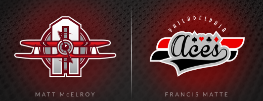
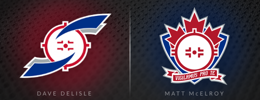
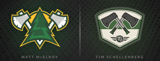
This is a great comp, and i think the standard is very high. For me, i like Matt McElroys Washington Sentinels, Philly Aces and Vancouver Lumberjacks (the highlight LJ in the tree is a brilliant subtle touch). I prefer Craig Wheeler's Olympiques logo (though it would have been nice to see the foot updated to a skate) its a bolder idea, and more of a singular image than Francis Matte's, which for me has too many elements collected together. For the same reason i like Dave Delisle's Snipers logo. Regardless who gets picked i think these designs will lead to some inspired jersey concepts. Im looking forward to seeing what everyone comes up with.
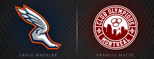
1. Francis Matte It's more a "Montreal" logo because of the elements on it and it's red :-) .
2. Francis Matte I can't say why but his logo is pretty awesome. It has its classic feel.
3. Matt McElroy I don't really like these logos but I prefer a little bit Matt's more because it feels more Canadian.
4. Matt McElroy This one was more colorful but either of them would be great for Vancouver. They're great.
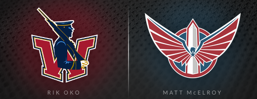
5. Matt McElroy The colors of Matt's logo are very sharp and stylish. I wouldn't mind if Rik Oko's would be taken since he's also great.
I think Matt McElroy should earn the nickname Mr. IceHL. Phenomenal work.
Speaking of him, I think his Sentinels logo is one of the best crafted, aesthetically pleasing concepts I've seen on the site. I think my favorite part is actual the beautiful simplicity of the wordmark. But, overall, the set is a bit too similar to the Capitals for my vote here.
Rik Oko's primary logo is absolutely perfect for the Sentinels, in my opinion.
In the other matchup I'm really rooting for, I'd love to see McElroy's Vancouver logo win. While both logos are very good, I think you have to consider that this league's Seattle Aviators wear green and white. The yellow in Matt's concept would set them apart.
I have to go legacy with the Sharpshooters and the Olympiques. Both are fantastic. But with the Sentinels, as much as I love Rik's design, Matt's is over the top good. It brings in a new shade of blue, which is nice, and just rocks. Same with his Lumberjacks logo. Great movement away from the sterotypical Vancouver colors, and ideas. I wanted the aces to be something cool, and Matt's is great, without being too similar to Houston.
Wait a second....was there an outright winner in the Dragons competition or was it omitted from these votes? I could be missing something but I read and re-read and didn't see anything about the Dragons winner.
These McElroy's are good quality but I don't find them that original. The Aces I still voted for because of the name but we do already have the hellcats as a plane logo. The others though are a problem for me. Snipers = Jets, LJs = portland timbers, Sentinels = current caps 3rd. I still voted for the Sentinels logo because I do not care for the current one. Maybe I'm judging too hard but I still think we should give credit to all the talented designers instead of just one.
For Montreal, I prefer the current logo, as Matte's logo is just a tad busy to me and I liked the Olympiques' current set.
For Philadelphia, McElroy's got my vote. As much as I like the idea of playing cards, it feels a little basic to me.
For Saskatchewan, Delisle gets my support. McElroy's is just too busy for me as a whole.
For Vancouver, this is a really hard vote, but I gave McElroy my support on this one on the flip of a coin. It was that tough to choose for me. Both are great sets and I think either set that wins is a much-needed upgrade over the present stuff.
For Washington, I had to stick with Oko's work. Sentinels are one of my 3 favorite logos in the league, and while McElroy's take is excellent, I prefer Oko's more. This was another tough vote here.
For both Montreal and Philadelphia, I went with Francis Matte's designs. Both seemed almost perfect for the names and cities. With the Aces, Matte's design was simpler and more elegant than Matt McElroy's , and with the Olympiques, Craig Wheeler's logo was just too abstract.
For Saskatchewan and Vancouver, McElroy did it for me. I think the splash of yellow sold me for the Lumberjacks, with Tim Schellenberg's logo just being too bland. As for the Snipers, I love Dave Delisle's logo and fully expect it to win, but wow. The maple leaf. The crosshairs. The Latin. That is just cool.
And for Washington, I don't think anything can top that logo by Rik Oko. I mean McElroy's is fine and everything, but a military-themed logo is what a team called the Sentinels needs and deserves. Beautiful.
Wanted to let everyone know that Matt McElroy made a few tweaks to his Sentinels and Snipers logo since these polls went up late last night. They're aren't substantively different. Just improvements to the original designs.
@Jesse: Yes, the Dragons along with 5 other teams had outright winners based on last week's voting. You can see those winning designs on the IceHL page which is accessible from the tab at the top of the page.
Montreal: Craig Wheeler, but I agree with changing the bare foot to a skate.
Philadelphia: Francis Matte - maybe the best looking logo in the competition, and a much better color scheme. I don't want to see any more aviation themes.
Saskatchewan: Matt McElroy - Great update on the Snipers logo. Just keep the red jerseys.
Vancouver: Tim Schellenberg - I'm not a fan of the McElroy Lumberjacks set. It's a bit too cartoony for my taste and the wordmark reminds of the SuperSonics NBA team.
Washington: Rik Oko - I like the guard idea. The McElroy set looks amazing, but the idea is played out.
So is Delisle going to get some design credit for McElroy's Snipers logo? The latter just seems obviously derivative.
Just great stuff from everyone! A couple of tough choices here but I generally think, either way, we're going to end up with some fantastic sets. My big fave's are Matte's Olympiques design, McElroy's Snipers design and Oko's Sentinels - its an original and I just love that soldier silhouette.
Oh and another thing @Matt McElroy - I don't suppose you played around with the wings on your Aces design did you? Like flip them the other way so that the longer one is on top, the shorter on the bottom? It looks kinda unbalanced in its current format?
My two cents on the various logos:
1) Francis. Wow. That logo just screams Montreal hockey. Not usually a big fan of the "Hockey Club" retro look, but I was a huge fan of this one. My favourite of all the submissions.
2) Matt. Really nice, pleasing design. I also much prefer the pilot motif to that of the playing cards.
3) Abstained. Wasn't a fan of either, really.
4) Tim. While Matt's is nice, it feels way too much like the Portland Timbers MLS logo. I get that those are common colours/ideas in Cascadia, but Tim offers a fresh approach to it, and I wouldn't mind seeing that new shade of green introduced.
5. Rik. I like Matt's here, yet the old Sentinels has always been one of my favourites, and the hint of gold is a refreshing departure from the usual red/blue look.
Chris: If Francis's Aces logo is a winner, for jersey designs could we get rid of the "PHILADELPHIA" script or would that need to be included in the overall design? $0.02
I thought I'd take my last chance to chime in. First off thanks for all the support! Now I'm going to adress some of the stuff I've see you guys comment on in my logos to try and answer some questions.
The reason the aviators logo has bigger wings on the bottom and not the top is because the plain is supposed to be takeing off from with in the confines of the logo so it is all shifted up a tad, and because the wings are the broadest surfaces on the plane its easier to tell there. I also went with a WWI style biplane vs a more modern plane and a completely different color pallet to keep it far away from the hellcats look.
On my Snipers 2.0 logo I've simplified it from my first entry to try and remove some of the clutter you guys saw. It does have a lot going on, but that being said they are all things that I think help ground the rather simple shape of the face-off circle/ scope sight in order to make a more military feeling logo to fit with the new snipers name.
For the lumberjacks I wanted something that was a lumberjack logo with out showing you the actual guy with the beard. The Highlights on the Tree make an L and J for lumberjacks and the base of the axes help form not only the base of the tree but also a small V for Vancouver the city the Jacks call home.
And Finally the Sentinels. Combining two symbols of Washington DC with the eagle and Washington Monument. A sentinel is someone or something whose job is to stand and keep watch. The eagle not only is the United States national bird it fly's high above the country while the Washington Monument towers over the DC skyline together they are keeping watch over the City of DC and the Country as a whole.
And now that I'm done with my creative writing exercise I'll leave the rest up to you guys!!
Anyone else horribly demoralized that the winning 'Texas Outlaws' logo was originally submitted as a 'Gotham Rogues' logo a year earlier?
I really love your work : )
@Erik G.: Great eye! I never put that together. Just goes to show the sheer volume of content I post on this site. Hard for me to keep track of it all. But honestly, I completely disagree with your take on this recycling of a cool logo. This is exactly what the IceHL was meant for. So that people who have designed great logos just for fun can see them put to use in some small way.
Sure, it would be nice to see original artwork for every team, but that's unrealistic. You wouldn't do your job for free, would you? So sometimes our designers rely on modifying work they've done in the past. That's the only way this league works well. Kudos to Francis for figuring that out!
For those wondering, click here to see that Gotham Rogues concept Erik referenced.
Chris: I can understand recycling parts of past work, certainly. I think what gets me (as a Dallas native) is that the edgse of the cowboy hat look like bat ears to me no matter how hard I try to convince myself it's a hat. If this team was supposed to be in Austin, I'd probably find that to be a sweet nod to the area's famed bat population, but it bugs me as a Dallasite.
So many home runs. There's going to be a lot of sharp teams next season.
For me:
Olympiques- Wheeler because I believe Matte's is slightly too busy.
Aces- Matte because I prefer the playing card aspect to the plane one as there are already 2 aviation themed teams.
Snipers-DeLisle because McElroy's is too busy. Also I really like the face-off circle imagery.
Lumberjacks- Schellenberg. This is one of my favorite logo sets of them all, pretty much only behind Slavo Kiss' winning Chargers Logo. I especially like the 'VL' secondary.
Sentinels-McElroy. Beautifully captures the spirit of Washington, also just looks really good. However, I preferred the original version before he updated it. Really hard to choose for Washington though, and I will be happy if either one wins