


Hawks Jerseys & Soldier Tributes
 Never ones to miss a Black Friday cash-making opportunity, the Chicago Blackhawks have announced plans to officially unveil their new third jersey. And they're not going to make us wait long at all.
The Hawks have posted on their web site that the new alternate sweater will go on sale Friday, November 27 — tomorrow — and that Patrick Kane, Jonathan Toews and Marian Hossa will be featured in a video about it.
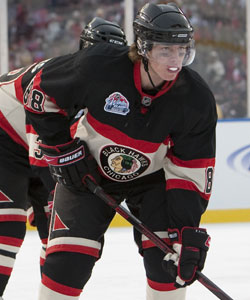 Patrick Kane at the '09 Winter ClassicI'm assuming the short notice goes to the fact that the design has been long-rumored to be based on the special Winter Classic sweaters worn on New Year's Day last season (pictured to the right) against the Red Wings. While they don't say so specifically here, I'd be shocked if they do anything different.
Obviously, Icethetics will have coverage of that tomorrow. So check back for details and pictures.
For whatever it's worth, this is my favorite Winter Classic jersey yet — and quite possibly my favorite NHL jersey of all time. I'm not sure why. I just know I want to own one.
Also while we're on the subject of the Blackhawks, I got an email from a reader today on a topic I never made it around to covering a couple weeks ago.
Why were the Hawks wearing these camouflage jerseys during warm-ups on November 11?
;)
;)
Well I think the answer is obvious. The Hawks were honoring American soldiers on Veterans' Day. But if you'd like more details on the tribute, click here.
 For the record, the Anaheim Ducks did the same thing the week before. On November 3, they donned camouflage jerseys in their pre-game skate. The sweaters were then auctioned for charity.
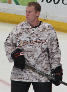
In case you were wondering, they are the exact same jerseys — only with different logos and numbers. And from the cut of the collar, it appears Reebok was in on the whole thing as well — which explains why both teams wore the same jerseys.
Anyway, I know I'm late on this story. And I apologize to all of you who sent in emails this month which seemed to go ignored. I read them but I just never managed to find the time to get it posted.
Actually, I had prepared an entire post talking about the lack of updates lately. It then got accidentally deleted before I could post it. Then I figured, who really cares anyway. You've heard it all before and I'm sure you guys are just happy when there's new content.
And this happens every hockey season. Work gets busy for me and when I do get home at almost midnight, the last thing I want to do is have to write more. Plus, I have a hockey team to follow too, you know.
One last note regarding KractIce. A couple of you have asked why it disappeared. Unfortunately it was due to a lack of interested just like the IceHL. And I understand that. The hockey season is back in full swing and no one really cares about logos and t-shirts anymore. We just want to see our teams to win.
We'll shoot for another competition this summer. In the meantime, enjoy the season and I'll keep posting new stuff whenever I have the time — except in January. I'm getting married in Las Vegas in January and I have no plans to keep the site updated during that time. I'll be back after though.
 Chris
Chris
 Quick follow up. Just read a good question that came up in the comments. Alex asked when Nashville is expected to debut their new third jersey on the ice.
As a matter of fact, it's this weekend. The Predators will wear the new alternates against the Blues tomorrow and the Panthers on Saturday — or so says the current splash page of their web site.
;)
By the way, I've got one more item to mention.
 If you haven't been following along with the Twitter updates in the sidebar, you may have missed the revelation that the Pittsburgh Penguins are evidently scrapping one of the best third jerseys currently in use in the NHL.
In an article posted on the Pittsburgh Tribune-Review's web site, writer Rob Rossi mentioned that the Panthers debuted their third jersey in Monday night's game and that the Penguins' alternates would be replaced in the 2010-11 season.
The Florida Panthers unveiled an alternate uniform last night. The color scheme mirrored the Penguins' original colors: baby blue, dark blue and white. Those colors are part of the Penguins' popular current throwback-themed alternate uniforms, which will be replaced next season.
That's as much as it mentions so there's no word yet on what the jerseys will be replaced with. And as far as I know, there's been no official mention of this from the team.
;) Pittsburgh Penguins' third jerseyPersonally, I thought they should've made the switch to these jerseys full time. But obviously the team disagrees — though I can't imagine why. Fans seemed to go nuts over it.
Pittsburgh Penguins' third jerseyPersonally, I thought they should've made the switch to these jerseys full time. But obviously the team disagrees — though I can't imagine why. Fans seemed to go nuts over it.
As you may know, the baby blue sweaters (pictured at left) originally debuted in the inaugural Winter Classic on New Year's Day 2008. They were such a big hit, the team opted to use them another dozen times both last season and this season.
It also means the Age of Reebok's Third Jersey Extravaganza won't end this season after all. We'll see a new alternate uniform in Pittsburgh at the very least come 2010.
Other teams for which I'm hoping to see replacement third jerseys — the Lightning, Senators, Stars, Bruins and Thrashers. But we can all keep dreaming.

Reader Comments (29)
I thought it was official they were switching to the Winter Classic jerseys.. why is an unveiling nessicary?
You're getting married? Congrats.
And those Blackhawk Winter Classic jerseys are atrocious IMO.
chris,
congrats! any plans to maybe hand over the reigns for a month while you are gone? maybe just someone to keep the strauss rebrand going - or perhaps have it auto post once a week - it would keep us all placated for the month!
NHLuniforms.com already have the WC jersey up as the Hawks' third, and the guys over there tend to be pretty on top of things. Unless Chicago is trying to throw everyone for a loop this seems like the polar opposite of when the Devil's held a press conference to announce that there would be no jersey unveiling of any sort.
Congrats!!
BTW, when will we be seeing Nashville's third hit the ice, I'd expect them to debut by now.
"And those Blackhawk Winter Classic jerseys are atrocious IMO."
Couldnt agree more. Love the hawks jerseys, except when there black. Both that and their other black third never really sat well with me.
congrats man.
although i was kinda thinking, you could get another person to update the site during your absence. like have a person post concepts, which could take a load off your back
Personally I hope the lightning stick with the same colours of the 3rd. Id just like to see a logo instead of BOLTS. I wouldnt even care if the had LIGHTNING diagonally across the front. Just not BOLTS. If they cant do that, go back to their original 3rds lol.
Personally I am soo happy that the Pens are about to put the baby blues to rest finally, It was fun to go retro for a while, but it's time to put them away for good. I'm hoping that the new third is a primarily gold jersey.
First off, Congrats, Chris! Married life is always an exciting time, but while you may still be on the honeymoon, just remember were still here waiting for something new (or at least a sign of life). Maybe you should think about handing over the reigns to somebody...or "Johnny Griswold" over at the currently inactive Puck Drawn will resurface for that time.
It's about time we heard something from the Blackhawks about their third. Really doesn't need much introduction It'll be easy for me to review. I'm also interested to see what Nashville will look like in action.
To comment on the Veterans Day (a.k.a. Remembrance Day) practice unis, kind of a surprise to see NHL teams wear something a ECHL team or a team in another league would wear for a full game...even if it was just the warm-up. I'd prefer it if league-wide for the first 11 days of November, teams would wear a Poppy in the form of a chest patch.
Finally, I don't get it, what is Pittsburgh trying to prove by replacing one of the best Third Jerseys in the league? All I can say is its replacement had better be drop dead gorgeous.
Is it possible that the 3rds will just be replaced with the current home sweaters? Pull a switcharoo?
Congrats on getting married soon! About Kractice: is there a chance that it could be revived if more interest is shown? I think that people had problems finding the submission link. (Kinda disappointing, I was looking forward to some free swag from IceJerseys)
If the Hawks do make a change to it. i foresee the Current logo in place of the old logo in the middle of the circle, that's about it.
I hate the penguins 3rds, baby blue is the worst color for a hockey jersey.
I can't believe the Pens are switching their third jersey. It is the perfect use of a third jersey. It changes things up (by going retro in this case), yet the Pens keep the black and gold as the regular uniforms that every Pittsburgh team wears.
And the winter classic Blackhawks jersey is awesome. Hopefully my Pat Kane will be here soon. But the former third jersey was very good too, as all Hawks jerseys are.
I have no problem with the Penguins getting a different alternate next year. Note that I do love the alt they have now.
Personally, I wish teams would just stick with a look (I'm a Habs fan) with their homes and away jerseys and use the alt to mix things up. The Pens can go to the original Mario era jerseys maybe even a modern take on the yellow/gold ones. They can bring back the baby blue colour in 7 or 8 years. Everyone is on the light blue bandwagon right now. They are just staying ahead of the curve.
reading that post again, i just had a thought. maybe the penguins arent getting rid of that jersey. all it says is that the 3rd jersey is being replaced. is it possible that they may switch the the baby blue full time and introduce a new third jersey? just thought i would throw that idea out there.
watching Pens on the island, and they're using their powder blues on the road. they look so sweet. whey they would change it is beyond me. can we get this confirmed????? it's arguably the league's best sweater. one step forward, two steps back...
Really? I'm not that big on the Chicago WC jerseys...
and congrats Chris. =)
I was gonna comment on it being a winter wedding, but then i remembered you dont really get winter :P
First off.... can we please not use the term 'drop dead gorgeous' when referring to a hockey uniform? Now, I totally agree with Nick and MP..... the Pens light up the hockey world 2 yrs ago when introducing the retro WC jersey, and now they wanna scrap it?? Many don't like the powder blue, but I think many more love it. That's one of the nicest examples the nhl's ever had...... IMO!
Just when I thought these hockey teams were finally getting it, and ignoring the Reebokification of the nhl, we get this news. Hopefully,as some have stated, they'll make the ice-blues their home jersey and do something else with their beloved black & gold for a 3rd.
Long live classic hockey and the nhl. Long live the days of the CCM jersey's, the normal hem cut and hem stripes. Long live the string collars and V-necks. Long live classic shoulder yokes, and normal block numbers! Reebok please stick to sneakers....... you messed up a good thing we had in this sport.
I agree that the Pens light blue is gorgeous, and 200% better than the ugly drab black and tan, yes, tan ones they wear otherwise. A move to the retros full-time would rule, but I'm probably giving them too much credit.
Congrats Chris!!
I love the hawks and penguins jerseys. I cannot understand why they would ditch these jerseys and I am angry, since I own one. Lets just hope that they don't mess it up too much.
The Blackhawks released their third jersey today. As expected, it was last year's Winter Classic jersey. The only change is that a red and gold shoulder patch is also included (still the Tomahawk C) The previous WC sweater had bare shoulders.
According to me, this is a big crime.
I personally would like to know what do the Panthers have to do with baby blue? They ditch the red they started the franchise with and added a color and a jersey style someone's already using?
The Pens 3rd is one of my favorites in the league.
Here's a question, don't the NHL teams have the right to vito new jerseys because, for example, one's jersey is almost a copy or using the same colors as theirs?
I like the changes made to the jersey for the full-time thirds. the shoulder crest is epic.
I simply don't believe that the Penguins are going to change those alternate uniforms. I believe the article is mistaken. I've read enough news articles to know that some times, reporters are just wrong.
So let me get this straight... Pittsburgh is scrapping arguably one of the best jerseys in the Reebok Age... because of Florida?!? Since when does an original expansion franchise take a back seat to the Panthers? And the circular logo trend needs to stop... it's already saturating the NHL.
As a hometown Pittsburgher, the movement for a return to our black and gold colour-scheme (as with the Steelers and Pirates) of the glory days in the early 90s. Most of us are sick of the baby blues. They're rather misrepresentative of our city, dating as far back to our Pirates and Yellowjackets hockey clubs at the turn of the century. I for one would love to see the oft forgotten Gold unis we had for a split second. Alternatively, the diagonal gold-lettered 'Pittsburgh' black sweaters during the 'Robopenguin' logo era would be an upgrade from the lousy baby-blues. I mean, Snoop Dogg wore one in a video - and who wants to argue with Snoop's sense of style?