


CHL Third Jersey Fever, Part 2
 19 Comments
After a few weeks of daily updates, I needed a bit of a breather. But it's time now to get back to it. We first need to get to a few more third jerseys from the CHL, as a continuation from last week. That post included only new alternates from the WHL. Today's will be from all three leagues.

 Photo credit: John AllenThe WHL's Tri-City Americans unveiled a new red third jersey just a few weeks ago.
The design was first seen on Annie Fowler's Tri-City Herald sports blog on Sept. 23. The jersey then made its on-ice debut a few nights later, Sept. 26, for the Ams' first game of the season.
For the record, the Americans beat the Spokane Chiefs in the new threads in front of their home crowd in Kennewick, Wash. by a score of 6-3.
The standard home and road jerseys for the Tri-City club are dark blue and white. Though the red clearly works very well. The primary logo is the same on those sweaters so it might've been a nice change to see something else there.
Still, this is the CHL and even though it's a junior league it's hard to complain about most of their sweaters. They usually put a lot of work in and tend to hit the mark — unlike a certain major professional hockey league we all know well.

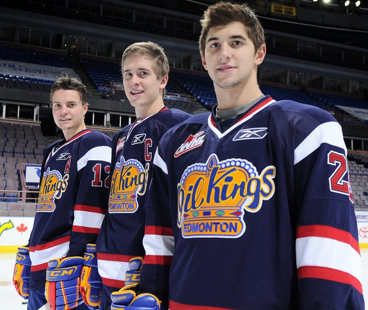 Oil Kings unveil third jerseyJust yesterday, the WHL's Edmonton Oil Kings unveiled their new blue alternate sweater.
Typically, the Oil Kings' dark jerseys are red with more traditional striping so this is a change of pace. And while the rest of the sweater changes, the logo remains the same. A post at etownhockey may have put it best:
The jersey's take on a new modern look but their gaudy symbol is still intact. I like the look but I was really hoping for a completely revamped 3rd jersey which saw a new logo.
The yellow logo is very dated and looks out of place with the rest of the uniform. I understand this goes back to the original Oil Kings days, but with an alternate jersey they had free range to add something new. Unfortunately this wasn't the case.
The Oil Kings' own press release makes no excuses for the design, just pointing out that it will look like a whole new team when the new sweater hits the ice for the first time (in a game) on Friday night against the Medicine Hat Tigers. They also have an extra photo for your enjoyment.

 Photo credit: Dave ChanOne of my favorite CHL third jerseys has got to belong to the Halifax Mooseheads of the QMJHL.
The Mooseheads' new black sweater is actually a revisit of a previous third jersey, only now it's made by Reebok. And despite being black, it looks great. You know why black works in the CHL? Because it's used sparingly.
The jersey first hit the ice on Oct. 1 in a shootout loss to the Saint John Sea Dogs. But they sure looked good, aesthetically speaking. Not that they normally look bad. On any other night, the Mooseheads normally look like the Minnesota Wild, whose jersey design they use for both their home and road uniforms.
In other jersey-related news from Halifax, the Mooseheads will hold Pink in the Rink III on Oct. 22. That will involve specially-colored sweaters and the ice surface painted pink. Also, if you have a minor hockey team in Nova Scotia, the Mooseheads could wear your sweater for a night. Details on the Great Mooseheads Jersey Race on their website.

 St. Michael's Majors third jerseyThe OHL team with the most ridiculous name ever, the Mississauga St. Michael's Majors, has a new third jersey.
It's a nice one but all these "fauxbacks" are starting to look the same. You got your circle crest in your Habs-style stripe across the chest. We get it. Even jerseys from way back in the day had their own styles. Still, most NHL teams struggle for a look this clean and simple.
The new sweater was unveiled Sept. 26 at the Meet the Majors event. This photo (right) was posted on Twitter by Tony Ambrogio the following day but the team has a small photo gallery on its website. Unfortunately, the "fauxback" thing only gets worse when you see the back. Yes, that's a dark blue nameplate on a vintage white sweater. When did this become a thing?

 Greyhounds' new third jerseyWe'll wrap up today's CHL third jersey post with the OHL's Sault Ste. Marie Greyhounds.
I don't know if they're trying to keep this new sweater a secret, but the Soo Greyhounds are doing a good job of it. A reader, Ryan, emailed in this photo (right) with no details on where it came from. There's also this article on the team's website.
The Greyhounds usually wear red and white so this is certainly something new. Still, it looks like they're trying (badly) to borrow an idea from the Mooseheads (mentioned above).
But I guess it's no worse than writing SENS or BOLTS across the front of your alternate uniform. The striping is hard to make out in either image but it appears to be pretty plain as well. Not that that's a bad thing.
Hoping the uniform looks better on the ice than in this photo, though. By the way, if you guys can track down a better shot (perhaps game action), let me know by email.

Reader Comments (19)
I agree with your sentiment that the Majors have the most ridiculous name. I simply call them what they should be: the St. Michael's Majors. It refers to a private school in Toronto, and the Majors is the team name for all teams associated with the school. The city name was added to "disassociate" the team with the school while maintaining the tradition of the Majors, who won Memorial Cups dating to the 1960s.
Great update, I love coming here to get the updates and a little history.
With that said, the Majors, although having a really long name, have a really historic name. St. Micheal's is an all boys catholic school in Toronto that used to be known for it's hockey program. Many players went on from St. Micheal's to play for the Maple Leafs. Their nickname was the "Majors".
The OHL version of the Majors is a re-birth of the school's team as it was originally owned by the school. It's now owned by Eugene Melnyk (Ottawa Senators owner) and when the team was added (or, "revived" as some like to say) to the OHL the team waived the rule that the boys playing on the team must be students at the school.
Since their move from St. Micheal's arena in Toronto to Mississauga's Hershey Centre the team had been referred to as just "the Majors" for the most part.
The new third jersey for the Sault Ste. Marie Greyhounds is actually a revisit to a previous third jersey, similar to what the Halifax Mooseheads have done. Sportslogos.net just recently added a rendering of the new Greyhounds third jersey.
I think the Majors' sweaters look sharp. The blue nameplate looks fine. It's better than the Sabres or the Flyers away jerseys.
And I don't think that you can mess with the Oil Kings logo. Just think of what the NHL's Kings did to their logo when they tried to modernize it and you'll see my point.
Any update on the London Knights? Will they be bringing back those beautiful Green thirds from 2 years ago?
All seem pretty nice. Not a fan of Soo opting for the "black for the sake of black" look. That fad had passed.
I am a Mooseheads fan and was disappointed with the third jersey unveiling. Was hoping they would add stripes to the bottom but instead they took the stripes off the sleeves and put them on the shoulders, making the jersey look more bare than before. Looks more like a baseball sweater to me.
This team wears about 7 jerseys a season now. Home, away, third, Pink in the rink, Armed forces night, Battle of NS jerseys and now a minor hockey sweater. That's too many, IMO. I miss the old jerseys, back when they just wore home and away.
My dream is one day they will finally wear green and it will be a classic original sixish style jersey.
The Edmonton jersey would look good with some "Cooperalls"
A little careless use of the word "ever" in the post, and lacks a sense of history and understanding of the history of junior hockey programs. In a sense, the Majors full name is far less silly than the New York Jets and Giants, neither of whom play in the city or state for which they are named, or the Los Angeles Angels of Anaheim.
And as far as "ever," well, there was the old Longueuil College Francais and Peterborough's TPT Petes, the TPT being shorthand for Toronto-Peterborough Transport Petes. For this American, those names, long or short, are just as classic and the old senior hockey team, the Flamboro Motts Clamatos. Good drink, and a good team. And after all, don't those two (good drink, good team) sum up a perfect hockey marriage? I vote yes.
That Halifax jersey is nice. Did anyone else notice that the player's name is "FRK"? Haha!
The Mississagua St. Michael's Greater Toronto Ontario Canada North America Earth Milky Way Universe...uh...Majors jerseys do look clean and simple, if they were not a direct rip-off of the Waterloo Black Hawks jerseys that started last year, which themselves were a direct rip-off of the Chicago Blackhawks' Winter Classic jerseys from New Year's 2009, which themselves seem somewhat of a ripoff of the Habs jerseys despite being a complete throwback to an actual jersey the Hawks once used.
Here's the link to Martin Frk's profile on the Mooseheads site. He's Czech, which I suppose explains the lack of vowels in his last name. I know I've got a couple of extra consonants in my last name, being Polish (despite my handle, which was inspired by a Japanese cartoon... but that's more to do with me being a nerd than anything else).
More "vintage white"? Ugh. Do Reebok and these teams not realize that they actually CLEANED hockey sweaters back in the day? Y'know, not totally unlike how they clean jerseys today? And I'm sorry, but the laces are totally unnecessary in this day and age, and to me they bring negative aesthetic value. If I were a player on a team wearing a laced jersey, I'd pull them out like Bobby Orr sometimes did, before the Bruins went V-neck.
Evidently, though, people seem to like those silly laces... whatever.
Frk? Really?
Sudburys new third is a black jersey looks alright
I believe the Greyhounds Jersey is a throw back honouring the Sault Indians
The Soo Greyhounds Third Jersey is fashioned after the jerseys worn by the Soo Canadians in the first professional hockey league formed in 1904. The IPHL was in existence from 1904 to 1907.
I am very sorry Matt, but the Halifax jersey is one of the best jerseys I've ever seen in my life. I am an enormous fan of the name under the number, and the shoulder striping (which comes from football, not baseball, look at the colts) is an amazing thing, and it amazes me that it hasn't been thought of before in hockey. All around a great job.
Captain Canuck, I don't follow football and was more so referring to the city name and number on the front as being "baseballish". That and the shoulder stripes should be left in the other sports.
i understand, you're the fan of the team and I'm not, so I'll leave it to you.
On another note, I really like the oil king uniforms, that navy is a good color for there color scheme