


Saturday
Oct092010
A Beautiful Sight
 70 Comments
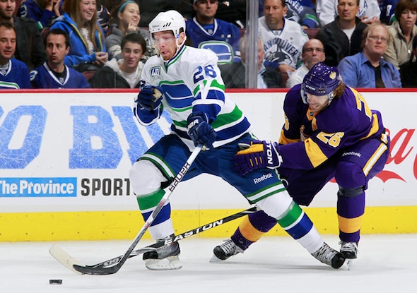
There's no news here. I just want this picture to be the first thing Icethetics visitors see for a little while. Color is slowly making its way back into the NHL. Because here's what this game would've looked like on any other night:
So enjoy it.

Reader Comments (70)
I love the LA Kings jersey, it is nice to see a different colour back in the scheme of things in the NHL. I agree that the colours had started to get repetative and boring. Would love them to bring back the gold version of that sweater too. This whole Reebok Edge system made a disaster of many uniforms. It is nice to see some teams rectifying that mistake like Buffalo, NY Islanders and Toronto. New Jersey and Detroit were smart not to change anything around.
I ike both jerseys, especially the Kings. I think these retro jerseys should be Reebok 6100 design. I absolutely hate Reebok Edge.
I wonder how the Calgary Flames were able to get RBK 6100 design jerseys last season? I think retro jerseys should always be 6100 design. Hockey is a traditional sport and Reebok doesn't respect that. Does anybody know how long NHL's contract with Reebok is?
I'm sure those saying the Kings jerseys are ugly are the same people who drool over the Canucks logo that I absolutely despise...
I guess we'll just have to agree to disagree.
this is what HD was made for. What a pleasure to watch that game. It felt special like the Winter Classic. This is how the NHL should do throwback games. There's nothing better than both teams wearing throwback uniforms and having cool little details like brown pads and that mask that Quick wore.
It's not the same when only one team wears a throwback. Like LA vs Calgary the next night. LA should've worn their throwbacks again against Calgary's red third. That wouldve looked awesome.
As far as Ottawa goes, I think they need to ditch the "3-D" logo, it looks way too cartoonish and well lopsided. I know the fans from ottawa probably don't want to go back to it because their first couple seasons in the league during the 90's we absolutely wretched but their original ( one from the nineties not the old old school 20's or whenever they were in the league) jersey and logo was way better than the crap they wear now or since 98. Bring back their original duds and use if you must the "3-D logo" on a red third with the =O= logo for shoulder patches.
Just get rid of them current thirds, dear god are they hideous. If those things flashed like christmas lights everyone would drop dead from epilepsy.
I really love the Kings' purple and gold uniform combos. It would be spectacular to see them return to their original colours and logo, similar to what is being done in Buffalo.
@ EL,
I absolutely agree with LA wearing their throwbacks against Calgary's. Just one problem. Both throwbacks are dark. The Kings would have to wear their vintage yellow-gold vs the Flames' reds or the Flames would have to wear their vintage whites vs the Kings' purples. It would be a "hockey dream come true" to see both teams go back to their originals. Of course, my good friend Nathan and I will have to agree to disagree on this concept. With HD TV and the beauty of the game, hockey looks great in colour.
Red vs Purple would totally work. Red contrasts against any dark colour except maroon.
Up until recently the NHL allowed the occasional game with colour on colour. I remember seeing Boston's yellow thirds against the Canucks all the time. The Canadiens used to wear red against the Rangers blue jerseys as well. Those were great looking games. In HD they would be a real treat.
Personally I just dont like white jerseys that much. Id like to see as much contrasting colour as possible. Red and yellow would definitely work against blue, black and green. Green vs blue or maroon vs blue would not work however.
As for this game, well I hope the NHL is paying attention. That was one of the best looking games I've seen in HD period. If the league wants to sell black they should do fashion jerseys. If they want to sell a TV game go with colour like that.
From reading the posts here, I think it is safe to say that most of my fellow Canucks fans want to see the Orca go. I think it's time we ditch that god-awful logo and make the third jersey our home sweater and create a white version. The vintage should be a third, just like what the Flames did. The Canucks have nothing to do with whales or Orca Bay and our hockey team shouldn't be used as a tool for corporate sponsorship. So how can we make this happen people!? If Sabres' fans can do it, why can't we?
@ Ryan,
I am with you 1MILLION %. I find it very appalling that Canuck fans have not taken the same kind of action as Sabre fans. I have been extremely anti-Orca from the beginning. I totally agree with your concepts. However, I also feel that the modernized skating Johnny Canuck logo should be our primary crest, for which our beloved team is named after.
I have beaten this horse to death numerous times when I talk to owners, managers, and clerks of NHL retail outlets and at the Canucks Team Store. Sadly, some of them favour the Orca because it's west coast and it appeals to tourists and children alike. Well, that kind of branding is WRONG. I have told those same people again and again, "Our name is CANUCKS, NOT ORCAS." Even the Orca gets support on the message boards at canucks.com. I think we should have our own website, "We Are All Canucks, Not Orcas". We should get a huge petition going in order to rid our hockey club of this irrelevent eyesore of a logo along with the "Vancouver" wordmark. Johnny Canuck and Stick 'n Rink brand. A CANUCKS brand. Then, leave it alone permanantly.
The Canucks have had too many logos and radically different colour schemes. That's why the fans can't mount a campaign to dump the orca. What do you dump it for? A lot fans in their 30's are still stuck in the 90's and want to bring that skate logo back. Other fans think the skate logo is pretty dated looking and equally nonsensical as the orca. Some fans like the rink logo. Other fans think it's too simple. Some fans like the Johnny Canuck logo. Other fans think it's too cartoonish and that the Giants somehow own the lumberjack. As for the Orca, I don't think it's a stretch to say it doesn't fit with the current colour scheme and I doubt there are any Canuck fans anywhere that really miss the first Orca jerseys. But there are many people and some fans in Vancouver that still like the logo.
Personally, I think the Canucks should have three main logos. The rink logo, the skating Johnny Canuck logo, and the Johnny Canuck V logo. About 80% of Canuck fans will get behind this right away. Make a home and road set based on the current 3rd jersey and throwback uniform. For the third jersey use the skating Johnny Canuck logo. Have a fashion jersey with the Orca in Orca colours. Presto. The Canucks sell a ton uniforms and people have a ton of choice.
Definitely an improvement over their current black and whites, but the gold jersey they had at the draft night is much better, if you asked me.
Andre, I totally disagree with you about the Orca. The colour scheme, the identity, and the logo is all about West Coast (the whale, the greens for trees, the blue for water, the First Nation style, the culture, etc) As a Canucks fan from the US, I can see how the jersey really does represent the PNW, and I am getting sick and tired of how people think the Orca is part of the Orca Bay. It doesn't really matter for people who are not in BC and they are not making any fuss about it. When I saw the logo for the first time, I don't see it as OBE, because a corporate company doesn't have anything to do with it.
The Johnny Canucks logo isn't a great idea as a logo, why? The word Canuck is short for Canadian and Johnny Canuck is a Canadian identity mascot. It doesn't make sense at all just to represent a team in Vancouver, not Canada as a whole.
It like putting a Uncle Sam on a team base in New Mexico and called it as "Americans." While Americans represent the US and Uncle Sam as an identity mascot. I'm not including the word 'Yanks/Yankees" that's belong to NY, PA, NJ, DC, MD, and DA. I even dislike how people outside of the US call us the Yanks, I don't even consider myself as a Yankee, because I'm from Florida not the NE.. It doesn't fit.. How would you feel if we 'Yanks' call you guys the 'Habs' (people who are not born in Quebec or Francophone) instead of Canucks as an overall? You would be arguing with me about that for awhile... So, it is very similar why it is not a good idea to have Johnny Canuck as a logo for Vancouver..
nice to see color back....??
is that because the current Purple and Green aren't colors? Granted they are brighter...Ill give you that, but Vancouvers new colors are way superior to their maroon/navy days....As is LA's purple/silver/black FAR superior to their Black/Silver/White....
And I thought LA was losing the Purple and going back to the garbage black and white....
@ Jeanette,
Thank you for your opinion and I respect you for that. It's quite obvious that you are a huge fan of the orca. Everyone is entitled to his/her own tastes.
I don't mean to come across as arrogant and condescending but there is something that you need to know, okay? You did mention that you are from the US and not from Vancouver/BC, right? Therefore, you are not familiar with the history of Johnny Canuck and its connection to Vancouver's hockey heritage.
First of all, when Vancouver joined the Pacific Coast Hockey League(later Western Hockey League) in 1945, the name "Canucks" was chosen to honour the brave Canadian soldiers who had served in both World Wars. Those very soldiers who had fought for our democracy and our freedom were symbolized by Johnny Canuck. Johnny was depicted as a soldier, a pilot, and a lumberjack. Because of BC's rich lumber industry and the city of Vancouver was built on this very industry, it was appropriate to use the lumberjack version of Johnny for the team identity. The Canucks went on to win 6 championships in the 25 years they were in the PCHL/WHL. It should have been the logo for the NHL Canucks from Day One. Johnny Canuck would answer the question of most people in the US and around the world, "what's a Canuck?".
Second of all, most people dislike the Orca because of its connection to the previous ownership, Orca Bay Sports & Entertainment, a Seattle-based company. The people who ran that company had no knowledge of the Canucks' history and the game of hockey, they were very meddling with the people who ran the hockey department, and how they treated their employees was very unprofessional. They used the Canucks to promote their corporate brand by putting the Orca 'C' on the uniforms. For your information, I happen to love the blue, green, and white colour scheme. However, the Orca is still a reminder to longtime Canuck fans like myself of the previous ownership. Yes, I do agree that it represents the Pacific Northwest. However, a team needs a logo that represents the team name. Johnny Canuck fits that very bill.
Third, as for Yankees/Americans and Canucks/Canadians, you contradicted yourself. You said the word Canuck is short for Canadian and Johnny Canuck is a Canadian mascot and that it doesn't make sense at all to represent Vancouver, not Canada a whole. So, you're saying the Canucks need a Canadian themed logo, not a Vancouver themed logo, right? Well, guess what. Johnny Canuck is the answer. I am also aware that the term "Yankee" is a habitant of the northern US. However, the song, "Yankee Doodle", is a national song of the US. Based on the opening lyric of the song, Americans are referred to as "Yankees" because of it. Also, we Canadians do refer to ourselves as "Canucks". However, I would not be offended if we were referred to as "Habs". Montreal's team is the Canadiens(Canadians) afterall and the nickname to their team name is The Habs.
Bottom line is this. The Canucks are the Canucks. Orcas have nothing to do with the name. Believe it or not, there are people in the world who think a Canuck is actually a whale. I know you love the Orca and I love the Speeding Skate logo from the 80s and 90s. However, the reality is that Johnny Canuck should be the Canucks' primary identity. Otherwise, if it weren't for Johnny in 1945, our proud Canucks name would not exist to this very day. These are pure facts, not just my opinion. If this doesn't make sense to you, then we'll just have to agree to disagree.
Cheers. :)
Andre,
Thanks for the backgrounder on Johnny Canuck! I have always been lukewarm on him as he seemed like some new cartoony BS to sell merchandise - and with the teams track record for uniform changes he seemed like just another thing to shake your head at. I have much more appreciation for him now, although I wonder what he originally looked like. Perhaps less cartoony?
At any rate, the team has changed so often that it shoul surprise no one that Johnny Canuck is unfamiliar to the majority of fans, many of whom will always see him as another new addition, rather than a piece of team heritage.
Oh, and you're right. They aren't the Vancouver Whales, the orca was a terrible logo. I loathe that logo as much as the thirds with nicknames instead of team names / logos.
@ Johnny C,
Thank you for your backup support. You know something? Like you, I was also initially lukewarm to the idea of Johnny Canuck. I remember Don Cherry mentioning him on Hockey Night In Canada during one of the Leaf-Canuck '94 playoff games and that Johnny should be Vancouver's identity. Cherry also played on the WHL Canucks, who had Johnny for their logo. I didn't like the idea of having a cartoony lumberjack for a team crest when the Canucks had the Speeding Skate. We needed stability in our team's identity. Well, two years later, the Canucks were looking to change their crest and colours. TEAM 1040 co-host, Don Taylor, had a weekly column in the Vancouver Province at the time. He said that the Canucks should have a crest that defined the team name and its heritage. His idea?? Bring back Johnny Canuck. Many fans older than myself and the media had echoed the same opinion. Well, I swallowed my Canuck pride. I realized that in order for the Canucks to have a permanant identity, they needed a crest that showed what a "Canuck" was. From that point on, the Johnny Canuck character grew on me like green leaves on trees in the spring. Yes, Johnny does have a cartoony look, but it isn't overly animated and Disney-like. Also, too, the skating Johnny holds a hockey stick and wears skates, two elements from the Canucks' first two NHL crests.
Bottom line is this, you can't fault Canuck fans for having their own likes and dislikes, considering all the changes in the franchise's history. I didn't want to be hard on Jeanette for preferring the Orca over Johnny. However, I had to set the record straight on the history of the two logos.
Cheers. :)
I like the Orca. It doesn't make sense with the current desgin being a throwback to Van's originals though.
Is there a petition out there that I can sign, asking the NHL to switch to light/home dark/away format?
KNUCKLES,
You can make one if you're THAT passionate about it. http://www.petitiononline.com/create_petition.html
For the record, if you make one I won't sign it, but I fully support the idea of NHL fans opinions being heard for a change. Particularly when it comes to the stylistic dark ages of the 90's onward to the edge uniform debacle.
One note regarding the White/home uniform idea. It can really be argued either way. One could say that a team should sport their colours at home, with their fans. Another could argue that colours should travel with you on the road, much as armies throughout history have done. In this respect the home team would appear more stately in white, being the hosts.
It's all opinion in the end, and I think that much of the appeal of going back to white's on the road, is simply because it's "going back". Any time you bring history, heritage and tradition into a debate, it will win hearts and minds. That said, I'm indifferent at this point. To me there are (much) bigger issues facing the NHL's branding, a few of which involve uniform design as a whole.