


Aeros Unveil New Uniforms
 Aeros unveil new jersey / Aeros
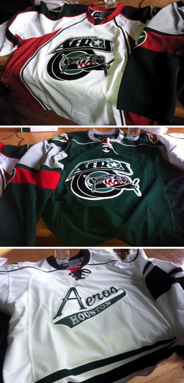
 The AHL's Houston Aeros unveiled new uniforms today which include a further integration of their brand with their NHL affiliate's.
The updated sweaters were unveiled at a press conference today and pictures were posted on the team's Facebook page. They're already getting great feedback from fans. Lots of compliments and excitement.
Here are some direct links to the original photos they posted:
Because of the way the jerseys are laid out in these photos, it's difficult to make out some of the details. The white and green jerseys look like hybrid Reebok Edge templates while the the third jersey is a reversed version of the Wild's.
The Aeros have even modeled their alternate logo off of the Minnesota Wild's. Now we know what their green jersey would look like in white. Not a bad look but I prefer their current white sweater. It's the only one that retains any of their original look from 2000.
But back to Houston. Their previous home and road jerseys, matched those sweaters the Wild used when they joined the league 11 years ago. They were nice, but I can see the Aeros wanted to advance their own brand a little. Still, there's no question the alternate was inspired by Minnesota's.
I think it's a nice mix of originality and paying tribute to their parent club. What do you guys think of them?
Now a couple of quick NHL-related stories...
Blackhawks dropping 3rd jersey in 2011-12
 The Chicago Blackhawks will not be sporting a third jersey at all this season, according to ESPN Chicago.
This information was previously reported on the blog but it's worth noting that others are now reporting it as well. Here's an excerpt from Monday's "mailbag" post on the Chicago Blackhawks Report by Jesse Rogers:
Q: I cannot wait for the season to start. Do you know if the Blackhawks will ever bring back the black alternate jerseys or are they sticking with the Winter Classic alternate look again this year? -- Andrew (Chicago)
A: The answer is neither. The Hawks are going with just two jerseys this season -- the home red and road white.
Apparently, the Hawks front office weren't huge fans of the 2009 Winter Classic jersey which had been adopted as a third in 2009-10. Personally, it was my favorite Blackhawks jersey. I'll be sorry to see it go. Still, we got two good years out of it and that's better than none.
Kings to wear four jerseys during 2011-12
 We also have more confirmation from the Los Angeles Kings on the four uniforms they'll be wearing throughout the 2011-12 season. That's right, four.
Yesterday on the LA Kings Insider blog, Rich Hammond laid out the Kings' new wardrobe for fans. He confirmed the old black-and-purple home jersey will now be the new alternate and the vintage purple-and-gold sweater will get a reprieve after we spent most of the summer thinking it was a goner.
Kings COO Chris McGowan told Hammond that the throwbacks will be worn on three occasions during the upcoming season. He didn't specify which games. I recommend a read of that post, but if you're too lazy to click, here are a couple of interesting excerpts:
McGowan: “We’re introducing a new look, but in a way we’re not. The look has already been introduced, with the alternate jersey, the black version of it with the L.A. crest on the front. So we simply just produced a reversed version of that, in white, because of positive feedback from multiple people that are involved with the jerseys, including our fans, our ownership group, the players, the NHL, Reebok. … Then we will still keep the purple elements in our organization. Not primary, but we still want to keep them because there are people who like the purple part of the Kings brand.”
Also, McGowan talked about the players' input on the new look.
Question: I’d heard that the players actually voted to wear the black jerseys in the playoffs the past two seasons. Is that true? Did that factor into things?
MCGOWAN: “They did vote. If you notice, the last two years we wore the black jerseys in the playoffs. You want the players being comfortable with what they’re wearing, and you want them to like what they’re wearing. They didn’t dislike our old jerseys. They just simply liked the alternates better. Then we started showing them mock-ups of what a reverse, a white version, of that would look like. We did the camera tests and the designing of it. You could just see it in their eyes, that that’s the one they want to wear primarily. They definitely played a part in the decision. ..."
Nice to hear the guys who wear the uniforms actually get to have a say in them. Though I worry what the league would look like if the players got to make every uniform decision. Perish the thought.
That's all for now. I know the Winnipeg Jets jerseys are still at the top of everyone's mind. Shouldn't be more than a couple of weeks now.
 Chris
Chris
Here's a closer look at those new Houston Aeros jerseys.
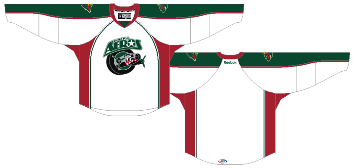
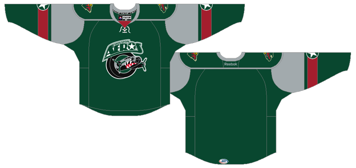
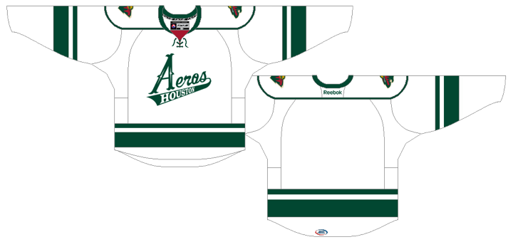
A little too much piping for my tastes, but overall a very sharp new set.


Reader Comments (18)
I wish I could see a better photo of the jerseys, but I'm leaning towards liking them a lot. I like the detail of adding the star from their logo to the sleeves. I also like the alternate, not just because it is modeled after my favorite Wild jersey, but because it is the inverse color-wise from the parent club, and the stars in the script (just like Minnesota's) tie it in to the brand. Overall, I like it thus far. Looking forward to see them on the ice!
I like the Green and Alt jerseys, from what we can see. The white is too much of an Edge explosion i think. If they had used the overall design of the Green jersey for the white it would have been awesome. It brings them back to their old Green/Blue days with a little more of the military theme.
As a die-hard hawks fan i also loved that black WC jersey, i can't believe they would want to get rid of it.
Isn't Minnesota's away jersey the only one of the the original jerseys and not the home. I thought the red one came in 2003 (or somewhere in there).
What the!? The Blackhawks jersey was one of the best ones last season...
I like the Kings' idea though I prefer the purple n yellow ones. The black n white is not that bad, but the logo is ugly.
The road and alt Aeros sweaters are fantastic. But as a Houston native, the whites are an embarrassment. I could give y'all a rant on why that piping sucks, but that has been done before.
Tyler J: Sorry, I realized that was confusing. I corrected it to say the "current white jersey" is the only one left from their original look. When it debuted in 2000, it was their home jersey. In 2003, the league switched whites to away. I think I even confused myself a little bit there.
Never really understand the thinking when a team completely rebrands its home and away jersey, logos, and then keeps a jersey from the previous year as a third. The Kings seemed hellbent on removing color from their palette, and then they just randomly keep a uniform from a previous era?
The Aeros want to advance their own brand... yet they go with the Edge template that the Avs use for Houston's new home jersey? And people actually like the apron look? Ugh. I'm sorry, but I simply don't like that template at all. The other Aeros unis look promising, at least. Personally, though, I'm a fan of their old IHL look. Yeah, it was a bit busy, but it just seemed to me to fit that team.
Glad to hear the Kings are bringing the vintage uni back. Not surprised about the Hawks ditching their third; it wasn't my favorite throwback design anyway.
I quite like the new Aeros uniforms from what I can see of them, look forward to seeing better pics.
It's a shame about the Blackhawk's WC jersey, especially as its one of the few that I own! Roll on the Rangers WC jersey...
So, for the second year in a row the Kings will use four jerseys. I thought that was just supposed to be a one off. Does this set the precedent that having four jerseys is OK? Montreal used a whole bunch of jerseys, but that was just the season they celebrated a 100 years. A few years from now, will most teams have home, away, alt and retro alt jerseys?
Sad about the Blackhawks. I know I'm probably pretty alone in thinking this, but I like the blacks better than the reds,
I really hate the new trend of miss-matching home and road jersey template designs, which is most prominent throughout the CHL. I like that new green Aeros road jersey, but they should've made a white wersion of it for the home jersey. I'm definately not fond of that template they went with for the white home jersey, just way way too overused and boring.
Aeros looks tight. Kings looks god awful except the purple which is more nostalgia than classic design.
Does anyone remember the extreme ubiquity of the Iverson-era Sixers jerseys? It took Philadelphia way too long to revamp their look. I think the Kane-88 Blackhawks' alternates were in danger of reaching that same level of critical mass, so good on the Hawks for nipping it in the bud.
Jersey popularity is one thing, jersey saturation is quite another.
I love this quote “They did vote. If you notice, the last two years we wore the black jerseys in the playoffs." What choice did they have really? Do you guys want the black jerseys or the black jerseys? Hmmmm...tough call...I'll go with black please. This is the same stupid group of people who came up with the "Back in Black" campaign when they were already wearing black. They should have just gone with "Screw Purple (except on special occasions)".
I'm fan with Chicago retiring their Winter Classic thirds, as their home and away sweaters are infinitely better anyway, so more ice time for them. Here's hoping that they either stick with the two sweater look until the next time they play in a Winter Classic, or they bring back their older black alts in a couple years, as always thought that those were better than the WCs.
I think the blackhawks need to do a modern alternate. Do a red jersey with something like the indain facing forward and do something cool with feathers instead of stripes.
love the third !!!