


Minor Jersey Mayhem
This is a big weekend for specialty jerseys around the minor leagues. Let's start in the AHL!
 Game photo from Rockford IceHogs (via Flickr)
Rockford celebrates Los IceHogs Dos!
How can we not start here? The Rockford IceHogs donned these numbers for Los IceHogs Dos this weekend. If you missed "Uno," check out this post from last year. They are really something.
I talked with IceHogs' communications director Mike Peck who said the team partnered with the Latino Leadership Coalition in Rockford for the event. In fact, they inspired the jersey design.
"They really wanted to highlight the strong musical aspect of the Hispanic/Latino culture," said Peck.
The IceHogs wore this uniform on Friday night and auctioned them off afterward with "proceeds being donated to La Voz Latina, an organization dedicated to serving the Rockford region’s Hispanic community through education, workshops and youth programming," according to the press release.
The great thing about these specialty jersey nights around the minors is that these teams are always raising money for charity. So no matter how silly the team may look on the ice, at least it's for a good cause.
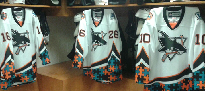 Photo from Worcester Sharks (via Facebook)
Worcester raises autism awareness
The Worcester Sharks wore these jerseys on Friday and Saturday to benefit The Autism Resource Center of Central Massachusetts. The puzzle piece pattern is the standard symbol of autism awareness.
 Photos from Texas Stars
Texas dons player-designed stars and stripes
This Veterans Day weekend was marked by a number of patriotic or military-themed jerseys. The Texas Stars called it Stars & Stripes Military Appreciation Weekend and wore these jerseys on Friday and Saturday. The subsequent jersey auction is benefiting the Texas Stars Foundation.
The cool part of this uniform is who designed it. Remember Taylor Vause? He played for the Swift Current Broncos a couple seasons and ago and was responsible for designing some fo the team's specialty jerseys. He's continued that hobby since graduating to the pros.
Vause spent most of last season with the Stars but is currently with the club's ECHL affiliate, the Idaho Steelheads. So unfortunately, while he designed this jersey, he didn't get to wear it this weekend.
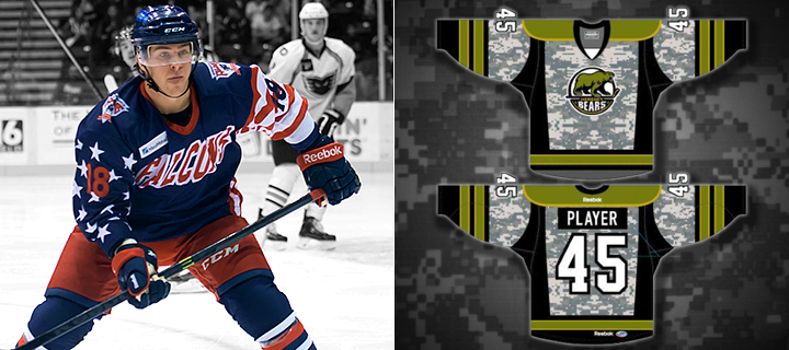 Images from Springfield Falcons and Hershey Bears
Falcons and Bears go patriotic for Veterans Day
The Springfield Falcons and Hershey Bears honored military veterans in different ways this weekend. The Falcons wore the Hometown Heroes Night jerseys above while being shut out 3-0 on Friday. (This is the only photo I've been able to find of the jersey so far.)
The Bears, on the other hand, are going the camouflage route with tonight's set. I have yet to see any photos of the actual jersey, but the rendering above was posted to their Facebook page on Thursday.
Bakersfield can't stop making odd jerseys
And finally, we wrap up in the ECHL where this is happening tonight.
 Image from Bakersfield Condors (via Facebook)
Had to make it huge so you could truly appreciate it. The Bakersfield Condors are always trying to go outside by the box with specialty jerseys. And I really don't know what to say about this one. Perhaps I could address the irony of the sponsor being Dignity Health. Because that's just what the players won't have after they wear these for three hours.
If you can't get enough, the Condors have a photo gallery on Pinterest.
I know there are some I've missed so I'll have a follow-up to this post likely later this evening. In the meantime, what do you think of these? Any favorites in the bunch?
 Chris
Chris
As promised, I wanted to follow up with a few more recent minor league event jerseys.
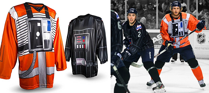 Photos from Toledo Walleye (via Facebook)
ECHL clubs compete on epic Star Wars Night
Last weekend, the ECHL's Toledo Walleye and Michigan K-Wings coordinated a one-of-a-kind Star Wars Night. This is a schtick that's been done many times before. In fact, just the week before, the Orlando Solar Bears hosted one of their own!
What made this one interesting was how both teams came together for this event in Toledo, Ohio. I have to be honest. I've never been a Star Wars fan, so I don't really understand all these teams doing this or even the references involved. But I can understand it's a big part of popular culture and many fans get a good kick out of it.
I read that the Walleye are dressed as X-Wing pilots (in orange) while the K-Wings are dressed up a Darth Vader. Of course as names go, wouldn't it be more appropriate to have the K-Wings dress up as X-Wing pilots? But then the game was in Toledo, so the Walleye can't be the baddies.
Anyway, it was visually a rather interesting game. No denying that.
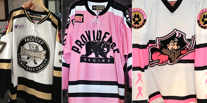
Cancer awareness night jerseys also popular
If you're a team trying to raise money for charity, the best you can probably do is cancer research. The Providence Bruins and Portland Pirates recently held their Pink in the Rink Nights — an event that a vast number of hockey teams have started to latch onto in recent years.
But taking the crown this weekend were the San Antonio Rampage who focused on cancer affecting children. Because there's no bigger bummer on which to end a blog post. But you know what, when the jerseys are sold, it's money those researchers wouldn't have otherwise had. So good on these teams for their efforts!

Reader Comments (9)
Maybe it's just the juxtaposition with all these other truly awful designs, but I actually don't think the Gettysburg jersey looks as awful as you'd expect on the players. The photo is a bit more subdued than on the concepts above. Best possible outcome of a mind-numbingly awful concept...
From that single pic, those Falcons jerseys look awesome. I could actually get behind them being regular alternates. Looks like it's in the sweet spot of looking retro, but not completely outdated and ridiculous.
Flames third review chris??
@Ryan: I'm getting to it. Working to get some stuff from the Flames. But they've been slow to respond.
I'm normally not into the specialty jerseys and how busy they always are but I have to give credit to Rockford on those jerseys. They're pretty clever and well put together. Way better than last year. Kudos.
Seeing that old San Jose Sharks logo on that special Worcester Sharks jersey just proves once again that the Original logo is far better than the one the Sharks have had since 2007.
@R Yes, much agreed. Perhaps they needed a change though, like Tampa Bay...I love both teams' original logos, though, so I hope they bring them back some day.
@NASCARFAN160, I think the Lightning's best look was their 2004 SCF look however, I would like to see them try something completely different that features Lightning Bolts on the jersey, bright colors like turquoise and a new logo, perhaps something inspired by the Greek God Zeus. Yes, I know I sound crazy but I think a team like the Lightning should have some crazy, badass uniforms, as long as they aren't completely ridiculous of course. As for the Sharks, I think their original look should have never been changed. The light teal and silver was absolutely amazing. Speaking of changes, that's why the NHL has allowed third jerseys since 1996. :p If a team wants to make a change, they can have a third jersey without spoiling their regular uniforms, like the Islanders and their crappy third.
I think those Falcons jerseys would make a MUCH better U.S. Olympic Team jersey than what Nike came up with. Of course, replace "Falcons" with "U.S.A." Despite all the stars and stripes on Springfield's jersey, they're actually less gaudy that the Nike U.S. Team ones, IMO. And considering the great looking Slovakia jerseys, U.S.A. really could use something different now. Anyhoo...