


What's in Store for the Stadium Series?
 31 Comments
![]()
New event merchandise could be full of clues
I rarely get the opportunity for a good headline pun. Tonight we're taking a look at some new NHL Stadium Series T-shirts that are now showing up in stores. The designs could be offering some insight into what the forthcoming jerseys will look like.
We'll dive in with the New York Rangers first.
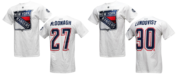 Photos from ebay (o_sports_gear)
A few things to note. First, the shirt is white. We'll see that's not the case with all of them and there's reason to believe they may suggest the colors of each team's Stadium Series jersey. For one thing, a source tells me the Rangers' jersey is, in fact, white.
It makes sense as the Rangers will be the designated "road team" for both of their Yankee Stadium games against the Islanders and Devils. Speaking of the Devils... (On a roll with these awful puns!)
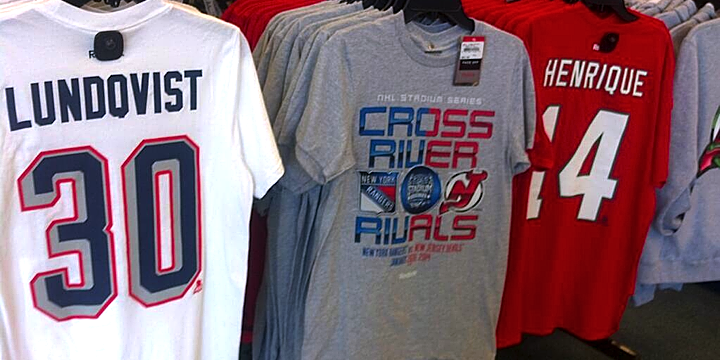 Photo by @TheJerseyNYRFan (via Twitter)
A photo posted to Twitter by @TheJerseyNYRFan on Monday shows the back of the New Jersey Devils shirt. It's red with white numbers.
The tweeter also pointed out the coloring of the Devils' chrome Stadium Series logo on the "Cross River Rivals" tee seen in the middle. There's no green in sight. But it's likely that has more to do with the production costs associated with the number of colors used in the screen printing process.
Back to the Rangers for a moment. The number treatment seen on these shirts is unlike anything the team has used before. The grey/silver evokes the design used on the Lady Liberty jerseys from back in the late '90s. But those numbers used red for the shadow rather than a thin outline.
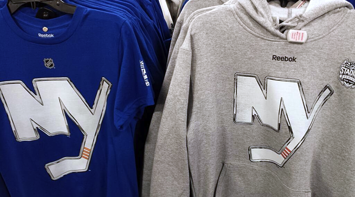 Photo by Jessica D'Agata (@ayojess via Twitter)
This blue New York Islanders tee seems to confirm the idea that the shirts match the jersey colors. But look closely and you'll see this chrome Isles logo doesn't quite match the one released last week. The one on the shirt has rounded corners and an angled corner at the top of the Y.
To sum up, these are the colors and logos that will be representing these teams in January.

As far as jersey crests, I think it's accurate only for the Devils and Islanders. It sounds like the Rangers will, as usual, go with a wordmark across their chests and the shield will be used on the shoulders. Whether the crests will make use of this chrome-treated effect is anyone's guess. But I hope not.
Let's switch gears now to the Soldier Field game in Chicago.
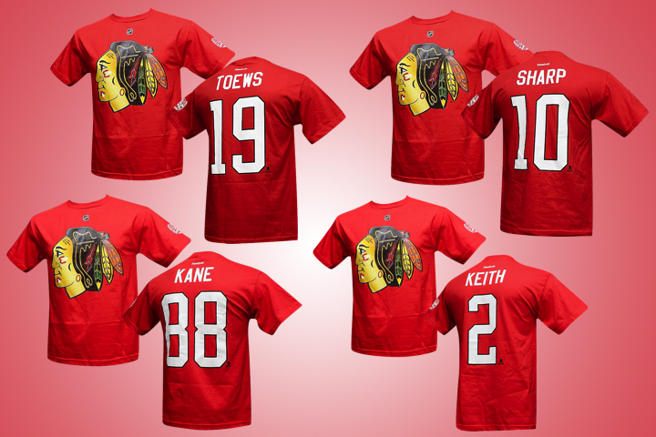 Photos from ebay (o_sports_gear)
The Chicago Blackhawks have red Stadium Series T-shirts. As the home team, this makes sense. But the noteworthy element of these photos is the elongated number design. It's the standard Blackhawks font, but it's stretched out.
If you look back at the Rangers' shirts you'll notice the same thing. It's just more pronounced here.
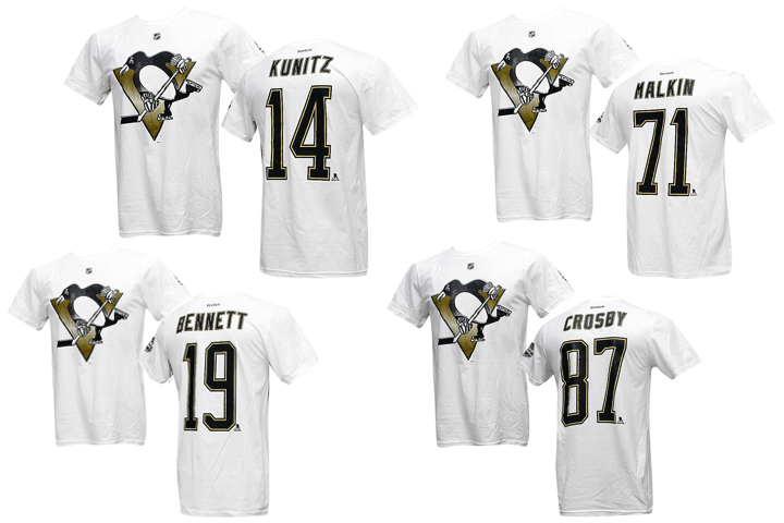
The elongated design is very noticeable on the Pittsburgh Penguins shirts. Their jersey numbers are usually rather wide. Definitely not the case here. So could these number redesigns be an element of the "futuristic" jerseys we've heard about?
Based on the colors and crests, it doesn't appear things will look too different for Chicago's Stadium Series game. Here are the colors and crests based on what we've seen so far.
That leaves us with the California game at Dodger Stadium.
Just today, a new T-shirt showed up for the Los Angeles Kings with another new logo.
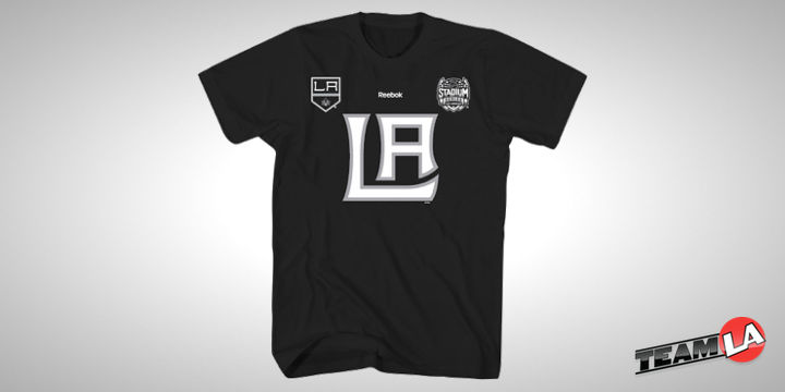 Photo from TEAM LA Store
The TEAM LA Store started selling this, described as a "ligature logo T-shirt." A ligature is basically a couple of letters joined together to create a unique letterform. It's the letters from the Kings' primary logo — which is also featured on the tee. However, it is not the same as the chrome logo unveiled last week. So that's nice and confusing.
What will be on the front of the Kings' Stadium Series sweater? Your guess is as good as mine, but I doubt it's this ligature. This shirt is different from the previous ones seen in this post. The others have the NHL shield in place of the Reebok logo near the neck — and apart from that and the chrome logo, there's nothing else on the front of them.
In other words, this shirt doesn't seem to be part of the same series as the others.
As for the Anaheim Ducks, I haven't seen a shirt yet. All I know is the jersey will be orange. That's according to a tweet by Ducks PR guy Adam Brady. This means the L.A.-based outdoor game may feature orange versus black. We already know the 2014 Winter Classic will see red versus blue. Nice to see the league branching out.

We don't have enough information to be certain yet, so this graphic is a bit of an educated guess on my part. Like I said, the Kings could end up wearing white. (I'm just hoping they don't.)
As we piece together the looks for the upcoming Stadium Series, what are you hoping to see or not see?

Reader Comments (31)
I think the Rangers jersey is actually going to be pinstripe much like the New York Yankees. I've seen pictures of what is supposedly Henrik Lunqvist pads and they are pinstriped.
I'd say the kings will go with the new Blacked out Crown Will on the front with the new word mark on the shoulders.
It might just be me but in all of the promos for the LA game, Getzlaf is wearing the Ducks third jersey while Brown is shown in both jersey styles (home and away). Makes me think that the Kings could be wearing white especially since the Ducks jersey will probably have it's fair share of black.
Great reporting and insight!
I now have more hope, based on what i've seen from pictures, that the Devils will be wearing their normal throwbacks again. Which is relieving.
The anticipation grows...
Tyler, by that logic wouldn't every goalie with Vaughn pads that have a "tribal" striping pattern indicate that their team's jersey has a "tribal" pattern?
Very rarely do goalie pad designs mimic the look of jersey. One that does come to mind is Josh Harding this year, but more often than not they just pull colors from the team's palette.
Several of the Winter/Heritage Classic jerseys in the past have gone on to be used again in future games, either becoming a full-time alternate (Chicago) or just worn a couple more times in that same season (Boston, Philadelphia). If it's true that these jersey designs have had less input from the individual teams than usual, it'll be interesting to see if any of them go on to greater things beyond just a one-game fling.
The Kings have been doing somethings with LA artists and have released some weird looking shirts with non logo designs. It could be one of those, but I would guess that it isn't part of the stadium series game completely.
That's the regular Devils player tee. The Stadium Series one has the green logo without the chrome on the front with the matching name and number. They're also selling a shirt with the chrome logo that has no name and number. Here's pics.
https://pbs.twimg.com/media/BZDX2g3IQAASTpy.jpg:large
https://scontent-a-iad.xx.fbcdn.net/hphotos-ash3/1454958_10201509757199695_313590805_n.jpg
NYR had a white liberty jersey that they used for only one season in the late 90s with a similar number/ letter pattern. The Hartford Wolfpack used it for a few seasons.
I'm thinking a barber pole Jersey similarly to what bingo wore . I don't really care I'm just psyched for the Sens in a outdoor,game
I sure hope the Pens and the Hawks do more than just chrome their logos and elongate the numbers for their jerseys. That would be truly disappointing....
This better not end up looking like the NBA's Christmas jersey's where it's a generic template with a big logo on the front and not much to make the different teams stand out.
Via NJ Devils beat reporter Tom Gulitti, Devils will be wearing throwback red-and-green jerseys for the Stadium Series game.
@Tyler J
I've heard that the plan was for the Rangers to do a Yankees style jersey (hence the pads) but the MLB squashed that idea.
The Devils' beat writer tweeted:
@TGfireandice: For those who've beem asking, Lou Lamoriello said Devils will be wearing original red jerseys with green in outdoor game at Yankee Stadium.
@TGfireandice: Lamoriello said they will be same jerseys team wore previously around St. Patrick's Day.
There may not be any green in the Devils logo on that one t-shirt, but the sweatshirts that are cut off towards the right hand side of the photo clearly have the green logo. Also in the case with the winter classic t-shirts, they generally match the jerseys, sans stripes. I wouldn't be surprised if the uniforms all had just basic chrome logos, which would be disappointing.
Am I the only one who is thinking I am going to be disappointed with the unis. I feel like none of them are going to bring something new to the table. I know its early but nothing that has been shown or teased so far is giving much hope. I do like the Devils in red and green.
“@TGfireandice: For those who've been asking, Lou Lamoriello said Devils will be wearing original red jerseys with green in outdoor game at Yankee Stadium.”
it almost looks as if the outline on the numbers on NJ's t-shirt might possibly be green
Sorry, Chris, but that is not an NHL.com-level pun in terms of its (total lack of) quality. That's probably simultaneously the best and worst thing about NHL.com. I feel like they do it on purpose now...
Anyways, on topic. I like those elongated numbers. My least favourite thing about NBA jerseys is the tiny effing numbers they have on the back of their shirts, but i have to give them credit for matching colour against colour in many games.
And i know it's not gonna happen, but am i the only one who would love to see a green Devils' jersey with that chrome logo?
Also, that LA ligature would make so much sense inside their current crest. As of now, the shield logo kinda looks like it was made in Claris Works. (Shout out to the Mac LC2 emmer-effers!)
Devils are going with their Christmas threads that they wear on St Patrick's day
I would also like to point out that the logos on the jersey tshirts also appear to be large. When compared to this normal Patrick Kane jersey tshirt on the shop.NHL.com the shiny chrome logo looks much larger.
http://shop.nhl.com/Chicago_Blackhawks_T-Shirts/Reebok_Chicago_Blackhawks_Number_88_Patrick_Kane_Red_Player_T-shirt
Thank you, Lou Lamoriello.
Looks like LA has released a player number version of their shirts like the other teams. Has the crown on the front (as expected):
http://shop.nhl.com/Los_Angeles_Kings/Reebok_Dustin_Brown_Los_Angeles_Kings_2014_Stadium_Series_T-Shirt_-_Black
Looks like there's a few more along with that other shirt:
http://shop.nhl.com/search/stadium_series/Team/Los_Angeles_Kings
tinfoil hat time
with these elongated numbers, one would think that any sort of waist piping would appear even further down the jersey. flash back to the beginning of the season to when the league decided to enforce jersey regulations more stringently, and one could possibly surmise this was a preemptive motion to make sure the jerseys were properly displayed ( ensuring any fancy features on the bottom are obvious to even casual fans. perhaps sublimation? that's something unseen in the nhl so far) on the ice in their first outings.
There is a Anaheim Ducks KOIVU Stadium Series shirt up on NHL.com.
Is this a precursor of the Ducks' new threads? http://shop.nhl.com/Anaheim_Ducks/Reebok_Anaheim_Ducks_Stadium_Series_Hockey_Bear_T-Shirt_-_Black
Also, this shirt predicted the Devils' jersey correctly.
http://shop.nhl.com/New_Jersey_Devils/Reebok_New_Jersey_Devils_Stadium_Series_This_Way_T-Shirt_-_Black
@Kingsknight great links. As a fellow Kings fan, I can definitely see those elongated numbers compared to the regular ones.
I'm just guessing but the elongated numbers could be chosen as a "fan friendly" feature, making it easier to spot the players in a football stadium where fans will be further away from the rink than at the UC.
any word when NYR jersey will be released?