


Texas Stars Introduce Sweaters
 15 Comments
Dallas' AHL affiliate reveals redesigned uniforms
While we eagerly await the unveiling of the Dallas Stars' new branding, their AHL farm club just pulled the trigger on some new sweaters. On Thursday the Texas Stars revealed their updated threads — which I would've posted here sooner if not for all the NHL craziness of the last few days.
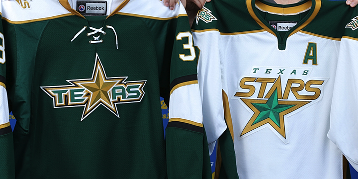 Photo from Dallas Stars Inside Edge
From the team's press release:
In preparation for the fifth season of AHL hockey in Cedar Park, the Stars will make a significant shift in their road jersey colors. Texas is replacing the all-black away uniform with a primarily dark green jersey, the same dark green that is featured in the team’s logo, and the crest patch will feature the team’s secondary logo.
The shoulder cap is white with a primary logo patch on each side. The collar is gold and includes a white lace tie-up. The sweater will also have thick white bands on each sleeve and along the bottom hem, trimmed with black and gold. The matching socks will be principally dark green with three bands of black, gold and white just below the knee.
The Stars' new home white sweater is simply their old third jersey, unveiled back on Oct. 5, 2011. No surprises there. But the new road sweater is now green instead of black — more in line with what Dallas is reportedly planning for their rebrand.
 Francis Wathier and Toby Petersen model the new Texas Stars jerseys
As wordmark-based uniforms go, this one isn't at all that bad — even if it is set in the Batman Forever font. And if you're curious about who designed the new unis...
The new jerseys were designed by the Texas Stars in conjunction with Reebok, the official and exclusive jersey supplier to the American Hockey League. The jerseys will be available in both replica and authentic versions at the Texas Stars merchandise stands beginning this Fall.
Reebok is always involved now. We just need to accept that.
 Photo from Texas Stars official website
The newer of the two jerseys also has a more traditional look — which is again in line with what we expect to see from Dallas on June 4. Even if you think Texas should've come up with all new logos — and I count myself in that group — this is hard not to like. Especially the added emphasis on green, a color that was more of an afterthought on the old jerseys.
 Photo from Dallas Stars Inside Edge
I am concerned for the play-by-play guys, though, as the gold name on green jersey will be rather difficult to read if you're far away. Probably should've stuck with the safter white — but then I do like this color combination. More now that it seems Dallas won't be using it anymore.
That's all I've got. I'll leave you with this graphic the Stars put on their website.
 Image from Texas Stars official website

Reader Comments (15)
Those are some nice threads!
As a fan of the Dallas Stars, and subsequent fan of the entire orginization, I'm really in love with these sweaters. While I def. believe that the green is much more traditional and classic than the white, even with the word mark logo, it's still hard for me to find too much at fault with them and hope this is similiar to what we may be seeing with there Big brothers in Dallas on the 4th.
I loved their old black jersey(I have it) but the green looks much better
This isn't too bad. I am quite impressed with the green one and even though the white one has strange piping under the armpits and a version of the Dallas Stars soon to be old logo that isn't as nice as the Dallas Stars version of it, I think they did a decent job. One of the best jersey changes I have seen in a while.
These are great. They look fantastic when worn. Another case of a team taking an alternate, and making it the base for new home/away jerseys done right. For a moment, I thought shoulder yokes with a brighter color than the sleeves/body were obsolete, like crest color swapping for the home/aways. I guess I was wrong, for the former at least.
Needless to say, these uniforms are a solid 9/10, giving it an extra oomph thanks to the fantastic use of the green and gold color scheme. I'm kinda wondering why they went with outlineless names here. I think they should do that, especially for the green jerseys. Maybe, a white name outline for the greens, and a black outline for the whites.
In any case, I wouldn't be disappointed (other than the fact it's nothing different) if these were the new Stars' sweaters. I'm getting more excited as the day arrives!
I think they should have used the logo on the green jersey on the white as well.
Yes, Reebok has an in house design firm, and teams are not required to use it. They still conduct a traditional design process with lots of client (team) input, and the team has to be happy with their work before it goes anywhere. There is not some massive conspiracy on Reebok's behalf to make the NHL uglier, or more in line with their ultimate swooshy objective, or anything else. Can we please stop pretending they're evil?
The stars uniforms look great. And yes, it's a wordmark based logo. Whether you like them or not, wordmarks of various sorts do have a very long history in hockey. Knocks on wordmarks in hockey circles often carry the implication, explicit or not, that it's not a hockey look. Which isn't true. Yes, it's not seen too often at the NHL level these days, but there is a whole lot more to hockey than the NHL level. And it's hardly unknown at the NHL level. Rangers, Colorado, Penguins, Pirates, the Quakers, the Americans, the Seals, the Islanders (though there are a few other problems with that uniform), the Blues, the Ducks, the Wild, the Thrashers... And I'm sure I've missed some. It's hardly some strange thing entirely foreign to hockey, or exclusive to the Rangers. Let's stop judging it as a "wordmark based jersey", and start judging it as just a jersey. And as a jersey, it's great. I love the white shoulder yoke against the green, a wonderfully crisp contrast. And you know, GREEN!
Anyone notice that the white is a recolored version of the coyotes current Third?
@Zeus- I wholeheartedly commend you for your comment and could not agree more with it. I'm curious though, when Reebok required all the teams to use the new Edge sweater for the 07-08 season, were they the ones who designed all the jerseys? For the most part, the transition from pre-Edge to Edge was for the worse, and I think (or thought) the Edge uniform system officially killed all creativity for hockey uniforms*, which is a bit depressing. I read on nhluniforms.com that the reason the Dallas Stars dropped the legendary star-shaped design was because the template wouldn't fit. Do you know if this is true? If so, it just proves the point* further. I mean, idunno. I think a lot of teams have improved their Edge jerseys since their inaugural season, such as the Panthers.
It seems to be template-based though. The piping is kinda...well, I guess it doesn't look right to me, and it's too "modern" in my opinion. It looks terrible on the current Sabres homes, some teams have yoke striping when the shoulder is the same color as the body (which I'm not that bothered by, but it's still unnecessary I think). And teams with pretty much the same template at once (current Sens, current Pens, 07-08 Lightning) is just obviously lazy. But then again, teams that make new uniforms have stepped away from the template-esque designs, like Nashvile, Tampa, Buffalo (except for the homes), Florida, etc. I hope that one day the uniforms in the National Hockey League can be as colorful and creative as the pre-Edge days. Particularly the late 90's, my favorite era in NHL logos and jerseys. Maybe there is hope at the horizon, I haven't fully bashed on Reebok yet, and I don't think there's any reason to. They have showed they can design decent uniforms. Though, when they design something that's worse than average, they should just back off.
As an individual NHL fan, I personally want things like team identities (mostly the logos, colors and uniforms) to look their best, as it is what stands for the team, the jerseys the fans buy and wear, the colors and logos that appear on merchandise, the thing that will go down in history along with a team's Stanley Cup title. It is something that should be perfect as it is the visual definition of a team.
No, they were not the ones who designed all the jerseys. I'm sure a bunch of teams did use them, but not all. I can only give you one hard citation on that, and that's the Sharks- they went back to the same lead designer who had designed the original uniform and logo, and had him do the revamp.
Yes, the Star went away because it couldn't be replicated on the Edge. So did the mountain peaked sleeves on Colorado's jersey. Those were the only two that HAD to be scrapped- every other team that farked over their uniforms did it by choice. Convenient excuse to sell more jerseys, some pressure by reebok, chance to freshen up their look, whatever. Yes, there were templates, but quite a few of them, and they were able to accommodate a lot of things, like the Ducks's swoosh, into them when required. I suspect a lot of the problem came from teams deciding to go ahead and make changes to sell jerseys, but half assing it and just picking a template and shading it in rather than really going through a design process. The edge system itself wasn't the problem- the entire league getting an excuse to change their uniforms at one time was. Plenty of traditional designs stayed, and continued to be great. The Devils didn't change. The Blackhawks didn't change. The Red Wings changed where the letters went, going back to what they had done in the days of Gordie Howe. Boston went from an awful mess of a jersey to the best set they've ever worn. Some rolled out incredibly good modern sets, like the Blue Jackets and Capitals.
Oh, and the decrease in color goes back to well before the edge days- teams were switching to darker schemes and adding black for a long time before the edge because they thought it would make their merchandise hipper.
It's reebok's fault that the entire uniform system was changed, though it desperately needed to be done. Every time I go with knit socks rather than my pro edge ones when I play a game, I'm reminded of that. So many teams choosing awful designs is not Reebok's fault. The Devils, Rangers, Blackhawks, Red Wings, Bruins, Habs, Caps, Jackets, Sharks, Canucks, and Coyotes proved that. Teams like the Hurricanes (flags), Thrashers (collar chevrons, asymmetrical stripe), Ducks (swoosh), Flames(vertically pinstriped striped panel), and LA (name on crotch) showed that you still had room for creative elements within the new format.
I want the league to look as good as possible, just like you. I enjoy a mix of the old and new. But I don't like bad design, and I want blame (and pressure) fixed firmly where it belongs: On the teams that signed off on such stupidity. When fans direct their energy right, they can get change. See the Oilers as a great example. The Islanders too- though while the fans got the initial edge abomination killed, they didn't manage to keep Wang from rolling out one of the worst third jerseys we've seen since wildwing. Seen what the flyers are wearing these days? If fans in St. Louis and Colorado started yelling at their ownership rather than resignedly sighing about reebok, maybe we could finally kill those tragedies.
These jerseys are really great, I agree with Chris' point of the names being gold, instead of maybe white with a gold trim (like he numbers) but I do have one question; the Dallas Stars may have accidentally leaked their logos on their mobile app on Friday, only to have it quickly taken down, meaning hey are more than likely the real deal... You notice they are going in a new direction in Dallas with NO gold, and completely different logos (as they promised) but in Texas they introduce a new jersey set, but with familiar styles... So my question is, could those leaked logos be legit if they are such a different theme from Texas? You would assume they would follow in their big brothers footsteps, and give some sort of an indication of what to expect on June 4th.
I'm beginning to think something is a foot. First the Stars leak their own logo and now with these new Texas jerseys I Think something is up. Would this be their way of preventing an actual leak of the new threads.
The green jersey is channeling the old North Stars, right down the the white shoulder yoke.
The Texas Stars road jersey is awesome. I'd get rid of the beveling on the star but otherwise I love that logo and colour scheme. Change the home uniform to match and you've got a winner.
That white one is awesome. Like EL, my only criticism is of the two different logos. Another win for hockey sweaters.