


Iowa's Wild New Logos
 6 Comments
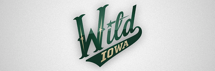
Back in April, the Iowa Wild unveiled their new logo and home uniform. Since then, we've gotten a look at some other elements of the franchise's visual identity. For one thing, the graphic above shows how the logo is colored on a dark background. It's been seen on the backdrop at recent press conferences.
Previously, we'd only seen the green version used on white backgrounds, including the white jersey that was shown to us. (We still haven't seen a road or alternate jersey yet.) Here's a reminder of what the green version of the logo looks like.
But that's not all. A few weeks ago, the Wild tweeted this photo of new T-shirts fans can get their hands on. And it showed yet
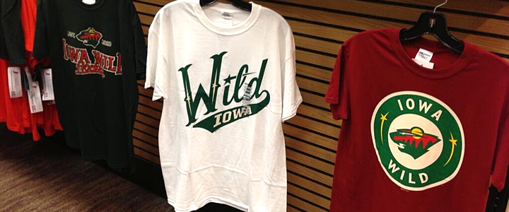 Photo from Iowa Wild (via Twitter)
On the right you can see a modified version of the logo Minnesota uses on their home sweater. Does that mean Iowa could be taking a similar route? Might not be the worst thing if they did. I know it's easy to complain when a minor league team takes on the branding of its NHL affiliate, but sometimes it's cool to see the variations.

I believe that covers all of the Iowa Wild's logos for the 2013-14 season. But there is one more thing I wanted to mention. Obviously, this team has yet to take the ice, yet you can already find "photos" of the new uniforms in action — all thanks to Photoshop.
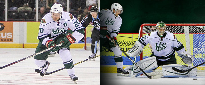 Images from Iowa Wild (via Instagram)
The image on the left was featured in an Instagram promotion and the one on the right was part of splash page graphic on the team's official website. (They have a different splash screen now but are still using a similarly Photoshopped player.)
It's basically just the old Houston Aeros alternate jersey with the new logo pasted on. Not a terribly complex solution, but at least fans get the feel of seeing the new Wild in action, right?
What do you think of teams Photoshopping new jerseys onto their players in the offseason? We've also seen it a lot with NHL teams given all the player movement since free agency began. Does it bug you? Could you care less?

Reader Comments (6)
Always hate it when they use word marks on jersey's, looks too much like a baseball uniform to me.
It bugs me when it's Daniel Alfredsson in a Red Wings jersey.
Photoshopping is a lot better than how they used to doctor caps on baseball cards back in the 1950s and 60s after players were traded. It's a sports tradition - at least they know how to do it properly now.
They photoshopped Stamkos into the new style Lightning jersey for the cover of NHL 12. It doesn't bug me when they do it properly.
Living in central Iowa, and finally getting AHL hockey back, I'll take what I can get. Personally I'm not a HUGE fan of the wordmark jerseys But I can't help but get excited by seeing the Jerseys in action. They did a very nice job on the PhotoShop. I would have loved to have seen an original logo with the (un)original name, but que sera, sera. Lets get some of the guys working on IceHL on the job (you guys have all done FANTASTIC work!!!) I also wouldn't mind seeing the Home jerseys in the off white or wheat-ish color rather than the bold white.
You're welcome Iowa:
http://www.icethetics.info/concepts/2012/8/7/0171-taking-christmas-out-of-the-wild.html