Entries in iowa wild (4)

Thursday
Aug222013

Iowa Wild Unveil Road Jersey

AHL team beats NHL parent club to the punch

With the Sharks uniform reveal in our rear view mirror — which by the way, from the first teaser to the full unveiling was all inside 40 hours and as efficient as the new designs themselves — it's time to look ahead to what's next in terms of new NHL jerseys.

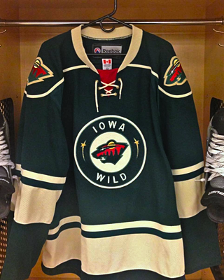
Photo from Iowa Wild (via Facebook)According to my calendar, the Minnesota Wild are 10 days away from showing us their new road threads. But yesterday, the Iowa Wild, their AHL affiliate, beat them to the punch with an unveiling via social media.

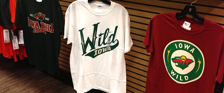
The I-Wild — as I've taken to calling them — debuted their new green sweaters on Facebook and Twitter Wednesday. They're essentially a reversed version of the home uniform with "wheat" instead of white and the alternate roundel logo on the front.

That white home jersey was unveiled four months ago, on April 22, when the team unveiled its primary logo. Both logos are borrowed from their parent club in Minnesota — with a few key words changed.

In fact, even the jersey itself comes straight from Minnesota. It's the Wild's third with the crest swapped out. Glad to see this franchise sticking with green.

I was sad to see the Houston Aeros identity disappear this summer, but I can live with that if it means getting to see more of that excellent Wild logo.

Between the two, I'm more a fan of the road jersey, both because it's green and features an actual logo on the front. The white jersey with its green wordmark is just dull, if you ask me. Nothing special there.

What's in store for Minnesota?

Seeing Iowa's road sweater logically leads us to speculate a little on what's coming to Minnesota. In this NHL, it has to be white, right? Using that wheat color might make it look old and dingy on television. But I'd definitely expect to see more green than red.

It also might be easy to assume a white version of the green jersey — like what Iowa and Houston before them used as a home sweater. But that's the reason I think we'll get something new. NHL clubs aren't in the business of copying minor league teams. Often it's the other way around.

So whatever we get from the Wild, I expect it to be entirely new. What's your prediction?

Wednesday
Jul172013

Iowa's Wild New Logos

Back in April, the Iowa Wild unveiled their new logo and home uniform. Since then, we've gotten a look at some other elements of the franchise's visual identity. For one thing, the graphic above shows how the logo is colored on a dark background. It's been seen on the backdrop at recent press conferences.

Previously, we'd only seen the green version used on white backgrounds, including the white jersey that was shown to us. (We still haven't seen a road or alternate jersey yet.) Here's a reminder of what the green version of the logo looks like.

But that's not all. A few weeks ago, the Wild tweeted this photo of new T-shirts fans can get their hands on. And it showed yet

Photo from Iowa Wild (via Twitter)

On the right you can see a modified version of the logo Minnesota uses on their home sweater. Does that mean Iowa could be taking a similar route? Might not be the worst thing if they did. I know it's easy to complain when a minor league team takes on the branding of its NHL affiliate, but sometimes it's cool to see the variations.

I believe that covers all of the Iowa Wild's logos for the 2013-14 season. But there is one more thing I wanted to mention. Obviously, this team has yet to take the ice, yet you can already find "photos" of the new uniforms in action — all thanks to Photoshop.

Images from Iowa Wild (via Instagram)

The image on the left was featured in an Instagram promotion and the one on the right was part of splash page graphic on the team's official website. (They have a different splash screen now but are still using a similarly Photoshopped player.)

It's basically just the old Houston Aeros alternate jersey with the new logo pasted on. Not a terribly complex solution, but at least fans get the feel of seeing the new Wild in action, right?

What do you think of teams Photoshopping new jerseys onto their players in the offseason? We've also seen it a lot with NHL teams given all the player movement since free agency began. Does it bug you? Could you care less?

Monday
Apr222013

Iowa Wild Unveil Logo and Sweater

Relocated AHL franchise holds press conference

That happened fast. Today, the Iowa Wild (still known as the Houston Aeros until the Calder Cup Playoffs end) unveiled their new logo and home jersey for the 2013-14 season. And it looks familiar.

Iowa Wild jersey via TwitterThe new logo is not surprising. It's based on the script font found on both the Minnesota Wild and Houston Aeros third jerseys. It was shown off today on their new website.

It's really not that great of a uniform or logo design so I'm a little stumped as to why this organization keeps coming up with new versions of it. What worries me is that the NHL Wild are working on a new road (white) jersey for next season. Is this a preview of what's to come for them?

I'm also a little annoyed at the name change. I don't mind Iowa Wild the way some folks do. What I mind is them using "Wild" in the first place as now every time we mention the name we'll have to specify NHL or AHL.

At least with the other instances of the NHL/AHL name duplication, there are easy ways of distinguishing them — B-Sens, P-Bruins, Baby Pens (though I know a lot of folks hate that). But with this team? The I-Wild?

It's also disappointing that one of the great minor hockey identites of the last two decades is going away. We'll miss the Houston Aeros and I'm not sure anyone would miss the "Iowa Wild" even if they'd been around 20 years.

All right, enough complaints from me. I'm just disappointed by the lack of creativity of this team's new branding. I'll get over it, but first I'll take out my frustrations by whining here on the blog.

What do you guys think of the new look of the Iowa Wild? Am I being too hard on them?

Friday
Apr192013

Official: Aeros Becoming Iowa Wild

It is official now. Two decades of Houston Aeros hockey has come to an end. But their loss is the gain of hockey fans in Des Moines, Iowa. Yesterday, the Minnesota Wild received permission from the AHL's Board of Governors to relocate and rebrand the franchise, starting in 2013-14, the Iowa Wild.

It all came down to the club's inability to secure a new lease at their arena. But Houston is one of the biggest markets in the U.S. so I can't imagine they'll be without pro hockey for too long. For now, though, they are.

The press release made no mention of a timetable for the introduction of new logos and uniforms, but obviously they'll come before the fall. Sometime this summer I'd imagine. Definitely something to keep an eye on. (UPDATE) The Minnesota Wild haven't officially announced the renaming of the Aeros but the Minnesota Star-Tribune is reporting that right now.

Rocket hold off on becoming P.E.I. Islanders

In other rebranding news, the QMJHL's P.E.I. Rocket were supposed to officially unveil their new logos and uniforms on Thursday. They were to be renamed the P.E.I. Islanders for next season. However, the owners suddenly put the team up for sale, according to The Guardian, taking the rebrand off the table for now.

Unless a local group can come up with the money to keep the team on Prince Edward Island, it will be sold to a group planning to relocate to Sorel, Quebec, where they'd be rebranded as the Sorel Eperviers — a team that played there from 1968 to 1981.

Either way, this team will get a new look before the start of the 2013-14 season.

Thanks to Matt M. for the tip on the Rocket story.