July Edition Reebok released its planning catalog to retailers for the new season back in January. Since then, we've been accumulating more and more about what logos and jerseys will debut in 2011-12 season.
I've been meaning to get around to the July update but work has kept me pretty busy the last few weeks. But I finally have some spare moments — even if we are on the cusp of August already. Some of the new information this edition is based on rumor and speculation, so bear that in mind. This is all guess work until official team/league announcements are made. New or updated information is noted in red.
Chicago Blackhawks
new!

 Blackhawks current third jersey / NHL.comNo alternate jersey Rumors have been circulating that suggest the Blackhawks are looking to ditch their third jersey.
At this point I don't have any hard sources to cite, but it sounds like team management doesn't really love this sweater (right) which began life in 2009 at the Winter Classic played at Wrigley Field in Chicago.
I'm not certain whether the Blackhawks plan to revert to the previous all-black third jersey, which first debuted in 1996 (and was later relaunched in Reebok Edge form in 2008 after taking a year off) — or go without an alternate uniform altogether. They could also try their hand an entirely new design, but I really wouldn't bet on that.
Also unclear is the timetable for the current third jersey's demise. Have we already seen the last of it? Or will it get one last hurrah this season before it becomes part of Hawks history?
That'll be worth keeping an eye on this season. Blackhawks fans, we'll be counting on you for details. The home and road jerseys will stay the same as they ever were.
Dallas Stars
updated

 Stars current third jersey / from NHL.comNo changes Reebok said the Stars were looking to launch a brand new third sweater this year. And most of us were hoping they'd run far away from their current look.
The most prevalent rumors this summer suggested it would be green with a nice nod to the past. As we know, retro is all the rage lately. But if it does happen, we'll have to wait at least another year now.
In the last edition of the JerseyWatch, I reported the rumor that ownership issues in Dallas could derail the process of adding a new sweater. Yesterday, that was confirmed by Daryl Reaugh via Twitter. (Hat tip to @Monrreal for the tip.)
The Stars' TV color man went on the record, responding to a fan question, saying: "[A] new third [jersey] was in the chamber but got shelved in deference to impending new ownership."
That's really a shame. I was hoping the Stars would get the chance to add a little more color. Now, if it does happen, it will likely have to wait at least until next season — maybe longer.
Looking back, Dallas may have been the hardest hit by the transition to Reebok Edge in 2007. They went from having a beautiful and unique set of sweaters to some of the blandest in the league. And green — already in short supply around the NHL — disappeared almost entirely.
For the record, the current set of uniforms will remain unchanged for 2011.
Edmonton Oilers

 Oilers new road jersey / OilersNew road jersey At last, Oilers fans can rejoice! A new white retro sweater (right) was unveiled on June 24 at the NHL draft.
Edmonton selected Ryan Nugent-Hopkins first overall and used the opportunity to reveal the retro jersey which now matches the club's blue and orange home uniform — completing a set fans have been begging for.
If the Stars fared the worst in the switch to Reebok Edge jerseys in 2007, the Oilers weren't far behind. The navy and copper uniforms were a disappointment. As with many new Reebok uniforms, there were no waist stripes. And the sleeve stripes inexplicably stopped on top of the elbow instead of wrapping completely around the arm.
Only a season later, the complaints of fans were quelled by the introduction of a retro third jersey that brought back the brightly-colored blue and orange from the 1980s — most associated with Gretzky's Cup-winning dynasty.
In 2009-10, the fan-favorite uniform got top-billing as the new home sweater. Many fans were hoping the white jersey return last season, but after three straight years of uniform changes in Edmonton, the NHL probably frowned upon a fourth — even though the Isles got away with it.
This means the 2007 white jersey is officially retired and that's great news for everyone but Flames fans (who can't make fun of them for bad uniforms anymore). The real bad news, however, the third jersey will not be changing. So those wannabe stripes aren't disappearing entirely quite yet.
Florida Panthers
updated

 Panthers unveil new home jersey / PanthersNew home & road jersey The Panthers joined a handful of teams at the 2011 draft in unveiling a brand new jersey at the podium.
As had been rumored for some time, Florida is going back to red for their home uniform (right) in 2011-12. And even a Lightning fan will admit that's a good thing. The Stinkin' Panthers were never supposed to be blue. That's Lightning territory. Happy to see them reclaim their original identity.
The Panthers' first red jersey was relegated to alternate status in 2003. When the Reebok switchover occurred in 2007, the red went away entirely.
The new red sweater borrows from the same template as the old blue one, without the extraneous piping on the front and sleeves. (But I think gold piping would've been all right on the sleeves in this case.)
The red rumors go back to January when Miami Herald writer George Richards revealed what he'd heard from players and team officials. On July 8, Richards also reported that the Panthers will be debuting a new road sweater as well. He says the new jersey will look an awful lot like the current one — white with red on the sleeves — except that now the useless blue piping is going away.
Additionally, it sounds like the Panthers are keeping their navy and powder blue third jersey. I've always been a fan of it. Though it's been reported (also by Richards) that team management could do without it. So the Panthers may again grace this space in 2012. We'll keep an eye on it.
Los Angeles Kings
updated

 Kings unveil new road jersey / GettyNew home, road & alternate jerseys The Kings have decided to switch things up in 2011 with an all new uniform set. (Kind of. Only one new jersey is actually being added.)
The Kings unveiled their new white road sweater (right) at the 2011 draft, which officially confirms months of speculation going back to October when we first saw prototypes.
The new jersey nearly matches the black alternate launched in 2008 — which becomes the new home jersey next season. The key difference is in the waist striping. On the black jerseys, there's piping around the bottom but no waist stripes.
The October leak aside, this uniform swap wasn't entirely unforeseen. The team has been dropping hints for some time. For example, the players wore the black third jerseys for home games throughout their 2010 and 2011 playoff runs.
The black and purple home jersey which debuted in 2007 is apparently set to become the new alternate in 2011 and the highly popular purple-and-gold throwback sweater from last year will go back into the mothballs. At least according to LA Kings Insider Rich Hammond, that is.
He said that back in March. Now, I've been told that the Kings are contemplating surprising fans by bringing back the retro threads as a full-time alternate uniform in the autumn. But it's only a rumor until then. I've got my fingers crossed.
While the fate of the black and purple jerseys remains up in the air for now, the 2007 white road jersey is officially no more. I, for one, won't miss it.
Nashville Predators
updated

 Gold sweater unveiled / PredatorsNew logos, home & road jerseys The Predators are one of a handful of NHL teams undergoing sweeping brand changes in 2011.
On June 22, the team unveiled four new logos and a revised color palette. The new primary mark is a simplified version of the "Pred Head" the team has used since Day 1. There's also a new secondary logo in the shape of a guitar pick featuring symbols from the Tennessee state flag.
Just a few days later at the draft, the Predators revealed their new white road jersey (below) by giving it to their draftees. It looked phenomenal.
Then on July 13, at the Preds' Skate of the Union event, the brilliant gold home jersey (right) was officially revealed to the world — on the side of a skyscraper, for that matter! They really went all-out on this unveiling. "Behold the gold," was how they put it.
 New road jersey debuts at draft / GettyReaction to the Predators' new look has been largely positive. It's refreshing to see bright colors and a simplified overall design. And ultimately, the official unveilings proved the rumors right.
Believe it or not, every rumor we've discussed here on the site has been dead on. A rarity, to be sure, right?
Initial reports said the blue and black third jersey would be the new home sweater and a white version would be added. That was true... until it wasn't anymore (when the team changed its mind). New rumors circulated that gold would be the new home color. And on July 13, that became official.
Regarding the new logos, a never before seen "NP" lettermark was seen in April on Pekka Rinne's new mask design for 2011. Turns out it is one of the new secondary logos and it will be used on the uniform pants, as seen in photos.
And finally, to quote an earlier edition of the JerseyWatch: "Other speculation involves a freshening up of the very '90s primary logo — perhaps swapping the navy blue for a brighter shade and increasing the amount of gold in use. Ultimately we'll probably have to wait until summer for any kind of confirmation."
Dead on. Again. I know it sounds like I'm tooting my own horn here, but that's not really the case. What I'm trying to say is that Icethetics has great readers when it comes to providing early details before they become official. All I do is filter what comes in. So kudos to you guys for keeping us all a step ahead!
One thing I reported that Reebok got wrong was when they said the third jersey was not changing in 2011. In fact, no third jersey will be used next season at all.
And for as nice as this new set looks, I'm sure it won't be long before a blue sweater works its way back into the Predators' arsenal. That's just the way the world seems to work.
New York Islanders
updated

 Isles current home jersey / NHL.comNew alternate jersey Reebok has indicated a brand new third jersey for the Islanders — which will probably ruin everything now that they've finally gotten it right.
Original rumors all but confirm that, suggesting that the new sweater will be primarily black. Wish I was making that up.
Proponents point to two other New York teams who have historically used the orange-and-blue color scheme. The NBA's Knicks and MLB's Mets have added black in recent years. Perhaps the Isles are just following the beaten path.
Ah, but wait... New rumors! I've recently been told that the Isles' new alts may actually have no black whatsoever. Instead? Grey. Think of that.
Specifically, the jersey itself would be the same royal blue we've come to know and love. Where it would differ is with grey shoulders and orange and grey trim. And the crest would feature a script mark. And if I were to guess, some non-traditional striping patterns.
Last season the Isles debuted a new white road sweater to match the blue throwback that's been in use since 2008. We were all relieved and overjoyed to see it. And that's because the folks on Long Island tend to make bad decisions when it comes to redesigning Isles uniforms. For this team, retro works and it always has.
The only time the Islanders have attempted a non-retro third jersey, it was orange. For the most part, fans liked it and it was used from 2002 until Reebok ruined the Isles in 2007. Also worth noting: Ex-Isles employee and exiled blogger Chris Botta said in a video blog that the team is indeed adding an alternate sweater next season. When asked why by a fan, his simple answer was "money."
Ottawa Senators
updated

 Sneak peek at heritage sweater / SenatorsNew alternate jersey Earlier I said the Thrashers may have had the ugliest third jersey in the NHL. But I'd forgotten about the Senators.
Luckily, in early March, the Sens confirmed a replacement is coming. They're calling it a "heritage" jersey. Team president Cyril Leeder later went on the radio and divulged a key detail — that being a barber-pole look as "part of the design." He even confirmed already having a prototype in the office.
Then at an event in late March, season ticket holders got a sneak peek at the jersey itself — which the rest of us were treated to later (right) in a video on the Sens' website.
The jersey was folded and framed in such a way that we can't really make out what it's supposed to look like. But you can do your own extrapolating.
Some things to keep in mind: A retro-styled concept designed by a fan has appeared in official team materials and in January, Ottawa's farm team in Binghamton wore the barber-pole throwbacks that the original Senators sported in 1930s.
For what's worth, I've been lead to believe it will be a lot like the fan-designed jersey I linked to above. Basically, black with a big black O in the middle on top of a thick red and "vintage white" stripe. Yes, indeed it sounds like that trendy non-white will make an appearance in Ottawa this year.
Ultimately, it has to be an improvement on what they've been wearing since 2008 — with SENS across the chest. I guess the good news here is, at the very least, that jersey is going away.
One other note regarding jersey patches. For years now, the host of the NHL All-Star Game wears a patch with the event's logo on their uniforms. The Senators, hosting in 2012, will be no different. The red home jerseys given to their draftees were outfitted with All-Star patches on the chest. Presumably, the 20th anniversary logo will not be used as a jersey patch unless it's done so after the All-Star break.
Phoenix Coyotes
updated
 Team name change Prior to the Thrashers' relocation to Winnipeg, there were reports that the Coyotes could have a new name next season if they stayed in the desert.
Prospective owner Matthew Hulsizer pledged to Glendale in December that he would rename the club Arizona Coyotes — only now he's no longer pursuing the purchase. And for the time being, at least, the club continues to be the property of the league in which it plays.
The immediate issue of the name change is out the window as far as I'm concerned. It would be stupid for the league to put any money toward rebranding this franchise as it seeks a buyer who could potentially relocate the team within a year.
I hate to bring up that dreaded R-word for the sake of any Coyotes fans reading, but you surely know already that your team is in dire straits. The city of Glendale bailed the franchise out with just enough cash to get them through the 2011-12 season — the only reason they didn't become the Winnipeg Jets again this summer. But their current situation is unsustainable.
Pittsburgh Penguins

 Pens' Winter Classic jersey / NHL.comNew alternate jersey This should be the least surprising news in the entire post. The Pens will have a new third in 2011.
The Penguins first talked about replacing their powder blue third jersey last year. But upon the announcement they'd be participating in another Winter Classic, those plans were shelved.
The last time the Pens added a third jersey, it was borrowed directly from the 2008 Winter Classic. Now three years later, it's all but a given that history will repeat itself.
I'd be very surprised if the new uniform isn't the 2011 Winter Classic sweater (right). Chances are this was the same design they were working on last year when the idea of changing the alternate jersey first came up.
The only difference would be the lack of a Winter Classic shoulder patch. I've altered the image to represent that. It's a nice looking jersey on its own. But I do think it would be better if they used real white instead of the trendy vintage white.
Tampa Bay Lightning
 Yzerman, St. Louis, Lecavalier, Stamkos, Vinik and Leiweke unveil new Lightning uniforms / Lightning
 New home & road jerseys The Lightning unveiled a new logo along with new home and road uniforms to very mixed reviews on January 31.
The new management team in owner Jeff Vinik, president Tod Leiweke and GM Steve Yzerman wanted to put a fresh new stamp on the team by changing the entire look.
 New home sweater / LightningThere are simplified logos and fewer colors than before, ultimately leading to a more traditional look worthy of an elite franchise. But for as clean as the new look was, many fans were not happy.
The new uniforms lost some of the personality and history that founder Phil Esposito built in back in 1992 — that being the underarm "victory stripes" and the lightning bolts on the sides of the pants.
After doing what they claim to do best — listening to the fans — Bolts brass made some tweaks which included adding black trim to the sweater numbers as well as white lightning bolts on the pants.
Leiweke also confirmed the "victory stripes" will be part of the uniform design going forward, but that the deadline for such a change in the 2011-12 season has already passed.
At the 2011 draft, the Bolts gave the new blue jerseys to their new picks. They now feature the inner black outline on the numbers, an element which was added after the January unveiling.
The Lightning have also said the BOLTS third jersey will remain for years to come. I imagine that even means keeping the black and gray elements as an alternate color scheme, though the shoulder logo will likely be changed to one of the new marks.
Toronto Maple Leafs
updated

 Leafs' rumored new third jerseyNew alternate jersey As rumored, the Maple Leafs will be debuting a new third jersey for the 2011-12 season.
The current third jersey in its Reebok incarnation launched in 2008. Prior to that, the same design was used from 1998 to 2007. It was based on a primary uniform and logo the Leafs wore from 1958 to 1967.
When team management recently discussed changing the uniform with the media, they said the plan is to borrow from their own history once again.
On July 14, the oft-reliable Howard Berger reported that the new thirds would be modeled after the 1967 version (above) — which, as it happens, was the last time the Leafs won a Stanley Cup. A week later, Berger posted about a bazillion photos of the original sweater in what he called a "Photo History of the Maple Leafs New Third Jersey." So do please enjoy that link.
And I'll say it once again. We won't really know anything until next summer, fall at the latest. But the Leafs usually like to make a big deal about jersey unveilings so I'm sure we'll know when it's coming.
Well, I think that's it for this edition of— no, wait a minute. I think I may be forgetting somebody.
Winnipeg Jets
logo unveiling
 Winnipeg Jets unveiled their new logos on July 22 / Jets
 New logos, home & road jerseys Yes, indeed the biggest news since the last JerseyWatch update was the hurried unveiling of the Winnipeg Jets' new logos on July 22.
Earlier that day, a photo of the new primary logo on a T-shirt had leaked onto the Interwebs, destroying keyboards everywhere... or, at the very least, prompting the team to take quick action and hastily assemble a press conference to unveil their new marks — officially. I'm not sure what their original plan was, but I know this wasn't it.
The new brand quickly made its way around the web, gaining friends and enemies alike. To call the reaction mixed would be putting it mildly. But most Winnipeggers were as giddy as schoolgirls to get their hands on the newest logo-laden gear. Proof that good design is not required to sell shirts.
Now you have my two cents. Speaking of which, I made a real hash of it at the unveiling. If you care to read more about my moment of humility, here's the link. In a nutshell, I was stunned by the poor design, but given that the team only had 52 days to come up with a logo, not terribly surprised by it. I'm not a fan, but it's not my team so I don't have to be.
In case you haven't been following along, True North Sports & Entertainment announced their purchase of and intent to relocate the Atlanta Thrashers on May 31. At the NHL Draft, on June 24, they officially announced the team would be named the Jets — after the franchise that called Winnipeg home until 1996.
The Jets were forced to give out generic NHL jerseys at the draft as theirs weren't — and still aren't — ready for public consumption apparently. The team has said to expect an unveiling in early September, prior to their rookie tournament which begins on Sept. 11.
And just so it's being said, obviously, none of the Atlanta Thrashers jerseys will be used by the Winnipeg Jets. All three are now officially retired.
NHL Special Events
 The 2012 NHL All-Star Game will be hosted by the Ottawa Senators. The event logo was unveiled in September. It's not clear if the same "fantasy team" format from 2011 will be used in Ottawa. For what it's worth, no All-Star uniform set has been worn more than once since 2000 and 2001.
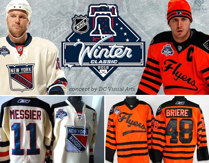
The league has yet to make an announcement regarding the hosts of the annual outdoor games. It's been widely rumored the Philadelphia Flyers will host the Winter Classic on the day after New Year's 2012, against the New York Rangers. That would be unfortunate for jersey junkies as both teams already have retro uniforms.
As for the Heritage Classic up in Canada, NHL commissioner Gary Bettman has said there will not be one in 2012. I just hope we don't have to wait another eight years for the next one.
At this time, there are no changes expected for the Ducks, Bruins, Flames, Hurricanes, Avalanche, Blue Jackets, Red Wings, Wild, Canadiens, Devils, Flyers, Blues, Sharks, Canucks, or Capitals.
As reported in previous editions of the JerseyWatch, the Sabres and Rangers will be hanging onto the alternate jerseys they introduced in 2010 as part of their respective anniversary celebrations.
And that's the fifth edition of NHL JerseyWatch 2011 all wrapped up. More updates will continue over the summer as a handful of teams still have new stuff to show us. But as always, keep an eye on the blog for the newest information.


 15 Comments
 On Wednesday afternoon, the OHL's Owen Sound Attack held a press conference to show off their updated logo and new uniforms.
 Owen Sound Attack unveil new sweaters / AttackEven the jerseys are highly simplified — going for the Blackhawks-style stripes instead of the claw-shaped design that was previously featured.
 In the minors, the Central Hockey League's Bloomington Blaze unveiled their logo and uniforms on Tuesday, just a couple weeks after announcing their existence.
 CHL Bloomington Blaze jerseys / BlazeThis week we got our first look at the Ottawa Senators' new Heritage Jersey. We could finally put the crazy-striped third jersey out of our minds. And then the Blaze came along.