


Official: NHL All-Star Jerseys Revealed

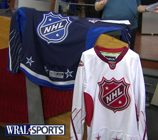 2011 All-Star jerseys / from WRAL-TVThis morning on WRAL-TV, the 2011 NHL All-Star Game sweaters were officially unveiled in the host city of Raleigh, North Carolina.
Carolina Hurricanes marketing director Doug Warf stopped by the station's studio to show off the new jerseys. In his segment, he talked about some of what went into designing them:
- Colors, six of them, were selected because they represent the majority of teams in the NHL. (At least they kept black out of it.)
- NHL shield was used as the crest because we won't know the team's names until the captains are selected. (Which we knew already.)
- Warf says the captains will be picked a week from today on Jan. 18.
- Red team is "home" while blue team is "road." Warf doesn't say how that was determined since the dark jersey is typically worn at home in the NHL. (Maybe because the host team color is red?)
- Reebok is trying new things. Oh geez.
This unveiling comes just a day after we got an early look at one of them here at Icethetics. Now we're able to have a good look at both of them.
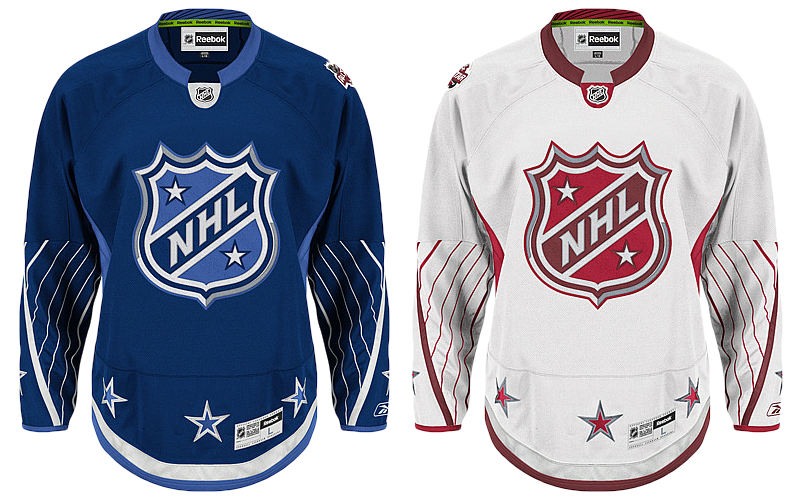 2011 NHL All-Star replica jerseys / from NHL.comAs predicted, the blue sweater is the inverse with all of the same design elements as the red one. Aside from the colors, the main difference between the two is that the All-Star patch is on the left shoulder of the blue jersey while it's on the right shoulder of the white one.
The league confirms the opposite shoulder will bear the player's home team logo. That article also contains more details about the uniforms including Reebok's new Smoothfit numbering and lettering. Good luck buying an authentic customized jersey.
As a side note, the more I see the red jersey, the more the lighter shade starts looking like pink. But I'm sure it'll look fine under the lights on the ice. Well, I hope. Also today, with just 17 days until the Fantasy Draft, the full 42-man All-Star roster has been announced. Half of that group has never been to an All-Star Game before, so that will be fun.
Who do you think the players will pick as captains? And who do you think the captains will pick? Or instead, if you were an All-Star captain, who would you pick? List your rosters below (paragraph form with commas please, bullet lists will be deleted). And don't forget to tell us what you think of the two sweaters.
 Chris
Chris
 Authentic 2011 All-Star jerseys / from NHL.comJust to clear up some confusion, the images of the jerseys above show the Premier replicas that fans can buy. The photo to the right shows the "authentic" versions, as seen on Shop.NHL.com.
Some of you have noticed the difference in spacing between the collar and the NHL shield — the area where the sweater number will go on the actual player jerseys.
As I've mentioned before, these images are not true photographs of the jerseys. The are simply meant to advertise a product. The process starts with a photo but most of the elements, including the crests and patches, are added in later with Photoshop.
To demonstrate this, look at these two different sweaters and notice all the little details like the creases and folds. There's no way you can take two separate photos and end up with exactly the same creases. Just not possible. So one photo is taken and the colors are altered to match the product.
What I'm saying is don't expect these to be dead perfect. We'll probably have to wait until we see a player's actual jersey before we know the exact arrangement of everything.
Chris
 All-Star jersey chest numbers / from NHL NetworkWhy wait? Our buddy Glen C. tweeted this image which shows the numbers on the front of the new 2011 All-Star uniforms.
Certainly an unusual placement for a sweater number. And most of the comments you're going to read here will be nothing more than horrible hyperbole.
So for something different, I'm going to tell you why All-Star Game sweaters should be bold and different. For one, it's the league's only chance to get you outside of your comfort zone.
They're worn one time (maybe twice) and then they're gone. But for that short interval, they have the attention of every hockey fan in North America and they get to grace the backs of the sports most talented.
Don't misunderstand, I love the traditional look the brought to Minnesota in 2004, but I'd hate to see it every season. I'd rather see the league's All-Star designers draw outside the lines once a year and give us something new and exciting to look at for a change. Every third jersey is starting to look the same now.
So I challenge every commenter to tell us what you like about these jerseys. And sure, you can't be a smart ass about it, but no one will be impressed. Let's get outside that comfort zone and recognize that once a year it's refreshing to see something unique. Not every jersey has to be based on the limited sweater design sensibilities of the 1910s.


