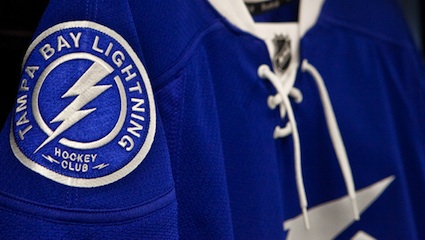
Entries in jerseys (170)

Wednesday
Feb232011

Lightning Listen, Add Bolts and Black

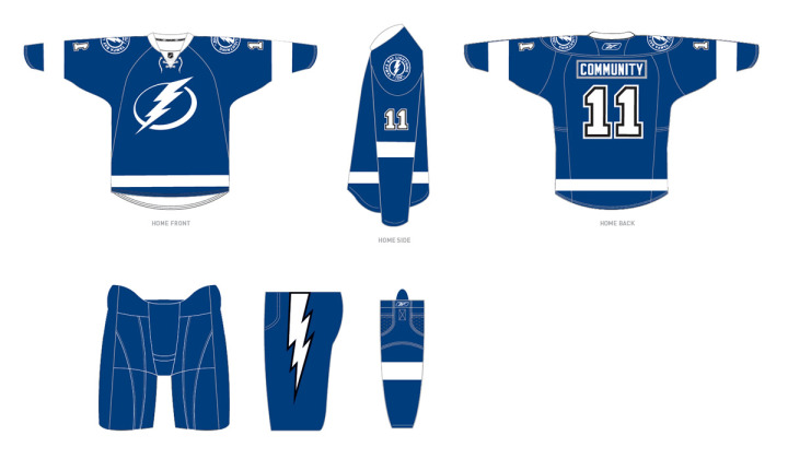
The Tampa Bay Lightning announced today the final design of their new uniforms for the 2011-12 season, which includes changes requested by fans.

Most notably, the revamp includes the additions of lightning bolts on the pants, a fixture of Lightning uniforms since the club's inception, and black trim, one of the team's original colors. The newly unveiled logos will remain unchanged.

The team released this image on its website:

Lightning unveil changes to 2011-12 uniforms / Tampa Bay Lightning

For what it's worth, it seems the regular blank jerseys that will go on sale to fans will not actually feature black at all, as it will only be used to trim the numbers and the bolts on the pants. But that seems to make sense from the standpoint of merchandising as the jerseys are likely already in production. To make changes to the sweater itself would mean scrapping everything that's already been manufactured.

Here's the statement from team management regarding the changes:

“After our multiple announcements in the past weeks we listened, as we always will, to feedback from our stakeholders,” said Leiweke. “While we have received overwhelmingly positive response regarding the direction Jeff Vinik is taking this franchise, we did hear from some fans regarding the traditions of black and a bolt on our pants. Thus, after consultation with the NHL and our design team, we are adding black as a third accent color and an elegant white bolt to our pant.

“While we are committed to pushing our franchise to new heights, we will forever honor the 2004 Stanley Cup and the other traditions and great efforts of those before us. The addition of the lightning bolt and the incorporation of black trim is an opportunity to send a message to Phil Esposito and the other pioneers that Lightning history will always be a part of who we are.”

The team also confirmed the BOLTS third jersey will stick around for years to come. Though they will likely swap out the shoulder patch with the new logo.

Now as a Lightning fan, here's my take: I love that they're keeping the bolts on the pants! That was the biggest thing in my mind missing from the new look. They're still leaving out the victory stripes, but most people outside of jersey geeks like us would have never noticed anyway. I'll miss it but it's not the end of the world.

Regarding the black, it seems they've tried to do as little as possible to placate fan complaints. Personally, I never thought we needed black, but if we have to have it, let it be in the small doses seen above. Overall, I'm ecstatic about the new look, especially now that the bolts on the pants are back.

So to those who didn't like the initial design, what do you think of the changes? Did the team address your concerns to your satisfaction? To those who did like it, do the alterations change your mind at all?

Sunday
Feb132011

Uncertainty in Nashville and Tampa

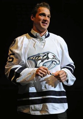
The "limited edition" jersey / Nashville PredatorsDon't bet on this jersey. (Pun.)

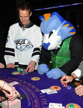
The Nashville Predators hosted the GnashVegas Casino Gala and Auction on Thursday night. It's one of those events teams put on to let rich fans rub elbows with players in a casual setting. And it's only noteworthy here because of what the players showed up wearing.

The jerseys they sported for the event, fully customized with their surnames and numbers (even on the sleeves), are nothing they've ever worn on the ice. Nor will they.

Last month just prior to the inaugural edition of NHL JerseyWatch 2011, we got our first look at what might've been the Preds' new road sweater next season. Only there were many indications that it wouldn't be.

GnashVegas Casino Gala / Nashville PredatorsRumors had circulated for some time that the Predators wanted to simplify their color palette and exile their present home and road uniforms in favor of their current alternate along with a white version of it.

Said white version showed on a silent auction table during a game recently. It fanned the flames, feeding rumors about jersey changes. As did the fact that every player was wearing one on GnashVegas night. But the club's Facebook folks threw a bucket of cold water on that theory.

They posted a photo album from the event and the first person to comment on it asked, "Any mention about these jerseys becoming the new away uniforms next season with the current 3rds [sic] the new home uniforms?"

The direct reply from the Predators: "These jerseys are limited edition jerseys that were auctioned off at tonight's event."

But the ensuing commenters weren't deterred, one asking, "why do I get a feeling that we will be seeing a lot more of these amazing, fantastic awesomely cool jerseys?"

The team's Facebook operator tersely reiterated, "These jerseys will not be used next season."

Of course that leaves the door open to indeed using new jerseys next season, just not these. Which we already know to be the case, thanks to Reebok. If you'd like to see more pictures of the players sporting their "limited edition" jerseys on casino night, there's an additional photo gallery on the team's website.

And the point of all of this is that we still aren't quite sure what to expect from Nashville in 2011. By the way, I must've gotten more than a dozen emails about this so thanks to all of you who sent in links.

The other bit of news has to do with the Tampa Bay Lightning, who just unveiled their rebranding plans a couple weeks ago to mixed reviews. Turns out, those plans may not necessarily be set in stone. Or they are and some don't want to believe it.

On Friday, the always reliable Uni Watch posted a note in the ticker that I have to question as more wishful thinking than actual fact. But if it's good enough for Paul, it's good enough for me.

Very interesting NHL news from Cork Gaines, who writes: “One of the Lightning radio broadcasters was on a local station in Tampa talking and mentioned that what they unveiled last week may not be exactly what they wear on the ice next season. He mentioned possibly adding a lightning bolt to the shorts and some other unspecified tweaks. This makes me think we got a mid-season unveiling just so the team could gauge reaction and make adjustments — a concept I’m surprised we don’t see more often.”

First of all, can anyone corroborate this? The Lightning have two radio guys — Dave Mishkin, the PxP dude, and Phil Esposito who provides color for home games. I don't see Mishkin stepping outside the lines on this — unless it was a clever attempt by the team to drop a hint to fans unhappy with the recently revealed changes. Either that or Espo spilled the beans. Which would not surprise me in the least.

I'm not sure I agree with Cork that the midseason unveiling was a way to gauge reaction. That's what focus groups are for. I take Leiweke at his word that the timing was all about making sure they got the new logo out there the way they wanted, rather than some crappy website (like this one) leaking it before the summer.

Management said they expected some resistance from fans as it's a pretty sweeping change. But I think they may have gotten a little more than they bargained for. And one thing they've reiterated since the beginning is their intent to listen to the fans. If tweaks are being considered, I'd chalk it up to that.

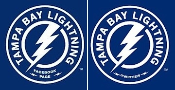
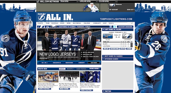
Lightning customize logo for social avatarsOne more thing. I know the last time I talked about the Bolts, I referenced the makeover of their web presence but I didn't really offer much outside of the background image from the website. They also added new social website avatars, customized versions of their new secondary logo.

On the actual logo, it reads HOCKEY CLUB between the two mini-bolts at the bottom of the circle. It's replaced by Facebook and Twitter in these versions. It's not a big deal, just kind of a cool branding thing.

And in case you haven't checked out the Lightning's website lately, here's how it looks in the new colors:

Wednesday
Feb022011

Junior Jerseys You Should Know About

Amidst all the recent NHL news, Icethetics readers have been emailing in to let us all know about some rather fascinating specialty jerseys hitting the ice in the Canadian Hockey League. And these you need to see.

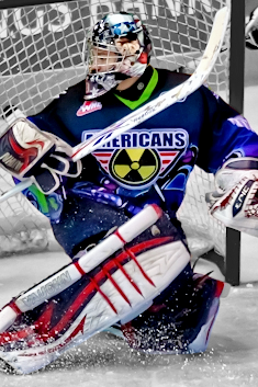
Nuclear Night jersey / John AllenOver the weekend, the WHL's Tri-City Americans, based out of eastern Washington, held a special theme night which required special sweaters.

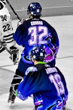
Friday, Jan. 28 was Nuclear Night in Kennewick, Wash. And they wore some rather radioactive uniforms to mark the occasion. Just look at them.

Full graphic rendering of jersey

I don't know what to say about that. Except that it's awesome! (We're supposed to think it's awesome, right?) I mean just look at all the colors... electric green, fuchsia, to name a few. 

Nuclear Night jersey (back) / John AllenThe event was announced Thursday on the team's website and that all of the jerseys would be auctioned off following Friday's game.

A special website was set up to take bids. (So if you have to have one of these, you know where to go.) It says the proceeds will benefit the Players' Continuing Education Fund.

Honestly, I love seeing this sort of thing in the minors/juniors. It's one night and it's fun. We'd never want to see it attempted in the NHL, of course, but if not for teams like this and their charitable causes, we'd never know what a Nuclear Night jersey would look like. Would we?

For the record, the Americans were victorious in all their atomic glory, defeating the Portland Winterhawks 5-2. And you know the Winterhawks didn't look this good.

My thanks to Josh S. for the tip.

If you though the Tri-City Americans had eye-catching jerseys, let's head to the Ontario Hockey League.

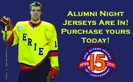
Alumni Night jersey / Erie OttersThe OHL's Erie Otters unveiled their Alumni Night jerseys last week.

These bright yellow sweaters will be worn this Saturday, Feb. 5, to celebrate the Otters' 1,000th regular season game.

These game-worn jerseys aren't going up for auction, however. (I think we know how that would go.) Instead, they'll go on sale following the game for $240 each (with a $20 discount if you're a season ticket holder).

Frankly, I'm not familiar with Erie's hockey past. Are there any readers who can shed some light on the history behind these colors?

Kudos to long-time reader Jeff S. for emailing this in.

Lethbridge throwback / from Joshua SchroederThe WHL's Lethbridge Hurricanes celebrated the 60th anniversary of a hometown team's world championship last week.

On Tuesday, Jan. 25, the Hurricanes hosted the Brandon Wheat Kings sporting the sweaters of the old Lethbridge Maple Leafs, who won the World Amateur Hockey Championship on the same date in 1951. They won 4-3.

This is a very cool tribute, and one of the few times "vintage white" is an acceptable color on a 2011 hockey uniform. They're honoring a team that played six decades ago. The cream color adds to the illusion that the guys are sporting the old club's sweaters. Even if we know better.

Now for all the links: Read a recap of the game on the team's website. Learn about the history of the Lethbridge Maple Leafs and the significance of the throwback night.

And while the auctions may be over, it's worth checking out what some of the sweaters sold for. One went for as much as $1,000! Who is Max Ross?

Thanks again to Josh S., our WHL watchdog.

I've got some other minor league jersey photos I'll try to get posted this week. Also preparing to give a stagnant Icethetics feature a big makeover. It'll give you another reason to keep coming back.

Monday
Jan312011

Lightning Unveil New Logo, Uniforms!

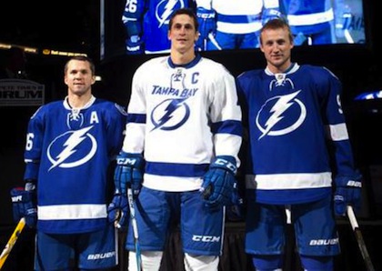
St. Louis, Lecavalier and Stamkos model the jerseys / TBL.comThe Tampa Bay Lightning officially unveiled their new logo and uniforms at a press conference today.

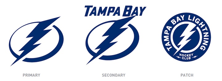
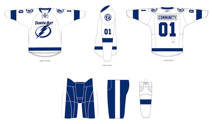
The new logo is one color... white on the blue home jerseys and blue on the white road jerseys, which includes the TAMPA BAY wordmark.

While it's a not a huge departure from the basic idea — a lightning bolt in a circle — it has been stripped down to its simplest elements.

We have a clean, iconic symbol here which is exactly what the new management was going for.

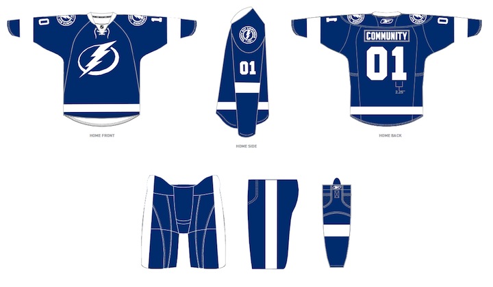
The uniforms are blue and white, and I hate to say it, but the striping is awfully derivative of the Detroit Red Wings'. It's understandable as it's a classic look but it's the one spot where the new brand fails to meet its goal of individuality and being unique. Outside of that, it's a traditional look that stands apart.

And it looks nothing like the Toronto Maple Leafs, as some worried. Unless, of course, you don't have your glasses on and every shade of blue looks the same to you.

At the press conference, we heard from owner Jeff Vinik and CEO Tod Leiweke. Even core players Vinny Lecavalier, Marty St. Louis and Steven Stamkos were on hand to discuss it. And they loved the new look, which will take over starting in 2011-12 season.

Here are the renderings of the new logos and uniforms as displayed on the Lightning's website:

As a Lightning fan, my first impression is very good. I love the simplicity of the logo. We always talk about how a good logo is one you'd find a kid doodling on his notebook. This one's easy to draw. I've thought for a long time the Lightning should have a blue home sweater — and just more blue in their uniforms in general. They certainly have that now.

But there are some things I don't like. The lightning bolts on the pants were always a unique element that's now disappeared. The "championship stripes" underneath the arms were used by no other teams and don't appear on these jerseys. Neither of these elements would've taken away from the simplicity of the design. Instead, the character they added is gone.

New logos, uniforms unveiled / Tampa Bay LightningThat said, I already know what the reaction is going to be from most readers: You don't like it. It's change and many of you are averse to that as a rule, no matter what the end result. You'll come around. And unlike the last few uniform designs, I can see this one being around for decades to come. Vinik, Leiweke and Yzerman have done a tremendous job rebranding this franchise.

The team said the jerseys will not go on sale "for a while" but that they wanted to be the ones to reveal them, rather than seeing it leaked before the summer. And I think that is awesome. Also noteworthy, only the home and road jerseys will change. The alternate BOLTS jersey will be retained next season, according to CEO Tod Leiweke — presumably with the black and gray elements.

Sunday
Jan302011

My Disappointing Jersey Collection

I'm not sure why it took this long.

The other night I mentioned via Twitter my intentions to buy a blue 2011 All-Star jersey. And that I hoped Steven Stamkos would get picked for that team so I could customize it. Then someone asked about the extent of my personal jersey collection.

All right, I admit it. I know full well why it took this long.

Some might say I write a somewhat popular blog on the topic of hockey jerseys with a rather nerd-like knowledge. And as such, it would make sense that I have an extensive collection of sweaters of my own. This might surprise you, but actually... I don't.

At present, I own just five hockey jerseys — all replicas. Perhaps due to that revelation, there was enough of a response on Twitter that I figured I'd share them and the reasons they're in my closet. However humiliating.

As my headline warns, prepare to be disappointed by my feeble collection — half of which you'll expect, half of which you won't. And to delay the embarrassment I have coming, I will be presenting them in reverse chronological order, starting with the newest.

Tampa Bay Lightning

Third jersey (2008—2011)

It shouldn't surprise you to learn that half of my meager collection is made up of Lightning jerseys. As I've said many times, I'm a true Bolts fan and have been since the day Phil Esposito and some Japanese guys brought them to Tampa in the early '90s.

When this third jersey was revealed in November 2008, it was widely criticized on this very website for its pedestrian crest. BOLTS? On the front of the sweater? I wasn't even sold at first. But it quickly grew on me. I call them the Bolts all the time. Why can't the jersey say that?

But the most important factor? I've wanted a blue Lightning jersey for years. There's nothing wrong with black, but blue is just as important in Tampa Bay's color scheme. Why had we gone so many years without one? So when it finally happened, I had to have it.

Now that it sounds like my Bolts are going with blue at home, I'm just beside myself.

Tampa Bay Lightning

Home jersey (2007—2011)

If you've been a reader since the beginning, you'll remember I posted pictures on the blog when this jersey arrived. That was Sep. 20, 2007, not long after the Lightning first unveiled the sweater. That was the Summer of Reebok. And nothing has been the same since.

Believe it or not, I'd never owned my own Lightning jersey prior to that. I haven't needed to. In the handful of seasons leading up to the Lightning's Stanley Cup championship, my dad used to buy game worn jerseys, some of which were even autographed.

He picked up Nikolai Khabibulin's No. 35, Tim Taylor's No. 27, and Brad Richards' No. 19 to name a few. During that incredible Cup run, I wore the Richards jersey to every game. I was devastated when they traded him in 2008. (Glad to see him back on Marty St. Louis' team for the All-Star Game — although annoyingly sharing Stamkos' No. 91.)

Anyway, when the new jerseys were unveiled I had to have one to properly represent my team. No other reason needed.

Florida Everblades (ECHL)

Road jersey, 10th anniversary (2007-08)

I had lived in Tampa my whole life, until 2007 when I got a job in Fort Myers — about two hours to the south. My closest team, geographically, became the ECHL's Florida Everblades, who were not affiliated with the Lightning at the time, but rather the Carolina Hurricanes.

It was easier and cheaper to drive 20 minutes and take in a Blades game than to drive two hours for a Bolts game. And even though I never found watching minor league hockey as fun as NHL hockey, it was still hockey.

While I could never not wear my Lightning jersey to a hockey game of any kind, my wife liked the Everblades' colors and uniforms. The Blades happened to be celebrating their 10th anniversary season and were wearing special sweaters to mark the occasion. So that's what I bought for her.

Now we live in Seattle so it just collects dust in the closet along with the next two on the list.

Nashville Predators

Home jersey (1998—2001)

This one may seem random, but there's a story. During a week-long family trip to Tennessee in the winter of 1999, we went to a Nashville Predators game — I believe on New Year's Day. For whatever reason, I really wanted to wear a Preds jersey. I was 15 so who knows what I was thinking.

We stopped into a sports store in downtown Nashville just a few blocks from the hockey arena so I could blow one of my first paychecks from the job I had just started. I wore the jersey to the game and that was pretty much it. They were playing the San Jose Sharks but I can't remember if they won.

A non-hockey fan friend of mine in Fort Myers used to wear it to Everblades games just to have a hockey jersey on. He joked that I should give him some facts about the Preds in case someone from Nashville ever came up to him. I told him that would never happen. Then it did. It was awkward.

I've never had a reason to wear that jersey since 2000. I'm not in any way a Predators fan — or a fan of any NHL team other than the Lightning. So that's the story. 

Mighty Ducks of Anaheim

Third jersey (1996)

Here's where we end. And I am mortified.

It's true. I own what might possibly be the ugliest third jersey in NHL history. Why? Because I thought it was cool. Bet you didn't see that one coming.

I was 11 years old when this one debuted. I think I bought it in the bargain bin a year later at a Sports Authority. If I remember right, I got it for $28. And even at that rate it was way overpriced. But that season saw the launch of the NHL's Third Jersey Program which, somewhat ironically, spurred my interest in hockey uniform designs.

By that time, I'd only been watching hockey a few years, but it seemed NHL jersey designs were all set in stone, and frankly when you're a kid, that's kind of boring. Now I can look back nostalgically but in 1996, I saw for the first time that teams could try new things and be creative. As a creative person myself and not really that athletically-inclined, I fell in love with that aspect of the sport.
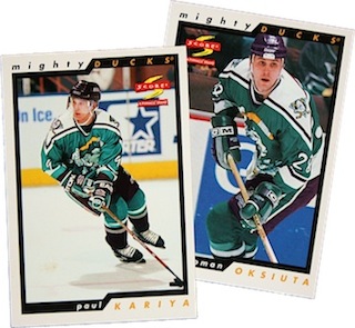
But the thing is, it was never that easy for me to see the variety that did exist in the league. The Internet as we know it today was barely in its infancy. There was no looking up photos on Google Images. No photo galleries on team websites. No Icethetics, to be sure.

Instead, I started learning about all of the NHL's jerseys by collecting hockey cards. Most kids would've been eager to see which new players they got as they unwrapped a new pack. For me, it was which new jerseys I got.

To this day, I still have that collection, thousands of cards going back to the early '90s. And when I saw Paul Kariya wearing this jersey, I figured it had to be awesome. Because he was. I've since learned that is faulty logic.

As my pathetic jersey collection clearly shows, I'm not a traditionalist in any sense. I love the vintage-style uniforms for teams that have a long history. Outside of that, I think a bit of creativity and outside-the-box thinking is warranted. But that doesn't mean I won't like the whatever the Lightning come up with, even if it lives up to the rumors. They're my team.

I love hockey sweaters as much as anyone else. Some choose to manifest that love with big jersey collections. Personally, I'm just not a fan of spending that much money on something that will collect dust in the closet. The only jersey I'll ever wear to a hockey game is a Lightning one. So I don't need any others.

But that won't stop me from collecting pictures of all the jerseys I can find.

So now that you've seen my collection, show me yours. Who among you has the best collection? Most eclectic? Biggest? Ugliest? Let's do a little competition. Maybe we'll even have a prize for the winner. Leave a note in the comments if you have a collection you're interested in putting on display. If enough people want to get involved, I'll set up a page and let everyone vote.

Page 1 ... 8 9 10 11 12 ... 34 Next 5 Entries »