Entries in jerseys (170)

Monday
Sep072009

Flyers to Reveal Classic Sweater

The Philadelphia Flyers will unveil their 2010 Winter Classic jersey this Friday at 2 PM in a rather unusual way. Three players will shoot pucks at a block of ice concealing the new sweater. I'm looking forward to seeing that.

The information comes from this article on Philly.com. The Flyers are also confirming the unveiling date and time via their official web site. As always, count on Icethetics for pictures as soon as I can get them posted. (I'm starting a new job on Thursday so it may be a little tricky getting this stuff posted immediately on Friday.)

Thanks to Andrew for the tip. No word yet on when to expect an unveiling in Boston.

Friday
Sep042009

B-Sens Unveil New Sweaters!

I've got some verified minor league news for you this evening. The AHL's Binghamton Senators unveiled brand new jerseys this week which will be worn for the 2009-10 season.

Our first look at them comes by way of FOX 40 WICZ in Binghamton, New York. The jerseys were on display at an event welcoming new coach Don Nachbaur. Icethetics reader Alex writes in with a few still frames from the video.

Binghamton Senators new road, home and preseason jerseys

Despite the use of the alternate logo on these home and road sweaters, I'm told the B-Sens will not be changing their primary logo from the big toothy one at the top of this post.

As for the black jersey on the right, Alex tells me he was able to get a better look at the placard in front of it. It's apparently not a third jersey but rather for 2009 preseason use only. That's interesting.

If you'd like to see the full length video from which the above still frames were grabbed, look no further. FOX 40 has made it available via YouTube.

Friday
Sep042009

Sneak Peek at New Pats Jersey?

If you haven't heard, Wednesday is the big day for all three Canadian Hockey Leagues. The OHL, QMJHL and WHL teams that have yet to unveil their new Reebok Edge jerseys will do so on 9/9/09. It's going to be a busy day here at Icethetics.

However, it seems Regina Pats fans may not have to wait that long for a sneak peek. The WHL team's new sweater may have been inadvertently leaked by their own play-by-play announcer today.

On his blog, Rod Pederson posted what I would imagine is some kind of marketing photo. It depicts a wild, screaming Pats fan decked out in red face paint and, interestingly, a red Reebok Edge jersey with the Pats' secondary logo on the front. Take a look.

Pederson writes:

I love this photo. Get used to it because I'm going to be using it LOTS this fall/winter whenever discussing the Regina Pats.

You can't see much, but it's definitely red and it definitely lacks the "Pats" wordmark fans have become accustomed to seeing on the front. Instead, it looks like the secondary mark has taken its place.

You can see in this picture to the right — taken last season — it does appear to be the same logo (facing in the opposite direction of course).

I'm not much of a WHL fan but I've always thought of the Pats in blue so it's a little strange to see the jersey in red. However, I can't really say for certain that this is the new dark jersey. Perhaps it's a third? Maybe nothing more than a marketing thing?

Icethetics reader Curtis wrote in with the link to Pederson's blog and even himself questioned the validity of the photo. Obviously we'll know for sure one way or the other on Wednesday. But I at least wanted to share the picture in the meantime.

What do you guys think? I'd especially like to hear from Pats fans. I know you're out there. Are you happy with a change to red in the Age of Reebok and all the piping that goes along with it? Or are you distraught by the hostile corporate takeover of the last remaining bastion of decent hockey sweater design?

(Were those questions a little too leading?)

Wednesday
Sep022009

Flames Go Retro for 30th!

This afternoon the Calgary Flames announced their 30th anniversary plans — which includes a special retro jersey to be worn during five regular season games in October, January and February.

First, the thing everybody wants to know about — the jersey!

Al MacInnisThe Flames will wear a vintage red jersey, modeled after what they wore for their inaugural season in Calgary — as seen on Al MacInnis in the picture to the right and Craig Conroy below.

The vintage sweater will be worn for five home games this season — once against each of Calgary's Canadian opponents, including opening night against the Canucks. See the complete schedule below.

  • Thurs., October 1 - vs Canucks
  • Tues., October 6 - vs Canadiens
  • Sat., January 2 - vs Maple Leafs
  • Sat., January 30 - vs Oilers
  • Thurs., March 11 - vs Senators

The game on January 30 would've been interesting to see if either the Flames or Oilers had a white throwback. Alberta hockey fans would've been transported back to the 1980s for a night.

You can read more about this retro sweater on the Flames' web site.

Jim Peplinski and Craig Conroy unveil 30th anniversary logo and retro jersey

Now the obligatory commentary. I think this throwback jersey is a good thing. It's always nice to see teams celebrate important anniversaries with classic uniforms — so far nobody's done it better than the Canadiens.

Based on comments I've read, it sounds like most of you will be thrilled by the lack of black in this uniform — assuming they lose the black pants for these five games. And unlike what others have suggested, I don't think this uniform is that ugly — it's just very '80s. It was a different time in terms of uniform design. Certainly a lot more colorful than it is today.

Flames' 30th anniversary logoBut wait, there's more. As part of their announcement today, the Flames officially unveiled their 30th anniversary logo. It's basically the same as the supposed "leak" from a couple weeks ago.

They've made a few changes to the lettering to make it appear a little less medieval and they've made some adjustments to the skyline. Barely noticeable unless you really study the two images.

Anyway, the worst part is that, as is typical, this anniversary logo will be painted onto center ice at the Saddledome and used as a patch on the jerseys.

Since I'm assuming the flags will stay on the shoulders, this logo will probably have to go on the front — on the opposite side from where you find the captain's letters, of course.

The Flames have said that more plans for their 30th anniversary celebration will be announced throughout the season. 

Sunday
Aug302009

Wild 3rd (Officially) Unveiled!

As promised, the Minnesota Wild officially unveiled their brand new third jersey today to fans at the State Fair. The sweater was first leaked by Icethetics on Tuesday.

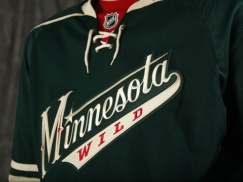
The new official pictures from the Wild offer us a better look at the new crest. Elements from it — such as the new stylized "M" — are set to make their way onto a bunch of new merchandise this season.

Here's a closer look at the front from the team's official photo gallery.

Minnesota Wild third jersey (photos by Bruce Kluckhohn)

In the previous leak, we never actually got to see what that "M" really looks like. Now that we have, I'm not so sure about it. It may grow on me but it just feels more Wild West than Minnesota hockey at the moment.

Back of new third jerseyThe new third makes use of the same numbering and lettering style seen on the red home jersey — the old third. You can see an example on jersey model Derek Boogaard here to the right.

This whole uniform very much lacks red — a plus, if I'm the one being asked. You see it very sparingly on the new crest and right at the collar behind the laces. Technically it's also on the gloves as well but that's just because players aren't going to get new gloves every time they wear a different jersey.

Even the socks are devoid of red, as you saw the in the leaked pictures this past week. The Wild's release had this to say about the new sweaters.

Based in the Wild’s Forest Green with Wheat trim and a hint of Iron Range Red, the jersey’s classic sports look was the overwhelming favorite of Wild fans surveyed during the summer of 2008. The jersey crest features a script “Minnesota” with “WILD” emblazoned below. The script look, including the classic “M”, harkens back to historic Minnesota teams of the past including Minneapolis and Saint Paul teams of the 1930s and 1940s. The familiar “north star” element, borrowed from the primary Wild logo, dots the “I” and adds a decorative detail to the stylized “M”.

“We wanted to provide our fans with a new look and feel for our third uniform that is uniquely Minnesota and true to our brand — authentic, classic, contemporary and truly worthy of The State of Hockey,” said John Maher, Vice President of Brand Marketing.

The new third jersey was designed by New York City-based SME and produced by Reebok, the exclusive provider of jerseys to all NHL clubs. SONY is proud to partner with the Wild for the introduction of the third jersey. Look for SONY high-definition displays throughout Xcel Energy Center beginning this fall.

Minnesota will debut the jerseys on Wednesday, Oct. 21 against the Colorado Avalanche on FOX Sports North and wear them 15 times this season (13 home games and two road contests). The Wild will continue to wear their original white jerseys for most road matches and their Iron Range Red jerseys for the remaining home games.

When/if the team releases a full third jersey schedule, look for it here on Icethetics.

Overall, it's an incredibly well-designed third uniform and should rank among the likes of the Penguins and Sabres in terms of current alternates. It may well rank among the best third jerseys in NHL history.

I'd like to do a complete ranking of all-time NHL third jerseys later this year after all of this year's new ones have been unveiled. Let THN try to stomp all over our turf, but nobody does logo/jersey tournaments better than Icethetics!