Entries in jerseys (170)

Thursday
Sep242009

Preseason Update

I'm taking a one-night detour from the Icethetics Season Preview to catch up on some news from around the NHL.

The Columbus Blue Jackets have a third jersey in the works, according to the Columbus Dispatch. Initially reported an online chat last Thursday, further confirmation came today via another session with beat writer Aaron Portzline.

The report include anything about elements of the design, just that it will make its debut for 2010-11 — meaning Icethetics is apparently not yet finished following third jersey news after this season.

First, the question posed to Portzline on Thursday, September 17.

[bucknuts07] Any word on the Jackets unveiling a third Jersey anytime soon?

[Portzline] It won't happen this season. But it's already in the works, I'm told, and it'll be out next season. They really like the current look and want to let it develop roots in the marketplace, which makes good sense to me. 

Also makes sense to me. But that didn't stop the Sharks, Lightning, Senators, Bruins or Canucks — all of whom introduced new logos in 2007 only to immediately launch new third jerseys the following season.

But everybody's trying to make a buck, as Portzline pointed out in Wednesday's chat.

[Moe Bartoli's Ghost] I would love to see the Jackets wear their white jerseys at home in order to see all the other teams colors, sort of like the Browns do. Any chance of suggesting this?

[Portzline] The NHL is always looking for ways to sell sweaters. (By the way, the Blue Jackets will have a third sweater next season, it looks like.) I don't know about always wearing the whites at home. I prefer the blues. As for the Browns ... those brown pants should be put away forever. 

I also agree with not wearing whites at home. Best move the NHL has made in the last several years. Why would you want your team to blend into the ice? Anyway, it's not even that great for most fans since the majority of teams wear red, dark blue or black at home.

It'll be nice to see the Flyers finally make that switch to orange this year. Lucky Wild fans will be treated to green sweaters for a handful of games this season. Unfortunately, there's not much else to look forward to until the Winter Classic — unless the Panthers whip out a yellow alternate.

Now onto our next subject. I get scores of emails every year during the preseason from irate Red Wings fans wanting to know why they've ditched the classic arched lettering style on the back of the jerseys.

The emails are already starting to come in again this year so I thought I'd head them off but informing the Icethetics public. First, see the following photo from Tuesday's game between Detroit and Philadelphia.

Chris Osgood in his preseason only sweater

So what's with the nameplate? It's the wrong font and it's not arched! Fear not, Wings fans. It will only last as long as the preseason. Once the regular season hits, everything will go back to normal. They do it every year.

Why? Glad you asked. First, think about what it takes to make an arched nameplate. Every letter has to be set and cut individually. An L in the middle of the name would be shaped differently from one on one of the ends. This requires extra time and energy on the part of the person in charge of that.

Now think about how many players see action during the preseason — certainly more than the 25 or 30 that may play during the regular season. As many as 50 or 60 guys can dress over the two-week span. And since the preseason doesn't really count anyway, why the hassle? 

They use a simple, straight nameplate to get through the September matches and the guys who actually make the team are treated to the fancy arched surnames in October.

I'm sure there was more I meant to write about tonight, but I cannot think of anything. If you've got any related questions, I'll expand this post tomorrow. Meantime, Part 4 of the Icethetics Season Preview will slide to Friday and Part 5 will go up on Saturday. Finally, a reason for you to visit Icethetics on the weekend!

Thursday
Sep172009

New Sweaters Abound!

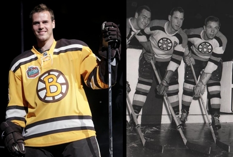
Big night for classic hockey jersey enthusiasts! The Nashville Predators unveiled their new third jersey as the Boston Bruins gave fans a first look at what they'll wear on New Year's for the Winter Classic — both with tradition in mind.

Let's start with my favorite of the two — the Bs' 60-year-old throwback.

A photo leaked last week but didn't really do this jersey justice. For one thing, I don't think it was clear enough that it's brown and gold. That's awesome! Nobody else wears brown. And it's used rather nicely here.

Check out David Krejci sporting the new threads.

David Krejci models the Bruins' 2010 Winter Classic sweater

I don't know. It may well be the best of the six Winter Classic jerseys — and that's some stiff competition. It barely beats out that Blackhawks jersey if you ask me. Just barely.

What we really need is a side-by-side comparison of the sweater it was based on, which was worn for a single season (1948-49) — to celebrate a quarter century of existence.

The Bruins are now just 15 years shy of their 100th anniversary. That's quite a bit of history. And there's no doubt in my mind they picked the best looking uniform for this event. By the way, I haven't seen any head-to-toe pictures yet. Anyone know if they're going with those classic socks too?

Leaked pictures take the wind out of jersey unveilings a little bit. I disappoint myself being part of that machine. Still, the Nashville Predators officially debuted their new alternate sweater for 2009-10 before their preseason tilt against Atlanta.

David Legwand, Martin Erat and Joel Ward gave fans their second look at the sweater — Taylor Swift having given the first one at a recent concert.

Legwand, Erat and Ward model their new threads (John Russell/Getty Images)

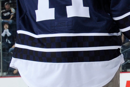
The big question you're surely asking: What of these wretched checkerboard patterns we heard about? Were they mere rumors? Sadly, I'm afraid not. Check out the close-up.

The checkerboard stripes

I mean it may not ruin the jersey, but it sure doesn't help things. Why are they there? They don't seem to serve any visual purpose as they're only visible up close when well-lit. But I've learned not to question what goes on in the Age of Reebok.

The jersey sticks with a classic numbering and lettering style in plain white and the primary logo on the front has undergone a bit of desaturation — now featuring only shades of blue. The shoulder patch features the now standard skull logo on top of its very own checkerboard pattern.

Icethetics reader Matt has provided these close-ups for us.

I think that covers it. The Icethetics Season Preview kicks off in just three days!

Tuesday
Sep152009

Baby Pens Unveil 3rd Jersey!

The AHL's Wilkes-Barre/Scranton Penguins have unveiled their third jersey for the 2009-10 season.

A picture of the new sweater was posted on the team's official web site recently. It's primarily black with heavy red and white horizontal stripes passing through the midsection.

In other words, it's the Chicago Blackhawks' Winter Classic/third jersey template sans the collar laces. Only the Pens managed to ruin it! (Didn't think that was possible.)

WBS Penguins third jerseyRegular readers know about my disdain for the baseless love the hockey world seems to possess for the Hawks' primary logo and jerseys. Why is it considered by so many to be the best? (None of your reasons will satisfy me so don't bother.)

Still, I was floored by last season's Winter Classic offering. That was a Blackhawks jersey I could get behind. I was even more impressed the decision to promote it to alternate for 2009-10. The more it's used, the better.

But nothing should be on the front of that jersey except for that classic Chicago mark — least of all this ridiculous penguin. Oh well. What can we do?

The team says the new threads will be worn for at least 10 home games this season. Interesting because the AHL usually wears darks on the road, right?

Thanks to Alex for sending in the link on this one. 

Monday
Sep142009

Sweater Switch '09: Part 6

Turns out the Sweater Switch series isn't quite over just yet. I realized there were some pictures I hadn't yet posted. Since it's been so long, for those of you who don't know, the Sweater Switch series is here to give you a first look at players wearing their new uniforms for 2009-10.

First, obviously, Alex Tanguay. He officially signed with my Tampa Bay Lightning back on September 1 and posed for photos with coach Rick Tocchet and GM Brian Lawton.

Rick Tocchet, Alex Tanguay and Brian Lawton

Tanguay opted for the No. 13 sweater this season, same as he wore last year in Montreal. But as he pointed out in the press conference, Tanguay's preferred number is 18. It's what he wore with the Flames from 2006 to 2008. Adam Hall has that one locked up in Tampa.

However, Tanguay may be best known for his No. 40 jersey, which he donned throughout his tenure with the Calgary Flames and Colorado Avalanche. Another Adam (Deadmarsh) had No. 18 back then.

Mike KomisarekMike Komisarek, one of a handful of new Toronto Maple Leafs has selected No. 8, as you can see in the photo to the right.

No surprises there as it's the same number he wore for six seasons with the Montreal Canadiens. Can't say what its significance is.

The last guy for Part 6 is Mike Knuble, who joined the Washington Capitals this offseason after four years in Philadelphia. As you can see in the picture below, he will keep the No. 22 sweater he wore with the Flyers.

Knuble began his career with No. 22 in Detroit for two seasons followed by two more with the Rangers. He then strayed for five years between 1999 and 2004, wearing the No. 26 jersey in Boston. At the time he joined the Bruins, Mikko Eloranta had No. 22.

Mike Knuble

If you guys can track down any new pictures before the season starts, I may be able to get in one more Sweater Switch post before the highly anticipated Icethetics Season Preview! (Kidding, no one's anticipating it.)

One more note. I have new concept art on the way. Look for it to be posted Tuesday or Wednesday.

Sunday
Sep132009

Amerks Unveil New Jerseys!

As expected, the AHL's Rochester Americans unveiled their new jerseys for the 2009-10 season at a press conference on Friday afternoon.

Basically, the Amerks are switching back to the same design they wore prior to the Age of Reebok. However, these are still Edge jerseys. Let's not get crazy now.

This photo was provided via the team's web site.

Rochester Americans unveil new jerseys

The Amerks were stuck with red jerseys when the change to Reebok was originally initiated.

Amerks' old red sweaterFor reference, to the right is a shot of Jason Garrison from last season. Clearly the threads above are a major improvement. Rochester has worn blue for as long as I can remember so the change was certainly odd.

Not only is the blue back, but the piping is gone from both sweaters and the horizontal stripes have returned. Guess Reebok decided to incorporate those lousy elements for no other reason than to promote themselves.

According to the web site, the blue road jerseys were last worn during the 2005-06 campaign. It's certainly nice to see that they're back.

One unrelated note now. The Icethetics Season Preview is just over a week away. It's a week-long event which you may remember from last season. Things kick off on Monday, September 21.

It's got everything you need to know to start the season — new logos, new jerseys — everything!

The next phase of the IceHL Project will be announced that day as well.