


Around the AHL, Again
 9 Comments
 Last week I said the Wilkes-Barre/Scranton Penguins would have their own post later in the week. Well that didn't happen.
The team unveiled three new specialty jerseys over a week ago, each of which pays tribute to a group of public servants who put their lives on the line every day. Photos were posted on Penguins' Twitter account.
I've also collected them here for your convenience.
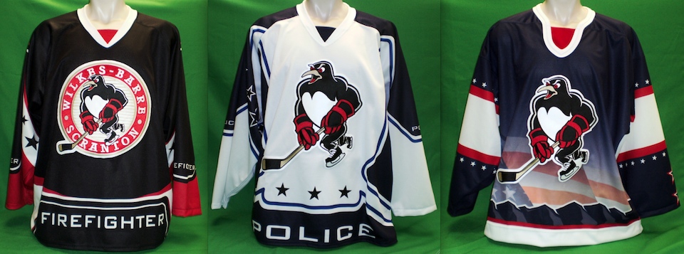 Wilkes-Barre/Scranton Penguins unveil firefighter, police and military jerseys
The firefighter-themed sweater (left) will be worn on Fri., Dec. 3 when the Pens host the Binghamton Senators, who will be wearing their police-themed uniforms that night.
The Penguins also have a police jersey (center) which will be worn once in Binghamton, presumably when the B-Sens will wear a firefighter sweater of their own. There will be one other home date for the Pens' police jersey, but no details have been announced yet.
Finally, the military jersey (right) will be worn on Sat., Feb. 26 when the Baby Pens host the Norfolk Admirals. I'll try to keep an eye on these dates so as to share game action photos at some point.
Thanks to Shawn S. for the tip on these.

 Sharks debut third jerseyThe Worcester Sharks have debuted their new 5th anniversary alternate jersey.
The new teal sweater is based on their NHL affiliate, the San Jose Sharks, with the anniversary logo on the chest. The uniform hit the ice for the first time on Oct. 23 when the Sharks hosted the Providence Bruins.
Something interesting I've noticed about Worcester's uniforms: While many AHL teams use their NHL affiliate's primary mark as a shoulder patch, the Sharks use shield version which isn't featured on any of San Jose sweaters — only the pants.
Not sure if these jerseys will be used beyond this season. Though if they are, the crest will need replacing. Maybe they can use that shield logo?

 Texas Stars' pink jerseyThe Texas Stars held their Pink in the Rink Night on Saturday.
They sported a special sweater to mark the event and unfortunately, this particular pink jersey has to be among the worst we've ever seen.
Maybe it's the shade of pink. Or the ribbon standing in for an A. Hard to be sure. And for the record, the Stars (6-3-0) lost 3-1 to the Houston Aeros (3-5-1) while wearing it. Coincidence?
If you're still interested in looking at this jersey, the Stars promoted the event with this rendering on their website for a time. My thanks to Brian G. for the tip.

 Milwaukee Admirals' pink jerseyIn stark contrast, the Milwaukee Admirals have put forth one of the best pink jerseys in recent memory.
Their Pink in the Rink Night was held Oct. 23 and they were actually successful, playing to a 3-1 win over the Abbotsford Heat. As is typical, the team is auctioning off the pink sweaters with proceeds benefiting a breast cancer research/awareness organization.
What's weird is that they have one autographed by Felicity Huffman that you can bid on. How random. (Ok, not really if you can read, but whatever.)
But back to what I was saying before. Brilliant job with this design. Sure it's pink, but it doesn't make a spectacle of itself or go out of its way to look feminine. It's still an ice hockey sweater, it just happens to be two-tone pink. Get over it.
Although maybe it's the pirate skull coloring my judgment. Also, it uses the same numbering style as the Tampa Bay Lightning did in the early days. Hm.
Thank you Kent S. for the tip.
That's really all I can muster for now. There should be another post coming soon dealing with more CHL third jerseys. Keep an eye out.

Reader Comments (9)
Oh man oh man, I've seen some bad Breast Cancer jerseys, but that STRS jerseys are the absolute worst of the worst.
The baby pens jerseys are 'interesting' I like the police one, it actually seems to have a bit of personality, while still looking like it belongs on a hockey player, and it's hard to judge the firefighter one without a good look at the sleeves. But if Anaheim and Tampa have taught us anything it's that sublimated jerseys are NEVER a good idea. That goes for you too Milwaukee.
Worchester needs to start wearing teal full time. The black road jerseys are just boring. But it's interesting that you point out the shoulder use of the SJ Shield logo. Worchester is a team that wears two different logos for home and away, and on their black road jerseys they use a W shield logo. Perhaps they just wanted to continue the theme.
A comment on the sharks shoulder patch-
I'm sure most of you already know this, but the Wolfpack/Whale wear the Lady Liberty logo on the shoulder instead of the regular shield.
Maybe it's just me but it seems like EMS always gets the short end of the stick with these tribute event things. Meh, whatever.
the firefighter and police jerseys should become full time. those are NICE
Can anyone explain to me why the Milwaukee brewers baseball mitt logo is on the admirals colarbone area? Is that logo on all their sweaters?
The Little Sharks need to stick to their habit of not using their big brother's orange in their uni's. Change that orange to grey and you've got a winner. I really dislike when minor league teams wear the same jerseys as their NHL affiliates.
Agreed, that STRS jersey is by far the worst Pink in the rink yet.
The Ottawa 67's one from last year is still the only really nice one IMO
The (former) regular Barberpole jerseys with pink replacing the red.
The brewers mit is on there because the owner of the admirals also owns part of the milwaukee brewers. its the same reason why they used to have grey away jerseys, like baseball.
I've seen the pink jerseys in action, the numbers are very hard to see. The script is a little too funky and thin for that color. Would be better if they were block letters or darker.
@ BRAD
The Admirals wear the Brewers patch because they were originally owned by a group including the Brewers, and are now solely owned by them.