The more we think we learn about unreleased jerseys, the more we find we really don't know a thing. I mean absolutely nothing.
 Another Winter Classic rumorAs a follow-up to yesterday's post about the Winter Classic rumors, it's been pointed out that UniWatchBlog had its own plausible speculation for the Pittsburgh Penguins. This new information found its way onto Paul Lukas' site on Thursday:
A little birdie tells me that the Penguins’ Winter Classic jersey will look like this: “Take the 1967 jersey (the diagonal Pittsburgh), flip the navy and powder blues, and put the circle logo with the ‘scarfed’ fatbody penguin on the front instead of the diagonal lettering. The numbers on the jersey will be rounded, as on the 1967 jerseys. It sounds like a hot mess, but in my opinion they’re very sharp.”
Almost immediately, Hockey Week put together the concept to the right. And just within the last 24 hours, Icethetics' own "little birdie" corroborates with the following note:
I wanted to give you a heads up that the powder blue jersey you just posted isn't the actual jersey. It's correct as far as the logo and number style goes, but the jersey body itself is identical to the 1967 jersey, only the body is navy blue and the trim is powder blue. ... The first thought is how similar it may look from a distance to Florida's alternate jersey. All in all, it's still very sharp.
What it really comes down to is this: we have to have patience. We'll wait and see what the Penguins unveil — now some saying it could be as late as November before that happens.
 If that doesn't have you scratching your head, this should.
All summer, Icethetics JerseyWatch 2010 has been reminding you that the Nashville Predators will have new home and road uniforms this year — elevating the third jersey and adding a white partner.
Then on Sept. 10, Chris Creamer of SportsLogos.net tweeted this:
@sportslogosnet Nashville Predators back off on new unis for 2011, pushed back to '12 #nhl #nashvillepredators
He cited an anonymous source previously used by Icethetics but try as I might, I haven't been able to dig up any other confirmation. By the way, to clarify, I assume he means they're backing off plans for 2010-11 (this season), pushing them back to 2011-12 (next).
 THN says Preds are changingWell that wasn't the good news we were hoping for but it was all well and good until Max B. posted on the Icethetics Facebook page The Hockey News was still reporting a change in the works on page 52 of their latest issue.
No. 6 NEW JERSEYS: Toronto and the New York Islanders revealed new duds this summer, while Anaheim is closely guarding its new third sweater, to be revealed in late November. Vancouver and Buffalo celebrate their 40th anniversaries with new gear, while Columbus and the New York Rangers also have new third jerseys coming down the pipeline. Also, look out for a purple and gold throwback from the L.A. Kings and a change in Nashville.
Now, if we're being honest, the Preds' mention does seem a little like an afterthought. But be that as it may, this is the current issue of THN and Creamer's news came more than two weeks ago. Who's got it right?
Here's the tally: Creamer says status quo, both Reebok and THN say a change is coming. That's 2-1 for the rumor. Nashville opens the season on Oct. 9. We'll know by then.
Update on Sunday · Sep 26 · 2010 | 6:23 PM PDT by
 Chris
Chris
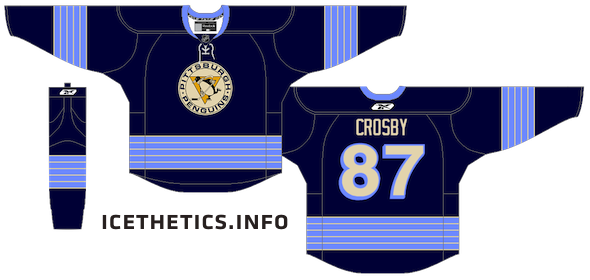
This story just keeps taking twists and turns. The Winter Classic jerseys posted yesterday in drawing form have turned up in photo form on a disreputable website that sells fake, cheap knock-offs of NHL products. I've blocked out the name of the site because I don't condone trademark infringement. Still, the pictures are worth a look.
 Knock-off jersey: Penguins
This is the alleged Penguins jersey. And our buddies at The Pensblog point out the design first appeared on the web about a week after the announcement of the 2011 Winter Classic. So that's not suspicious or anything.
There are so many reasons why these jerseys stand out as being counterfeit knock-offs; most notable is the lack of a Reebok label inside the back of the collar.
Still, if there's a chance they could have the design right, I wouldn't want to keep it off the blog. But like I've said, plenty of other sources say this is NOT the jersey. Who do we believe? No one. We just wait for something official.
 Knock-off jersey: CapitalsThis would be the alleged Capitals jersey. As I said before, anything else would be an utter shock. They may have details wrong and their reproduction of the Capitals' logo is horrid, but we get the idea.
And anyway the Washington Capitals will officially unveil their Winter Classic jersey on Oct. 2 so we'll know for sure within a week at least.
And once again because I want to be absolutely clear about this, THESE PHOTOS SHOW KNOCK-OFFS. They are NOT the actual Winter Classic sweaters. The designs, however, remain in question.


 The Dallas Stars are mulling the possibility of adding a green third jersey for the 2011-12 season, according to Mike Heika of the Dallas Morning News.