Green is one of the most neglected colors on hockey uniforms. It's a perfectly good color that, far too often, gets overshadowed by the likes of blue and red. But there's at least one day on the calendar when green rules. One week from today is St. Patrick's Day and hockey teams across North America are taking note with green-infused uniforms. Thought I'd take some time today to run down the list of what to expect.
NHL: New Jersey Devils

 Devils announce Retro GameSince 2010, it's become an annual tradition for the New Jersey Devils to sport their red and green retro jerseys on or near St. Patty's Day.
The tradition continues for the third year in a row next weekend as the Devils host the Pittsburgh Penguins. Icethetics reader Mike Iannaccone tweeted a photo on Wednesday from the Prudential Center that confirms this.
The Devils wore this sweater for the first time on St. Patrick's Day 2010 — also against the Penguins. (It was actually their first time wearing green since 1992 when it was replaced with black.) The Devils won that game 5-2, but were shut out 3-0 last year when they hosted the Capitals on March 18.
Devils GM Lou Lamoriello has made it known he has no interest in New Jersey wearing an alternate sweater on a regular basis, but if he ever changes his mind, this one is a classic.
ECHL: Trenton Titans
 Elsewhere in New Jersey, the ECHL's Trenton Titans will sport the green plaid for Irish Heritage Night when they face the Reading Royals.
But oddly, this Irish Heritage Night will not take place on March 17, but rather a week later on Sat., March 24. The promotion had to wait a week since the Titans will be on the road for St. Patrick's Day. But they wouldn't miss this opportunity.

In fact, when the Titans his the road next week, they'll be in Chicago. That takes us to...
ECHL: Chicago Express
 Chicago Express St. Patrick's Day jersey
 The ECHL's Chicago Express, currently embarking on their inaugural season, will celebrate St. Patty's Day with a special jersey as they host the Trenton Titans next Saturday night.
The Express's green-themed sweater is decidedly not plaid. In fact, you might say it's a little more... alcohol-y. If that wasn't a word I just made up, anyway.
The bubbles up and down the front and back of this jersey certainly make it look like the players will be giant green beers skating around. Though you'd be more likely to see that if you already had some green beers in you. That's all I'm saying.
The primary logo is normally navy and powder blue, but the standard colors have been swapped out for green and orange for this event.
For what it's worth, this jersey has all the bad design markers, from the black for black's sake right down to the illegible name and numbers. But they'll get auctioned off for charity after the game, so we'd all sound silly to complain.
While we're in Chicago...
AHL: Chicago Wolves
 The AHL's Chicago Wolves will wear their St. Patrick's Day jerseys for three home games over the next two weeks — though not on the actual day itself.
The jerseys are green with WOLVES arranged diagonally across the front in cream. Based on the image below, provided by the team, it looks like there will be a patch on each shoulder — one with a black shamrock and the year, the other with the Wolves' primary logo. As is the norm with these things, they will be auctioned for charity.

You'll note the jersey will be worn for home games on 3/14 vs. the Peoria Rivermen, 3/24 vs. the Hamilton Bulldogs, and 3/25 vs. the Houston Aeros but not on March 17. That's because the Wolves are traveling that night to... yes, Cleveland. Folks, you can't make up segues like this...
AHL: Lake Erie Monsters
 The AHL's Lake Erie Monsters will be wearing their St. Patrick's Day colors when they entertain the Chicago Wolves in Cleveland on March 17. Unfortunately, while they've made the announcement on their website, they haven't offered us any pictures of the "shamrock-filled jersey," as they put it.
But, you see, the Monsters may have won St. Patrick's Day simply by doing one thing. They're painting the ice green that night. Yikes. Here's what their press release says:
The Monsters will be celebrating St. Patrick's Day all weekend long, next Friday and Saturday, March 16th and 17th! We're teaming up with The Ohio Lottery to bring you the luck o' the Irish in back-to-back games at The Q.
The team will be wearing one-of-a-kind, shamrock-filled green jerseys both nights (which will be auctioned off at the games). Plus the ice will be painted green as well!
Along with the game against the Wolves, the Monsters will also trot out the St. Patrick's Day jerseys the night before against the Milwaukee Admirals.
Sadly, there's no clever transition to be had here...
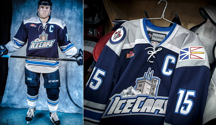
AHL: St. John's IceCaps
 The AHL's St. John's IceCaps will also sport green threads in honor of St. Patrick's Day. They're the only Canadian team on this list (that I know of).
The IceCaps are in their first season playing in Newfoundland after the Manitoba Moose were uprooted by the relocation of the Atlanta Thrashers to Winnipeg. The IceCaps are currently affiliated with the Jets.
The team has been holding drawings to determine which lucky fans will win these green jerseys right off the players' backs after the March 17 game against the Manchester Monarchs. Here's a look at that sweater.

I think that's all I've got for you today. If I've overlooked any St. Patrick's Day jerseys, let me know and I'll make the appropriate updates to this post.
Update on Monday · Mar 12 · 2012 | 5:02 PM PDT by
 Chris
Chris
As expected, I managed to overlook a handful of teams that plan to sport special St. Patrick's Day jerseys this weekend. We'll begin this update in Texas...
AHL: Houston Aeros

 Aeros' St. Patrick's Day jerseyThe AHL's Houston Aeros are among the few teams that wear green on a regular basis. But on Saturday, they're doing it a little differently.
We got our first look at the team's special St. Patrick's Day jersey this morning by way of Aeros winger Jon DiSalvatore, who tweeted this picture (right). DiSalvatore's tweet was later confirmed by the team through Twitter.
Though the tweets don't specify exactly when the jersey will be worn, March 17 is a safe bet as the Aeros host the Abbotsford Heat. They're also at home against the Rockford IceHogs the night before, for what it's worth.
Interestingly, this jersey appears to feature an argyle pattern (in a gradient no less) which is somewhat unusual. I'm pretty sure argyle originated in Scotland.
Then again, so did plaid for that matter. Or tartan patterns, which are a type of plaid but commonly just referred to as "plaid." (See the Trenton Titans jersey above.)
I realize those last two paragraphs were pretty nerdy, but St. Patrick's Day is an Irish holiday that we're borrowing, right? And while the clovers are certainly relevant, I'm not sure the Scottish jersey designs are.
Anyway, I don't really care about that, it was just something I noticed and wanted to point out. My thanks to reader Chris Fraterrigo for letting me know about this today.
All right, so I'm attempted another neat segue here. This Aeros jersey was first shown to us by Jon DiSalvatore, who is originally from Maine — which happens to be where the Portland Pirates play...
AHL: Portland Pirates
 Another team doing the green thing this St. Patty's Day is the AHL's Portland Pirates. And for them, Green Night is not just a time for a new jersey color but altered logo colors as well.
For one night only, the Pirates will swap the red and silver in their logo for green and gold when they face the Bridgeport Sound Tigers at home this Saturday. They've even altered the the colors in their NHL affiliate shoulder patch. In fact, the patch used in this jersey is normally seen on the Phoenix Coyotes' third jersey. The Pirates wear the Yotes' primary logo on their regular home and road uniforms.
The design was posted for all to see on the Pirates' official Facebook page.

It looks like there's enough space underneath the wordmark on the front to fit a uniform number. But as this is a design sample, I can't say for sure. I'll keep an eye on it this weekend.
Got to squeeze in a shout-out for commenter Frank C. for keeping us in the loop.
AHL: Wilkes-Barre/Scranton Penguins

 Baby Pens' St. Patrick's Day jerseyThe AHL's Wilkes-Barre/Scranton Penguins don't miss an opportunity for a specialty jersey. And March 17 is just an excuse for one more.
Right off the bat, I have to express my disappointment with the lack of creative originality with the crest design. (Visit Google Images and search "four leaf clover" and take note of what you find in the top 10.)
I realize it's just a simple clover for a one-off jersey design, but it isn't that difficult to draw a four-leaf clover. And if you're going to nab one from the web, does it have to be the first one that you spot in an online image search?
This is turning into the tartan/argyle rant all over again. It doesn't really bother me that much but it's still worth mentioning.
We have a pretty bare-bones jersey here, as you can see. It's based on the Minnesota Wild's red home sweater. There's not a lot to it, but of course it does have its share of green.
This preview (right) of the sweater design was posted last month on the Baby Pens' official Facebook page. My thanks to reader Eric Rodgers for letting me know about it.
We've got one more from a different league...
CHL: Wichita Thunder

 Wichita Thunder's St. Patrick's Day jerseyThe Wichita Thunder of the Central Hockey League will be among the many North American hockey teams donning green this Saturday.
The Thunder showed off the design via their official Facebook page back on Feb. 27. It features a recolored version of their old logo — similar to what they've been using on their uniforms this season to celebrate their 20th anniversary.
On Saturday, the Thunder host the Arizona Sundogs. (Damn. Just realized the Sundogs are affiliated with the Coyotes and Pirates. I think I could've finagled a decent transition before the Baby Pens if I was up for rewriting this post.)
Wichita's colors are normally black and blue but they're going with forest green and bright orange for St. Patrick's Day.
One final shout-out goes to commenter Jason S. who let us know about these jerseys in Wichita.
And this is where I leave you (again). If I've left out any of the teams that are celebrating the color green next weekend with special sweater designs, you know what to do.
Update on Friday · Mar 16 · 2012 | 10:43 AM PDT by
Chris
Two more teams to add to the March 17 madness tomorrow.
NHL: Dallas Stars

 Dallas Stars' St. Patrick's Day warm-up jerseyThe Dallas Stars are set to take the ice prior to tomorrow night's game wearing green practice jerseys emblazoned with Irish-ified nickname nameplates.
For example, Alex Goligoski's sweater calls him O'Goose. Brenden Morrow is O'Morrow. In fact, the whole team is doing it.
Here's a list of some other Irish-themed Stars names:
- Stephane Robidas — O'Robi
- Trevor Daley — O'Daley
- Jamie Benn — McChubbs
- Adam Burish — O'Legend
- Toby Petersen — FitzPetie
- Radek Dvorak — O'Devo
- Loui Eriksson — O'Loui
- Tom Wandell — O'Wandy
- Eric Nystrom — Guinness
- Adam Pardy — O'Pardy
- Mark Fistric — McCrush'em
- Steve Ott — O'Daddy
- Kari Lehtonen — O'Lehts
- Vernon Fiddler — McFiddler
- Sheldon Souray — O'Hammer
- Mike Ribeiro — McRibs
- Michael Ryder — O'Rydes
I think McRibs may be one of the funniest.
It's a neat little promotion the Stars are doing and as is typical with these things, the jerseys will be auctioned off after the game to benefit the Dallas Stars Foundation.
ECHL: Stockton Thunder
Also joining the fun will be the ECHL's Stockton Thunder as they sport green lightning bolts tonight and tomorrow night. "Easy Being Green" is how the event is being marketed, but Zeus is wearing a leprechaun's hat and a shamrock on this jersey so let there be no mistaking it's really all about St. Patrick's Day.
 Stockton Thunder's St. Patrick's Day jersey
Thanks to Wade B. for the tip.


 Photos from St. John's IceCaps
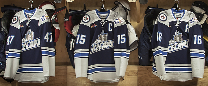 Photo from St. John's IceCaps
 Photos from St. John's IceCaps (via Facebook)
 Photo from St. John's IceCaps