Entries in thirds (94)

Friday
Jul242009

O6 Style for Preds 3rd

The Nashville Predators will be among a half-dozen teams to debut third jerseys in the fall. Now we're getting more information on that subject from Tennessean beat writer John Glennon.

In his blog Inside Predators, Glennon wrote about yesterday's Skate of the Union Address at the Sommet Center. The first two paragraphs are all about the team's upcoming alternate sweater.

Preds owner David Freeman said the team’s new third jersey is likely to be revealed publicly in September. He described it as a very traditional-looking jersey, with a design that "came purely from some of the original six teams."

Freeman said the third jerseys will frequently be worn at home on Saturdays. Nashville has 15 home Saturday games this season.

Good news for a team that has all too commonly been the butt of jersey jokes, with its attempts at being cutting edge. After all, at just over 10 years old, it's not like the Predators have a lot of tradition to draw on. The "mustard jersey" was certainly memorable but I'm not sure how fondly it will be held.

It'll be interesting to see what "traditional-looking" Original Six elements designers will borrow for this new uniform. I'm anticipating a common color like blue, more horizontal lines and a simplification of the color scheme. That would fit well with the alleged leak I posted a few weeks ago.

In addition, we now have an unveiling date to look forward to. As with the Wild, the third jersey is expected to be unveiled in September. Of course if anything comes out any sooner, count on Icethetics.

By the way, the Predators web site has undergone its' change to the new league-wide format.

Thursday
Jul232009

Old Leak, New Look for Wild?

Tonight's post is in reference to a link I offered up yesterday on Twitter. If you haven't had a chance to check it out yet, take a look.

Depicted there are seven Minnesota Wild jersey concepts purported to be actual prototypes for an alternate sweater the team put forth in focus groups way back in 2001.

At that time the Wild had barely played a season but team management was already looking into the possibility of a third jersey. It would be 2003 before the Wild actually debuted one, but it was on their radar even then. And if you look at image #3 in the linked gallery, it's nearly the same design but with the green and wheat swapped and without the alternate shoulder logo.

Alternate jersey #3

Without vouching for the veracity of these unverified images, what's interesting to me is that prototypes #1, #2 and #6 all feature a script across the front of the jersey. Two days ago, Wild beat writer Michael Russo of the Star Tribune said he'd seen pictures of the new alternates, they're green, and the team name is written in a script across the chest.

Alternate jersey #1

Try to imagine the red swapped with green. Could we be looking at an earlier version of the Wild's upcoming third jersey? And if so, what do you think? Does the script suit the classic look Minnesota strives for? Or does it fall flat and ruin the club's aesthetic?

One thing I want to make note of that makes me question whether these are legitimate prototypes. If you look closely at the shoulder patches on both of these designs, the logos are upside down. A simple mistake for a design firm on unofficial artwork? Perhaps, but it's worth pointing out anyway.

Later tonight, I'll try to throw together a green version of Alternate jersey #1 so we have a better idea of what we're seeing.

Tuesday
Jul212009

Wild Unveiling 3rd in September

We've got some exciting third jersey news in this afternoon. I use the term "exciting" loosely, as any news is pretty "exciting" at this point in the summer.

Icethetics reader Josh used that ubiquitous new medium, Twitter, to gather some new information with regard to the Minnesota Wild's new third jersey. He asked Star Tribune beat writer Michael Russo if there was an announcement of some kind in the works.

According to Russo, the unveiling will take place during training camp, which is typically in early to mid-September. (The Wild's preseason schedule kicks off on September 15 in St. Louis.) He says he's seen them and he likes them. I think it's safe to say that bodes well for everyone.

Russo went on to tell Josh that, based on the pictures he's seen, the new sweater will, in fact, be green with a "cursive" script across the front that reads "Minnesota Wild." In other words, NOT what previous "leaks" would have you believe.

Stick with Icethetics for all the newest information as we continue to track third jersey news throughout the summer (and fall if necessary).

Friday
Jul032009

Claims of a Predators Preview

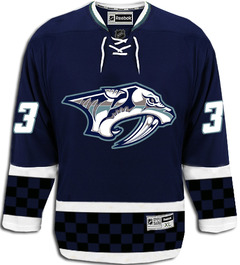
I'm normally opposed to posts based entirely upon rumor, but I can make an exception in the name of a slow news day. Yesterday, a commenter called LF3240 left us a couple of links to interesting message board threads that explore potential third jersey options for the Nashville Predators.

I'll start with the realistic and slowly move into the silly. To start, a user at HFBoards (echlfreak) claimed to have had an "inside look" at the new alternate sweater. Whether this is true or wishful thinking remains to be seen, but I'll take a page out of CNN's book and report on the reports of others for a moment.

The following is that user's description of the jersey, verbatim.

There is no yellow or gold at all. They have brought in a steel grey, same blue color and some other shades of grey to the logo. Same Pred logo...just different color scheme.

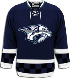
The arms and bottom have two white stripes separating a thick middle stripe. The middle stripe is black and blue checkers. Tie on the front.

Thats it. Looks cool from far. But, the checkers is kind of dumb up close. From far away the checkers are not noticeable.

That spurred another user to create the following concept design.

I'm not a fan, but then it's not geared toward me. It's more for the Nashville/NASCAR fan, I think. (The checkered pattern?) What I do like is the simplified color scheme. However, echlfreak replied, "The checkers are only two rows and the Pred's eye is red." Mulligan.

Not much different, but also not any better. Typically a lot is lost in translation when people get a quick glance at a new sweater. So we'll just have to see when in comes time for the Preds to release the real thing.

The aforementioned message board threads also featured a handful of other concepts based on what fans are hoping for. Two stuck out for me — both featuring the relatively new saber-toothed skull logo. The first is based on a more traditional striped look.

The other looks like something you might seen on someone working in a construction zone.

Philadelphia can get away with orange. Maybe even the Ducks one day. This concept convinces me the Predators should never attempt it.

I wish I had more to offer tonight. But unfortunately, rumors reign when facts are few and far between. Take all of this with a grain of salt and believe none of it until you read the word "official" in the Icethetics post headline.

And Happy 4th of July!

Page 1 ... 15 16 17 18 19