Entries in washington capitals (17)

Tuesday
Mar012011

Worth a Thousand Words

The Icethetics-related news really tends to dry up this time of year, but I hate to let the blog dry up with it. So I'm declaring today Picture Day. Later this week, I'm planning an update to NHL JerseyWatch 2011. But for now, I'm just offering some things to look at. Feel free to add your comments at the end.
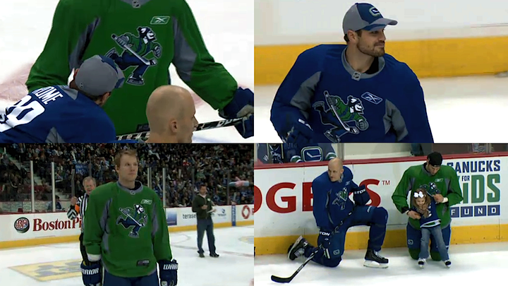
Canucks sport new practice threads at SuperSkills / Vancouver Canucks

For those that missed the Facebook post, over the weekend the Vancouver Canucks were wearing special practice jerseys at their SuperSkills competition, featuring the updated Johnny Canuck logo. It was Team Blue vs. Team Green and these sweaters made it clear that logo doesn't belong on the front. Maybe the shoulders. But definitely the helmet, where it already is on the alternate uniform.
2011 NHL Winter Classic / Pittsburgh Penguins

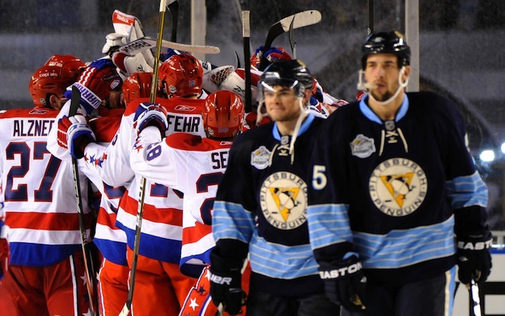
It's a shame I haven't posted pictures from any of the outdoor games yet. Way back on New Year's Day, we all saw the Washington Capitals defeated the Pittsburgh Penguins on their home turf. (Haha, turf.) If you've been following along with the Jersey Gallery updates, you've seen the Caps' uniform, but I haven't gotten around to the Penguins yet.

I'm torn on it, by the way. Dark blue just doesn't work for the Pens. I think I like the '08 version better. Still...

Dan Bylsma coaching at the 2011 Winter Classic / Pittsburgh Penguins

Nobody rocks a hat like Dan Bylsma. 
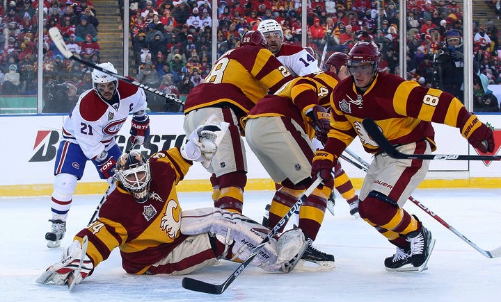
2011 Heritage Classic / Calgary Flames

You know what, I'm only all right with this because it was one game. But let's not do this anymore, Calgary. Let's not look like a skating advertisement for a Big Mac. It wasn't a good look a century ago and it isn't now. Even more disappointing than what the Flames wore was what Montreal wore. They're the Habs and they're classic but they've got an entire arsenal of throwback jerseys from a hundred years ago. Why not?

Miikka Kiprusoff in a cloud of snow / Calgary Flames

So many thoughts on this one: Is there supposed to be a goalie hiding in there? ... This is what I imagine to be the Canadian version of walking around with a raincloud over your head. ... If any player could just manifest a cloud of snow around himself, it would make cherry-picking a lot easier. ... Goalies are not born; they simply appear after a snowstorm. ... Should I stop now? ... Abominable goalie? ... Yes, stop? Okay.

WHL's outdoor game / Dylan Lynch

The WHL's Calgary Hitmen and Regina Pats borrowed the temporary ice rink at McMahon Stadium just prior to the Heritage Classic. And like their NHL counterparts, they sported retro-style sweaters. They're pretty much the same jerseys, just in different colors. Spooky.

Canucks' hall of sweaters / Vancouver Canucks

And we'll finish where we started — Vancouver. I'm sure Canucks fans are well aware of the sweaters hanging outside the team's locker room, so you can ignore this. For everyone else, how cool is this? From the Vancouver Millionaires on through to the orange third jersey from the '90s, they have a very rich and very colorful uniform history and it's nice to see they don't bury it and pretend it never happened.

That's all. If you've got any pictures you'd like to share, shoot me an email.

Saturday
Oct022010

Caps Unveil Winter Classic Jersey!

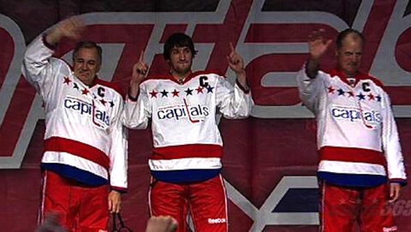
Washington Capitals unveil their 2011 Winter Classic jersey

No surprises here.

The Washington Capitals unveiled their 2011 Winter Classic sweater today at the Capitals Convention. As anticipated, the Caps will wear their 1970s throwback jerseys.

W.C. jersey from behindThe original design has been modified to fit the Reebok Edge style which includes an NHL logo at the front of the collar. The jersey is white with a red shoulder yoke and the vintage logo emblazoned across the chest and six blue and red stars aligned above it.

There are blue and red stars running the length of the sleeve from the number to the wrist. The heavy red, white and blue stripes around the bottom of the sweater would be perfect but for the curved hem of the Edge design.

Outside of that, it looks just like what the Capitals wore from their inception in 1974 until 1995 when the dumped they red, white and blue color scheme for dark blue, bronze and black (personally, my favorite era until the black jersey came along).

What do you think? Did the Caps hit the mark here with a simple classic for the Winter Classic?

Saturday
Sep252010

Penguins Winter Classic Preview

The Pittsburgh Penguins are preparing to unveil their brand new 2011 Winter Classic sweater, according to the Tribune-Review.

An article published this morning goes into little detail about the new threads, except to say that they're blue and the scarf-wearing penguin will finally see its way onto a sweater. The story is more of a retrospective on Bob Gessner, the man who created that original Pens logo.

First, the good bits in a quote box:

A new blue-colored alternate uniform is soon to be unveiled by the team. It will debut at the outdoor game against Washington, and the Penguins plan to adopt it next season as a "third" uniform. Also, the first day of 2011 will mark the first appearance of the Penguins' original logo on a uniform.

If you managed to catch my radio interview last weekend, you heard me make a bold prediction I didn't have much basis for. That being, my guess is the Penguins will go with a mish-mash jersey, like the Bruins did at the last Winter Classic.

Rather than recreating a past look, I wouldn't be surprised if they combined elements of several looks and got a little creative with it. Based on this article's assertion that the 1967 scarfed penguin will be on the jersey, it sounds like I could be right. How rare.

There's no date set for the unveiling, but the story does say the new sweater will "resemble uniforms worn by Mario Lemieux's son's local youth team." If anyone reading is involved with that team, maybe you have a photo or two you could provide to give us an idea of what to expect.

For the record, a quick Google search turns up this photo of Austin Lemieux's team in action from February 2008. They are wearing the Pens' current third jersey — which debuted in the NHL just a month earlier at the 2008 Winter Classic. Perhaps they've redesigned their uniforms since?

Anyway, this post is already getting long so I won't harp on the last bit. If you want the inside scoop on the design of the Penguins' logo, you should really read the rest of the article. Gessner says he never liked the scarfed penguin and he doesn't think he'll be impressed with the new sweater.

Tuesday
Jul272010

Winter Classic Logos Unveiled!

At a press conference this afternoon, the NHL unveiled the logo for the 2011 Winter Classic along with the retro logos to be used by the Washington Capitals and Pittsburgh Penguins.

The outdoor game will take place on New Year's Day at Heinz Field in Pittsburgh. The logos were revealed on giant digital screens at the football stadium, which is normally home to the NFL's Pittsburgh Steelers.

Unlike past Winter Classic logos, which have typically used a neutral color palette, the 2011 mark seems to feature only the colors likely to be found on the Penguins' Winter Classic throwback uniforms. To be fair, though, these are the colors most associated with the city of Pittsburgh itself.

And based on the news conference, it seems everyone in Pittsburgh is very excited to be playing in the NHL's most publicized regular season game for the second time since 2008 — though this is Crosby & Co.'s first time hosting.

A staple of the Winter Classic since its inception has been retro logos and uniforms. Every team involved has looked into its past for something special to wear. This year will be no exception.

The Pittsburgh Penguins will call back to their inaugural season, 1967-68 — for the logo at least. The uniforms won't be revealed for either team until the fall. The mark features the original skating penguin wearing a scarf, all set on a "vintage" white.

The use of this logo suggests the Penguins will also wear their inaugural uniforms, which were light blue with PITTSBURGH in diagonal text across the front. Again, we'll have to wait for the fall, but this is probably a fair assumption.

The Washington Capitals will also look back to their inaugural season, 1974-75. The logo is the original script mark used from the team's inception until 1996. The Caps' current logo, in use since 2007, is call back to this mark.

With the expection of the first Winter Classic in 2008, the host team typically wears the dark uniforms, with the visitors in white — as is standard in the regular season these days. That means the Capitals will likely wear their original white sweaters.

Of course talk about Winter Classic uniforms is speculative and premature, it's easy to make educated guesses based on history. I'd really be surprised if we get anything different — though I was definitely surprised by the Bruins last year!

The Capitals will officially unveil their Winter Classic uniforms on Oct. 2 at the Capitals Convention. The Penguins have said theirs will also be unveiled some time in the fall — no specific date just yet. You can read more about today's event at NHL.com.

Wednesday
Jun302010

Caps Sued Over Weagle

Designer claims infringementA few weeks ago a lawsuit was filed against the Washington Capitals for copyright infringement. Apparently, a fan from Vienna claims the team's new secondary logo, introduced in 2007, was his idea.

Here's an excerpt from an article in the Washington Business Journal from June 18:

Chris Joannou claims he started tinkering with the Caps’ old logo in his spare time in 1993. He sent the team an unsolicited drawing of an eagle and the Capitol dome embedded in a hockey stick. Very Pittsburgh Penguin-y, but the late Abe Pollin, the Caps owner at the time, allegedly acknowledged the design in a July 1993 letter.

“Very creative, very bold, and I like it,” Pollin supposedly wrote. “We haven’t thought of changing the Capitals’ logo or name; but, if and when we do, your logo will certainly be given consideration.”

A couple of years later, Joannou alleges, he showed Caps officials two versions of another proposed logo, this time with an eagle astride the Capitol building, its wings outstretched in a “W” shape.

The law firm Stueve Siegel Hanson are representing Joannou and included another version of the Weagle logo in their complaint. What do you guys think of them?

Lawsuit logo comparison

It's worth noting there is a reason most pro sports teams don't accept unsolicited artwork. Crap like this. I'm not discounting Joannou's claims. Maybe he created this in the 90s, maybe he didn't. Maybe it's similar, maybe it's not. That's for a judge to decide. All I know is that if you give someone artwork without any prior agreements, you're just setting yourself up for problems.

If you find yourself wanting to submit artwork to a team, I highly recommend first reading this post about unsolicited artwork over at PuckDrawn. Johnny's got a lot of great information there for logo designers, including an Idea Submission Form.

Meantime, I'll try to keep an eye on this story and see where it goes. The Weagle is possibly one of the most popular secondary logos in the NHL. It would be a shame to see it disappear.