The most important events of the off-season calendar are behind us. The Stanley Cup has been awarded. The prospects drafted. And now the biggest day of free agency is at an end with players like Mattias Ohlund, Nikolai Khabibulin, Marian Hossa, Dwayne Roloson and Marian Gaborik finding new teams.
Now more than three months away from the new season's debut in Europe, what does that leave us to look forward to this summer? New third jerseys, of course. I have to be honest and up front when I say that this post isn't so much about disseminating new information as it is creating a reference for what's to coming in the next several months.
Ever since the revival of Icethetics, I get emails every day from folks asking if a certain team will be getting a new third jersey this year. This post will contain all the information I have and any predictions or expectations I'm willing to share — presented alphabetically.
 Calgary Flames. The days of the flaming horse head are clearly behind them, however that very design does indicate a willingness on the Flames' part to experiment with alternate logos. If you remember, last September I wrote about this very subject.
At that time, Flames president Ken King said the sweater design was being finalized and that there would be a departure from the Flaming C. What sort of a departure remains to be seen. He also hints that the jersey will be black, but that's no surprise considering the team already wears red and white.
King was confident fans will embrace the alternate look and I'm sure I speak for most of us here when I say I can't wait to find out.
 Chicago Blackhawks. As previously reported, the 'Hawks have said their Winter Classic sweater will be used in games with roofs beginning in 2009-10 as it takes on the new role of third jersey — banishing the old black one.
For the first time, I will have absolutely nothing bad to say about a Blackhawks uniform. I'm sure many of you will appreciate that.
 Colorado Avalanche. Icethetics last reported on a future Avs third jersey back in December when a Denver Post writer indicated the team's plans. The article didn't go into detail about the design, but rather expressed a hope that it would include some sort of Quebec connection. Not a bad idea now that the Avalanche are playing more like the Nordiques.
But I digress. I would expect to see a burgundy alternate much like what the Avs wore until the Age of Reebok. However, I'm not sure how well the diagonal text would work after the issues the Rangers had with the EDGE cut. And personally, I'd rather see Colorado go in a different direction. Pun.
 Florida Panthers. We have little information on the Panthers, but they are expected to be one of a handful of teams to debut new thirds in the fall. I fully expect more of the same from the Cats. In other words, a red sweater with the logo that features a stick-biting panther.
If the Panthers were to try to exceed my expectations, they might try something completely different. Perhaps a new logo featuring the profile of a big cat on a red jersey with a unique design. But I think we all know not to set our goals too high.
 Minnesota Wild. Green will make its glorious return! Gone for just a couple of seasons, it's my understanding that the Wild will use this opportunity to relaunch the green sweaters for their 10th anniversary season.
I imagine design will be much like the current road uniform. And despite that, I hope it doesn't overtake their red one anytime soon. Despite its ubiquitous color, it's got that classic hockey feel that we just don't get to see much of anymore.
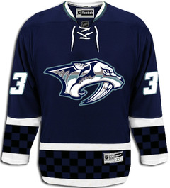
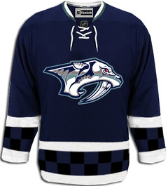
 Nashville Predators. The Preds officially announced plans to release a third sweater back in March during my leave of absence. So I'm telling you about it now. The article tells us that the old "mustard jersey" it describes as both "revered and reviled" will not be back. (Between us, I think they were playing it fast and loose with the definition of one of those words.)
Then Preds Business Ops President Ed Lang started speaking incoherently. "I don’t want to give too much away," he teases, "but ours will be kind of a mix between a traditional and a retro look." If anyone knows what that means, you know how to get in touch.
It's almost like he said it's going to be cobalt crossed with denim. Why don't we just call it "faded blue"? Speaking of which, that brings up an important question. If mustard is out, what color will this new sweater be? Grey can be done right if done carefully.
We're told to expect the debut of the new threads prior to Christmas. Hint, hint. You can even get one for free if you're willing to shell out for season tickets.
Those are the only teams who have talked officially about bringing third jerseys into the mix this year. I've said it before, but I'm really hoping the Rangers and Capitals get on board. We could use a blue Weagle sweater and Lady Liberty needs to be free again. But that's just my two cents.
 However, you may recall the Detroit Red Wings recycled their Winter Classic jerseys for their final game last season against the Chicago Blackhawks. Icethetics reader Bill writes in wondering if this could be an indication from the club that they are in fact open to an alternate sweater.
I sure wouldn't mind seeing it on the ice more. The Wings have said nothing publicly about this so as always, we'll just have to play that wait-and-see game.
What's left? The New Jersey Devils, who have never worn a third jersey, the Anaheim Ducks and Columbus Blue Jackets have announced no sweater-adding plans. The Montreal Canadiens still have a couple more 100th anniversary throwbacks to debut this season.
You are now up to date on what to expect in terms of third jerseys as we press on this summer. And of course, keep checking back for the latest news and updates.
By the way, if you haven't been by lately, check out NHLUniforms.com, which is now called the Hockey Uniform Database. It has recently been given a facelift and is cooler than ever.
 Friday · Jul 3 · 2009 | 9:18 PM PDT
  20 Comments
  I'll start with the realistic and slowly move into the silly. To start, a user at HFBoards (echlfreak) claimed to have had an "inside look" at the new alternate sweater. Whether this is true or wishful thinking remains to be seen, but I'll take a page out of CNN's book and report on the reports of others for a moment.


