Wednesday
Aug222007
Senators Unveil New Uniforms!
 Wednesday · Aug 22 · 2007 | 3:34 PM PDT
  96 Comments
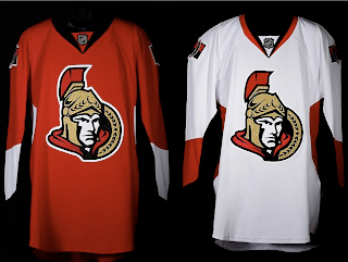
 The Ottawa Senators' new Rbk EDGE uniforms are here! Please view!
But wait, it gets better. Want to see Chris Neil, Brian McGrattan, Jason Spezza and Chris Kelly posing for a photo in their new threads? Look no further.
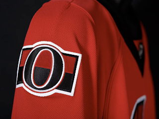
That's really all I got. The Sens unveiled their new sweaters at Scotiabank Place in front of the media and fans. Count them as the tenth team on the list. Before I go, I'll leave you with a close-up of the new shoulder logo.
Enjoy your night and be sure to check out my official Rbk EDGE gallery for all the photos I can find of these new jerseys!


Reader Comments (96)
i like the idea of the shoulder patch but it is too plain and boring and bad like the rest of the jersey.
http://nhllogos.blogspot.com/2007/08/revisiting-senators.html
that shoulder patch is much better IMO
I love them. I think they look fantastic. The new logo is bolder, meaner, and stronger looking than the old Senator Soldier. The retro O with the red and black stripe is a nice touch harkening back to the original team.
They aren't circus-y like the Islanders, Panthers, Predators and instantly become one of the best looking jerseys in the new crop.
I'm amazed at all the negative comments I've read so far. It really makes me wonder what y'all think would be a "good" jersey.
Im happy.
Like the 3rd red jersey, and the 3rd black....it will take time to LOVE them...but im happy.
Simple is sooo much better. The worst part about the red and black was thhey were a little busy.
They are very modern looking, but moreso than any other sens jersey are reminicent of the barberpoles. The socks really do this, as do the pant stripes.
Cant wait to get one!
I think they look great. I think the pissed off "3D" centurion looks much better than the profile version. I'm glad he's the official primary logo now. While I think the secondary logo is cool in that it pays homage to the Original Sens (1884-1934), it does look out of place. Maybe they should have put the profile centurion on the shoulders as a secondary logo instead.
they look pretty good so it'll be ashame when the flyers come to town and dance the pants off of 'em. i hate the sens.
Pretty Plain looking jersies wheres the GOLD??? one of the concepts on this site was real nice and mean looking...
this one looks way better lol!
http://bp1.blogger.com/_r8tWGVHrjGI/RrDzV9B0YJI/AAAAAAAAA6Y/kovVFEYQc2k/s1600-h/senatorsmishmash.jpg
You people are impossible to please. They go for a simple, classic look (unlike florida and nashville) and the majority of you ball your eyes out. The logo gets slightly tweaked, an suddenly you think it becomes preschooler material. These jerseys are the best new ones I've seen so far (except for boston whose design isn't really new). They could have done far worse, i.e. Islanders.
ok you have to be a moron not to like these jerseys. those jerseys are crazy nice. i love the sides and the logo is very sharp.
http://senators.nhl.com/team/app/?service=page&page=MediaGalleryPlayer&galleryId=2214
http://senators.nhl.com/team/app/?service=page&page=MediaGalleryPlayer&galleryId=2224
the old reds (?) were the worst jerseys in the history of the league. Definitely an upgrade.
But is it me, or do all the Edge jerseys feature logos that are freakin' ginormous?
i think the new logo and jerseys are both very sharp. the shoulder patch is also creative and a nice nod to the team's history. but, as some people have already noticed, the jerseys just don't seem to look good on the players with the equipment on and all.
is it me or are the numbers on the back of the jersey ginormous? other than that i think they look pretty good.
I finally figure out why all these "new" jerseys look so weird and ugly. It sbecause for 90% of them, they left the bottom of the jersey without any stripes or anything which were traditionally on all the old jerseys. That made the "new" jerseys have too much space of 1 colour from the logo down making it very plain looking !
Not a bad looking jersey. The shoulder patch is stupid though. While Ottawa fans will say it's an 'O' for Ottawa, others will say it's a zero, as in 'zero Cups'.
I think the reason the new RBK jerseys look weird on players is because the jerseys are tighter around the shoulders and torso area but then flare out around the hip area to cover up the much larger hip pads on the pants. I think it makes them look like they have wide hips (like a woman). The old jerseys were bigger and more flowing, so it went straight down from the shoulders to the hips
A little bit too plain for my liking...i actually preferred some of the fan concepts over this design...and they look like practice jerseys! awful!
After looking at the jerseys again, after a couple hours, I really really like the white jerseys.
wow, they look akward on the players, the sens will look real bad on the ice
I love these! They were able to create something new and modern while keeping the same sort of vibe as their last uniforms. I love the little tribute to the old Senators with the shoulder patch. Maybe it will give the Sens some Stanley Cup karma.
Actually, I didn't like them at first because I never really warmed to the logo and I thought the jerseys were boring, but I think simpler is definitely better. They didn't make it too messy and complicated with pointless colour blocking and piping and the arms at least have some visual interest.
I have to say, I thought it was great they used the old school silver sevens logo for the shoulder patch.
All I can think of when I see these is Adam Sandler singing 'Red Hooded Sweatshirt' on SNL... why, check out the colar/neck of the warrior dood.
lol
I like them. I'm apprehensive, but I like them. Wish they had a bit more black/gold, and had kept the side profile of old to some capacity, but I like them.
Love the heritage shoulder crests.
they look good on the hangers, but not on the players. those guys look fat!
The look metrosexual. Which is exactaly what I was affraid of. Where's the fucking bottom!?
i luv the way the jersey looks when noone is wearing them but it looks awful on players
i don't care how much this will reduce hooking, holding and wind resistance, it's an eyesore