Wednesday
Aug222007
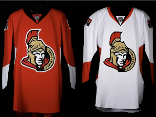
Senators Unveil New Uniforms!
 Wednesday · Aug 22 · 2007 | 3:34 PM PDT
  96 Comments
 The Ottawa Senators' new Rbk EDGE uniforms are here! Please view!
But wait, it gets better. Want to see Chris Neil, Brian McGrattan, Jason Spezza and Chris Kelly posing for a photo in their new threads? Look no further.
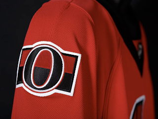
That's really all I got. The Sens unveiled their new sweaters at Scotiabank Place in front of the media and fans. Count them as the tenth team on the list. Before I go, I'll leave you with a close-up of the new shoulder logo.
Enjoy your night and be sure to check out my official Rbk EDGE gallery for all the photos I can find of these new jerseys!


Reader Comments (96)
They don't look good! The only thing looking goood about these things is the style of the numbering. It's a shame to make such a fuss about new logo and new uniforms and then they look as if some pre-schooler designed them.
First reaction is: I dunno. Not bad. Not what I was expecting. I prefer the old reds and blacks better. Looks like the 2d logo from the CIPO site was a fake, though, as the shoulder patch appears to be more of tribute to the Senators and Silver Seven of the early 20th century.
Hey, could be worst. We could have ended up with something more along the lines of the Panthers new jerseys.... :)
the sens had potential to have the best looking jersey in the league, it looks great dont get me wrong, but the shoulder logo is fucking retarded.
And people laughed at the Islanders jersey. This is plain ugly. Should have used the original logo.
Would have been nice to see more gold, thats what made the Sens stand out from the 5 or so other red & black teams.
My first reaction is not positive. I am the only guy thinking that these jerseys seem too small?
Looks good, certainly could've been much worse and it's nice to see a team stay simple rather than overdo it [cough] panthers [cough]. It might look better with something along the bottom, al la the caps road whites, to break up the solid space a bit, but nice nonetheless.
so much potential but ended up absolutely brutal. half of the concepts on this site are WAY better than what they decided on.
Eeh, not bad, but not particularly exciting either. I always liked the "profile view" logo better than the 3D one.
i also preferred the profile and the leaked profile made me hopeful. overall not bad.
The first team to use a copy of the All-Star template. The fronts are a little plain. The white one especially could use a red border/hem at the bottom.
The good news is that it looks like some teams are going back to stripes on the pants.
The patch not fit with the lines of the jersey. The gold, witch was great, is gone. The upper corner of the helmet is too sharp, especially on the white jersey. Absolutely no unique thing about that pyjama. The red is way better looking than the white.
Their black jersey with the 3/4 view and the gold were their beat jersey ever.
They might be ugly but I am sure they will beat the Leafs this year anyway
According to the Sens site, the secondary, updated profile logo will appear on "classic merchandise", whatever that means. Probably t-shirts. I bet the practice jerseys will feature it.
i like the international style they went with, it could use more detail, kinda looks like a practice jersey. but not bad, like the logo better, but they should keep going with the two logos for home and away.
Also - it's weird. On the players, the jerseys don't look spectacular. However the picture of just the jerseys, no one in them, they look pretty decent.
Jersey - Nice, (not as nice as the original red, but w/e.)
LOGO - SUCKS MY FUCKING BALLS...wow its bad!
Well whattya know.. that old NHL08 screenshot of the fans in the stands wasn't lying after all.
Bad bad bad. Not 100% but bad enough to convince me that I don't want to spend a 100$ on that thing. Do extra lines make frictions with air or what? RBK Edge Jerseys looks too small. What was the problem with old ones, players don't need to go faster than now...not on those small rinks. Anyway, looks like we're stuck with it.
Agree with anonymous about the jersey being good looking on the new flash the sens just posted.
But it seems that on the players it don't translate well. Seems that these jerseys are made for wearing without equipment.
Another case where i like the old ones better. How does a weasel like garybetteman become the commishiner of the greatest game in the world?
are their socks like the ones from the all-star game where the stripe wraps around the back and goes down toward the ankle? i was wondering if anyone would do that.
and as for the jerseys, their kinda plain and the logo... well it sucks.
These are really great looking uniforms. Sharp, classic and unique. The design has more of an Original Six feel to it rather than some of the over-done duds newer teams are introducing/sporting.
worst jersey...ever.
Im a huge sens fan, i love these jerseys, especially the home jersey, i think the new logo is a good change and the shoulder patch gives them a really authentic look.