Wednesday
Aug222007
Senators Unveil New Uniforms!
 Wednesday · Aug 22 · 2007 | 3:34 PM PDT
  96 Comments
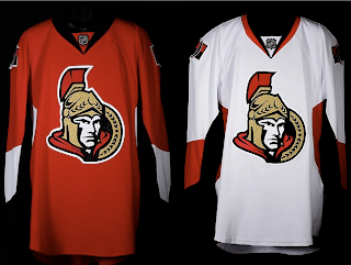
 The Ottawa Senators' new Rbk EDGE uniforms are here! Please view!
But wait, it gets better. Want to see Chris Neil, Brian McGrattan, Jason Spezza and Chris Kelly posing for a photo in their new threads? Look no further.
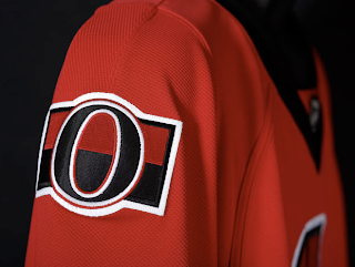
That's really all I got. The Sens unveiled their new sweaters at Scotiabank Place in front of the media and fans. Count them as the tenth team on the list. Before I go, I'll leave you with a close-up of the new shoulder logo.
Enjoy your night and be sure to check out my official Rbk EDGE gallery for all the photos I can find of these new jerseys!


Reader Comments (96)
I like the new logo, but the jerseys need some horizontal striping at the bottom. The profile at the sides of the jersey, under the arms, is pretty SENSeless. The designs that I saw earlier on this site, which incorporated the new logo looked much better. However, I don't agree with those people saying these are the worst jerseys ever. I'm sure they'll be better than most.
They are right in stating that Hockey fans are pretty passionate. Amazing how emotional people get regarding a jersey design. Personally I think that they are pretty classy- but I know that when I am watching them play (Or even when I played) I am not finding myself say "How pretty they look in their new threads." I am watching hockey. I understand that we have to have an attachment to things, and we are more apt to support things we like (Especially to the eye) but come on, stop being so picky!!!
ewww just ewww, the old were better
Back of the jersey
http://i169.photobucket.com/albums/u236/mozhfboards/ctmpphpMcpPmR.jpg
I like them. I think they are my favourite new ones so far, and I don't even like the Sens.
i like the profile logo better but i do think the tweak on the new primary is better. and with the jerseys i thought they looked a little plain but with the uniform as a whole i think they look awesome (with the striped pants and socks)and the shoulder patch is insanely good i was hoping for the "O" to come back. with only the jersey it would look better with a horizontal stripe but the vertical stripe flows down to the pants and a horizontal stripe would disrupt that so i can deal with it. gonna look unreal hoisting the cup too.
So was the goal of this uniform to make every player look as if he's got a nice beer gut going? It's especially apparent in the road whites. God, these Rbk Edge jerseys are all terrible.
...at least they got rid of the black,red,white swirl jersey. THAT was the worst jersey ever created. They looked like a clown troupe in those things. The new jerseys are better IMO...and Im not a sens fan.
Let's see...
- I prefer the new profile logo better than this updated 3D one.
- I don't like the red (too many teams wear red) but at least that horrible swooping black stripe is gone
- I don't know who's idea it was to make hockey jerseys with no bottom trim. You're an idiot, whoever you are. Bottom trim completes a hockey jersey. See Boston's simple design.
- I give the O shoulder logo a meh.
- Hate the stuff on the sides, under the arm pit. Brought to us by the same idiot that doesn't like bottom trimming I assume.
Overall grade: 6/10, only because they're an improvement over the old too busy red sweaters. I would have liked to see the black third jersey with the gold trim instead, complete with the new profile logo on the front and the peace tower on the shoulder.
Being a Sens fan,I wasn't there for the unveiling but this new look is not bad in pictures. Like alot of comments here, i, too, miss the gold. but lets see how it will REALLY look on HD tv or live at a Sens game.
The Silver Seven patch is a neat tribute to the past but i think they could of find a better spot for it than the shoulders.
As a Sens fan here are my thoughts:
-I don't mind the new logo, I liked the old one and they tweaked it a little better.
-Love the old school "O" for the shoulder patches (not everything has to be flashy)
-Like the colours
-Dislike the design under the armpits (looks like a practice jersey).
-The jersey's look kinda of bland and out dated, why it doesn't even have a white/black stripe on the bottom trim is beyond me. (Like the Calgary flames ones).
-Wish the red was a little darker.
Overall they're alright, although I think they could have done alittle better.
my question is what has made the senators decide that the 3/4 senator logo is better than the profile view?? They have been favouring it for years and now they have just gotten rid of the profile view completely. Everyone I talk to though prefers the profile logo!! Wake up sens!!! These are ok jerseys, but they need the FIRST logo back, and need a little more flare. Love the vertical stripes on the pants, the shoulder patch and the numbers. Bring back the old logo...tweak it if you have to...but it is way better!!
I was honestly expecting them to use the updated profile image leaked a while back. It looked badass. Simple as that. While I do like the chosen 3/4 logo, I think the profile would have been better received.
Who knows, maybe Ottawa is just living up their high from going to the finals, and as a Calgary homeboy, I can relate.
Childish. I don't like them at all. The new primary logo looks much better on paper. The shoulder patch is nice, but it's the only one positive I found on this ugly jersey.
Some people think the Senators went for a classy or traditional jersey?? What planet are you from??My God these things look horrible. The players look quite gay.I hope the Senators get their ass kicked every night! These look very lame. The funny thing is that the shoulder patch is actually very cool and yet some people think that the patch sucks..I guess some people are just wrong on everything.
How very unimaginative and un-hockey and reebok prescribed. Rubbish, the fan efforts are better.
This is pathetic. We waited 3 months for a glorified practice jersey. I wanted to see something different, but this has to be my biggest disappointment as a Senators fan. I just find the lack of horizontal striping anywhere on this jersey frustrating. The only I do like is the stripes on the pants and the O on the shoulder. I think this abortion has me questioning my loyalty to this team.
I like that they used to original senators logo on their shoulders. However, on the whole, I find this uniform to be rather boring. It needs some type of horizontal stripe. Also, those uniforms look way too tight on them. Especially the socks. The players look like they aren't feeling comfortable in them.
I don't like them. It just looks like a 3rd jersey. They also kinda look like short sleeved football jerseys.
The players don't look happy in them. Any yes, they do look too small.
http://www.edmontonsun.com/Sports/Hockey/2007/08/22/Senators_Jersey_20070822_TO_1.jpg
I don't like them AT ALL. They look horrid.
I haven't gone back to look, but isn't this the exact design as the "leaked" Pens jersey? It's at least REALLY close.
Also, the Sens should have gone back to the c1993 black unis. Those were my favorite Sens jerseys.
AWESOME. Modern, but simple and classic.
I like , better than i thought...
-I dont mind the new look from Reebok that changed those horizontal stripes, defenitely think (the no bottom stripes)it loooks good on those jerseys
-people that say they look like practice jerseys are so wrong, you guys are just relating to the reebok jerseys thata ctually looked too good for practicing
-As a proud canadian and living in the capital, i defenitely miss the PEace tower on the shoulder
-i really like the striping on the pants. maybe the the Silver Sevens logo coul have been on the pants ???
-the thing i miss most is the the lack of gold, like someone else was saying , was separating us from other red balck white teams across the league
- logo just got better, its funny because it is not a big change, at the ceremony when they unveiled the logo everybody was looking but were maybe not noticing the differences, i couldve maybe started a slowclap or something eheheh
-im glad someone used those socks like the allstar game, dont know if lots of teams will turn to that, different doesnt mean bad
- number are big but kind of thin-looking
-we the nice run we had with the red jerseys and that "be red" slogan, its normal hOme are red, but i think the whites look better
- for the fit of the jerseys, mcGrattam just seemd a tall skinny guy
So the new jerseys overall to me are better than what they had (funny loking reds with that weird stripe) , whites are nicer
Lots of people showEd up last night for the ceremony (or free sens army tshirts)
with all the hype, tis too bad the jerseys werent for sale, they wouldve sold lots
i will say again, these jerseys were the best concept for the sens (to my opinion)http://bp3.blogger.com/_r8tWGVHrjGI/RsNlMtB0aEI/AAAAAAAABK4/-ozGNgYS3l0/s1600-h/OttawaSenatorsRBKEdge.bmp
(the ones with the middle horizontal golden laurier stripes a la canadiens' 3rd jerseys)
And this i have to say to RGM, what a trooper you are with those comments ehehe GO SENS SO !
http://bp0.blogger.com/_r8tWGVHrjGI/RsNmT9B0aFI/AAAAAAAABLA/zaZ7QIsFK_8/s1600-h/OttawaLogos.png
this post(i thnik) is the new wordmark
The logo is okay. I like the retro second logo but as others have said, it looks out of place on this jersey.
Someone already pointed out why these jerseys don't look good - THERE IS NO HORIZONTAL STRIPING ON THE WAIST. This is a problem with other new jerseys this year as well. Without this feature, the jersey looks like a PRACTICE jersey.
I would really like to see them use the secondary logo and design something traditional along the lines of the Canadians jerseys.