Wednesday
Aug222007
Senators Unveil New Uniforms!
 Wednesday · Aug 22 · 2007 | 3:34 PM PDT
  96 Comments
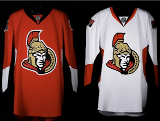
 The Ottawa Senators' new Rbk EDGE uniforms are here! Please view!
But wait, it gets better. Want to see Chris Neil, Brian McGrattan, Jason Spezza and Chris Kelly posing for a photo in their new threads? Look no further.
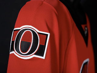
That's really all I got. The Sens unveiled their new sweaters at Scotiabank Place in front of the media and fans. Count them as the tenth team on the list. Before I go, I'll leave you with a close-up of the new shoulder logo.
Enjoy your night and be sure to check out my official Rbk EDGE gallery for all the photos I can find of these new jerseys!


Reader Comments (96)
http://www.youtube.com/watch?v=kKk8qDhvHcg&mode=related&search=
found this link on youtube concerning the ceremony
can all the leaf fans get off so we can get some real opinions on here...
Anyways, onto the real point of this, the uniforms, which personally have already grown on me, their simple and clean cut, i do really miss the side profile though. if you loook at their backs, both the jerseys and the sox, they have a nice sharp look to it which is pretty nice. i dunno, i still prefer the old uniforms, but these really arn't as bad as everyone complaining about.
hey dude LOVE the site. but shouldnt you put the senators under a team with a logo change?
Wow. Lots of mixed reactions. Tons of comments. I appreciate them all guys. Thanks!
The most recent comment: Glad you love the site, but I'm only human and I hadn't gotten a chance to add them yet. I've done it now. Enjoy!
(Lightning are next on Saturday. So excited!)
As a Sabres fan I can say...Hate the team, love the logo. They look pretty good and I would slide them into second place behind Boston in my RBK Edge jersey power rankings.
RBK still SUCKS for what they are doing. Who cares if a regular fan in a jersey weigh a couple ounces less after a beer is spilled on him?
Chris can I link to your blog? And would you vice versa?
regards,
Charlie
www.SabresNotSlugs.com
email: info@SabresNotSlugs.com
I think these are amazing. Clean and mean. Kinda Team Canada style.
Nothing fancy, before, the bunch of jerseys didn't aid Ottawa in establishing an identity on the ice.
These are sweet. As for how they look on the players, get used to it, the tight jerseys look strange in general, we'll get used to em.
Tuns of people dislike them but the more I see them the more I love them. I saw them in person and they really look good! I love the vertical stripes on the pants, it makes them look less plain. I'm very pleased!
I think they are pretty good. I know that for me, the RBK Edge just seems to ruin all the jerseys, but with the inevitablke conclusion that the jersey will remain, I have lowered my standards.
Here are my criteras:
1) Likeness to previous jerseys
- Well, they look like the red jersey that already had the 3D logo and they have a vintage shoulder patch. Makes it for me.
2) No vertical stripes (the ones going from under the arm to the collar)
- Again, that jersey passes here.
I know I'll get used to them, and my initial reaction was simply "Not bad, not bad..." Nothing less, but nothing more.
I hope the Canadiens don't scrap their jersey like this. I am scared. To death.
I like the update but to be totally honest I like the profile version much, much more. It's more classic and has a real feel of tradition.
My first reaction: It looks like the leaked Penguins jersey
I don't understand why people are getting so worked up over these new jerseys? I personally love the updated logo, didn't at first but it grows on you. My only complaint is that there is too much blank space near the bottom.
I personally just hate to see the old red ones go. Without a doubt the single best jersey in the league, I loved them. I like these too but please to god put something on the bottom of the jersey!
Go Sens Go!
Could they have made them more boring??? I yawn everytime I see those jerseys! I might as well take that picture of their new jerseys and blow it up poster size and hang in on the foot of my bed so I can fall asleep easier. I'm a Sens fan and trust me, I'm not buying that boring silk for $100 when I can get a Sens t-shirt that looks exactly the same for $20.
I don't know why everyone dislikes the new jersey of the Ottawa Senators when most teams jersey's aren't much better. For Exemple the new logo of the sabres doesn't quite resemble a Buffalo nor sabres. For me, I enjoy the new logo, except the chin looks too big, really love the shoulder patch for a tribute to the Original Ottawa Senators. What I don't like about the jersey itself, boring, nothing spectacular to look at unlike the black jersery with the gold trim at the end. Overall - Slight downgrade from last years Jersey.
Here's what I think about this design, and all of the jerseys in general. Traditionalists have to try to come to terms with what has been released thus far. I've been an NHL fan for 30+years and I can honestly say that this was an update that needed to happen to the league in general. While I'm not thrilled about the fact that I'm going to have to shell out $300 for a new Heatley jersey, it's a part of the evolution of the sport. It happens, so deal with it.
That said, the only team whose new shirts I like more (thus far) are the Capitals, but I'm a long time Caps fan as well, so I'm partial to the old reds.
Anyway, they look great, and I think that negative judgment should be reserved until we see them in action. The guys wearing them don't seem to be complaining too much, so they can't be all that bad...
- the O shoulder pads: AWESOME
- why keep the 3/4-view logo concept? It looks better than the earlier one they had, but the original profile-face logo was downright classic. It actually made them look like they made the Original 6 an Original 7.
At least they still have 'senator' confused with 'legionnaire'; having a jersy logo of an old toga-wearing man would suck.
It's a simple design that will stand up over time much better than the overdone unis. As a Senator fan I am SO HAPPY that the 2D Trojan Condom logo has finally been killed.
It's all right... the red one is a vast improvement over the previous design, which was just too busy. Still, I liked the black 3rd the best, as well as the Peace Tower shoulder emblem.
The retro logo on the shoulder just looks out of place like that. The main crest is a significant tweak of the older version, but it's not all that different.
The striping could've been a little better, I think. I'm a sucker for traditional striping.
Simple, straightforward, classy, AND contemporary. The best new jersey in the NHL (not counting the Wings, Rangers, etc). It would have been easy to have overdone this jersey with the new logo design and extra piping, etc., but the designers resisted that urge and that can be the toughest part. Excellent job.
The jersey is alright but any attempt to make it look good is washed away by the fact it will be on the backs of the Ottawa Schmuckators. I hope these guys fall right out the gates this year.
this is comming from a LEAFS fan who hates the Sens, (cept a few f the players. These jerseys are nice, I really like them, they are the 3rd bes of all the new jerseys so far. I cant wait for tomorrow for toronto to reveal theirs
At first I was shocked, because we are always shocked by the new.
But I love umm.
Go Sens Go!