Mixed Reaction To Canucks Makeover
 Wednesday · Aug 29 · 2007 | 2:16 PM PDT
  105 Comments
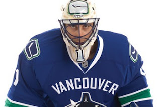
 It's officially official. At the time I'm writing this, there have been almost 150 comments posted on the previous post. Vancouver Canucks fans mostly seem to be upset by the new Rbk EDGE uniforms unveiled today at GM Place.
A lot of you guys seem quite unhappy. Specifically, you seem to loathe the wordmark above the crest. As a non-Canucks fan, I think it's great and that these jerseys are very sharp. Honestly, I don't have a single complaint. But I'm one voice against thousands. As a Lightning fan, I can somewhat understand your distress though. I've never been a big proponent of "TAMPA BAY" in the logo. At least the got rid of "LIGHTNING" in the new design.
Anyway, this post is about the Canucks.
The "C" on Markus Naslund's sweater is a little close to the wordmark on the chest, but it's not the end of the world.
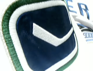
The stylized stick-in-the-rink logo is an excellent touch that moves the uniform forward. And those colors — you can't beat them. I also find interesting the choice to put green on the jersey but not in the logo itself. A little unusual but that wouldn't be the first time.
That shot should offer a better look at the rest of the uniform as a whole. Nice touch with the logo on the pants. I'm adding all of these images and many more to the official Rbk EDGE photo gallery. Go check it out!


Reader Comments (105)
You know, these are really growing on me. At first, I absolutely hated them, and everytime I look at them there are getting better.
The colors are what I was hoping for, and while its not great, its not bad either.
I am very happy with the new uniform. I was down at the unveiling today and I was really surprised to see the "VANCOUVER" wording across the front. I really like the look with the wording. It has that sort of classic look that we see more in others sports where the city or team name is across the front. The uniform over-all is crisp and clean. Getting rid of the red and gold accents really looks nice and gives it that west coast feel that is so Vancouver. When you look at the logo and the colours you really get the west coast feel. How many other jerseys and logo's make you think of the place they come from?
should have just modernizes / stylized the old stick + rink logo instead of the Orca crap. It looks like some marketing guru decided all the elements it needed and forced some poor graphic designer to make absolute crud. It's like someone used a cracked copy of Illustrator with some scanned images. Throw it away.
http://cdn.nhl.com/canucks/images/upload/2007/08/sweater04_082907_big.jpg" REL="nofollow">Canucks Jerseys
heres a decent shot of the jerseys.
"Kyle said...
Save Clone High"
I'm not exactly thrilled by the word mark, but it doesn't take anything away from the jerseys.
I don't understand how Canucks' fans don't adore these - especially when you consider some of the abortions they've worn over the years.
After the Bruins, these are by far the nicest of the RBK Edge pack.
Wow, I'm actually kind of surprised people figured out the Save Clone High so quickly, but it has been in about all my big posts for the last few days.
Anyway, the jerseys are great in my eyes but would be better with no VANCOUVER but derek is right the jersey does feel really west coast
I must say I think the new jerseys are terrible...The best "concept" I saw in the previous weeks was
http://www.kuklaskorner.com/images/uploads/canucks-uniforms.gif
And to me this is a far cry from that. I knew they were going to keep the Whale so this was out, but I just think their new jerseys are terrible.
Personally, I think the jerseys are fine. It will take some time for fans to get used to the VANCOUVER, but I think it will grow on people.
The horizontal stripe at the bottom gives me hope that the Oilers will do the same...
This is the ugliest Jersey I have ever seen. They made a huge mistake.
hey chris i think ur having the same problem that you did with the lightning logo thing where it doesnt show the udated logo in changing logos section.
I like alot of the teams new jerseys till now. One word EWWWWW!!!!!!!!!!!
hey chris i think ur having the same problem that you did with the lightning logo thing where it doesnt show the udated logo in changing logos section.
Nah, it's just your browser. Try refreshing the page. That should do the trick. Either that or empty your cache and give it another shot. Thanks for the comments, all!
This is absolute garbage whoever likes this has a very weird taste the green one i saw on canucks.com was horrible absolutly dreadful
Not only do the jerseys stink but the team does! Maybe they will average more then 2 goals this year in the playoffs if they can even make it.
Should have been called the vancouver luongos.
i didn't like the idea of "VANCOUVER" written on the top, but now that i see it im liking it more and more. it defenitly represents our city quite well. anyways, it could have gone a lot worse and im glad they went for a classic look like boston instead of some crazy edgy look/new age shit.
"Anonymous said...
Not only do the jerseys stink but the team does! Maybe they will average more then 2 goals this year in the playoffs if they can even make it. "
... ya. it's always tough when you have the best goalie and one of the top defensive units in the league. idiot.
ok, that is officially the WORST logo ever, right next to the ducks.
Although I hated them at first, I'm warming up to them.
The following link shows another view of the uni's. Not bad.
http://cdn.nhl.com/canucks/images/upload/2007/08/sweater04_082907_big.jpg
U...G...L...Y. they ain't got no alibi that's ugly. yeah yeah that's ugly.
I could do without the Vancouver text, although it's not awful. All-in-all, it's a great design and I love the color scheme. I'm still not crazy about the orca logo, but otherwise, think this is a good direction for the 'nucks.
After looking at these sweaters for a few hours...the design has grown on me. Ive always loved the vintage colors, and the wordmark is a little large...but still its a nice sweater...8/10
I think the Canuck fans dodged a bullet. These could of been much worse. They look as good as they could considering they had to choose from one of the lame reebok templates. Hat's off to the Canucks!! for remaining traditional. The only thing I am not crazy about is the Vancouver wording above the logo.There may still be time to get rid of that fans, but then again that isn't nearly as bad as if they had incorporated a lot of lame vertical lines/piping.Considering everything I think the Canucks will look cool this season.
What really needs to go on all of these jerseys is the reebok templates!