Mixed Reaction To Canucks Makeover
 Wednesday · Aug 29 · 2007 | 2:16 PM PDT
  105 Comments
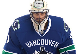
 It's officially official. At the time I'm writing this, there have been almost 150 comments posted on the previous post. Vancouver Canucks fans mostly seem to be upset by the new Rbk EDGE uniforms unveiled today at GM Place.
A lot of you guys seem quite unhappy. Specifically, you seem to loathe the wordmark above the crest. As a non-Canucks fan, I think it's great and that these jerseys are very sharp. Honestly, I don't have a single complaint. But I'm one voice against thousands. As a Lightning fan, I can somewhat understand your distress though. I've never been a big proponent of "TAMPA BAY" in the logo. At least the got rid of "LIGHTNING" in the new design.
Anyway, this post is about the Canucks.
The "C" on Markus Naslund's sweater is a little close to the wordmark on the chest, but it's not the end of the world.
The stylized stick-in-the-rink logo is an excellent touch that moves the uniform forward. And those colors — you can't beat them. I also find interesting the choice to put green on the jersey but not in the logo itself. A little unusual but that wouldn't be the first time.
That shot should offer a better look at the rest of the uniform as a whole. Nice touch with the logo on the pants. I'm adding all of these images and many more to the official Rbk EDGE photo gallery. Go check it out!


Reader Comments (105)
Are these seriously there new jerseys? My goodness. I've thrown up stuff that looks better then this!! Sheesh!!
Vancouver Whalers !
Uh, not so much. Despite being a Lightning fan (and thus a fan of a team with the city name as part of the logo), I don't think the "Vancouver" helps the new Canucks sweaters. And, in a coup I would have never thought possible, the new Canucks home sweaters are both busy AND dreary.
I like the jerseys but the wordmark is too big in font size...Otherwise, it should be a top selling jesrey this season.
But Canucks fans who hate it SHOULDN'T BUY IT! Take it from a frustrated Sabres fan who HATE the slug.
I love the return of the classic colors!
I LOVE the contrasting BOLD stripes on the sleeves and waist! YES! That's how a jersey should look!
However...
the front of the jersey is a mess.
Both the wordmark and logo take up too much space. It looks way too busy and awkward.
Either have the logo with no wordmark, or keep them both and make one or the other smaller.
And why no green in the logo???
There is the potential for a GREAT jersey here. Just fix the front.
All of the other teams that have NO striping at the waist should take a good long look at this Vancouver jersey. They all look like Roller Hockey jerseys alongside this one!!!!
What the hell? The whole province of BC cheers on the Canucks, why would we want VANCOUVER printed on the front of the jersey? Who's bright idea was that, the colours are great. But who ever had the idea of putting Vancouver on the front, they should be Fired, i was so excited to see the new jerseys, and i was totally disappointed, the canucks seem to be cursed with bad jerseys.
I know all my friends, as well as myself, are saying they like it in a courus of shrugging and "I guess we have to like those" additude. I know that for me there is also a bit of muted shame and embarassment.
Honestly, they should have just grabbed the old-school green/blue/white logo and relegated the Orca to 3rd sweater status. Seriously, who out there would take what we recived as a sweater over that option?
Those Jerseys aboutsoutly horrible.
What did a grade 3 sketch that in art class. Check out these new Jerseys for the Winnipeg Jets. The team does not even exist and has nicer jerseys, than you canucks fans.
http://www.winnipegjetsonline.com/new-Logo.htm
people have made nicer jerseys online in 10 minutes. They are so busy, and the jerseys have nothing to do with the fact they're called canucks. I don't understand why they stayed with the orca, they should have used the rink and stik logo.
The wordmark is unnecessary. At the very most, it should only belong to the road jersey. Even still, it takes up a lot of space and it distracts your eyes from the rest of the entire uniform, which looks great. I'm imagining if I were a fan in the GM Arena, I'd be thinking: "YEA! I GET IT! WE'RE IN VANCOUVER! YOU ARE TOO! WE'RE ALL HERE! GOTCHA!" Especially since the Canucks are marred with a history of silly uniforms, they better remove the wordmark before the season starts.
While I think retro looks and vintage jerseys are cool (and a great marketing strategy), these new jerseys are supposed to be bringing the league into the 21st century. The whole reason for the vintage 3rd jersey was a sign of respect for the roots of the team.
However, by mixing vintage with current, you get a jersey like these new Canucks ones. Everyone has their opinion on what (if anything) could be done to make them look nicer. Personally, I would lose the horizontal stripes, and go with some underarm colours, like other teams have done. And I will join in with others who see the VANCOUVER wording as too much. This is supposed to be a throwback to the Vancouver Millionaires, the team that won the Stanley Cup back in the early 20th. The issue for me is that the Canucks are no way associated with the Millionaires, other than they both come from Vancouver. Perhaps this is why most people have had a problem with VANCOUVER appearing on the new Canucks jersey; because it has never been on a previous Canucks jersey.
Anyway, I don't think they are awful, but I wouldn't mind seeing them without VANCOUVER.
Corey in Vancouver
I can deal with the Orca logo on the retro jersey... but the wordmark has got to go. It looks like some minor-league team from the 60s or 70s, or the New York Rangers of the mid-40s. And that's not a good thing.
ah, the remix jersey. as dave pratt says on the radio, you shouldn't mess with great originals. like remixing led zeppelin, the canucks have found a way to make a great, slick jersey look cheapened. still, compared to a lot of the new jerseys coming out... i'd rather take a remixed led zeppelin song than a lot of the new crappy pop that's coming out these days. it may be dissapointing, but we could have done so much worse. cue; nash, la, fla, ott, etc.
unrelated, i heard on the radio today that arthur griffiths tried to bring back johnny canuck back when they were designing the orcas originally, but mccaw nixed it. another reason to hate the orca and the mccaw era it represents.
I've got to say that at first I was underwhelmed...they are growing on me though.
all the vancouver fans saying this is the worst jersey they've ever seen are lying to themselves. it can't be that easy to forget those horrible flying v jerseys. but even those weren't the worst ones they've had. that alternate they had with the red/navy blue gradient was the worst jersey choice they ever made.
and i think it's obvious that the vancouver on the chest is so that people don't confuse them with the hartford whalers, you know, with the blue/green color scheme and whale in the logo and all. i know that if i had gone into a coma sometime before 1997 and woke up today and looked at the logo and colors, i would be slightly confused.
mannnn the orca goes with last years colour scheme way better, i dont mind the Vancouver at the top of the jerseys, but WHY THE FUCK WUD U NOT MAKE THE ORCA BLUE AND GREEN TOO. THATS wut RUINED these Jerseys and makes em look like crap,
The league has a chance to totally change its look and you have teams wasting the opportunity. Don't get me wrong I think the Nucks jersey is nice but have you seen the islanders or the bruins, AWFUL!!! The new RBK jerseys are awesome but some teams are using the same style as the ccm ones, you cant, there different. Washington has the right idea, their jerseys are awesome looking. Their look matches the rbk design. Its what the league needs.
Worst jersey so far. The wordmark crowds the horrible logo.
It looks exactly like Northeastern University's jersey form 06-07
just take off VANCOUVER and its a nice jersey, i still like the stick in the rink logo as the front crest.
Boston, Rangers, Detroit, Columbus & Washington - great stuff. The rest of these jerseys? Yikes! The "stick in rink" logo was so popular last season as an alternate, why didn't the team just use that as their jersey base? Who needs the city name in letters that nearly dwarf the whale? And what would have made sense was using the original logo for the crest, then have two shoulder patches - one of the whale, the other of Johnny Canuck. Going back to the original color scheme was a great move, though there should be some green in the logo. This is just one in a series of hideous jerseys that the Reebok morons have put out. And what really scares me is that some of the jerseys that have yet to be unveiled will be on the "shithole" pile. (Philly looks okay on the leak, though.)
Overall not as bad as I initially thought. We can all agree the colours are great - the wordmark is controversial but at least original. If we're stuck with these (I might even buy a blue one), the change I'd make is on the white jerseys. Make the tail of the jersey blue like the bottom of the sleeves - then they'd blend into the pants and wouldn't look so silly from behind... the horizontal stripes are great but don't match the RBK Edge profile.
man i thought are jerseys looked like shit man, after seeing what other teams have done and are doing around the league. VANCOUVERS JERSEYS R PIMP,IM GONNA GET ONE CUZ IM A DIE HARD CANUCKS FAN, NOT U BAN WAGON JUMPERS, but i admitt i wanted johnny canuck back but w/e not gonna happen yet but they look way better then half the leauges so far man so ppl shud just shut up n thank tha lord we aint the florida panthers & that we stole Luongo from them so he dont gotta wear that crap either hahaha weOoOOoOooooo
love the new jersey.
i love how it says Vancouver at the top.
Vancouver is the best city in the world, and having it on the uniform will make our players PROUD!
VERY SHARP JERSEYS!!! It's amazing the amount of comments that have been made on them already! The Canucks jerseys were the most anticipated in the league and now have spurred the most opinion.
The colours are superb! Classic as well as representative of the province. The way it should have always been for the Canucks, if it hadn't been for some psychologist that said yellow, orange and black were more aggressive colours and the team should switch.
The jersey design is classic with modern elements. A mix of many eras of hockey history in this region. I have read many comments stating a dislike for this blend. People seem to think that you need to either pick modern or original, but this jersey has elements from many time periods which I believe is its strength. The stripping is original from 1970, the primary logo is an upgrade from the 90s orca, the VANCOUVER word mark is pre-NHL Canucks, and the secondary logo is a modern version of the much loved stick-in-rink original. I do wish that the Johnny Canuck logo had been incorporated, but I guess that leaves the door open for a third jersey logo down the road.
I took a good amount of time to go through Chris' gallery and compare this jersey to the others that have been released so far. I can say, without a doubt, that these jersey are on par with any of the Original Six jerseys but with a uniqueness that stands out from the rest. I believe that, in the long run, even the nay-sayers will grow to love this jersey. I will definitely be sporting one at the games, and I have a good feeling that many other Canucks fans will be wearing them as well.