Mixed Reaction To Canucks Makeover
 Wednesday · Aug 29 · 2007 | 2:16 PM PDT
  105 Comments
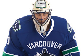
 It's officially official. At the time I'm writing this, there have been almost 150 comments posted on the previous post. Vancouver Canucks fans mostly seem to be upset by the new Rbk EDGE uniforms unveiled today at GM Place.
A lot of you guys seem quite unhappy. Specifically, you seem to loathe the wordmark above the crest. As a non-Canucks fan, I think it's great and that these jerseys are very sharp. Honestly, I don't have a single complaint. But I'm one voice against thousands. As a Lightning fan, I can somewhat understand your distress though. I've never been a big proponent of "TAMPA BAY" in the logo. At least the got rid of "LIGHTNING" in the new design.
Anyway, this post is about the Canucks.
The "C" on Markus Naslund's sweater is a little close to the wordmark on the chest, but it's not the end of the world.
The stylized stick-in-the-rink logo is an excellent touch that moves the uniform forward. And those colors — you can't beat them. I also find interesting the choice to put green on the jersey but not in the logo itself. A little unusual but that wouldn't be the first time.
That shot should offer a better look at the rest of the uniform as a whole. Nice touch with the logo on the pants. I'm adding all of these images and many more to the official Rbk EDGE photo gallery. Go check it out!


Reader Comments (105)
Cant say I love this new look. The "VANCOUVER" is just not needed and is way too large infact its down right dumb. The changed vintage logo on the shoulders looks like a little kid did it the original was just fine. I like the colors not sure going with with horizontal lines was the best but I can live with that. Pictures with the players wearing them says it all they look horrible. A million supposidly spent on what? Wont be shelling out money to buy one and it seems neither will many other canuck fans. Basicly a big dissapointment for something they easily could have gotten very right by listening to fans and made a classic jersey.
Looking at it more the "Vancouver" does not bug as much now as when I first saw it. I still don't think it's needed but overall it is a nice uniform.
Amazing how something as simple as putting in a word across the chest can turn an otherwise great jersey into a poor one. Jersey designers never seem to get the basic concept of "less is more." At least it's not as bad as the pajamas my Islanders are stuck with.
I agree with everyone that would remove the VANCOUVER thingy. Otherwise, it's a nice jersey.
Has anyone posted any pictures of the BACK of the jersey? I've been waiting to see if the font of the name and numbers on the back has changed or not. An ugly name and number set to me can ruin a jersey just as much as the front can.
These unforms suck balls the only good part is the new coulors
As a Flames fan who absolutely hates the Canucks, I love this jersey. I'll be laughing at how horrible this jersey is every time I see it. I feel sorry for Nuck fans out there, I'd be ashamed to have my team wear such a horrible jersey.
I actually think this one is worse than the flying V.
I'm not a Canucks fan, but overall I like the uniforms. To me, the Vancouver wordmark gives it a classic look that reminds me of the unis from years ago. I love the royal blue and the green. Seems like every team is wearing either navy blue or black (two overrated, eesthetically unappealing colors).
its the best, cleanest jersey the canucks have ever had. i love the fact that canucks are original with their jerseys and you will never see that with any other team! now its about the team, its about the community, its about the city, and the history!! its not just about the name on the back of the jersey, but the name on the front that represents us all! take some pride guys! this is some really good stuff...
These look stupid... I'm sorry...
Probably the most non-commital jersey overhaul I've ever seen. Should've gone with the retro look or a seperate vision for the orca but not both.
What a sham!
ok so first off if you've ever watched any hockey you'd know that the cap's went back to the uniforms that they had during their inagural seasons in the league, i think they look alot sharper and less cartoony than their other uniforms, and these canucks uniforms look like absolute crap, come on lets mix the only decent uniform (hockey stick logo) they've ever had with the stupid orca and change the colors, what's the point, why keep the bloody orca are they owned by orca bay anymore, no!
The Vancouver Canucks have finally found themselves a sharp looking uniform. It incorporates previous colors and logos, (including the VANCOUVER, from the Vancouver Millionair days). Furthermore, they kept it looking like a traditional uniform. Not like some of those other Mickey Mouse looking designs, with exception to Detroit, Boston and the Rangers.
To get a good look at the uniform, including the back (name and numbering) check out the Canucks web page...
http://canucks.nhl.com/team/app/?service=page&page=MediaGalleryPlayer&galleryId=2244
Great job Canucks, good luck this year!
Too busy, stripes don't match the fit of the jersey, colours don't match the logo, wordmark is terrible.
I'm a Canucks fan, but I'm definitely not a fan of the Canuck's jerseys.
They'd be perfect without VANCOUVER pasted across the top as though the fans are going to spontaneously forget where they play.
Adding VANCOUVER is completely unnecessary. It's way too large, it looks like it'd create some odd illusions with a C or A badge, and it references a team that isn't the same franchise or even played in the same league, let alone a team with any fans that aren't, you know, long dead.
I saw these before I went to work and thought they sucked... I came home from work and now I think they are the greatest. Weird, eh?
The majority of positive responses are probably from Canucks Employees who are being payed to make multiple positive comments about the new canucks jerseys.
Now that I look at the jersey's a little longer they look good. I like that I can where my Vintage jersey now and be the same colors as the new one's. I'm still not sure if it's a buyer for me, but maybe if I look at them some more I will change my mind further.
When they win the cup this year I will have to buy one to celebrate.
I am from vancouver and when i saw the new uniforms from work on the TV not impressed.
To those who say its awesome your lying its not. the only good to come from having another ugly jersey is the fact that the canucks play better the worse the jersey is.
The orca should have green in it. if the canucks want text on their logo, which i dislike, it should be way smaller.
To those who say "i didnt like it but now its growing on you" You really dont have much of a choice to let it grow on you, because when it comes to it. All canuck fans will buy the newest merch just to stay true to the game. I was looking forward to the chnage but now regret it, thanks RBK
I absolutely love this new jersey. I think that the silver/blue Orca logo nicely emboldens the blue/green of the jersey itself - the main problem with that scheme on the vintage duds.
I also love the wordmark, I'm not sure what people are complaining about.
The only really problem, to my eyes, is that there's so little colour in the logo. And the colour that is there is no where else on the jerseys. That makes no sense to me.
As posted before, there's a nice image gallery on the nucks' site.
After looking them over for the day, I'm starting to like them. I'd still prefer no wordmark though. Or a wordmark that matches the jersey colour so you don't really see it. Like a ghost effect.
http://canucks.nhl.com/team/app/?service=page&page=MediaGalleryPlayer&galleryId=2244
the jerseys are really growing on me. i hated them at first, possibly because i was expecting something new after all the hype. after looking at them though, i absolutely love the vintage jerseys with the striping including on the pants which i think looks real sharp. i also hated the idea of the wordmark at first, but that's also growing on me as it sort of fits with the old school style of the jersey. while i think the orca looks better with less colours, i still find that it sort of clashes with the colour and style of the jersey. only bad thing is the blatant olympic marketing ploy.
GUYS, let's think about the yellow halloween costume with the "German" "V"...these are new style. Logo and script...Then don't touch the orca...
by the way, have you seen the other reebok edge jerseys? they suck (all but boston!