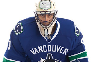
Mixed Reaction To Canucks Makeover
 Wednesday · Aug 29 · 2007 | 2:16 PM PDT
  105 Comments
 It's officially official. At the time I'm writing this, there have been almost 150 comments posted on the previous post. Vancouver Canucks fans mostly seem to be upset by the new Rbk EDGE uniforms unveiled today at GM Place.
A lot of you guys seem quite unhappy. Specifically, you seem to loathe the wordmark above the crest. As a non-Canucks fan, I think it's great and that these jerseys are very sharp. Honestly, I don't have a single complaint. But I'm one voice against thousands. As a Lightning fan, I can somewhat understand your distress though. I've never been a big proponent of "TAMPA BAY" in the logo. At least the got rid of "LIGHTNING" in the new design.
Anyway, this post is about the Canucks.
The "C" on Markus Naslund's sweater is a little close to the wordmark on the chest, but it's not the end of the world.
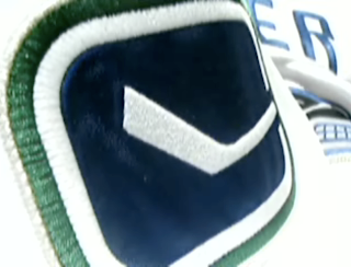
The stylized stick-in-the-rink logo is an excellent touch that moves the uniform forward. And those colors — you can't beat them. I also find interesting the choice to put green on the jersey but not in the logo itself. A little unusual but that wouldn't be the first time.
That shot should offer a better look at the rest of the uniform as a whole. Nice touch with the logo on the pants. I'm adding all of these images and many more to the official Rbk EDGE photo gallery. Go check it out!


Reader Comments (105)
THESE JERSEYS KICK ASS! ORIGINAL AND SHARP.
i find it funny that you (chris) have been fervently against wordmarks in logos, but now you have no complaints about this one?
yeah, whats with all ur caps hate if you like the Vancouver mark above the logo. at least the caps logo incoporates some hockey oriented things and has original font
c'mon....the caps new logo it's awful!!!! the has history in it...i'm changing idea edry second I look at it...strange...begining to like it..
Nicest sweater to be unveiled so far.
Like it a lot. Like many others I think the "VANCOUVER" is too much but otherwise it looks great. It's a mix of new and Vintage and at least they kept the bottom lines. Hurray.
However, the new RBK Edge "revolution" is too much for me. It starts to look a bit too much like European jerseys whick isn't really a good thing to my opinion.
Anyway, Vancouver jersey looks sharp.
i find it funny that you (chris) have been fervently against wordmarks in logos, but now you have no complaints about this one?
Hi all! It is kind of funny, actually. But just to be clear, that wordmark on the Canucks jerseys is not in the logo itself. It's just on the sweater — above the logo. The Rangers sweater only has a wordmark and I like it. What I don't like is wordmarks trying to pass themselves off as logos (Ducks, Capitals, etc).
That make any sense? (I say that trying not to contradict myself.)
Anyway, these are nice. I am very impressed with the Canucks. I liked the blue and maroon, but the blue and green blow it out of the water.
I wasn't expecting this...it's not really nice at all. The logo doesn't go with the uniform and the lettering above doesn't help it. The only things I like are the colours of the uniform and the secondary logo.
It is kind of starting to grow on me though...
it looks great!!
love the colours....
and the whale is fine...
Those jerseys are crap!!! And its basically everything that was mentioned that bother me. They need to get rid of 'Vancouver', add green to the canucks symbol, id move the sripes on the jerseys need to be lowered. And is it me or do the players look ashamed to be wearing them?
Actually on the Canucks.com web site, the Vancouver wordmark is incorporated above the orca which leads me to believe that Vancouver is officially a part of the new logo....
I Like IT !!!
I think the majority of ppl who complain could never be satisfied anyhow...
cry me a river
welcome to 2007
I give the new jerseys an 8 out of 10, but would have liked to see "Canucks" on the Home jerseys and keep the "Vancouver" for the road jerseys. I was also hoping for "Johnny Canuck" on the Shoulder patch and maybe on a Third jersey. Otherwise, could have been a lot worse.
No third jerseys this season for any team.
If you go to Chris Creamer's website, you'll see a large set of secondary marks for the Canucks, including a Block V with Johnny Canuck's head at the top.
http://www.sportslogos.net/index.php
I really don't underStAnd the problem with these jerseys. I love the way Vancouver is presented moVing it into a morE basketball kind of jersey but it is unneCessary. The coLOurs of course look great and the stick iN rink is grEat. But as all the jerseys do thHey look super tIGHt, especially in the Luongo jersey.
Not everyone in Vancouver hates them just the nerds over at CDC who have been obsessing about them for months now...the colors are great and i think they look very sharp
Join the movement:
http://www.facebook.com/group.php?gid=5337258311" REL="nofollow">Fans Against the New Canucks Jersey
the VANCOUVER is ugly for sure. far too busy of a jersey..
But the WORST aspect is the empty white jerseys w/ the horizonatal stripe on the bottom and a white tail beneath.. those lines are SO ugly. I can't believe anyone with a design eye would put that out - unless the loath the Canucks?
Suppose it's inline with Vancouver's history of some of the ugliest looks in the history of the NHL. +1 for consistency.
The Canucks are gonna look small and feeble on the road.. and that's before the puck drops and they get hammered by the Flames, Sharks and Avalanche.
can someone help me understand why the logo crest is a completely different color than is found in the rest of the jersey? That's the only part I don't quite understand, and can't figure out why that is. I can live with the rest of it, but why does it look as though they simply took the old logo, removed the red, and slapped it on the vintage template? The dark blue/black looks out of place.
Terrible, MArketing simply to visitors leading up to and during Olympics...
shamefull.
I've been watching vancouver for the last 30 years and besides the skate logo in the late 80's early 90's this new jersey rules. By FAR the best new one out there. Canucks 2008 Stanley Cup Champions (We are all Canucks)
Wow...terribly designed jerseys. The Vancouver across the chest above the logo ruins the whole jersey.
I thought the Canucks jerseys were going to look great, but...YUCK!!!
The new Vancouver Canucks jerseys are not what I expected. I could use harsher words but other people have said enough about them so I don't need to add insult to injury. The VANCOUVER above the orca is stupid. The orca has been around long enough for people to know it belongs to the Vancouver Canucks. I would of used the stick in the rink and used it as the main logo and the orca on the sides.
I let it sink in for a minute before I made a comment...
They don't suck. And they're not the greatest either.
If they do two things, it would be so much more sensible.
1. Like another poster said, put 'CANUCKS' on the home instead of 'VANCOUVER.'
2. Try again with the proportions between the 'VANCOUVER' and the orca logo. Overall it should be smaller. I don't know if the orca should be larger than the text or if the text should be larger, but it probably shouldn't be a 50/50 ratio.
The "new" uniforms are horrible. There is nothing new about them. They basically took the classic vinatge jersy and made an absolute mess of it by adding the whale. That took a year? That is the best that Mr. Nike (Zimmerman)could come up with? What a joke! No creativity no originality! I am a season ticket holder but i would rather listen to the game on the radio then watch them play in that jersy!