Avalanche, Here's How You Fix It
 Sunday · Sep 23 · 2007 | 1:58 PM PDT
  3 Comments
 The introduction of Reebok's new EDGE Uniform System has left a lot of people stratching their heads. If you're among those questioning some of the design choices made here, then this series is for you.
Yesterday we contemplated fixes for the new Vancouver Canucks uniforms. Today we're going to look at the Colorado Avalanche.
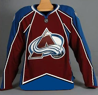
Among the complaints for the Avs' new threads was the lack of the zig-zagged, mountain-range like stripes we're used to seeing. In fact, the sleeves even go from blue to burgundy on the home sweaters without so much as a stripe in between. One designer came up with a solution in this rough sketch.
Voila! But Reebok would have us believe such a design is incompatible with the cut of their uniforms. Well, Atlanta and Buffalo seemed to have gotten away with it all right.
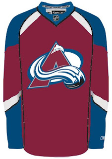
No matter. Check out this design.
Personally, I've found that the Blues' new uniform is one of the best of the new crop and even in Avalanche colors it's still pretty damn nice.
When you come right down to it, I think the Avs still escaped with a relatively nice jersey. Seeing Joe Sakic's "C" overlap a big stripe on his shoulder will take some getting used to, but all told it could've been worse.
Any thoughts on improvements to the Avs or any other team's new threads? Email me at nhllogos@gmail.com.
Up next: Atlanta Thrashers.


Reader Comments (3)
"Well, Atlanta and Buffalo seemed to have gotten away with it all right."
Not sure what you mean by that Chris.
as an avs fan, neither sweater appeals to me.....
Put the current crest logo for the Avalanche on their alternate jersey (instead of the diagnol "COLORADO") and have a white version of it and you have two much better jerseys that what they rolled out recently.