NHL Tournament of Logos

Thursday
Jun192008

Philly Concept Logos

You've seen concept logos for the Devils and Predators from this artist and now he's moved on to the Philadelphia Flyers for his latest design.

Here are the secondary logos he came up with.

Even if they aren't entirely feasible as NHL logos, they're still very sharp and nice to look at. It's got the best Liberty Bell logo I've ever seen too. Anyway, what do you guys think?

By the way, I've got some great Los Angeles Kings concept art to post tomorrow. I think you'll enjoy it too.

Wednesday
Jun182008

Wallpaper Wednesday II

This week brings the second edition of Wallpaper Wednesday and this one is focusing on player-centric designs. We'll start with Alexander Ovechkin.

And we have lots of goalies too — like Marc-Andre Fleury...

...along with Henrik Lundqvist and Martin Gerber.

And I thought this was cool — this year's complete playoff bracket.

Speaking of the Stanley Cup champion Red Wings, check this out.

And this, also designed by SnyperP.

He's actually gone and fulfilled several requests but unfortunately I don't have room for all of them here. I'm putting together a gallery that will be available soon. In the meantime, here are a couple more.

And I chose those two to post because they were voted best secondary and third jersey logos by you guys in earlier logo tournaments.

So keep sending in your desktop wallpaper art. You never know, it may one day appear right here on a Wallpaper Wednesday.

Tuesday
Jun172008

New Looks For The Whole League

I've opted to be lazy today. I have concept art but it's all in one graphic. One reader has redesigned the uniforms and logos of every single team in the NHL. Some of them are great... but some of them are terrible. I'll leave it up to you to decide what's what.

Comment away! Another edition of Wallpaper Wednesday comes tomorrow.

Monday
Jun162008

Land Of 10,000 Concepts

Yeah and I have about that many concepts for the Minnesota Wild tonight. After I posted the news about what their new third jersey will look like, my inbox was inundated with fan created designs. So naturally I have a bunch to share.

The one on the left is an odd combination of Wild and North Stars that doesn't completely suck. Sure, it's weird and you'll never see it on a jersey, but look at that thing. Crazy. Of course on the right is a simple green sweater from Jacob at We're Revolting!

Here's an interesting one.

I think MINN is just weird but then I'm not from there so I don't get to have a say. What do you think of a wheat-colored design?

Here's an odd set, taking a page out of the Dallas Stars' book. Funny how that works.

Still got a few more to share. The one on the left could work as a couple of options for a third jersey or a completely new home and away set.

On the right is a wheat-colored version of the current red home sweater. And we'll finish things off on the same tack, only going the green route instead.

The last one just has a different striping pattern.

My thanks go out to everyone who's been submitting artwork. You guys are the reason I continue to have content for this blog on a daily basis. Keep them coming. I tend to post the best stuff sooner rather than later so really put your heart into it!

Sunday
Jun152008

Result: Luongo vs Turco


LUONGO NAMED CHAMPION!


Congratulations go out to Roberto Luongo today! Voters here at NHLToL have chosen his mask as the best in the league! The Luongo finished the final poll with a 54% of the nearly 2,000 votes.

Thanks to everyone who voted! This tournament saw the most votes cast ever on the site. I hope the next one will be as popular.

With this tournament over, I'm taking this opportunity to announce that the brand new ICETHETICS will launch on July 1. The big question I've had about this is whether the URL will change. In fact, it will so be prepared to update your bookmarks. ICETHETICS will replace NHLToL and ToHL.

NHLToL and ToHL will both remain online but will no longer be updated as of July 1. All of the concept art, jersey news, logo tournaments, and everything else you've come to expect from NHLToL will be featured on ICETHETICS. NHLToL will simply continue to serve as an archive. For now, I just wanted to make you guys aware that this change is finally coming.

And over the next couple of weeks I'll be detailing the new features you'll find at ICETHETICS, including specialized concept art galleries, an artist partnership program, more new tournaments for you to vote in, and a whole lot more. Get ready!

Saturday
Jun142008

Possible News About Wild Third Jersey?

I got an email from a reader named Jerry about possible new third jersey designs for the Minnesota Wild. Apparently the team held a fan appreciation day in St. Paul on Thursday and there were staff members walking around doing surveys with fans about new alternate sweaters.

Jerry said they had about six to eight designs to choose from and that they were not allowed to take pictures — probably because of sites like this one. Anyway, I asked him to describe the designs for you guys. Here's what he said.

OK, I'll try my best to remember

Two designs were just text: Minnesota and Minn, each had the North Star symbol for the dot in "i," the colors were green or wheat (single color).

One design had the letter "M" in the same font of the Boston Red Sox's "B" with the Wild colors orbiting the M, the color was red or green (the same for the following).

One was super-stretch "W" with Wild background etch in the "W."

The remaining two were morphing the Wild logo into "M" and "W."

That's what I can think off right now,

hope this can help!


If anyone would like to design concepts based on these descriptions, I'd love to post them. I'd also appreciate if anyone else who might have attended could confirm these descriptions.

And if you've got any tips or possible news on third jerseys, you can email me at nhllogos@gmail.com.

Friday
Jun132008

Just To Freak You Out XXXVII

Two weeks have elapsed since the last Freak Out Friday, so right on time it's here again. And oddly enough, we're starting where we started last time — with the clubs from New York.

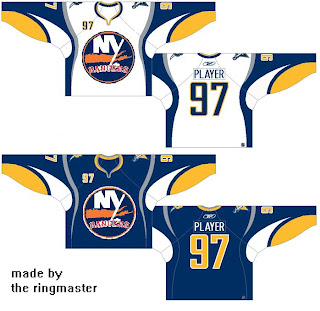
I think that needs no explanation. And sticking with NY for a moment, check out this Buffalo Sabres logo concept.

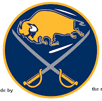
Yeah it takes a minute to really realize what you're seeing. At first you're thinking, "yeah, that classic '70s logo... but wait, something is a little off about it — aside from the buffalo being yellow, that is." Oh that's it! It has a slug head.

And just when you thought the Sabres hadn't been through enough for one Freak Out post, just wait for this.

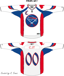
Perhaps if the Bills played hockey... No, just no. And while we're on the topic of odd jerseys, we have another.

I believe we've seen something of this nature before, but it's still funny to me.

Now we're heading out west for the rest of the post — starting with a very strange Vancouver Canucks concept logo.

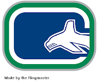
The whale is diving into the "C" ... get it? (Say it out loud if you haven't gotten it yet.)

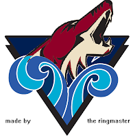
And with the QMJHL logo tournament in full swing over at ToHL, a reader sent me this logo crossing the Rimouski Oceanic with the Phoenix Coyotes.

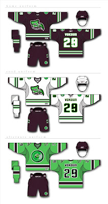
Finally, on a completely different tack, someone has not only created a brand for a team, they've created a brand new team. I'm told the Florida Panthers should move to Seattle to become the Totems.

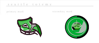
Now I'm no fan of the stinkin' Panthers but if this is the only option, I can't say I'd wholeheartedly support it. The design comes complete with jerseys and everything.

So keep your freaky artwork coming so I can keep this series going. Check back in two weeks for the next Freak Out Friday.

Oh, and to anyone out there who doesn't believe in the evil powers of Friday the 13th, consider this: Tim Russert dropped dead in the NBC newsroom today, a 6.9 magnitude earthquake rattled Japan, Iowa is under water and a tornado just tore off a bunch of roofs and wiped out a Wal-Mart down here in my part of Florida.

Yeah, but that Wal-Mart had it coming.

Thursday
Jun122008

Post Wednesday Wallpapers

Unfortunately, I don't have time to write up a real post tonight. Instead, I'm going to direct you to someone else's site. This guy's got a lot of cool NHL logo wallpapers you all might be interested in. Click here to check it out. More tomorrow.

Wednesday
Jun112008

Eastern Identities

Just when you thought things couldn't get better, what with the Wallpaper Wednesdays kicking off today, I have concept logos. And some really great ones too. And since we did the West yesterday, today we're sticking to the East. Dare I say it, some of them even rise to level of Matt's work.

We're starting with the New York Rangers. And before you balk at the notion of rebranding a member of the Original Six, just give it a chance.

If you've been reading this blog a while, you know how much I love the Lady Liberty logo for the Rangers. Here are the uniforms to go with that logo set.

These work exceptionally well and I think that's hard to deny. Now I could go on and on about the quality of this artwork, but I'm more interested in reading what you guys have to say, so comment below.

But first, let's move on to the Ottawa Senators.

It's like a Hulked up version of the new alternate logo. Scary. Very scary.

Got a couple more neat designs before I call it a night, including a secondary logo for the Toronto Maple Leafs.

Or who knows, maybe it would even work as a primary. But I'm smart enough to know you guys don't like messing with tradition.

Then this here is just a Philadelphia Flyers logo incorporating the Liberty Bell.

So we begin and end with "liberty" today, apparently. Weird. Totally unintentional. Seriously though, drop us a line. I really want to read what you guys think of these logos, especially the Rangers. (Take a close look at that secondary mark.)

I hope to have more for you tomorrow.

Wednesday
Jun112008

Wallpaper Wednesday I

As I've mentioned, today I'm launching a new series called Wallpaper Wednesday. In the middle of each week, I'll be showcasing some of the best desktop background artwork that's made its way to my inbox. I've already posted a few wallpapers over the last few days and one of the first was a great Bruins design.

It was created by a reader named Patrick, who is continuing a series based on the original. I've already posted the Oilers and today we have a couple of new ones. First, the Sabres.

I'm sure you Sabres fans love that he used your classic emblem. Also, the Flyers.

Now based on the recent poll, we know that the team with the largest percentage fan base visiting NHLToL is the Vancouver Canucks. So naturally, they've got to be included here. And I really like this wallpaper.

It's designed for a widescreen display yet at the same time compatible with standard screens. To those of you submitting wallpapers, I (and many others) would be forever grateful if you could work with this in mind.

This Thrashers wallpaper is also designed for widescreen, except in this case it's not completely compatible with standard monitors because of where the NHL logo is placed in the corner.

Finally, this one is absolutely stellar and while the focus isn't a logo, I can't pass up the chance to post it.

That's all for this week. If you sent something and I haven't posted it yet, don't worry, I'll get to it eventually. Thanks to everyone who has submitted!