NHL Tournament of Logos

Entries in capitals (60)

Friday
Jul202007

Lightning vs Capitals


vs
LIGHTNING
CAPITALS
3-5
4-3

The Aesthetics
While the Lightning logo may include an annoying wordmark, the Capitals logo is almost nothing but a wordmark. And not even a very good one. I like the Capitals' new colors, but I don't like what they did with them.
Lightning

The Nickname
If Lightning struck the Capital, it could all go up in flames.
Lightning

The Analysis
Both logos spell out the team name so it comes down to the more subtle elements. And in that area, the Capitals logo has a hockey stick and a puck. Still, I'm a fan of the three stars about the word "Washington." The Lightning logo, on the other hand, has no such subtle elements. Now if we were looking at the secondary, it has an outline of the state of Florida which is a nice touch. But we're not. No sweep for the Bolts here.
Capitals


WINNER
2-1


Saturday
Jul142007

Devils vs Capitals


vs
DEVILS
CAPITALS
5-1
4-2

The Aesthetics
The Capitals logo is really not much more than a wordmark and it may be solely for that reason that the point here goes to the Devils. However, the Devils have a pretty killer logo and we'll say that's why they get the point.
Devils

The Nickname
Is the Devil even on the same level as a Capital? He could swallow the entire place into pit of fire.
Devils

The Analysis
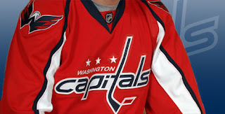
This Capitals was just introduced less than a month ago by the team. I think it still needs work. Still, its one redeeming quality is the three stars above the word Washington. They represent the D.C. flag. However, they get a little drowned out by the blatant and unnecessary use of a hockey stick and puck. I'm all for tradition and remembering where you came from, but this is just bad. Regardless, I'm still loving the "NJ" that makes up the red devil in the Devils logo. I'm not saying it can't use an upgrade or "modernization" but it definitely wins this match.
Devils


WINNER
3-0


Wednesday
Jul042007

Capitals vs Canadiens


vs
CAPITALS
CANADIENS
3-2
5-1

The Aesthetics
The red, white and blue abound here with the Caps' recent return to the original colors. Unfortunately for them, I felt it was the bronze and blue that made them stand out — in a good way. For choosing a new logo that spells out the name — and uses a hockey stick and puck, all of which I hate — I should take the point away out of spite. But I'm not like that. The Habs' logo is actually better looking and more balanced.
Canadiens

The Nickname
A Canadien is a citizen and is therefore subject to the laws created and passed in the Capital.
Capitals

The Analysis
Being that it was just unveiled last month, the Capitals logo has a more contemporary feel than one that was basically designed almost a hundred years ago. Matched with the fact that the Caps actually makes an attempt at alluding to its home city with the stars of the D.C. flag representing Maryland, Virginia and the district itself, I'm tempted to give it to the Capitals right there. I can't say the Canadiens didn't put up a fight, though.
Capitals


WINNER
2-1


Thursday
Jun282007

Hurricanes vs Capitals


vs
HURRICANES
CAPITALS
2-0
3-1

The Aesthetics
The Hurricanes logo is just better looking all around. Need I even bother getting into the bit about logos which are nothing more than a team name spelled out?
Hurricanes

The Nickname
The weather doesn't care about places. A Hurricane would blow the Capital away.
Hurricanes

The Analysis
I'm a big fan of the Caps' new colors — despite being one of the few people on earth who actually liked the blue and bronze. For the last time, it looked absolutely nothing like the USPS logo. Unless you're blind or something. Still we've been through why the Hurricanes logo is so befitting the name and why I think the U.S. Capitol dome was much more appropriate than three stars and 18 letters. I like the secondary logo for the Capitals better than this. Chalk up another sweep for the 'Canes.
Hurricanes


WINNER
3-0


Tuesday
Jun262007

Capitals vs Maple Leafs


vs
CAPITALS
MAPLE LEAFS
2-1
0-4

The Aesthetics
The new Capitals logo was just unveiled last week. It's sharp but it breaks one of my cardinal rules. And you know they're gospel, buddy. If we look we see both teams make the mistake of spelling out the full name in the logo. But someone has to get the point. The Capitals logo gets it for the good colors.
Capitals

The Nickname
If lawmakers in the Capital can pass legislation to, say, protect maple trees, they then have the upper hand on a Maple Leaf. Crazy thought.
Capitals

The Analysis
Both logos spell out the full team name so nobody's getting any default points here. The saving grace then has to come in how the logo depicts the name. Again, I was always a fan of the capitol building but three stars does not a point get. I've said before that a silhouette is too easy, but let me eat my words now. This one is very practical in comparison.
Maple Leafs


WINNER
2-1


Saturday
Jun232007

Islanders vs Capitals


vs
ISLANDERS
CAPITALS
0-0
0-0

The Aesthetics
The Capitals' new logo debuts in the tournament today — a day after being officially unveiled — and sadly, there's nothing very impressive about it. Both logos manage to spell out the team names completely. And both incorporate a hockey stick. And a puck! Completely unnecessary, in my opnion. Neither team should get this point. But somebody has to. The Islanders logo is a lot easier on the eyes in comparison.
Islanders

The Nickname
It's in the Capital where laws are written that might affect Islanders and perhaps what fish they're allowed to catch or not catch. I suppose.
Capitals

The Analysis
As I mentioned in Aesthetics, both logos have hockey sticks, pucks and the team name spelled out. The difference (aside from color) is how they incorporate representations of their home towns. We have an orange map of Long Island on one which is fairly obvious. On the other we have a very subtle ode to D.C. with three stars above Washington which are culled from the District of Columbia flag. I love subtlety in logos.
Capitals


WINNER
2-1


Friday
Jun222007

The Caps Unveiling Party


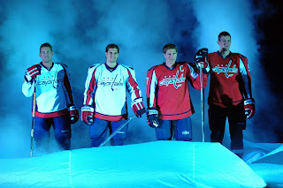
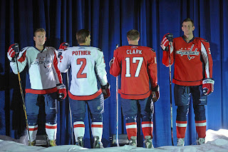
This evening the Washington Capitals had their big draft day party in D.C. where they unveiled the uniforms to fans. Check out all the cool smoke and stuff.

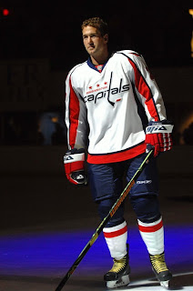
Ex-Bolt Ben Clymer is seen here modeling the brand spankin' new Caps duds. They're sharp uniforms. I still hate the logo though. I don't mind the shoulder logo with the eagle in the form of a "W." Anything but a logo made out of the team name.

I do get nostalgia and throwbacks and stuff, but come on. Put that on the shoulder or something. Anyway, it's not up to me and I'm not even a fan of the team. I'm just hoping the Lightning come up with something cool this summer.

We're all waiting on the "EDGE" of our seats. Come on! You don't like puns?

Friday
Jun222007

More Potential New Unis

Today is Draft Day and that means each team has to break out the "07" jersey to throw on the backs of their new draft picks. But this year every team is getting new jerseys and the only ones we've actually seen at this moment are Boston and Washington. For a refresher, these are them:
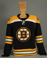
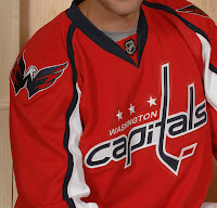
Now for what you haven't seen yet. At least not here, that is. While scouring the internet as I do I came across possible designs and mock-ups for both the Dallas Stars and New York Islanders. Let's start with the latter.

This appears to be a cell phone photo taken possibly covertly. But now the world has it via the wonderful internet. Now as with anything I post that isn't official, do take it with a grain of salt. I'm not anymore connected than you are reading this. The jerseys hanging here definitely have some color issues. I can't say I'm loving all the striping but so far I haven't really loved any of the new Rbk jerseys we've seen. That includes the Bruins and Capitals — although I did like what they wore at this year's all-star game. Am I too picky? Usually I like change, but I haven't been wowed over yet. Yet being the operative word there.

There's also this which might be better off the Hockey Fans & Photoshop series I just finished running a week or so ago. In fact the design even looks a little bit reminiscent of what I posted for the Dallas Stars during that series. Even if this is the team's actual design, it's not half bad. I don't hate it and I like the creativity with the crest on the dark jerseys. However, that in itself indicates a possible change back to the days when the home team wore white.

Don't you just love all this speculating. God knows I do. So that's that for now. Tune your sets to Versus tonight at 7 for coverage of the draft. We'll see if we get any sightings of new jerseys tonight. I'm sure we will. I'm also looking out for the possibility of new logos. I'm desperate for a new one from the Lightning and still expecting changes for Dallas, San Jose, Ottawa and Toronto.

More later tonight.

Friday
Jun222007

It's Official: Caps Unveil New Logo!

There it is, posted right on their official web site this morning. The official announcement and ceremony doesn't come until tonight. It's true. The Washington Capitals will actually be wearing that this fall. I'm not even sure about the shoulder logo there — except to say that its a million times better than what's on the front of the jersey.

I feel bad for Caps fans. Hey, unless they like it. And then I'm just a jerk.

Wednesday
Jun202007

The Way It Was?

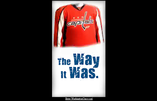
At this point I am awfully tempted to believe that the image we saw yesterday of the new Washington Capitals uniform is the real deal. The images you see here to the left are what you find on the Caps' official web site as of today. The graphics very closely match as you can see. Having said that, still anything is possible. Once again, we get the official word from the team tomorrow evening.

For now, I leave you with this...