NHL Tournament of Logos

Entries in capitals (60)

Monday
Aug272007

Result: Bruins vs Capitals

Boston
BRUINS

61% 6,438 votes

Washington
CAPITALS

39% 4,123 votes

10,561 total votes

Boston Bruins
Advancing to Quarterfinals to face Ottawa Senators

Washington Capitals
Eliminated


Poll opening date
Aug 20 @ 4:22 AM
Poll closing date
Aug 27 @ 11:59 PM

07CHTRN | #E1E | BOSvWSH

Monday
Aug202007

Poll: Bruins vs Capitals


vs
Boston
BRUINS
Washington
CAPITALS


Place your vote and then feel free to leave a comment as to how you came to your decision. Tell all your friends to drop in and vote! The more voices heard, the more accurate the results!

Poll opening date
Aug 20 @ 4:22 AM
Poll closing date
Aug 27 @ 11:59 PM

07CHTRN | #E1E | BOSvWSH

Saturday
Aug182007

Revisiting The Caps, Cats

The Washington Capitals and Florida Panthers have already officially unveiled their new Rbk EDGE jerseys for this season, but that won't stop me from posting fan-designed concepts for those two teams.

Let's start with the Capitals and a couple of designs that have been floating around since about way back in January.
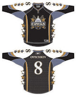
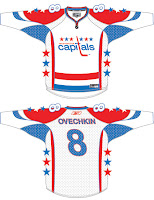
How about those lookers? Naturally, they're based off that infamous all-star jersey template. There are lots of colors. The quilt in my old bedroom is coming to mind. Sew a patch here. Sew a patch there. By George, you've got yourself a hockey jersey.

Moving right along now. Shortly after the Capitals announced they would be making a return to their traditional colors of red, white and blue, this concept popped up on the web.
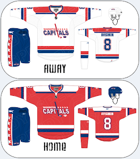
The logo aside, that wouldn't be a half-bad uniform design, if you ask me. I could see the Caps wearing something like this and looking very good doing it. Know what I'm saying?
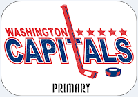
For a closer look at the logo used in that design, see the image to the left. What's interesting is that it makes use of "capitals" in the text of the logo. The irony is that the current logo and the one from the '70s are written in lowercase type. Weird, right? In addition to that, this logo also uses the stick and puck from the dome logo of recent years.

It's sharp work, but ultimately I don't feel it would be an improvement on what the Capitals ended up going with for their new unis. Now let's move on to the Panthers. Got some cool stuff there.
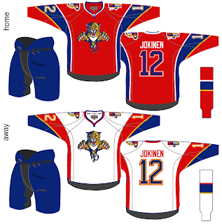
This is from the designer who treated us to the Ottawa Senators jerseys I posted yesterday. Check out the swooshes on those sleeves. That's quite something. Not sure about the choice to put blue numbers on the red jersey. Probably better off with white. I'm also intrigued by the use of the yellow. These jerseys look nothing like the Panthers despite the use of the same colors.

What I think is cool is the concept for a new secondary logo on the shoulders of these sweaters. For a closer look at that, check out this alternate jersey idea.
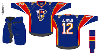
That's different. Though between that and the sun with the palm tree crossing the hockey stick, I prefer the current shoulder patch. Also, try to visually imagine a player wearing all of those items. That is quite a lot of blue, isn't it? Blue sweater, blue pants, blue socks — and the only thing that breaks it up is the red stripe on the sock.

Hope you enjoyed that. If you want to see what these two teams' uniforms actually look like, I've set up a photo gallery you can access from the sidebar.

But enough with my opinion, let's have yours. Comments go below.

Friday
Aug172007

Getting All Conceptual On Logos

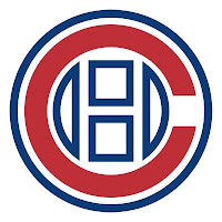
One of my favorite things is seeing the ideas people have come up with for new team logos. I always like to start off with the most outrageous stuff. So Montreal Canadiens fans, prepare to gouge out your own eyes (because I know you will).

That's an idea someone came up with to update the Habs' logo. Personally, I think it's interesting but that it doesn't outdo what they have now.

I'm sure the Montreal faithful have lost their lunch, but I'm all right with that. But in all fairness, what do you guys think? Is it really that bad, or would this be the way to go if things needed to change?

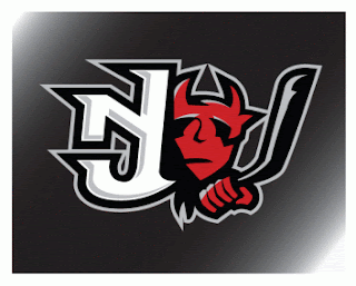
This next concept logo comes from designer Ian Baker. He worked on an idea for the New Jersey Devils.

It's interesting, I kind of like it but again I'm not sure it would be much of an improvement on what they currently wear. I really like the Devils logo. It's one of those logos that will live on as an NHL classic a century from now.

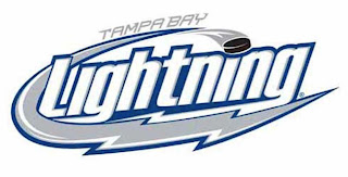
It turns out the same ad agency who designed the first Tampa Bay Lightning logo I posted on Wednesday, came up with another idea. More of a word mark, but here it is.

It's pretty cool. I don't like the puck in it, but that's just me.

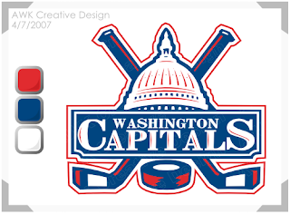
And finally, I'll leave you with a design that I feel would actually be an improvement for the Washington Capitals. I don't really like their new logo. I was a fan of the bronze and blue. But even if they had to switch back to the red, white and blue, what about keeping the logo. Something like this?

If you've got any thoughts or comments on these designs or any others, you know where to put them. Right down there in the comments section.

Wednesday
Aug082007

Senators vs Capitals


vs
SENATORS
CAPITALS
6-6
4-9

The Aesthetics
The Capitals logo is a word mark, and with only three days to go in the tournament, you should well know that doesn't work well for me. I don't think we need much more of an explanation than that.
Senators

The Nickname
Somebody recently wrote in wondering how this match would go. Here's how I see it. The Capital is where the Senators convene. If there's no Capital, there are no Senators.
Capitals

The Analysis
Aside from the word mark, all the Capitals logo offers are three stars and a hockey stick/puck. Please. The Senators logo offers up a bunch of cool stuff. It's got a gold "O" for Ottawa and a red "C" for Canada. Win-win. And that does it for the Capitals in this tournament.
Senators


WINNER
2-1


Wednesday
Aug012007

Flyers vs Capitals


vs
FLYERS
CAPITALS
5-8
4-8

The Aesthetics
Hey, speaking of the Capitals. A dissenter (Pens fan) among you recently commented that I was a "bandwagon hockey fan" because my personal preferences lean away from liking his team's logo. He called me a Capitals fan. I'm sure he didn't mean any offense to Caps fans. Anyway, if you are one, don't be offended by my distaste for your team's logo. I like the new colors, but wordmarks don't work for me.
Flyers

The Nickname
You suppose some Flying creatures could attack a Capital city? It would be like a remake of the Alfred Hitchcock movie. (You come up with something better.)
Flyers

The Analysis
I like the three stars on the top of the Capitals logo but that's about its sole redeeming quality in my eyes. They're blurry. That's why I wear glasses. The "P" in the Flyers logo does a better job of subtly referencing its home city. And that I like. There are other things too that I've mentioned in past matches, but we'll leave that for now. It's the end of the tournament for the Flyers. They'll finish with a sweep.
Flyers


WINNER
3-0


Monday
Jul302007

Capitals vs Rangers


vs
CAPITALS
RANGERS
4-7
2-9

The Aesthetics
Man, the red, white and blue abound. Though, personally, I'm one of the few that believe a darker blue would better serve the Rangers. But then I also like the Lady Liberty logo better than the shield. For one thing, they don't even use a logo anywhere on their regular jerseys. Still, the Capitals logo is a wordmark and that doesn't earn it points in my book. I'm going with the shield.
Rangers

The Nickname
The Capital is the center of the goverment and Rangers are mere governmental peripheries.
Capitals

The Analysis
The Rangers logo is a classic. The Capitals thought their '70s logo was a classic which is why they used it for the inspiration for the new logo. It's inexcusable, really. Even the eagle on the shoulder is better than the wordmark as far as crests go. The Rangers deserve this point to right along with the win.
Rangers


WINNER
2-1


Sunday
Jul292007

Capitals vs Thrashers


vs
CAPITALS
THRASHERS
4-6
5-6

The Aesthetics
The hockey sticks in these logos abound. But that's fine, what I'm staring at is the wordmark that the Capitals are calling a logo. The Ducks made this mistake and I hope they're going to learn from it. Seems we'll have no such luck with the Caps. Plus I think the Thrashers logo has a sharp and rather unique color scheme.
Thrashers

The Nickname
Hmm. Maybe the Thrashers open fire on the Capital by freeing their "droppings" on the buildings causing mountains of paperwork as the government tries to get it all cleaned up. Stretch, yes.
Thrashers

The Analysis
I'm sorry, I was a fan of the Capitol dome logo. I don't know why it had to go just because the colors got changed. But who knows why the Capitals do anything? But I can't in good conscience allow them to have this point. That's a neat bird on that Thrashers logo.
Thrashers


WINNER
3-0


Saturday
Jul282007

Bruins vs Capitals


vs
BRUINS
CAPITALS
5-2
4-5

The Aesthetics
If you were keeping track, this is the first time in the tournament where two brand new logos have met. And the letters abound. The new Capitals logo, in my opinion, is definitely a downgrade. I like the colors all right, but then I was one of the few who though the blue and bronze worked really well. Anyway, the Bruins redesign was definitely an upgrade. While the difference may not be noticeable to most people just looking at it quick, it's light years ahead of what they team had been wearing.
Bruins

The Nickname
The headline would read: "Bruins terrorize Capital!"
Bruins

The Analysis
Both logos are made up of letters so we'll have to consider that. I really do like the bear used on the Bruins shoulder logo. That should be the primary. Put the spoked "B" on the shoulder. Speaking of which, does anyone happen to know the significance of the spokes? Or is that just a design element that happen accidentally and has lasted half a century? The hockey stick and puck in the Capitals logo, while more cleverly designed than in the '70s logo, are superfluous on any NHL logo if you ask me. But I think the three stars put it over the Bruins logo for this point. It's at least making a good effort at referencing the region.
Capitals


WINNER
2-1


Saturday
Jul212007

Capitals vs Sabres


vs
CAPITALS
SABRES
4-4
4-3

The Aesthetics
The Capitals logo, as discussed is a wordmark with a hockey stick and a puck and that is the opposite of what's required to take this point. On top of that, the Sabres actually have a rather aesthetically strong logo.
Sabres

The Nickname
I can't really think of how to compare Capitals and Sabres, but let's say an army of Sabre-wielding anarchists stormed the Capital. They would probably overwhelm the lawmakers.
Sabres

The Analysis
Sabres fans everywhere have bemoaned the "Buffaslug" all year, begging for a change. I agree in that the team could do better, perhaps in merely placing an actual sabre in the logo would be an improvement. It's the reason why the team hasn't earned this point all tournament. That won't change today. Despite the Capitals logo being a glorified wordmark, the three stars representing Maryland, Virginia and the District will win me over in this match.
Capitals


WINNER
2-1