NHL Tournament of Logos

Entries in capitals (60)

Tuesday
Jun192007

I'm A Little Concerned...

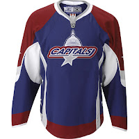
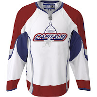
Why am I concerned? Folks, this very well may be the new Washington Capitals uniform and logo. And it is not looking good. Now you know me. You know I wouldn't post something I didn't believe to be the real deal where I didn't specifically say it was fan-created. I have a bad feeling this could be it.

Let's hope it's just that though. A bad feeling. And that the Capitals organization has a little more sense than this. And that there's a very Photoshop-inclined hockey fan out there who really hates the Capitals. All right then.

I nabbed this image off of a forum that seems to indicate the Caps may have intentionally leaked the new look. But like I said and will say over and over again, it could all be nothing. Still, I am inclined to post it. We'll just have to wait and see. The official word comes on Friday evening. Do stop by here for that news. You know I'll have it.

Monday
Jun182007

Panthers vs Capitals


vs
PANTHERS
CAPITALS
1-0
1-0

The Aesthetics
Both logos use a lot of detail and eye-catching elements, but face it, the Panthers is just so much cooler. It's hard to say who has the better colors, but I"m going have to give the Panthers the edge here.
Panthers

The Nickname
The Panther is an endangered species and it is in the Capital where they write the laws to protect them.
Capitals

The Analysis
As I've said, the Panthers is a very appropriate nickname for a team from Florida. Not that Capitals doesn't work for a team from Washington, D.C. Ultimately, we have to look at the colors and logo design. I'm giving the edge to the Panthers because of the Capitals' use of hockey sticks in the logo. They do add some nice symmetry but they're rather unnecessary.
Panthers


WINNER
2-1


Wednesday
Jun132007

Penguins vs Capitals


vs
PENGUINS
CAPITALS
0-0
0-0

The Aesthetics
Right off, both logos have a lot of complexities though we find a lot more in the Capitals, obviously. On the other hand, its colors are appealing and used well. The Penguins makes use of only a single color outside of black and white (albeit a good color). Despite the Capitals' use of a script spelling out the team name (and city) within in the logo, it still squeaks by with the point.
Capitals

The Nickname
If we assume the Capitals are lawmakers of some sort, then it's their job to write laws to protect Penguins and other animals. They therefore have the upper hand.
Capitals

The Analysis
Washington, D.C. is the capital of the United States so the name seems like a rather obvious choice. But as far as the name goes, my question is: What is a Capital? A Penguin is a little ineffectual flightless bird. Regardless, I don't know what relevance Penguins have to the city of Pittsburgh as Penguins tend to live in rather chilly locales.
Capitals


WINNER
3-0


Friday
Jun082007

A Caps Contest

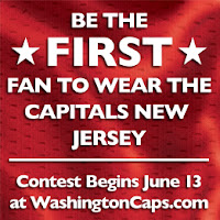
I don't really know what this is supposed to be about, but one way or another, I suppose we'll find out on Wednesday. Seems like the Washington Capitals will be holding a contest among fans to be the first to get to try on the brand new Caps unis. I guess that means free tickets to the big party where it will be unveiled. Too bad I'm not a Caps fan.

Monday
May212007

HF&P, Part 7: Washington Capitals II

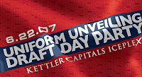
This is the "Hockey Fans & Photoshop" series and continues with an unusually massive post. First of all, I know I already did a Washington Capitals post. But in about a month the Washington Capitals will unveil the new uniforms they've been talking about at a draft day party. The graphic to the right is meant to promote the event — open to season ticket holders and fans in D.C. I obviously won't be there but I'll be keeping a look out online that day. I can't wait to see what they come up with.

But in preparation for that, I've been scouring the net for other fan-made designs. Just before the HF&P Caps post came one of a similar nature featuring this design. Those are fine but there are many more — just that I've come across.
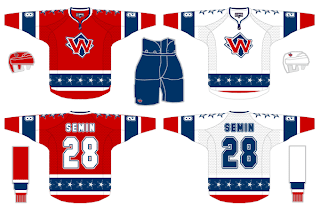
I really liked the all-star jerseys from when the game was held in Minnesota. So I think these jerseys would be great for the Caps. Not so much the logo. That might make a good secondary logo for the shoulder, but how about a "DC" instead of a "W"? But the colors work well along with the 18 stars that don the shoulders and waist.
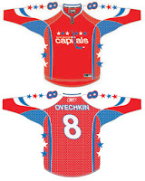
In keeping with this general color theme we get this rendering. The lettering is a bit out of style but then so is the logo. Seems one fan thinks this would be what the uniforms might look like if the Capitals returned to their '70s logo with the new Rbk EDGE uniforms. But this one only has 12 stars and is therefore inferior.

I kid of course, but frankly, that is a red I would rather not see on the ice — ever. But credit to the designer for trying. It's more than I've come up with.
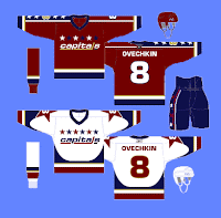
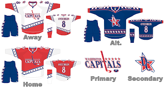
This is another design I thought was rather unique. It ignores the new Reebok jerseys but I still like the idea. A little blast from the past featuring some more contemporary elements. The road jerseys are cool with the arm number set within a star. I'm not sure how I feel about the gold color, though. Keep the bronze and just dabble in the dark red. I also like the use of stars down the right sleeve on the home sweaters. It's a cool design but like all of the others, it will never hit the ice.

And neither will this one.

Coming tomorrow: the Boston Bruins.

Tuesday
May152007

HF&P, Part 2: Washington Capitals

In case you missed yesterday's post, HF&P stands for "Hockey Fans & Photoshop." It has a lot to do with the fact that this series of posts features potential uniform designs consistent with the new Rbk EDGE unis to be used next season. No NHL team has yet officially unveiled their uniforms, but hey, fans can dream right?

By the way, I didn't do any of these designs so don't let me take any credit. I'm just re-posting someone else's handiwork that I found kind of cool.

Today's graphic is for the Washington Capitals. The Caps previously announced plans to return to a red, white and blue color scheme so this fan took it a step further and came up with a new logo — a modernized version of the old '70s logo. The graphic features an "alternate" design and as one reader pointed out yesterday, the league has said it will be shelving "third jerseys" for a while as the teams adjust to the sweeping uniform changes.

If it makes any difference, I really like the "DC" star logo. Put a graphic design firm on that to touch it up and we may have something there.

Coming tomorrow: the St. Louis Blues.

Sunday
May132007

FanFic Canucks Jerseys

Okay, people, we're down to less than a month before the tournament begins but that doesn't mean this site is useless until then. Everyday (hopefully), over the next several weeks I'll be posting information regarding new logos and uniforms. So keep checking back. You know you want to.

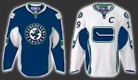
First, I have to start out by scolding myself for forgetting the name of the blog where I found this image. With regard to the coming announcement about new uniforms and logo adjustments, a Vancouver Canucks fan had a little fun with Photoshop.

Quite honestly, I don't hate the design they came up with. On the other hand, I'm fairly sure the final product won't be anything close to this. Plus, I've always been a fan of teams using different logos on their home and away jerseys. I want to say Atlanta was the first to do that when they entered the league, but Washington would've been pretty close. Currently, Ottawa does that as well. In the case of the Sens and Caps, though, the dark jerseys are former third jerseys that have been promoted.

Anyway, just wanted to share that tidbit with you tonight. Like I said, keep checking back for more every day.

Saturday
May122007

FanFic Caps Unis Making Rounds

a Cathode Rays & Power Plays cross-post from May 3, 2007

First off, of course they're fake. Everybody keeps posing the ridiculous question: Are these real? Are you for real?

As is evidenced by the web address where the images are located, the handiwork comes by way of a graphic artist — from Baltimore, Maryland. (Clearly either a Caps fan, or friends with one.) If he's just hosting it on his site, I'll be very surprised.

Anyway, the design mixes the old with the new in that it keeps the dull (instead of bright) colors and elements of both the old logo and the current one. Note the "Capitals" script with the dome element above it. The grey star beneath it is interesting but it doesn't work on the white jersey. As I've said, I've never been a fan of NHL logos wherein the team name is blatantly spelled out. That's not what a primary logo should be.

That's all for now. Remember, the Washington Capitals unveil their actual new logo and uniforms on June 22.

Friday
May112007

Caps Unveiling New Logo June 22

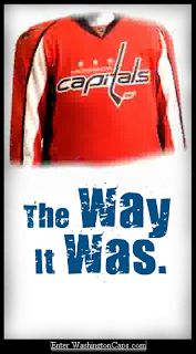
Now that the tournament blog is officially open for business, let's get to the business. We have our first bit of news by way of the Washington Capitals. They are the first team to announce plans for a new logo and uniforms. The Caps made the official announcement of their intentions on their official site — WashingtonCaps.com.


The Caps' official site had this graphic as their splash page during the week following the announcement.

Like the Sabres and Canucks, the Caps are planning a return to the colors they wore originally when they entered the league in 1974. What's with everybody going back to '70s colors? I know style is cyclical, but come on already. You can read the team's press release below.

Washington Capitals to Unveil New Uniforms at June 22 Draft Day Party

April 23, 2007

ARLINGTON, Va. — The Washington Capitals will unveil their new uniforms at a special Draft Day Party on Friday, June 22, held at the Kettler Capitals Iceplex in Arlington, Va. The event will be held in conjunction with the live broadcast on Versus of the first round of the 2007 NHL Entry Draft, which takes place that evening in Columbus, Ohio.

The new uniforms will mark a return to a red, white and blue color scheme — the colors the Capitals wore from their first season in 1974-75 through 1994-95. The Capitals are the first team in the NHL to announce their plans to unveil their new uniforms, which are produced by Reebok and feature the Rbk EDGE Uniform System technology that was introduced at the 2007 NHL All-Star Game in Dallas. The Capitals are the first team planning to have their new uniforms on hand at the NHL Entry Draft.

Further details about the event will be announced in the coming weeks.

Monday
Apr302007

Capitals


Washington CAPITALS


Team Information
Team Colors / red, white, blue
Inaugural Season / 1974-75 (33 years)
Current Logo / 2007-08 (0 years)

Tournament History

2007 Qualifying Tournament
4-10, 15 pts
Finished 11th in East; 23rd overall

Page 1 ... 2 3 4 5 6