NHL Tournament of Logos

Entries in flyers (67)

Thursday
Jun212007

Flyers vs Penguins


vs
FLYERS
PENGUINS
2-2
0-1

The Aesthetics
Both teams call the same state home and both logos make use of a single color outside of black and white. The orange and gold are quite unique but there is almost too much detail in the Penguins logo. However, that seems to add to it in this case.
Penguins

The Nickname
A Penguin is one of the rare birds that is unable to Fly. Too bad.
Flyers

The Analysis
This point is incredibly difficult to award in this case. Neither logo makes a very good representation of its locale but hit the nickname right on the money. The angry penguin veers away from cartoonish yet can be bogged down in minute detail. Meanwhile the generic winged "P" fits well with the generic nickname. It comes down to this: When looking at them side by side, the stronger logo is the Flyers by a hair.
Flyers


WINNER
2-1


Wednesday
Jun202007

Flyers vs Rangers


vs
FLYERS
RANGERS
2-1
1-2

The Aesthetics
Both logos symbolize storied franchises but as I've said many times before, words can kill the aesthetics of any logo. That and I love subtle letters such as the "P" in the Flyers logo.
Flyers

The Nickname
As with any bird, it's the job of a Ranger to protect the Flyer, who therefore has the upper hand.
Rangers

The Analysis
Quite honestly, red, white and blue have never been such important colors to New York City than in the aftermath of the attacks of 9/11. That makes the Rangers colors very significant. Meanwhile, the Flyers logo doesn't go a very long way to symbolize its home city of Philadelphia.
Rangers


WINNER
2-1


Sunday
Jun172007

Flyers vs Bruins


vs
FLYERS
BRUINS
1-1
0-0

The Aesthetics
Here, both logos are very simple and very similar. Black and white are featured primarily with a slim helping of a color and each features the first letter of the home city. While the Bruins logo simply features a "B" in a circle, the "P" attached to a wing in the Flyers gives the feeling of movement and is therefore more eye-catching.
Flyers

The Nickname
Assuming the Flyer is a bird, when it lands in the tree, the Bruin will climb up and eat it. Yum!
Bruins

The Analysis
Both teams have been around for a long time. And while the Bruins emblem has gone through many alterations and upgrades, the Flyers logo has remained largely the same throughout its lifetime. Cheers to staying power and Halloween colors.
Flyers


WINNER
2-1


Saturday
Jun162007

Flyers vs Hurricanes


vs
FLYERS
HURRICANES
1-0
0-0

The Aesthetics
Both logos utilize black and white along with a primary color — red for the Hurricanes and orange for the Flyers. But the Hurricanes logo adds a silver accent. The Flyers works in a subtle "P" while the Hurricanes has a subtle puck. It's a tough one, but the Hurricanes gets the edge.
Hurricanes

The Nickname
Nothing can Fly anything in a Hurricane. It's as simple as that.
Hurricanes

The Analysis
I've always thought the Liberty Bell would make a good secondary logo for the Flyers, just like a torn hurricane flag makes a good secondary for the Hurricanes. But this competition is about primaries. Having said that, the Hurricanes name might be more appropriate for a team closer to the Gulf of Mexico, but still works for a state that has had its share of Hurricanes. I still don't really know what a "flyer" is exactly.
Hurricanes


WINNER
3-0


Friday
Jun152007

Sabres vs Flyers


vs
SABRES
FLYERS
1-0
0-0

The Aesthetics
The Flyers logo is almost overly simplistic but is a classic. Upgrades are always welcome, however, for logos that have existed for 30 years or more. The third-jersey logo is a good example of what can be done. The Sabres logo features nice colors but no sword.
Flyers

The Nickname
Are we to assume a Flyer is a bird of some type or an informational sheet? Either way, if it were to get in the way of a Sabre, its days would be over.
Sabres

The Analysis
Flyers is one of those generic team names that doesn't mean anything but its long, storied existence strikes fear into the heart of opponents. Unfortunately for them, this game doesn't work that way. Still, the weak logo design for the Sabres gives the Flyers the edge.
Flyers


WINNER
2-1


Friday
May252007

HF&P, Part 10: Philadelphia Flyers

I know, I'm a bad blogger, I promised this post yesterday, but I had a pretty nasty stomach virus that had me in bed all day. I know, no excuse. Now without further ado, "Hockey Fans & Photoshop" continues into the double digits with the Broadstreet Bullies.

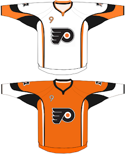
It's not a bad design. Rather simplistic when compared to some of the others we've seen. But I like it. I'd gotten used to the Flyers wearing black but I think a return to orange would be welcomed. Like others, this design also makes use of the front shoulder number on the jersey a la the Buffalo Sabres' new duds this season.

Now the coolest thing about this design is on the shoulders. Check out that secondary logo. I've always said the Liberty Bell would make a great secondary for the Flyers. I think it's really cool. I hope one day we can really see it on their uniforms.

Hope you enjoyed today's post in the HF&P series. It's been fun. And there's still so much more to come in the next 18 days before the tournament begins. How excited are you right now?!

Coming tomorrow: the Dallas Stars.

Monday
Apr302007

Flyers


Philadelphia FLYERS


Team Information
Team Colors / orange, black, white
Inaugural Season / 1967-68 (40 years)
Current Logo / 1967-68 (40 years)

Tournament History

2007 Qualifying Tournament
6-8, 20 pts
Finished 9th in East; 16th overall

Page 1 ... 3 4 5 6 7