NHL Tournament of Logos

Entries in flyers (67)

Saturday
Jul212007

Flyers Jersey Concept Designs

Hope you're enjoying the tournament. In the last few days, the traffic here on this blog has skyrocketed, due in part, I believe, to links being posted on various message boards. I thank you all for dropping in and I hope the information regarding new jersey and logo designs for this fall that I've been providing is helpful.

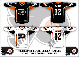
Today we get a look at a fan-made concept for the new Philadelphia Flyers uniforms. These designs have the Rbk EDGE cut but use the same layout scheme as the all-star uniforms, which is why I know its fan art and nothing official from the team. I'm under the impression the Flyers will be going with black for their home jerseys this season. Take a gander.

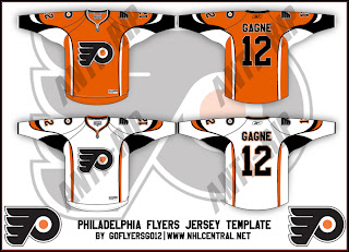
If you were wondering what the home uniforms might look like in orange, check out the design below.

Once again, these were of course designed by a fan and despite the fact that the Flyers are taking pre-orders for the 2007-08 jerseys, we have yet to see what one will actually look like. As usual, keep it here for info on that as it becomes available.

Friday
Jul202007

Maple Leafs vs Flyers


vs
MAPLE LEAFS
FLYERS
1-8
4-8

The Aesthetics
These are a couple of classic example of NHL logos. Unfortunately, the Maple Leafs won't win this point because of the words inside the leaf silhouette. I happen to like the leaf, though, I just think there's more they can do with it. The Flyers logo may be limited on color, but at least it uses more than two.
Flyers

The Nickname
I'm not sure a Maple Leaf could deal a blow to a Flyer of any sort.
Flyers

The Analysis
It's finally been time for the Flyers to shine today. I've always liked the logo; I've just liked others better. And I really do like the maple leaf silhouette but it just doesn't work for me with the team name in the middle of it. The Flyers logo, alternatively, is solid and classic, despite the fact that it was obviously designed in the 1960s. What sells it for me is the "P" for Phildelphia attached to a wing. And we have a sweep.
Flyers


WINNER
3-0


Saturday
Jul142007

Flyers vs Thrashers


vs
FLYERS
THRASHERS
4-7
3-3

The Aesthetics
You can tell these two logos come from very different eras. Both of are strong hockey logos but when it comes to the look and use of color, the Thrashers beat out the Flyers in that area despite the blatant use of a hockey stick.
Thrashers

The Nickname
You could say a Thrasher is a Flyer. But the Thrasher sounds much fiercer.
Thrashers

The Analysis
This is where the Thrashers logo gets in trouble for its hockey stick. At the same time, its where I give credit to the Flyers logo for the "P" that does Philly proud. I also like the simplicity in the Flyers logo but the sharp, tapered points in the Thrashers logo work in its favor. Still the Flyers have one of those classic sports logos that will be around forever, I'm sure.
Flyers


WINNER
2-1


Wednesday
Jul112007

Panthers vs Flyers


vs
PANTHERS
FLYERS
5-1
4-6

The Aesthetics
Straight away, the Panthers logo seems a lot more striking. In comparison, the Flyers logo seems plain and colorless. Sometimes things aren't what they seem. But sometimes they are.
Panthers

The Nickname
Panthers can't Fly for more reasons than just that they haven't got any wings.
Flyers

The Analysis
Both logos are very appropriate to their teams. The colors aren't inherent but they work well. Only the Flyers logo makes a head fake toward recognizing the home city, but any favor they won there was lost with that lack of color problem they're having. Despite its strength, it's a bit of a dull logo to look at. And despite the minute details in the Panthers logo, it is interesting to look at and therefore wins this point.
Panthers


WINNER
2-1


Saturday
Jul072007

Lightning vs Flyers


vs
LIGHTNING
FLYERS
2-3
4-5

The Aesthetics
You would think the fact that the entire team name being spelled out would automatically lose this point for the Lightning. But that's not quite the case. The Lightning logo makes much better use of color in that there's more of it. Despite wearing black home jerseys, the only black in the logo is the drop shadow on the bolt. The Flyers logo is almost all black but for the orange circle in the middle.
Lightning

The Nickname
No bird can Fly through a Lightning storm. It would get zapped!
Lightning

The Analysis
Neither logo makes a representation of its home city. The Lightning wear a shoulder patch with the outline of the state of Florida behind the bolt, but that logo's not in this competition. This one spells out the whole name and therefore defeats the purpose of what a symbol should be. The Flyers, however, does that very well. It's a "P" for Philly with a wing attached. (I guess the "P" flies.)
Flyers


WINNER
2-1


Friday
Jul062007

Flyers vs Senators


vs
FLYERS
SENATORS
4-4
3-2

The Aesthetics
It's funny. I never noticed the similarities between these two logos until just now. Both have wing-like elements on the left side and semi-circles on the right. Anyway, the Flyers logo has the same problem as the Sharks in the West. Too much black and not enough of the primary color. Find a way to make this logo more orange and then we'll talk. Until then, despite being a little heavy-handed with the detailing, the Senators logo is so much cooler looking.
Senators

The Nickname
Within the government, the Senator holds a lot of power over what laws should be passed to, say, protect endangered species, some of which may Fly. I know, a stretch, but you come up with something better. Seriously, comment away if you feel like it.
Senators

The Analysis
I'm not entirely sure what a Flyer is meant to be — perhaps a generic bird of some sort — but this competition is about logos, not team names. And when you say Philadelphia Flyers it's difficult for me to picture anything but the winged "P." So I'd say they got it right. I'm just not as happy with the Senators logo. I've heard rumblings that the Sens will go full-time with what is currently the third jersey logo. It's light years ahead of this one and I'd love to see them do it. Maybe then they can have this particular point.
Flyers


WINNER
2-1


Thursday
Jul052007

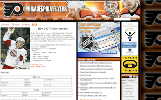
Flyers Rbk EDGE Jerseys Up For Pre-Order


Grabbed this from the Philadelphia Flyers' official web site. They're taking orders for the team's new Rbk EDGE jerseys. The jerseys will be unveiled on September 16. So if you're a Philly fan, go ahead and get your $200 order in for a product you've never seen — and won't get to until the day it arrives at your door. I'm assuming there won't be any glaring changes to the uniforms since they're taking orders prior to the unveiling.

Either that or it's a really ugly design and they'll be taking in a lot of suckers.

Thursday
Jul052007

Canadiens vs Flyers


vs
CANADIENS
FLYERS
5-2
4-3

The Aesthetics
Here, both teams have rather generic names both logos are letter-based — one a "C" and the other a "P." And there's nothing wrong with that. In fact, I'm all for it. I'm also all for the use of color, which is rather lacking in the Flyers logo. A single small circle of orange doesn't exactly spread around the color. Like I've said, I like the third jersey logo a little better.
Canadiens

The Nickname
I'm not sure how a battle between a Canadien and a Flyer would go down, but if we say a Flyer is a bird, those are nasty little pooping machines and no one is safe when they are airborne.
Flyers

The Analysis
One thing I should've mentioned in the Aesthetics section is the attractive simplicity of these two logos. There's not a lot of annoying detail here, just plain old great logos. And they're similar in a lot of ways. In fact, both are division leaders at the moment. But ultimately, it's the use of color, the subtle "H" and the Flyers logo's need for an upgrade that insures the victory for the Canadiens.
Canadiens


WINNER
2-1


Saturday
Jun302007

Flyers vs Islanders


vs
FLYERS
ISLANDERS
3-3
0-4

The Aesthetics
That's a lot of orange up there. We're almost going to have to start defaulting this point automatically to the team that does not use their name in the logo. The Flyers logo gets this point for showing a hair more creativity.
Flyers

The Nickname
I have no idea. We're just going to say that the Flyer is a nasty bird that poops on the Islander's head while he's out fishing.
Flyers

The Analysis
Here's where we have to give a little credit to the Islanders logo for the use of the map of Long Island. I would be thrilled if somehow the Flyers could work in the Liberty Bell or some other Philly landmark. Though I'm tempted to revoke this point from the Isles for the blatant use of a hockey stick and puck — the words notwithstanding. But I won't though, because this is where the Flyers falters.
Islanders


WINNER
2-1


Wednesday
Jun272007

Flyers vs Devils


vs
FLYERS
DEVILS
3-2
1-0

The Aesthetics
Both logos prominently feature black and white along with another color and subtle letters. But all you have to do is look at them to know the Devils logo is the cooler one.
Devils

The Nickname
The Devil could cut the Flyer's wings off with his pitchfork. That's becase he's pure evil.
Devils

The Analysis
So simple the way this tournament has been done, right? Simple is good in logos. These two are good examples of that. To rerpresent the names we have a winged "P" and red devil complete with horns and a pointy tail. Who's better? They're kind of on the same level, aren't they? Unfortunately for the Flyers, I've seen their alternate logo from the third jersey and it's better. They should switch to it full time.
Devils


WINNER
3-0