I know you'll all be sad to see it go, but today I'm wrapping up my week-long series of whacked-out and crazy images. So let's get this final show on the road. Our first stop is Pittsb— er, Kansas City. Or, well, I don't really know. You figure it out.
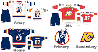
I know we've seen a lot of crazy shit, but wow. A Kansas City Scouts Rbk EDGE jersey with Sidney Crosby's name and number. I'm sure this design was concocted in the days when the Pens' future was largely uncertain. With KC looking like a predator ready to pounce, you never know. Just, wow. I don't really have any other words. Maybe you guys can find some.
Over in Philly, there's a consortium that can't tell the logo forms a "P" unless it's cockeyed.
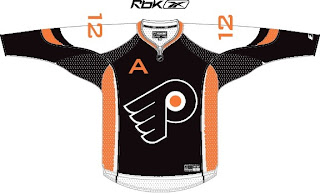
My neck hurts from looking at that. My eyes hurt after looking at this.
Ha ha. Now your eyes hurt too. I promise I won't do that anymore.
Oops, gotcha! You guys are easy. Anyone want to see a black coyote?
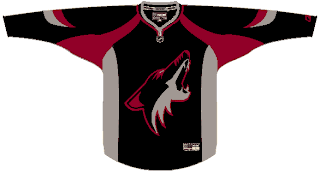
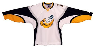
Probably not anymore, huh? Seriously, though. Charlie, from SabresNotSlugs.com really needs to see this. It could be the new logo for his site.
Somebody didn't like the slug. Showed it what a sabre is. Then gutted it. Sad story, really. But you guys haven't seen the half of it yet. Remember the amazing composite logo Pfizer created for the Canucks. He dropped the Sabres logos into the same blender. It produced this.
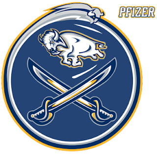
Maybe that should be your new logo, Charlie. Sometimes we just don't recognize how good we have it.
I hope I've been successful this week in freaking you all out a little bit. My goal is to show you that what you have, despite what some of you think, isn't that bad. We all like to moan and complain about changes but just remember, they could've done so much worse. And then where would we be?
I'm going to leave you one last little nugget, though. On Tuesday I posted a crazy concept for the Tampa Bay Lightning. I also asked if someone might be able to show me what it would look like on a player. As I close out this series, let me leave you with that image. Let me burn it into your soul.
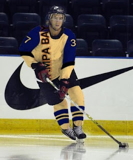
Big time thanks to Russ for that one!


 1 Comment
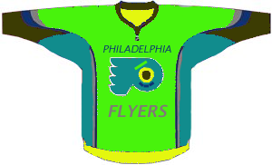
 Philadelphia Flyers
 Tampa Bay Lightning


