NHL Tournament of Logos

Entries in kings (57)

Wednesday
Aug012007

Canucks vs Kings


vs
CANUCKS
KINGS
5-7
6-5

The Aesthetics
This is a hard one. I like both of these logos. How to choose. I actually like the Canucks logo's color scheme better than the Kings. I also like the Haida style artwork. It's very unique in this league. But both of these teams have struggled with an identity for decades, changing logos constantly. But as for right now, I'm going with the Canucks.
Canucks

The Nickname
A King pretty much gets whatever he wants. He can have Canucks do... anything really. Go whaling or something. I don't know. Where are my creative juices when I need them?
Kings

The Analysis
As far as logos pertaining to the team names, a Canuck is not a whale. A King is not a crown, but he wears one. I also like the subtle hockey sticks in the top of the crown and the suns on either side of it. The Canucks logo doesn't offer anything cool like that.
Kings


WINNER
2-1


Tuesday
Jul312007

Kings vs Blues


vs
KINGS
BLUES
5-5
5-7

The Aesthetics
Some logos just don't look very good next to each other. These two look very good. It's kind of a wonder they seem to be bathed in mediocrity in this competition (or not based on my bad judgment). One thing that always gets me is the two-tone blues of the Blues logo. That's unique and very cool in combination with the yellow trim. I hope they don't lose that anytime soon. Unfortunately for the Kings, all I keep seeing right now are all the little circles. There must be like a dozen of them on that crown.
Blues

The Nickname
All right, you can already tell this one is going to be a stretch. Do you suppose a King would simply be able to hire a person to play music for him, be it Blues or anything else?
Kings

The Analysis
I like the subtle hockey sticks at the top of the crown and the suns on either side of it in the Kings logo. But I also like the Blues logo as it has been recently pointed out to me that the logo is a 64th note and the city of St. Louis was founded in 1764. So what it comes down to is which one works better. Frankly, I think the Blues logo looks more like a wing than a 64th note but it was a good effort. Kings, please.
Kings


WINNER
2-1


Saturday
Jul212007

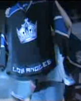
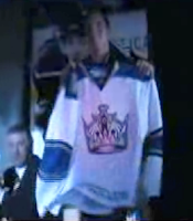
Kings' New Uniforms Official

It's been brought to my attention that there is in fact another team that has unveiled their new Rbk EDGE jerseys. The Monday after draft day, I posted photos I came across of what appeared to be said uniforms. Turns out, the Kings actually did unveil them officially at the team's draft day party.


I know the image quality sucks, but you're looking at screengrabs from a video shot at the Kings draft party. They show Jack Johnson holding up the home jersey and Michael Cammalleri with the road sweater. For a better look at both jerseys, the photos I first posted were accurate.


Thanks to those of you who pointed this out to me. We now have five teams with OFFICIALLY unveiled jerseys for 2007-08. If you want to keep up with who's done what, there's now a tracker in the sidebar.

Friday
Jul202007

Kings vs Ducks


vs
KINGS
DUCKS
4-5
1-8

The Aesthetics
All three California teams are getting play today. Need I say anything beyond that the Ducks are still using a wordmark as their primary logo? They don't get this point. They don't deserve it. Plus, the crown is just cool like that
Kings

The Nickname
The King rules all the land. A Duck is an insignificant bird.
Kings

The Analysis
While I applaud the unique colors of the Ducks logo, the Kings colors are equally unique and are featured in a logo that is not letters. Plus, I like the subtle hockey sticks and the suns on either side of the crown. The Kings logo is a cool one that I could see sticking around for a long time, unlike their half-dozen previous logos. The Ducks just need to go with the webbed "D" or design something new altogether. This really isn't working.
Kings


WINNER
3-0


Tuesday
Jul172007

Oilers vs Kings


vs
OILERS
KINGS
1-8
3-5

The Aesthetics
Well it's been a full two weeks since we've seen the Oilers in action. And at that time they were way ahead of everyone in matches played. Today, they're pretty much on par with the league. Unfortunately, they still have the same logo made up almost exclusively of the team name. The Kings on the other hand, are still looking as good as ever.
Kings

The Nickname
A King rules the land. An Oiler digs in it.
Kings

The Analysis
I feel like the Oilers logo missed the boat. The current shoulder logo isn't all bad and the third jersey logo is epic (after all, it was created by a comic book writer). Put this one on the shoulder. And that is all I have to say on the matter. The Kings hit the nail on the head with this logo. I like the purple shield they used in the late '90s but a crown is so much more effective. Add in the subtle hockey sticks and the suns on either side and you can call this a sweep of the coolest kind.
Kings


WINNER
3-0


Friday
Jul132007

Kings vs Blackhawks


vs
KINGS
BLACKHAWKS
2-5
2-7

The Aesthetics
Both logos have a lot of detail but one thing I really like is their unique outlines. Imagine seeing just shadows of the logos. It's a good sign when you can place it based solely on that. More on that another day. Still, though, its the Kings with the obviously better looking logo. Defined and unique colors along with those subtle hockey sticks in the crown tip the scales in their favor.
Kings

The Nickname
I believe it was the King who ran the Indians and Chief Blackhawk out of town. He was a bastard.
Kings

The Analysis
The logos are appropriate for their teams. That's always a good start. The Kings logo, however, goes a step further in reference their home city with the suns on either side of the crown. Nothing really there in the Blackhawks logo. And it has too many colors.
Kings


WINNER
3-0


Saturday
Jul072007

Kings vs Flames


vs
KINGS
FLAMES
2-4
5-0

The Aesthetics
Solid color schemes and unique outlines are what we have here. The Kings logo is a little complicated but I like the subtle hockey sticks at the top of the crown. As for the Flames, simplicity can sometimes not work out. The flames on the left side of the logo seem unbalanced (which in some cases can be good), but I like the symmetry in the Kings emblem.
Kings

The Nickname
Flames could completely burn down everything the King's land and there isn't a whole lot he can do to stop it.
Flames

The Analysis
Nothing says Kings like a crown but the Flames logo actually has flames — and a "C" to symbolize Calgary. I also like the subtle suns on the sides of the crown to remind us the Kings live in California. It's a tough choice, but ultimately, the Flames get the point.
Flames


WINNER
2-1


Sunday
Jul012007

Stars vs Kings


vs
STARS
KINGS
1-1
1-4

The Aesthetics
I like the unique colors seen in both logos but there are too many letters in the Stars logo. Plus I don't think a few tweaks here and there would hurt.
Kings

The Nickname
Again, all-consuming ball of fire. A Star would obliterate even the King. Are they going to win this one every time?
Stars

The Analysis
The Stars logo has a very Texas feel to it and that is more than admirable. Unfortunately those damn words keep bugging me. The Kings logo works in a pair of subtle hockey sticks which works for me but what it really does that's awesome: check out the subtle suns on both sides of the crown. Welcome to sunny California.
Kings


WINNER
2-1


Friday
Jun292007

Kings vs Avalanche


vs
KINGS
AVALANCHE
1-3
2-0

The Aesthetics
This should be a pretty strong match-up. Both teams have great logos with off-the-beaten-path color schemes. Where else do you see purple and silver or blue and burgundy? But the Avalanche logo is more of a classic with a simpler design. I think it will be around forever. Kings logos seem to come and go.
Avalanche

The Nickname
I don't care what the King orders, an Avalanche could completely wipe out his kingdom.
Avalanche

The Analysis
A lot is good about both logos and it's difficult to say which is better but such is the task at hand. Nothing says "king" like a crown — which also works in subtle hockey sticks. An avalanche of snow is led down a mountain in the shape of an "A" by a very subtle puck. And you know how subtlety rocks my socks. It was not easy to award this point.
Avalanche


WINNER
3-0


Monday
Jun252007

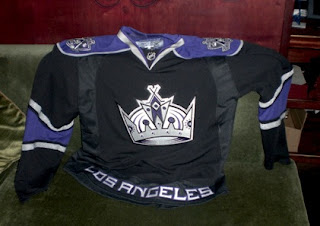
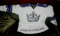
Possible New Kings Jerseys

As you know, I'm always more than happy to share new uniform designs I come across while scouring the web. Today we get a look at a photo of what is likely the Los Angeles Kings jerseys. Word is they were on hand at the team draft party. The team hasn't made any official unveiling or announcement as far as I know, but I wouldn't expect much fanfare anyway. There doesn't appear to be much difference between the Rbk EDGE design and the current one.

So I have nothing bad to say about them but as usual, take it all with a grain of salt. I obviously don't know for certain if this is the real deal, but I can't see any reason why it wouldn't be.

By the way, I hope you're enjoying the tournament, the few of you that seem to be following it. Feel free to leave comments as we go along about your feelings on how these logos stack up against each other. Should readership of this blog expand, I'd like to do a tournament that's voted on by the fans. Would probably be more realistic, anyway.

Thanks for stopping by.