NHL Tournament of Logos

Entries in kings (57)

Friday
Feb082008

Just To Freak You Out XXVI

After a week off, Freak Out Friday is back in action tonight! And there's some pretty crazy stuff here. We're beginning in Alberta with a rivalry between the Edmonton Oilers and Calgary Flames.

Now, we've seen "If They Mated" concepts created simply by recoloring one team's logo with the other's colors. This goes a step beyond that. Actual time and effort was put into this. And that in itself is frightening.

Yeah, I'll understand if you need a minute after seeing that. But hold on, now. Wait until you seem these logos on jerseys.

I really don't know what to say about that. But while we're on the topic of odd jerseys, I have these.

The Boston Bruins should never use this logo ever again. I understand it as something coming out of the 1970s. But we're all a little older now and just look at it. It's ridiculous. Meanwhile, the Kansas City Scouts on a Wild jersey? Just weird.

Now I've got some offbeat logos. The first is a Kings/Ducks mixture.

The Los Angeles Mighty King Ducks of Anaheim is pretty spectacular. But how about the Pennsylvania Flying Penguins? (No, I didn't make that up.)

Also we've got a morphed Minnesota Wild logo, making obvious use of the letters MW much to my disapproval.

It's not like I don't appreciate the work put into this, but the Wild have a pretty awesome logo as it is. To do this to it has got to be considered heresy in some manner. Which reminds me...

Yeah, it takes "Flaming C" to a whole new level. (No pun — or offense — intended.)

All right, yes the pun was very much intended.

Monday
Feb042008

Finally, Some Concept Art

I really feel bad for having gone so long without a concept art post. It's not as if I didn't have anything on deck, either. A friend of mine would say if I really felt bad, I'd stop doing it. I just wish I had more time to dedicate to the blog the way I did over the summer when most of you started visiting.

But it's a tough job, finding the time to add new content daily and I just want you guys to know I'm giving it my best. I'm lucky to get polls up every day so I just wanted to say I appreciate your understanding. And eventually I know I skipped the Freak Out Friday last week (we should have one this week) and I will update the bracket as soon as I have a chance. (By the way, keep the emails coming. It's the only way I know whether anyone is still interested in the site.)

Anyway, I have some fan made logo and jersey designs to share from my inbox. Allow me to take you on a trip to California in what will be one of the longest concept posts in a very long time.


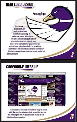
I wanted to start with something really well-designed. As part of what I understand to be a school project, this designer painstakingly created an entire identity for the Anaheim Ducks — whose current logo was, to my surprise, eliminated from competition in the first round of the Quest for the Worst.

At least tell me you guys would vote this one down.

But while I mock the current logo, it does have its redeeming qualities. For instance, a simple improvement would simple call for a dropping of the "UCKS." As such.

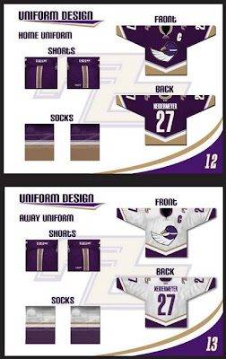
My favorite logo still has to be this one, though.

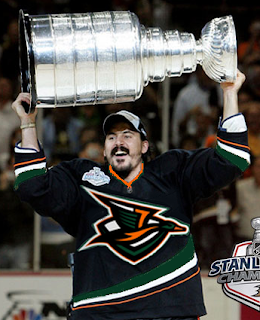
One of a kind, I tell you. Obviously, they would've looked so much better raising the Cup in that sweater.

Now let's head to L.A. where we've got a couple of options. The first one keeps the colors while simplifying the uniforms.

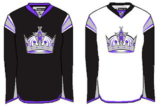
The second suggests switching the silver to gold and toying with past logo designs.

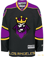
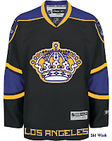
I know you guys tend to mock it, but I love that king logo. I love everything about that logo! Especially it's subtle asymmetry. But for what it's worth I hated the jerseys it was worn on. Yes, they were different and interesting, but at some point you have to realize you've got a gray gradient wrapped around your jersey. And then it just get weird.

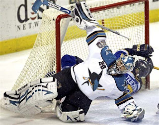
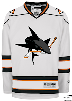
Speaking of weird, I could never understand why the San Jose Sharks unveiled a "full shark" logo and consigned it to the shoulders. My feeling is you put it front and center.

Then you take the new fin logo and put that on the shoulders, which this artists did not do. And staying on the weird tack, check out this blue jersey.

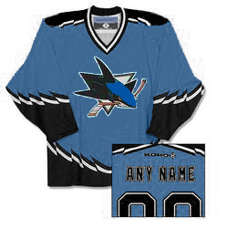
Yeah, it didn't work for the Bruins. It certainly doesn't work for the Sharks. Consider the effort applauded, but really, no.

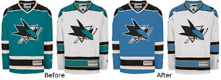
However, this brings up a good point. In the digital age, the hue is often mistranslated and sometimes the Sharks look like they're we're a greenish teal and sometimes they don't. What about a complete switch to blue?

Now for a little something out of left field. A lot of folks bemoaned the introduction of orange but few have even considered letting go of the teal. Until now.

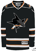
Notice too how the diamond-shaped fin logo appears on the shoulders of these sweaters. I like it but it's very lackluster in the color department. Maybe some teal accents or something to go along with that orange. I don't know.

Anyway, I thought we had a nice Californian crop of artwork tonight. As always, I welcome your thoughts below in the comments.

Friday
Feb012008

Poll: Bruins vs Kings


vs
Boston
BRUINS
Los Angeles
KINGS


REMEMBER: You're choosing the WORST logo!

Place your vote and then feel free to leave a comment as to how you came to your decision. Tell all your friends to drop in and vote! The more voices heard, the more accurate the results!

Poll opening date
Fri Feb 1
Poll closing date
Tue Feb 5

Friday
Jan252008

Just To Freak You Out XXV

Time for this week's Freak Out Friday post — which happens to be the 25th ever. You know you love it. By the way, you're going to start to notice a very specific theme. Just go with it. I'll begin with a little something to startle you.

Now something to downright disgust you.

Who would do that to the Blues logo? And why?

Beware of purple sweaters.

And scary Tim Burton penguins.

Also white sweaters, apparently.

And sweaters with trees on them.

Yellow ones as well.

There's so much to be wary about these days that you might hope to find solace in the Vancouver Canucks.

All hope is lost.

And any notion of a sensible design.

Finally, the fisherman you all love so much may not have worked for the Islanders, but if the Whalers every make a return, I think we've found their man.

Hope you guys enjoyed this episode. Stay tuned for a brand new one next week. Same bat time. Same bat channel. (Batman on the brain. Just watched Batman Begins again today.)

Thursday
Jan172008

Poll: Kings '67 vs Kings '95


vs
Los Angeles
KINGS '67
Los Angeles
KINGS '95


REMEMBER: You're choosing the WORST logo!

Place your vote and then feel free to leave a comment as to how you came to your decision. Tell all your friends to drop in and vote! The more voices heard, the more accurate the results!

Poll opening date
Thu Jan 17
Poll closing date
Mon Jan 21

Saturday
Jan052008

Concepts In Photos

It's my favorite thing. Concept renderings in pseudo-photographic form.

The most commonly used player for these jersey redesigns has overwhelmingly been Roberto Luongo. And it hasn't just been Canucks concepts for him, either. But tonight, yes, they are both Canucks concepts. Here's one.

Seriously, I would buy that. That green looks phenomenal. I don't know why his teammate isn't also wearing green over there on the left, but that team would still look a million times better if only Luongo wore a good sweater. While I'm thinking of it, are there still people left who liked the old '80s logo and colors?

Don't be fooled, though. It's not the jersey. Luongo can make anything look good.

Next we're moving on to the Philadelphia Flyers.

It's a simple redesign that incorporates orange and a bit of silver. But if you want to see the goalie wearing it, well you'll have to look at the image on the right (not the left).

Back to the days of black-and-white Kings here.

And hurricane flags that are actually hurricane flags.

Now we see why the team didn't do that in the first place. The shoulder thing is cool because it incorporates both of the Carolina-named states. I don't think a dividing line at the border would be too much to ask for clarification's sake.

Lastly, if you hated those mustard-colored jerseys once worn on special nights by the Nashville Predators, then you're absolutely going to adore this.

And one final note (which may or may not explain the late hour of this particular post) if you are into things that are funny but not necessarily hockey-related. First, go see Juno. Great film. (In one scene there's a guy wearing a Minnesota Wild jersey. The green one you all like.) And buy a copy of Stephen Colbert's "I Am America (And So Can You!)". (I'm pretty sure he's all about the OHL's Saginaw Spirit.) These two things will complete your life. If they don't, you have no soul.

Friday
Dec212007

Just To Freak You Out XX

The quality of Freak Out art I've become accustomed to was sorely lacking this week and that'll be clear after you get through tonight's post. It's not that nobody sent anything, it's that they were either trying too hard or not trying hard enough. I've got to have some standards, right? Perhaps not, but I'll forbear any further deliberation if for no other reason than to quite simply get on with it. Good plan?

What's wrong with this picture?

Yes, it seems like some of the colors there are a bit off. These too.

And don't even get me started on the absurdity of tropical storm flags surrounding a jersey with a Hartford Whalers logo on it. My head would explode.

Next is a Philadelphia Flyers concept logo that I think fits fairly into the "freaky" category.

At first, I liked this New York Rangers jersey. But the more I stare at it, the more it disturbs me. I don't care how old that team is. They need a new logo.

And finally, this one I just can't figure out. My brain tells me this is a nice Photoshop job, but a small part of me fears someone, somewhere actually made this jersey.

Islanders fans, I apologize. That's just horrible.

Anyway, that's all I've got for this week. Hope you got a little freaked out. And I hope you guys will keep sending in good Freak Out Friday material so we can keep this series going. Enjoy your holiday weekend!

Thursday
Dec202007

Poll: Thrashers vs Kings


vs
Atlanta
THRASHERS
Los Angeles
KINGS


Place your vote and then feel free to leave a comment as to how you came to your decision. Tell all your friends to drop in and vote! The more voices heard, the more accurate the results!

Poll opening date
Thu Dec 20
Poll closing date
Mon Dec 24

07SCTRN | #2D | ATLvLAK

Saturday
Dec152007

Poll: Kings vs Blue Jackets


vs
Los Angeles
KINGS
Columbus
BLUE JACKETS


Place your vote and then feel free to leave a comment as to how you came to your decision. Tell all your friends to drop in and vote! The more voices heard, the more accurate the results!

Poll opening date
Sat Dec 15
Poll closing date
Wed Dec 19

07SCTRN | #1H | LAKvCBJ

Wednesday
Dec122007

Concept Art Grab Bag

I don't really have a theme for tonight's concepts post. Mainly, I just thought these were different and interesting. Kind of curious to see what sort of feedback they get.

One of my favorite things is seeing really nice concepts painted onto game action photos. So I'll start with those. There's this one Kings design from a while back that I liked a lot.

I think it's kind of funny that Roberto Luongo is wearing it. I guess L.A. fans can dream, right?

There was also a bit of Canadiens artwork that I made part of a Freak Out post that a lot of people responded rather well too. Here you can see what it looks like on Cristobal Huet.

I wonder why both designers decided to paint fake jerseys onto goalies. Hmm.

Anyway here are a few more wacky designs that don't quite warrant being included in the Freak Out series.

For those who don't care for the sky blue, how about maroon? Doesn't look terrible either. I'm sure the asymmetry is still driving you nuts though. And how about the Ducks' logo and colors on a Sabres jersey? That's pretty weird.

I thought the colors were interesting on the Bruins jersey. That logo really did wear out its welcome, though, didn't it? And for a complete change of pace, I've got a Flyers jersey with a redesigned set of logos.

And to finish things off, as far as ironies go, I thought this was a pretty good one.

The Columbus Blue Jackets wearing red sweaters. Don't get me wrong. I think it's a really nice-looking jersey, but blue is in their name. It's one of those no-brainers.

Anyway, let me know what you guys think of those. I'll try to have more posted tomorrow.