NHL Tournament of Logos

Entries in maple leafs (68)

Friday
Aug032007

A Peek At The New Leafs Jersey?

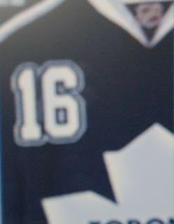
While making my rounds on the various message boards, I recently bumped into the image below which is being touted as a sneaky photo of the new Rbk EDGE jersey for the Toronto Maple Leafs.

As we've come to expect, it's blurry and doesn't show very much but for a number on the front of the sweater a la the Buffalo Sabres' new unis. Obviously, it's not out of the realm of possibility that this is the artistic work of a fan.

For one thing, I've been hearing for a very long time that the Maple Leafs are planning to update or modernize the logo. The one we sort of see here appears to be no different from what they've been using. Ah, but fear not, faithful Leafs fans, it won't be a drastic change. They do update it every couple of decades or so, so it's probably due.

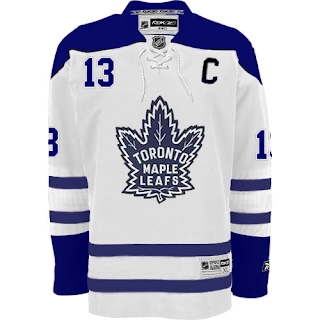
Anyway, while I'm on the topic of fan-created artwork, a reader sent me this image he made based off of the Boston Bruins' new road sweaters.

It's pretty solid. What do you guys think? Would you like to see Toronto in something like this or something completely new and different just to changes things up?

By the way, just as a side note, I added the Edmonton Oilers to the uniform countdown. A reader wrote in saying that the unveiling date is said to be September 17, the day of the team's first preseason game. Despite there being no official word from the team on this matter, I'm tempted to say that date is rather solid considering they wouldn't wear their old uniforms for a preseason game anyway. If it comes sooner, though, I'll surely let you know.

Thursday
Jul262007

Hurricanes vs Maple Leafs


vs
HURRICANES
MAPLE LEAFS
9-1
1-10

The Aesthetics
I know I continue to disappoint Maple Leafs fans for my lack of love for their logo, but I like pictures. The symbol on a jersey should be just that — a symbol. And while I think the leaf by itself is a little too boring to be its own logo, there's plenty that can be done to improve it. Or at least that's what I'm telling people. The Hurricanes logo is a cool one — a symbol for a jersey.
Hurricanes

The Nickname
This one pretty much writes itself. The winds of a Hurricane would blow all the Maple Leafs away.
Hurricanes

The Analysis
Now my distaste for the spelled out name on the maple leaf doesn't extend to this category. The reason I think it deserves this point over the Hurricanes is that the 'Canes logo lacks a good representation of the Carolinas, while the leaf is the very symbol of Canada itself and you can't really beat that.
Maple Leafs


WINNER
2-1


Monday
Jul232007

Oodles Of Rbk EDGE Jersey Concepts

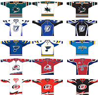
All right now, I know this is exciting stuff but please try to contain yourselves. A great reader to whom I'm enormously appreciative sent links my way for the jersey artwork you see below. PLEASE DO NOT CONFUSE IT WITH ACTUAL OFFICIAL DESIGNS. These are merely the work of an artistically-inclined hockey fan pondering on the future of the NHL's aesthetics.

To enlarge an image below, just click on it. The designer of these went through the painstaking task of creating three different design schemes for 17 different teams, one of which doesn't even exist. It's worth noting that the NHL has said there will be no third jerseys this year during the transition to the new Reebok sweaters. Though I don't know who created them, these designs are just for fun. I'd implore you to avoid the urge to post a comment about how they aren't real, lest you lack the reading skills of a third-grader. (In which case nothing I write would matter.)

For your pleasure, I'll go through each of them one-by-one.
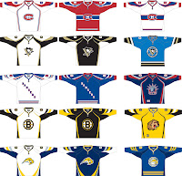
CONCEPTS #1
Not much to speak of with regard to the Canadiens designs. It's basically what they wear now with more curvy lines. The Penguins designs are interesting, if for no other reason than the alternate is a throwback to the days when the club wore blue. The Rangers concepts update the name running across the front while keeping Statue of Liberty logo on an alternate jersey. Personally I'm of the opinion it would make a great crest on a jersey worn night in and night out. But it's not my call. What's interesting to note here is the jersey number placed on the bottom corner of the front of the alternate.

Then there's the Bruins concepts wherein we realize this must be the musings of a fan as the Bruins have already unveiled their jerseys which look nothing like this. I'm a little creeped out by what appears to be a lion head on the alternate. (Don't try and tell me that's a bear.) Beneath that is a series of Sabres jerseys with a fun throwback as an alternate. Don't count on seeing that on the backs of Buffalo players anytime soon.
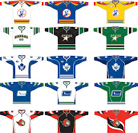
CONCEPTS #2
First off, the team on top, the Kansas City Scouts, haven't existed for the better part of three decades. Let's not let that stop us though. With all this talk about KC becoming an NHL market in the near future, who wouldn't wonder? But I doubt seriously they'd go back to that old gem. It is interesting to look at though. The Stars are rumored to be foregoing the traditional crest for the word "DALLAS" across the front of the road jerseys. Is this the NBA now? Let's not have any cheating refs, at least. As for the other two designs, I'm partial to the green.

I like the minor upgrades made to the Maple Leafs logo but the design could use some work. We'll waive straight stripes in place of curvy ones for the Stars yet not the traditional Leafs? The silver is a nice touch, however, on the alternate. A twist on the stick-in-rink Canucks logo doesn't improve it in my eyes. But I do like the colors. And as for the Senators design, it's basically an Rbk EDGE twist on the current sweaters. The Sens should be getting a new logo though, so I wouldn't count on seeing this on the ice.
CONCEPT #3
The hockey world seems to be taken with this Sharks logo thought to have been leaked by the club itself. Personally, I'm skeptical but that's my nature. And while I don't love it, I'm a big fan of that color scheme. I wouldn't mind seeing players wearing something like that. The white and blue Lightning jerseys I've posted before. The black one is kind of cool and I wouldn't mind a design like that on my team. The logo is growing on me a little. But the team hasn't made an official announcement yet so take it for what it's worth.

The Blues design is cool. I like the light blue alternate and even the name written across the chest doesn't bother me that much. The Avalanche concepts are very sharp. They should be so lucky as to be wearing something like that this fall. My praise, however, falls short on sight of the alternate. No, no, no. I applaud the effort, but still... no. As for the Hurricanes design. In my mind, it would be hands-down best in the league. It's the best concept I've seen so far this summer for any team!

CONCEPT #4
The Red Wings designs are simple enough. Perhaps a little too simple. And the maroon and red of the alternate clash in a way that hurts my brain. I like the Islanders concepts as well. The slanted bars on the alternate are especially cool and I don't think any Isles fans would complain if their team went with something in this neighborhood.

And there you have it. Now that you've got my opinion on all 17 designs, tell me yours! Comment below!

Saturday
Jul212007

Thrashers vs Maple Leafs


vs
THRASHERS
MAPLE LEAFS
4-6
1-9

The Aesthetics
The Thrashers logo is so much better looking than the Maple Leafs. And I say that despite the hockey stick the bird is holding. What's worse is the team name completely spelled out in the Leafs logo. I've said before how the Maple Leafs can improve without scaring lifelong fans away. It is possible, believe it or not.
Thrashers

The Nickname
I've never heard of a Maple Leaf hurting a Thrasher. The Thrasher, on the other hand, has some nasty claws.
Thrashers

The Analysis
Neither logo is really strong in this category. Here's the thing, though. When you look at the two, which is easier to guess the home city of, if you didn't already know it? If we're ignoring the fact that Toronto is spelled out in the Maple Leafs logo, the maple leaf itself is a dead giveaway for Canada. It would be pretty impossible to guess where the Thrashers come from.
Maple Leafs


WINNER
2-1


Friday
Jul202007

Maple Leafs vs Flyers


vs
MAPLE LEAFS
FLYERS
1-8
4-8

The Aesthetics
These are a couple of classic example of NHL logos. Unfortunately, the Maple Leafs won't win this point because of the words inside the leaf silhouette. I happen to like the leaf, though, I just think there's more they can do with it. The Flyers logo may be limited on color, but at least it uses more than two.
Flyers

The Nickname
I'm not sure a Maple Leaf could deal a blow to a Flyer of any sort.
Flyers

The Analysis
It's finally been time for the Flyers to shine today. I've always liked the logo; I've just liked others better. And I really do like the maple leaf silhouette but it just doesn't work for me with the team name in the middle of it. The Flyers logo, alternatively, is solid and classic, despite the fact that it was obviously designed in the 1960s. What sells it for me is the "P" for Phildelphia attached to a wing. And we have a sweep.
Flyers


WINNER
3-0


Sunday
Jul152007

Maple Leafs vs Devils


vs
MAPLE LEAFS
DEVILS
1-7
6-1

The Aesthetics
The disparity in the records of these two logos is rather apparent. However, look at them and you think hockey instantly. I'd say that they're recognizable to almost anyone on the continent. Still, this point is about looks. I've said over and over again that the Maple Leafs logo would be great if not for the team name in it. That remains true. Perhaps we'll have something new presented to us this summer. No official word from the team yet.
Devils

The Nickname
Those little Maple Leafs keep getting the raw end of this deal. But then we are talking about the Devil. Everything up in flames.
Devils

The Analysis
Here we have classic hockey logos that have been around for decades. That doesn't mean they couldn't use an upgrade, though. The Devils logo is great and though it doesn't really need it, a slight modernization wouldn't hurt. The Maple Leafs, on the other hand, need to get their name out of their logo. Otherwise, the leaf silhouette is awesome. Maybe next time.
Devils


WINNER
3-0


Thursday
Jul122007

Panthers vs Maple Leafs


vs
PANTHERS
MAPLE LEAFS
6-1
1-6

The Aesthetics
Look at the contrast in these two logos sitting side-by-side. But let's be honest, which logo draws your eye better? While you could say the Panthers logo goes overboard on detail, you would have to say the Maple Leafs logo is sorely lacking in that category. And if that wasn't enough to give this point to the Panthers, the 17 letters in the Maple Leafs logo are.
Panthers

The Nickname
It's a Panther, you know, with razor sharp teeth and claws. And a Maple Leaf which has probably wilted and fallen from a tree. Sometimes things are obvious.
Panthers

The Analysis
While it's true that I've always liked the leaf silhouette, I'm turned off by the words inside it. There's so much that could be done with it. Add an outline. Perhaps a noteworthy landmark from Toronto like the CN Tower. Something to liven it up. But until the day comes when that happens, the Panthers will steal this point for the sweep.
Panthers


WINNER
3-0


Thursday
Jul052007

Maple Leafs vs Rangers


vs
MAPLE LEAFS
RANGERS
0-6
2-6

The Aesthetics
Don't we just love those Original Six matches? We have a combined total of 31 letters embedded in these two logos. How much worse can it get? There's no reason to spell out your team name all over a logo that is supposed to serve as a symbolic replacement for said name. I like the use of multiple colors in the Rangers logo but it's the unique maple leaf silhouette that at least gives us some graphical representation of the team name. They'll take the point.
Maple Leafs

The Nickname
If we're sticking with the whole park ranger interpretation — which is lame, I know — then its the Ranger who is in charge of protecting the Maple trees and their Leafs.
Rangers

The Analysis
Neither logo makes a real effort at city recognition but each has been in those cities for nearly a century. It's not that I hate old logos or those which have been around for many years. That's a big part of what hockey is today. These two logos are some of the most recognizable in all of sports. But that doesn't mean that graphically we still have to live in the early 20th century. Make a few upgrades to show us that these teams exist in 2007. A good example is the Bruins. Ward off staleness, folks. Now when it comes down to it, the Leafs logo takes this point for unique lettering and a very cool maple leaf outline. (Shut up! Did the Maple Leafs really just get a win?)
Maple Leafs


WINNER
2-1


Sunday
Jul012007

Canadiens vs Maple Leafs


vs
CANADIENS
MAPLE LEAFS
3-0
0-5

The Aesthetics
They're two of the most storied teams in the league and one of the biggest rivalries in all of professional sports. But when it comes to which of the two has a better logo, the answer is pretty clear.
Canadiens

The Nickname
A Canadien dude walking down the street crushes many Maple Leafs under his feet. That's just how it goes.
Canadiens

The Analysis
Both logos are simple but its the red that makes the Canadiens logo stand out. The spelled-out name only detracts from the Maple Leafs logo, because I think the leaf silhouette is great. I'm a little disappointed that simple letter "C" — with a subtle "H" hidden inside — is all that is meant to symbolize the team. But sometimes you get a name that's difficult to do more than a letter with. The Habs complete the sweep.
Canadiens


WINNER
3-0


Wednesday
Jun272007

Senators vs Lightning


vs
SENATORS
LIGHTNING
2-2
1-1

The Aesthetics
This point goes the way of the Senators for other reasons than just that the Lightning logo spells out the team's name. It's also overly simplistic — like something a five-year-old child would draw. The Senators logo has the power to strike fear.
Senators

The Nickname
A bolt of Lightning would strike a Senator dead — or at least unconscious.
Lightning

The Analysis
With Tampa considered by some to be the Lightning capital of the world, no name could be more appropriate. On the other hand, a better logo might be what's required. If only we could lose all the letters from it. Did you know there are 17? The Senators logo gets the point for a better depiction of its namesake.
Senators


WINNER
2-1