NHL Tournament of Logos

Entries in maple leafs (68)

Thursday
Aug232007

Canadian Team Unveiling Dates

Yes, I have just a little more Canada for you guys. I almost forgot about this. With the Senators having released their new Rbk EDGE jerseys, that leaves five other Canadian teams left to do so. Only the Canucks and Flames have made official statements. Vancouver will do the deed on August 29 and Calgary on September 4.

The Oilers, Maple Leafs and Canadiens have yet to announce official dates, but I've been told of likely dates for unveilings for those teams that I've added to the sidebar countdown. Apparently, Montreal will go on September 4. Toronto shows off their duds on September 13 — this according to CBC. And Edmonton will supposedly unveil theirs on September 16.

Once again, those three dates are speculative until the teams make official announcements. But the sources seem reliable enough to add the dates to the countdown.

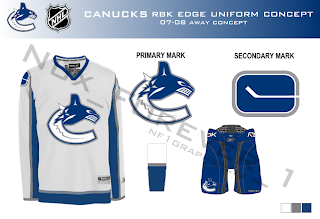
And all right, Canucks fans, I won't leave you out. I mean, how could I in good conscience share Nordiques and Jets concepts and not Canucks?

One fan designed this concept based on the teaser photo on Vancouver's official web site. Have a great night, all!

Thursday
Aug232007

Hey, Canada! Part 4

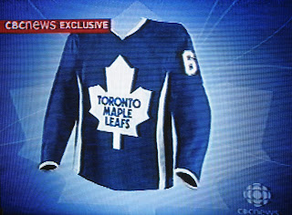
You know, one of the things I hate about living in Florida is that an occurrence like the one that arose yesterday in Canada would never happen here. Right there in the first block of the 6:00 news, CBC reported on what fans might expect for the new Toronto Maple Leafs uniforms.

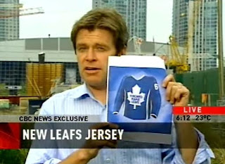
First, let me be clear in saying that this is neither a leak nor an official unveiling by the team. This is a concept produced by good people of the Canadian Broadcasting Corporation, acting on information they'd received about what the Leafs' new Rbk EDGE jerseys might look like.

Look at that! A news reporter holding a picture of a speculative hockey jersey. I have a special dislike for Florida. Those vertical stripes you see going up the sides are silver, by the way.

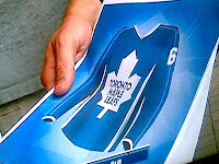
In case you wanted one more look at the uniform design they came up with, I offer this. It better shows the thin vertical stripes going up and down the sleeves.

It's really something. I need to make a trip up to Canada one of these days. Just to bask in the hockey fever. It's not very contagious around these parts.

So now you should be able to understand my plight and why I spent the whole day today taking a pretend trip across the Great White North. You guys up there, you don't know how lucky you are. (Or maybe you do.)

Before I forget: Leafs fans, what do you think of these developments? Do you like these designs or does the team need to go in the horizontal stripe direction of the Bruins and Red Wings?

Sunday
Aug192007

Result: Devils vs Maple Leafs

New Jersey
DEVILS

51% 5,887 votes

Toronto
MAPLE LEAFS

49% 5,573 votes

11,460 total votes

New Jersey Devils
Advancing to Quarterfinals to face Carolina Hurricanes

Toronto Maple Leafs
Eliminated


Poll opening date
Aug 12 @ 7:34 AM
Poll closing date
Aug 19 @ 11:59 PM

07CHTRN | #E1A | NJDvTOR

Tuesday
Aug142007

Some Snazzy Leafs, Sabres Stuff

It just keeps getting better over here at the NHL Tournament of Logos. Hope you guys are all voting. If you haven't yet, there are three open polls that you can have your shot at.

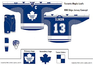
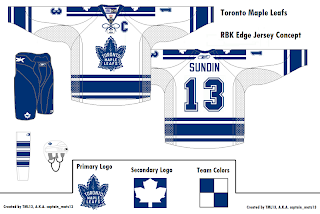
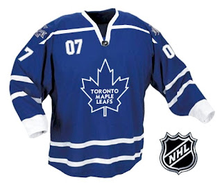
Anyhow, while we wait for all the votes to trickle in, I've got a few more concept designs to share with the class. Let's start with everyone's favorite Ontario-based team that isn't the Ottawa Senators — the Toronto Maple Leafs. A reader emailed some great designs I thought were cool and different. Behold.

He sent a handful but I felt like these two were the cream of the crop. They're pretty sharp and they do away with that "TML" logo that fans apparently hate with a passion. Personally, I thought it worked. It gave them a 21st century feel without altering a logo that hasn't been messed with for decades.

But what do I know? I'm just that Florida guy writing a hockey blog, right?

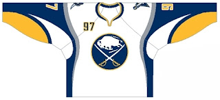
Let's cross the lake and see what's going on stateside. I have Buffalo Sabres artwork for you. Have a look.

What do you guys make of this? My belief is that if you're going to use the old logo, you've gotta use the old jerseys as well. I'm not sure this mixing and matching really works. Thoughts?

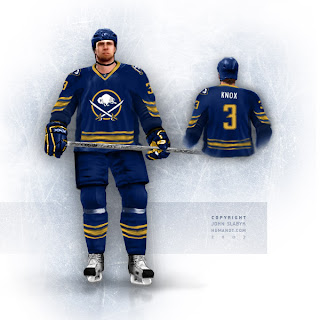
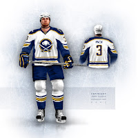
Plus, from hockey logo and uniform designer extraordinaire John Slabyk comes another look at his all too cool Blue & Gold Project on the backs of a dude in NHL 07 or something like that. It's quality work, really. You don't see that sort of thing every day.

If those were the Sabres' uniforms, stores wouldn't be able to keep them in stock, and not a single hockey fan in the greater Buffalo area would file a complaint — or at least that's my small-minded belief.

Should I stop going on about them now?

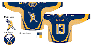
Also there's this design which makes us see why the "B" with sword through it should really be left on the shoulders.

I don't hate it, but at the same time, I feel like you could do so much better with the crest.

And as always, there's much more where that came from, but you don't want to spoil your supper now. I'll hang onto it for now... save it for later. Hope you're enjoying the tournament and all the Rbk EDGE speculation.

It fills the empty hours.

Sunday
Aug122007

Poll: Devils vs Maple Leafs


vs
New Jersey
DEVILS
Toronto
MAPLE LEAFS


Voting is finally here! This is the first match of the championship tournament. Place your vote and then feel free to leave a comment about how you came to your decision. Then come back tomorrow and vote on the next match. Also, tell everyone you know to drop in and vote. The more voices heard, the more accurate our results will be!

Poll opening date
Aug 12 @ 7:34 AM
Poll closing date
Aug 19 @ 11:59 PM

07CHTRN | #E1A | NJDvTOR

Friday
Aug102007

Mailbag: Some Radical Jersey Concepts

Um... it's a slow day so I apologize in advance, but this is pretty much all I have to offer. Forgive the image and design quality, but I was emailed this fan art. I'll try to find some good stuff before I call it a night.

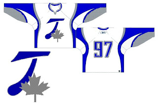
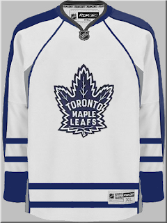
For those who haven't deduced it, this is a radical concept for the Toroto Maple Leafs. It's interesting. Can't think of much to say beyond that. It looks like it makes use of the leaf on the Canadian flag in place of the team's logo. I like the extra silver, but on the whole, what do you guys think?

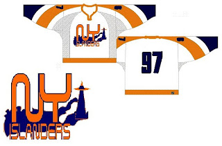
The next one is another radical concept for the New York Islanders.

Many of the Isles concepts we've seen have incorporated a lighthouse in some way and I'm a big fan of that. I don't think we need to lose the classic crest from the jersey, but could it hurt to add a secondary on the shoulder?

This next design is pretty far out as well.

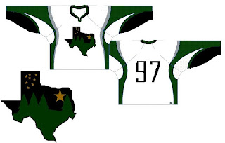
If you hadn't guessed, that would be a concept for the Dallas Stars. You've got a starry night scene set in the forest inside the outline of the state of Texas. It's a very interesting concept but Texas doesn't seem to me like a forest state. Those trees make this feel more like the Minnesota Wild logo.

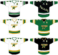
Why don't we take a look at less-radical idea. I kind of like the notion of the Stars going with "DALLAS" written across the crest on the road jersey. These are backwards if that's the case, but it's interesting to look at nonetheless. What do you think of the green jersey in the middle? Too North Stars or should Dallas adopt something in that vein veering from the black?

Anyway, hopefully I'll have more to offer later. I know this isn't spectacular artwork, but still worthy of looking at I thought.

Friday
Aug102007

Islanders vs Maple Leafs


vs
ISLANDERS
MAPLE LEAFS
2-11
1-12

The Aesthetics
A real battle of the titans here on the final day of the tournament. More text-filled logos in this match. Unfortunately, the Islanders logo commits the other sin of incorporating and blatant hockey stick and puck combo. I'm not impressed. This one will go to the Maple Leafs logo.
Maple Leafs

The Nickname
A Maple Leaf logo is thin and flimsy. An Islander could easily crush one under his fishing boots.
Islanders

The Analysis
To put it plainly, I believe a logo should serve as a symbol for a team therefore making redundant the use of the team name in said logo. I get tradition and all that and quite frankly can't see either of these logos being drastically changed. The Islanders tried that once and fans revolted. Still, I have to pick a winner. I'm going with the Maple Leafs because the leaf logo is iconic. There is no need for all the text. Shame it'll only be their second win in my tournament. Time for you guys to decide which logo is best. Come back on Sunday and start making your voices heard!
Maple Leafs


WINNER
2-1


Thursday
Aug092007

Maple Leafs vs Penguins


vs
MAPLE LEAFS
PENGUINS
1-11
3-10

The Aesthetics
Penguins fans, you're in luck for your team's final match of the tournament. Maple Leafs fans, not so much. Sorry, no way to please everybody. And tradition has never affected my judgment as far as this competition goes if you've read any of these before. The bottom line: I don't like text in logos. It defeats the purpose, doesn't it? It's supposed to be a symbol for the team. Here, we should already know who the text culprit is.
Penguins

The Nickname
I'm sorry but we're talking about a Maple Leaf. Even a Penguin could crunch one of those under its little foot.
Penguins

The Analysis
What says Canada more than a giant maple leaf? Not much can really fit that bill. At the same time, I'm not sure a gold triangle really screams Pittsburgh to anyone not familiar with the area. Having said that, both logos are appropriate to their teams, even if they could use a little work here and there. Ultimately though, the penguin in the hockey gear continues to bewilder me. Still, the Pens pull off a win in their final match of the tournament.
Maple Leafs


WINNER
2-1


Tuesday
Aug072007

Yet Another Leafs Concept

I posted this design on Sunday and another reader has emailed me his concept for the new Toronto Maple Leafs uniform. He tells me he based it off of the Nashville Predators new uniforms, so expect some of that piping that you all love so dearly.

Oh yeah, that's the stuff. I don't think it's terrible. It's a little similar to a design I posted on Friday with a few exceptions. This one doesn't have the drawstring collar and actually adds silver up the sides along with vertical stripes. The blue also seems to go the length of the sleeve as opposed to covering just the shoulders.

Any feelings on this one? Is all the speculating making you crazy? Should we stop and just wait until the Leafs feel like unveiling the jerseys? Leave your thoughts below.

Sunday
Aug052007

Mailbag: Maple Leafs Concept

A reader emailed me his design for a new uniform for the Toronto Maple Leafs.

We have been hearing we should expect a modified Leaf logo for this season. This concept certainly takes that into account. What do you guys think?