NHL Tournament of Logos

Entries in maple leafs (68)

Sunday
Oct212007

Photographic Tinkering

Amidst all the artwork I get on a daily basis, I occasionally get digitally retouched photos that I would consider to be cool concept art. So that's what this post is about.

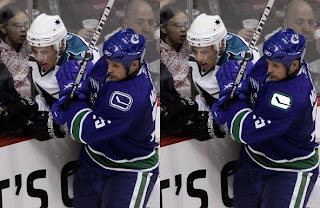
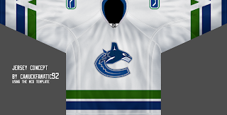
We all know the Vancouver Canucks made an odd move by not including the dark blue of the logo in the jersey. Just as the green from the jersey isn't included in the logo. Here's something I hadn't noticed.
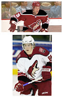
Despite there being black in the Coyotes logo, there's no black in the jersey. This concept was designed, I'm guessing, to give us an idea of what Phoenix would look like with a little black in their sweaters.

If you ask me, there's a third jersey right there. The dark one, at least. It's weird on the sleeves, though. Doesn't really work with the striping. But I don't mind it at the bottom of the jersey. Same as how it looks pretty sharp on the shoulders as well.

Overall, a winner. Nice work by the artist.

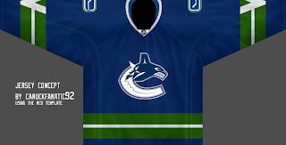
Uh-oh. I'm about to talk about the Canucks. Somebody's gonna have something to say about that. Anyway, this one here simply suggests a higher contrast shoulder logo for the home sweaters. The original '70s logo did have a white rink on the dark jersey, but the new one seems to come in only one form.

A little unusual but it doesn't really bother me. I could live with it either way. Though it sure stands out more in white. Just an observation.

And this one isn't so much about redesigning jerseys or logos as much as somebody spent a lot of time on it and I can't see denying them.

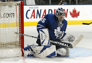
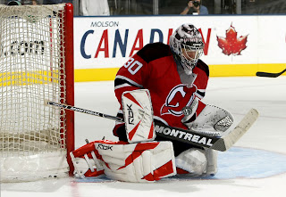
Of course we know Vesa Toskala minds the net for the Toronto Maple Leafs. But what if he did so for the New Jersey Devils?

Thing is almost flawless. We can play that Sunday comics game with it. Can you spot the differences. Or more appropriately, can you spot the missed changes. I have to tell you, there aren't many. And I've been staring at it for a while.

Anyway, hope you guys enjoyed that. Kudos go out to the artists. It's one thing to draw elements on a blank jersey template. It's another to doctor up photographs like this.

Remember, if you've got anything you think might be worthy of posting, please email it to me. I'd love to take a look.

Thursday
Oct182007

Some Simple Fixes

Here's the post I was trying unsuccessfully to bring you yesterday. In going through all the concept art you folks have sent, I've found some interesting stuff. These are some simple ways of fixing the Canucks' and Maple Leafs' jerseys — both of which have been met with distaste from fans.

For the Vancouver Canucks, the biggest complaint seems to be the city name above the crest. This concept suggests removing that and simply reverting to the striping pattern of the old days — just with the new logos. I can't say I hate it. Though I figure myself as an oddball in all of this as I really like Vancouver's new sweaters.

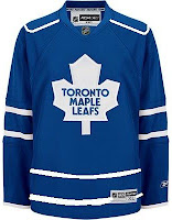
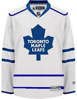
One new sweater set that struck me as a little too plain is that of the Toronto Maple Leafs. The lack of striping leaves us wanting more, I think.

This simple concept suggest striping at the waist and piping around the shoulders. While the shoulder piping has not impressed me much, I think it can work a jersey where not much is going on — perfect example.

I'd be curious to see what it would look like on the ice, but that curiosity will never be satisfied. In the meantime, we can only ponder what might have been and keep shouting our suggestions into the wind. Anyway, concepts are fun. What do you guys think of these?

Thursday
Oct182007

Poll: Capitals vs Maple Leafs


vs
Washington
CAPITALS
Toronto
MAPLE LEAFS


Place your vote and then feel free to leave a comment as to how you came to your decision. Tell all your friends to drop in and vote! The more voices heard, the more accurate the results!

Poll opening date
Thu Oct 18 @ 4:26 AM
Poll closing date
Mon Oct 22 @ 11:59 PM

07VNTRN | #2D | WSH74vTOR38

Wednesday
Oct172007

Result: Maple Leafs vs Scouts

Toronto
MAPLE LEAFS

67% 1,522 votes

Kansas City
SCOUTS

33% 748 votes

2,270 total votes

Toronto Maple Leafs
Advancing to face Washington Capitals

Kansas City Scouts
Eliminated


Poll opening date
Sat Oct 13 @ 7:17 AM
Poll closing date
Wed Oct 17 @ 11:59 PM

07VNTRN | #1H | TOR38vKCS

Saturday
Oct132007

Poll: Maple Leafs vs Scouts


vs
Toronto
MAPLE LEAFS
Kansas City
SCOUTS


Place your vote and then feel free to leave a comment as to how you came to your decision. Tell all your friends to drop in and vote! The more voices heard, the more accurate the results!

Poll opening date
Sat Oct 13 @ 7:17 AM
Poll closing date
Wed Oct 17 @ 11:59 PM

07VNTRN | #1H | TOR38vKCS

Friday
Oct122007

Just To Freak You Out X

It's like watching a trainwreck. It's horrible, but there's just something about it that prevents you from looking away. There's all manner of scary stuff out there and now I'm bringing some of it straight to you on another Freak Out Friday. Here goes.

I wouldn't be able to live with myself if I didn't start with this one.

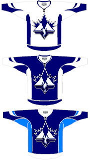
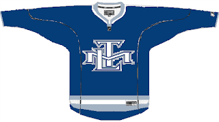
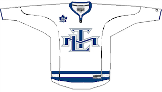
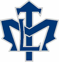
It shouldn't take you more than a second to realize the designer was trying to offer us something different for the Toronto Maple Leafs.

Leafs fans, I really want to hear from you on this one.

We've got a brand new logo with a very prominent "M" worthy of perhaps a place like Minnesota — or Montreal! And that leaf! Don't look it in the eye or it will cut you. Deep.

Even the second shade of blue worries me some. I'm not sure how I'm supposed to feel about this, but let's just say it's not great.

Anyway, I'd like to move along now because I can't take looking at this anymore. There's a point when doing this to a team like the Leafs starts to hurt.

Once again, Leafs fans, please comment.

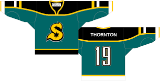
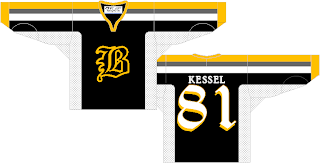
Speaking of prominent letters in place of actual logos, I've got a pair of concepts from each coast.

Cleverly, though, we can't know exactly what these letters stand for as alliteration was employed to mask it. Is the "S" for San Jose or Sharks? And is the "B" for Boston or Bruins? Perhaps, the ultimate question is why dump perfectly good logos for these two teams in favor of members of the alphabet?

Even more disturbing is that "S" keeps reminding me of the Minnesota North Stars. Make it stop.

Each of those were delivered to me with a road sweater design to match. I wouldn't do that to you, though.

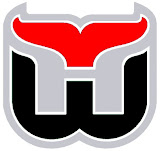
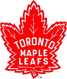
Here's what concerns me, though. I've been send a number of logos which have been converted to red and black for no apparent reason. Do any of these work?


It may be that the blood-in-the-water shark is the scariest one. I do see what's going on, though with the Hurricanes colors on the Whalers logo and the old Sabres colors on the new logo — but that doesn't make it any better.

I'm still worried about the killing to follow.

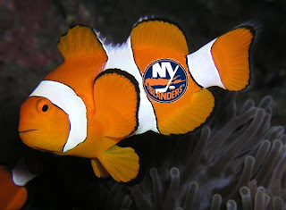
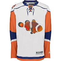
I'll wrap things up today with the thing that might frighten you the most. Did you ever get to feeling like that Rbk EDGE New York Islanders jersey reminded you of something? Perhaps you couldn't quite put your finger on it. But maybe it evoked feelings of being lost. In the ocean.

One reader thought so and sent in this.

If you wanted to know what they were thinking when designing the new Isles uniforms, now you do. Don't you wish you didn't?

So there it is. Another in the Freak Out series is behind us. I'm looking forward to next week. In the meantime, I await your crazy concept art. You can send it to me at nhllogos@gmail.com.

Tuesday
Oct092007

Caps, Sharks, Leafs Get Cool Concepts

Today I've got a post with some very cool artwork. Take a look.

Lots of folks have suggested using the Washington Capitals' secondary logo as a primary. Here's a sweater design with that in mind.

The only problem I have is the star beneath the wings. Other than that, it's the best design I've seen with the "Weagle" logo, as it's been dubbed. Even the stripes on the sleeves look awesome with that logo.

These San Jose Sharks sweaters are nice if not slightly reminiscent of the new Blues jerseys with the piping and the Islanders jerseys on the sleeves. I like the shield logo being used on the shoulders, but I think it needs to be bigger. For being a design I like, it sure sounds like I have a lot of complaints. But honestly, though, I am a fan.

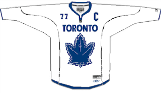
Finally, I have a concept with the best Toronto Maple Leafs logo I've seen yet. It's the one on the right.

While I'm not loving the striping pattern, I really like that logo. It mixes the current leaf silhouette with the old Toronto Arenas logo. It kicks ass, to put it quite simply. Any Leafs fans out there that like that idea? Or is it just me?

And remember, if you have any concept art you'd like to see posted here or in the Concepts Gallery, feel free to send them along to nhllogos@gmail.com.

Wednesday
Oct032007

Maple Leafs, Here's How You Fix It

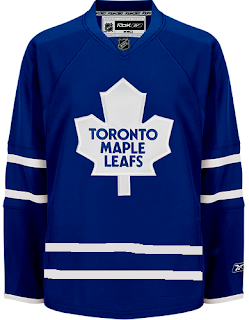
The Fix It series has worked its way into the double digits today. In this episode, we explore ways of improving the Toronto Maple Leafs' brand new Rbk EDGE uniforms.

No question, the biggest complaint has been its simplicity and the fact that while wearing the home uniform, a player is nothing more than a giant blue blob. One minor change some feel might rectify this is adding the same double-stripe found around to the elbows to the waist.

If that's not entirely to your liking, however, I've got more. No, your eyes aren't playing tricks on you. These are the new Phoenix Coyotes jerseys recolored to blue and featuring the Leafs logo. If you look closely at the shoulders you'll see the remnants of the "PHX" patch.

But isn't that a sight to behold? Something about them just makes those jerseys look quite nice in my eyes.

And then if that still isn't your cup of tea, perhaps you enjoyed the new Vancouver Canucks sweaters. Perhaps Toronto could go that route.

Or perhaps not. That scares me a little bit. So let's pretend you never saw that one.

That's all I got. Up next: Nashville Predators.

Friday
Sep282007

Just To Freak You Out VIII

The Freak Out series continues this week with a brand new episode. Some of this stuff is just unbelievable.

We'll kick things off with some small but significant Atlanta Thrashers concept attempts.

I'm not sure I can find the words to describe this. The thrasher head, while being used as a major element of the crest, has also been employed as a rather horrid stripe. It points up the arm the shoulders along the sleeves and runs across the waist.

The secondary logo is used on the front of the jersey on the right side while the player number is on the left. Captains be damned. The full primary logo is also featured on the front, but not as the crest. No, you'll find that at the bottom on the left.

The crest being used features only the bird's head on an "A." But hey, at least there's three to choose from. Also notice that the panel under the arms is blue on all three.

This jersey set is an eye sore of the worst kind. But just look at the socks. I've never seen a logo on a sock. These socks have three — each! And that's just the side we can see. Imagine if they appeared on twice or even three times.

It hurts my brain to imagine what these would look like on the ice.

And then this. Anyone who thought the Maple Leafs introduced a rather plain jersey should see this.

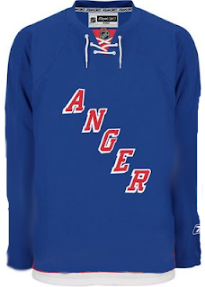
And though I'm not sure who's conjuring the anger, I can only guess that it's fans who feel like they've been somehow cheated because the letters were spread vertically (not squeezed horizontally).

We're just now hearing of the NHL's plan to expand once again.

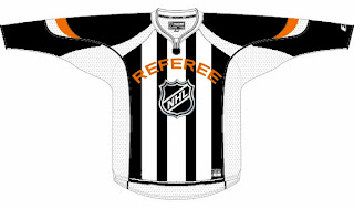
We don't yet know what city they'll play in, but the new club will be named the Referees. I don't know why this was made. But it made me laugh — and then it freaked me out some. Speaking of which, we've all seen the mish-mash logos created by Pfizer. Well this one was created by another artist, but it's almost equally as disturbing.

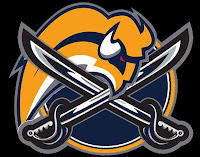
It seems some folks hate the slug so much, they feel a beheading is the only solution. Indeed.

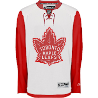
Oh, this deserves an explanation. The fervor over the Calgary Flames claiming the Albertan flag on their shoulder has spurred the Toronto Maple Leafs to go all out and convert their entire uniform into a Canadian flag. With the vintage logo, of course. No other way to go.

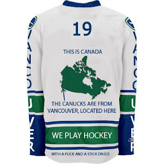
And finally, if you thought the text on the front of the new Vancouver Canucks jersey was as bad as it gets, wow. Just wait until you look at this.

I never cease to be amazed — or freaked out — by the things people send me. If you have come up with anything wacky and would like to make it a part of the Freak Out series, send it along to nhllogos@gmail.com.

I hope you all enjoyed your Freak Out Friday and are looking forward to the ninth installment coming in one week's time.

Can anyone tell me where the Canucks play? I seem to have forgotten.

Saturday
Sep222007

Toying With TML

I don't know why I've been skimping on the concept art posts. I have plenty of stuff to share. Tonight, we're going to take a look at the Toronto Maple Leafs logo. I'll be the last person to say it needs to go, but I'll be among the first in line to call it dull. (Consider its early exit in the tournament.) In other words, dull logos are all right for teams with a history as rich as these guys.

Now having said that, let's mess around a little. Seems like the Leafs have always have a logo that featured a leaf. Makes sense. But a few years ago they introduced a secondary mark that wasn't shaped like foliage. If I'm to understand correctly, it was met with disinterest by fans. Many were happy to see it go when the Leafs unveiled their Rbk EDGE jerseys recently.

So to those people, prepare to have your eyes assaulted by this.


It's just the skeleton of an idea someone had. Not a bad idea but it needs some work. No matter what, a leaf needs to don the crest of both main jerseys. However, I don't see why these couldn't work as an alternate sweater.

Something cool I ran across a long while back is this logo.

The TML actually forms a leaf. The leaf. Very creative if not slightly awkward to look at. So what about this?

I think there are enough logos enclosed in circles and this probably wouldn't work on a jersey, but there it is anyway. It sounds like I don't have anything good to say about any of these designs, but that's not true. I like them to some degree but I'm not oblivious to why they wouldn't work. While I understand the double-lines in the logo above, it just seems empty.

Anyway, what do you guys think? Does the leaf need some work? Or is it untouchable?