NHL Tournament of Logos

Entries in news (596)

Tuesday
Sep042007

Hurricanes' New Sweaters Coming Early

A couple of people emailed me a link to this post at the The News & Observer regarding 'Canes jersey news.

According to writer Luke DeCock, the Carolina Hurricanes will unveil their new Rbk EDGE uniforms tomorrow afternoon at the RBC Center in Raleigh. Now, before you start commenting with links to pictures from EA Sports' NHL 08, I know all about them but I don't consider video game renderings to be actual images of the new uniforms. For that, we need good old-fashioned photographs.

And apparently we're getting them on Thursday.

September 4, 2007

New uniforms unveiled Thursday

The Hurricanes will unveil their new Rbk uniforms at a press conference Thursday afternoon at the RBC Center. Eric Staal, Justin Williams, Erik Cole and Ray Whitney are scheduled to attend.

One new, new addition: a patch commemorating the franchise's 10th season in North Carolina.

Fans can get their first look at the new uniforms on Sept. 16 at the Caniac Carnival. The Canes will wear them in the preseason game against the Capitals that afternoon.

As you know, I'd previously reported the unveiling date as September 16. It's been corrected in the sidebar countdown.

Thanks to all of you who emailed in with this info!

I'll have photos posted as soon as I can. Just remember, I usually don't get home from work until after 12 PM (Eastern) and I can't post anything until then. 'Canes fans, your big day is tomorrow! Get excited!

Tuesday
Sep042007

CBC Radio Appearance For NHLToL

So you've been reading the blog, but would you like to hear me talk about it on the radio? CBC has asked me to do an interview tomorrow afternoon about my NHL Tournament of Logos blog. Can you believe that?

Apparently, we're going to tape the interview early in the day Wednesday and it will air on CBC Radio One in Vancouver (690 AM) at about 4:40 PM locally (7:40 PM Eastern time). So be sure to tune in! My guess is we'll talk about the tournament in general as well as our thoughts about the new Rbk EDGE uniforms of which I've been trying diligently to cover this offseason.

For those of you who live outside of Vancouver, the show will be streamed online at cbc.ca/bc. Then under the Listen Live link, choose 690 AM Vancouver. I'm pretty excited!

I hope most of you will listen and I hope I don't trip over my mouth too much!

Tuesday
Sep042007

Flames Unveil New Uniforms!

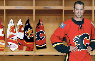
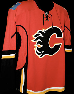
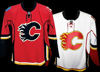
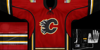
The Calgary Flames have become the 14th NHL team to unveil their new Rbk EDGE uniforms. Check out Craig Conroy modeling the newest in the progression of Flames sweaters.

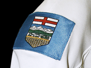
The element that seems to be causing the most controversy is the patch on the right shoulder which is the flag of the province of Alberta.

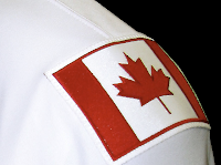
The left shoulder of the jersey features the Canadian flag. From the team's official release: “Among the enhancements, we are pleased to carry our National and Provincial flags on our home and road jerseys this season,” said Flames President & CEO Ken King.

“As proud Canadians and proud Albertans, our desire is to display the identity of our country and province and carry them throughout North America and the world. Our jersey incorporates our strong history, the latest in technology, and is something our players and fans will be proud to wear.”

These new jerseys are very nice and Flames fans should be thrilled! Enjoy your big day!

Coming tomorrow... the Pittsburgh Penguins.

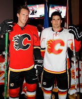
UPDATE (5:06 PM): Thought you guys might like to see these jerseys on players in full gear. Here, Dion Phaneuf and Matt Lombardi model the new uniforms at the unveiling ceremony at Flames Central today.

I can't say I have any complaints. I'm really liking the giant logos on the front. I never liked the huge jerseys with such small logos on the front. Never really made any sense to me. It's your team's symbol. Show it off, dammit!

Anyway, thanks for the comments you guys have posted so far. I'm sure there will be many more to come. As for my two cents, I think the flag shoulder logos are a very nice touch. I don't think the blue flag clashes at all. I think it just stands out.

I also like the idea someone suggested of the Oilers incorporating a new shoulder logo with the outline of Alberta. The Lightning's secondary logo has an outline of the state of Florida and I really like that.

Tuesday
Sep042007

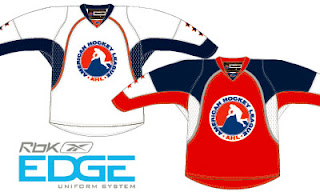
AHL Announces Rbk EDGE Switch!

I know this isn't NHL news, but it deals with the new Rbk EDGE jerseys, so I felt it was relevant. The American Hockey League announced today that they will be switching to Reebok's new style of uniforms.

The wonderful folks at TheAHL.com are even keeping their own gallery of all the new sweaters as they're unveiled — just like what I'm doing for the NHL. You can see their gallery here.

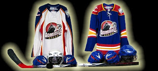
My only attachment to the AHL would be the Norfolk Admirals who are affiliated with my Tampa Bay Lightning. But look at this...

... these jerseys were unveiled today but they have the old Lightning logo on the shoulders! What's with that?

Also, I thought I'd send shout-outs to Admiral fans Jonathan and Charlie who have been keeping me up to date on AHL jersey news. Thanks guys!

Tuesday
Sep042007

Preview New Flames Threads

The Calgary Flames won't make an official announcement until later today, but here's what their new Rbk EDGE uniforms look like. A couple of fans got their hands on the official online photo gallery this morning before it was taken down.

I'll obviously have more later today. Until then, notice the new shoulder patches. Canadian flag on one side. Albertan flag on the other. Very unique.

Monday
Sep032007

Prepping For Habs' Big Day

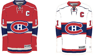
Along with the Calgary Flames, the Montreal Canadiens will be unveiling their new Rbk EDGE uniforms tomorrow. To get everyone ready for that, I have concepts.

Unlike the the Flames, the Habs haven't really leaked anything whatsoever regarding their new sweaters. I don't know of one solid rumor or suggestion thereof that we have to go on. It's going to be a total surprise. Or else, they won't change a thing and simply adapt the present design to the new cut and style like the Red Wings and Rangers have.

This concept is based off of the New York Islanders' new duds. They're pretty sharp and would probably go without too many complaints from Habs fans.

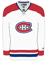
This fan-created design is closest to what the Canadiens wear as a road jersey at the moment. The white one above seems more like the vintage alternate jersey.

Not that there would be anything wrong with either. But I've been reading comments from Habs fans who would like to see a new road sweater more similar to that one.

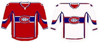
If you're a fan who fears these uniforms will be too busy and feature an overabundance of striping, don't look now, but we have concepts to scare you.

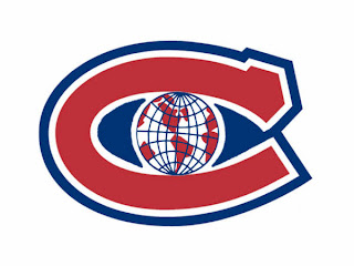
Whoever wears those jerseys will need pretty big shoulders to fill them out. I'm not entirely convinced those aren't football jerseys. Anyway, I've also got a fan-created logo redesign to show off. What do you think?

Personally, I like it with the "H" in the middle and would hate to see it change. Furthermore, it won't change. The world will end before the Canadiens get a new logo, of this I'm quite certain. Perhaps it's my crystal ball or perhaps it's an understanding of human behavior and an overwhelming hatred of change in the hockey world.

Anyway, hope you've enjoyed what you've seen while you wait for the new sweaters to be unveiled tomorrow at some point. This goes for the Flames as well as the Habs, but naturally, as soon as I can post pictures, you know where to find them.

Monday
Sep032007

Prepping For Flames' Big Day

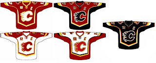
As you all know, the Calgary Flames unveil their new Rbk EDGE uniforms tomorrow. So to prepare, I've got concept art.

We'll start out with the most promising. From everything we've read and heard about the new jerseys, the following image most likely best represents what we'll see tomorrow.


Rumor has it that the Flames will be introducing a new shoulder patch, which may feature the Albertan coat of arms. Oilers fans, don't go getting your knickers in a knot just yet. Nothing's been confirmed. Wait one more day.

Overall those jerseys are pretty sharp. Here's hoping the Flames live up to that standard. For something a little different, check out these.

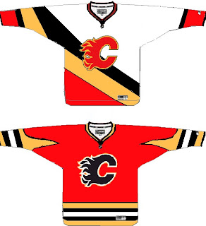
They're nice designs — if you can live with the numbers on the front — but feature the horse head secondary logo we've heard is going away. Personally, I always liked that logo. It made for one of the best third jerseys in the league, I thought.

Before I go, I've got one last concept to post that might make you rub your eyes or scratch your head.

I'll let you all find the words to describe that. Meanwhile, Flames fans, what are you hoping to see tomorrow when your team shows off their new threads?

Monday
Sep032007

What If The Jets Were Still Here?

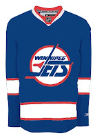
Over the past week, I've been surprised at the number of concepts I've been sent featuring the Winnipeg Jets. Surprised because that team no longer exists. Still, all the work people put in made me think I should share some of what I received.

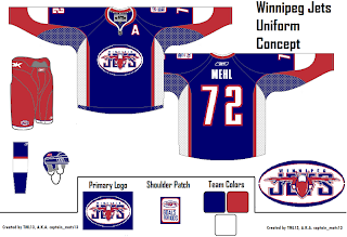
Here's what the Jets might look like in a new Rbk EDGE jersey. This concept is based off of the new Canucks jersey. Not bad at all.

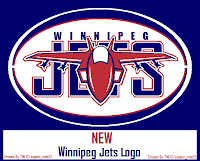
But with all the modernizing of this league, I have a feeling the logo would be different today. The logo you see on this jersey has been around since 1990. Don't get me wrong, I think it's a great logo, but I just feel like it would've been changed somewhere along the way.

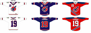
Maybe to something like this.

The diagonal stripe in the red jersey freaks me out a little bit. Too steep? The designer wanted me to let everyone know that the shoulder patch emanates from the city of Winnipeg's coat of arms. I know it's small, but it's there.

A different artists had a different idea for a new Jets logo and uniform set. It's also quite impressive.

I wish I could tell you it was an original design, but it's based entirely off of the AHL's Houston Aeros' logo. I do like the jerseys, though. Not too much to complain about there. A simple and classic sort of feel.

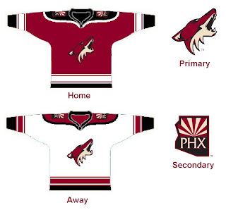
But despite all of this effort and toiling over Photoshop and Illustrator, the Winnipeg Jets moved to Phoenix in 1996 to become the Coyotes. So while I'm here, I also got emailed a great 'Yotes concept I can share.

One thing I don't like about the current Coyotes jerseys is the monochrome feel. Black is a big part of the logo so why doesn't it have any part of the uniform?

I like that a lot! Coyotes fans, do you have an opinion. Do you like these or are you more supportive of Wayne Gretzky's prescribed design which the team currently wears?

Sunday
Sep022007

Sun Says Leafs Jerseys Coming 9/12

I got an email from a reader named Desmond today, pointing me toward some new information in the Toronto Sun. The newspaper is holding a contest where you can win the new Toronto Maple Leafs Rbk EDGE jersey.
The team has not unveiled the uniforms or made any official announcement about doing so, as far as I know. Still, the following was posted in the Contests section of the web site.

The Toronto Sun wants you to win a newly designed Toronto Maple Leafs Jersey. Plus the winner and a guest will attend the unveiling at the ACC Wednesday September 12.

Apparently we can expect to see the new Leafs Rbk EDGE uniforms a day sooner than I'd initially posted — and at an event hosted at the Air Canada Centre. Now, this doesn't come from the team directly, so anything is possible. But I'd consider a newspaper to be a reliable source of information — as that's their job.

I'll let you know if I hear anything else.

Sunday
Sep022007

Dipping Into The Oil

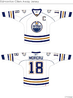
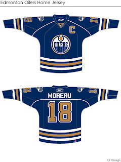
More concepts! These fan-designed works of art were created for the Edmonton Oilers.

These concepts were created by the same artist who brought us the Chicago Blackhawks jerseys I posted earlier today.

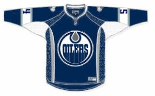
They're very clean designs and would make great uniforms for the Oilers. I especially like the use of the shoulder patch from the third jersey on this set. I don't think it should necessarily replace the crest, but I do like it a lot. I could definitely see them going with something like this.

But I'm not an Oiler fan so it's not really my place to say.

If you're not a fan of the copper, you might enjoy this.

I'm not sure the secondary logo would work at the wrist — being hidden by the gloves. The curvy stripes up the sides are reminscent of the Buffalo Sabres' current sweaters, but not all bad. You could do a lot worse.

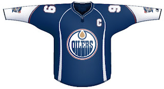
I've got one final design for you that eliminates both the copper and red, replacing it with the silver from last year's third jerseys.

I think that's a little too plain. Oiler fans, what really matters is your opinion. See anything you like here? Or does the Oil need an extreme makeover?