NHL Tournament of Logos

Entries in senators (67)

Tuesday
Jun192007

Senators vs Maple Leafs


vs
SENATORS
MAPLE LEAFS
1-1
0-2

The Aesthetics
The Senators logo makes much more use of color than the Maple Leafs. Another thing that detracts from the Maple Leafs logo is, as always, the words spelled out. I believe it was in the '70s or '80s that the Leafs actually donned a wordless Leaf on their uniform shoulders. What ever happened to that?
Senators

The Nickname
If a Senator, walking down a sidewalk, stepped on a Maple Leaf that had fallen from a tree, he would no doubt crush it with a crackle.
Senators

The Analysis
Despite the fact that I like the use of a design similar to the Canadian flag's primary element as the Maple Leafs logo, I always go back to my distaste for logos which spell out a name and/or city. But I'd settle for something even a little more interesting to the eye. The logo used on the third jerseys is a good example of what can be done. And even though I like the Senators logo, it wouldn't hurt if they did the same. They're third jersey crest is one of the best. Ultimately, however, they do get this point.
Senators


WINNER
3-0


Monday
Jun182007

Rangers vs Senators


vs
RANGERS
SENATORS
1-0
0-1

The Aesthetics
I know the Rangers logo has been around forever but it's a little boring. I'm also a little annoyed at the fact that, while it is the primary logo for the team, it never makes an appearance on any of the team's jerseys. The Senators, however, is a solid design that we actually see on the uniforms.
Senators

The Nickname
In a straight-up fistfight, a Ranger could totally take a Senator.
Rangers

The Analysis
The Rangers have been around forever, though there's a case to be made that the Senators have too — they just had to endure a long hiatus. Ultimately, though, I really think the Rangers need to upgrade their look and go with the third jerseys full time, including the primary and secondary logos. That's why they don't get the point.
Senators


WINNER
2-1


Saturday
Jun162007

Sabres vs Senators


vs
SABRES
SENATORS
1-1
0-0

The Aesthetics
The use of color in both logos is very appealing to the eye. There aren't too many or too few. The problem for the Senators comes in the detail. While I'm glad they removed the team name from the gold circle several years back, we're still a little heavy on the minutia. The Sabres logo features a single small element — the buffalo's red eye — it makes the logo more aesthetically interesting.
Sabres

The Nickname
A Senator is a person who makes laws. Untrained, he stands no chance against a soldier with a sharpened Sabre.
Sabres

The Analysis
It's interesting how neither logo really seems to capture the team's nickname. In the Sabres logo, there isn't a sword in sight, as I've mentioned. With the Senators, I see what seems to be a Spartan soldier. Still, the Senators logo is much stronger in portraying its nickname. I also think the color combination is better. I like the Sabres logo back when it was black and red.
Senators


WINNER
2-1


Sunday
Jun102007

HF&P, Part 28: Ottawa Senators II

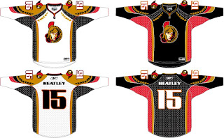
Today we're revisiting a couple of Canadian teams as part of the "Hockey Fans & Photoshop" series. We last saw the Ottawa Senators back early on in Part 6. Well we've got more where that came from. Right now.

The Sens may not have won the Stanley Cup but I think they would be coolest jerseys in all of hockey if they nailed these suckers down. Tell me that sweater doesn't frighten you. One of my favorite parts of this design is the use of the logo's helmet element along the shoulders and arms. These would be seriously classy jerseys. Unfortunately, this design is the work of a fan and therefore it's not likely we'll ever see it on NHL ice.


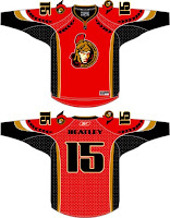
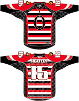
The graphics you see here to the left come from the same designer, obviously. With the red, we see what can be done in the alternative of a black home jersey — though I rather like the black in this case. And below is the horror from the '20s or something. I am not amused. Seriously, I hate that design. A lot. I'm all for throwbacks but horizontal stripes going the length of the jersey don't do it for me. I'm sorry.

In any case, that's what we've got for Ottawa today. I honestly hope you enjoyed it. Or if you didn't, whatever. Feel free to comment with your thoughts on these designs. Disclaimer: Again, I am NOT the designer. All I've done is scour the web for these images so as to bring them all to one place for fans like you and me.

Later today: the Montreal Canadiens — again.

Sunday
May202007

HF&P, Part 6: Ottawa Senators

The "Hockey Fans & Photoshop" trudges along, today with the Ottawa Senators fake new uniforms.

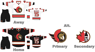
Actually, not bad. We appear to have a decent artist all over this conjecturing. I do like the use of the Peace Tower logo but what's with incorporating elements of your rival's emblem? Personally I prefer the more stylized Spartan head.

Yesterday, we talked about people taking issue with horizontal stripes mysteriously not working on the new Rbk EDGE jerseys. But look, it does. Oh my. I know there's special stretchy material on the sides and under the arms but that does inhibit dyes from working.

I like the lettering and numbering used in this design, but ultimately I'd like to see something different for Ottawa — not that this isn't a good idea. But there's nothing that exciting here. No sweeping changes like in other designs that I've posted.

In fact, if you want to see sweeping changes and fan artwork that will blow your mind, you definitely will want to come back tomorrow and get a glimpse of what some people think is coming for the Washington Capitals. We'll have lots of images and lots to say. Be sure to come back.

Sunday
May132007

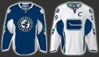
FanFic Canucks Jerseys

Okay, people, we're down to less than a month before the tournament begins but that doesn't mean this site is useless until then. Everyday (hopefully), over the next several weeks I'll be posting information regarding new logos and uniforms. So keep checking back. You know you want to.

First, I have to start out by scolding myself for forgetting the name of the blog where I found this image. With regard to the coming announcement about new uniforms and logo adjustments, a Vancouver Canucks fan had a little fun with Photoshop.

Quite honestly, I don't hate the design they came up with. On the other hand, I'm fairly sure the final product won't be anything close to this. Plus, I've always been a fan of teams using different logos on their home and away jerseys. I want to say Atlanta was the first to do that when they entered the league, but Washington would've been pretty close. Currently, Ottawa does that as well. In the case of the Sens and Caps, though, the dark jerseys are former third jerseys that have been promoted.

Anyway, just wanted to share that tidbit with you tonight. Like I said, keep checking back for more every day.

Monday
Apr302007

Senators


Ottawa SENATORS


Team Information
Team Colors / red, gold, black
Inaugural Season / 1992-93 (15 years)
Current Logo / 2007-08 (0 years)

Tournament History

2007 Qualifying Tournament
8-6, 24 pts
Finished 5th in East; 11th overall

Page 1 ... 3 4 5 6 7