Concept Art For Sens, Kings
 Sunday · Aug 12 · 2007 | 9:30 AM PDT
  9 Comments
 Thanks to everyone who's placed their vote here on the first day of the Championship Tournament. Exciting stuff.
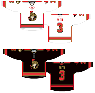
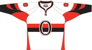
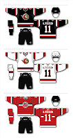
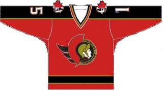
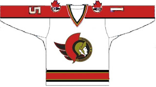
Anyway, I've still got fan artwork to share. We'll start out with the Ottawa Senators amidst all the news of their logo leaking. This concept ignores that logo (or was perhaps created prior to its leak).
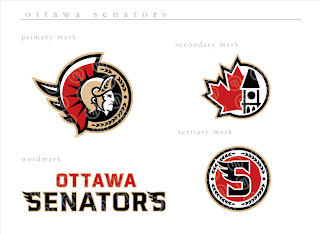
It makes the current secondary logo the crest and sends the current primary to the shoulders, but beneath the shoulder elements. I'd be curious to see how something like that actually looks on a player. I think those are pretty sharp, even with the vertical stripes under the arms. Only, if it were me, I'd avoid doing vertical and horizontal stripes together. What do you guys think?
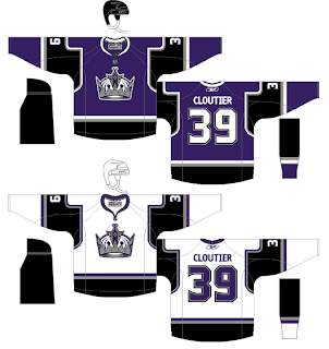
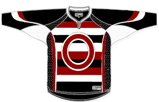
I was also emailed this concept for the Los Angeles Kings. I know they've already unveiled their new jerseys, but these aren't actual possibilites anyway, are they? It's just something fun to stare at while we wait for the hockey season to start again.
I think what the designer's done with the shoulders and sleeves is very interesting. It also seems he isn't a fan of the "LOS ANGELES" text across the bottom of the sweater. Seems a lot of Kings fans don't care much for that. I think it's unique. Is it a cool element or should they dump it?


