NHL Tournament of Logos

Entries in senators (67)

Wednesday
Oct312007

Sens, Flyers Art

I was contemplating a Freak Out post to celebrate Halloween tonight. But I don't really have enough content yet for that. However, if you want something Halloween-related, the Phantoms' second-round matchup against the Sound Tigers in the AHL Tournament of Logos just went live. Go vote!

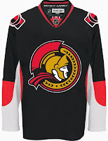
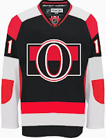
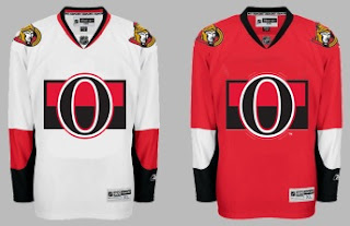
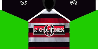
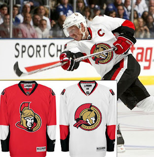
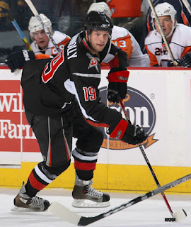
Anyway, today I've got a set of concept designs all from a single designer. Ninh Ly submitted a few items for me to share with the group. Despite taking a position as a professed Leafs fan from the other side of the pond, Ninh sure has a lot of Senators art.

I'm of the opinion that the design you see on the left is really what the Sens should be wearing right now. They're a black team, not a red team. But maybe I'm wrong about that. And as for the one on the right, despite it's obvious... issues, I sort of like it. Not the crest. But I think the stripes are all right. Not as hideous as that design would sound on paper.

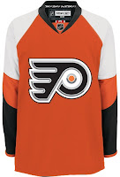
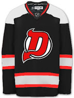
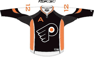
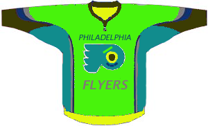
And finally, another stab at a Flyers third jersey. Very sharp. I could see Philly skating around in those. I do think orange is the way to go for them. Weird how I like black for one team and not another.

Anyway, if you got concept art of your own, you know what to do with it. I look forward to your emails.

Saturday
Oct272007

Red & Black

We've got a color theme for this concept post. Check it out.

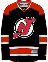
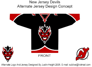
The most obvious place to start is the New Jersey Devils.

They both offer unique ideas for an alternate jersey. I don't think we'd really want to see the Devils in anything but red on a regular basis. Very interesting how these two different artists came up with something so similar yet so different.

But for something completely different, look no further.

That's a pretty scary logo. Looks like somebody's tattoo.

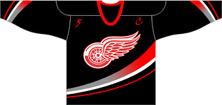
And here's a team you don't often associate with black.

The ironic part is the Ducks' template on a Red Wings jersey. Just so many things wrong with that. I know the Red Wings are sworn enemies of third jerseys, but I think they should try one out some day. Maybe not this design, though.

Another black and red team is the Ottawa Senators. Here's an example of what they shouldn't do with a third jersey. Ever. And here's another.

Now here's something that would work — even as a full-time road jersey. This 2D Senators logo is quite possibly better than the primary. It's unfortunate it's nowhere to be seen on their uniforms. Rumor was that it would be featured on various bits of team merchandise. If anybody owns anything with that logo, send me some photos.

And while we're on the topic of doctored photos of jerseys, more and more I'm in favor of the black/red/silver color scheme for the Buffalo Sabres — who are presently being conquered by my Lightning (that goes out to all my email hecklers).

Yeah, it's true. My Sabres-fan readers have taken to email trash talk. Well we'll just see how that goes, won't we? It's 2-0, not five minutes into the second period. Hope you're watching.

UPDATE (9:33 PM): Sadly, I may have spoken too soon with regard to the game. It's now tied.

UPDATE (10/28 8:17 AM): Stupid overtime.

Wednesday
Oct242007

Rbk EDGE Review: Senators

Part 30 of 30. All 30 NHL clubs have unveiled new jerseys under the new Rbk EDGE Uniform System for the 2007-08 season. Here at the NHLToL, we're going to review every one of them. Read up and then rate the new sweaters. We'll do a full ranking after completing all of the reviews.

Rbk EDGE Uniform System

Ottawa Senators


New Uniforms

Old Uniforms

The Unveiling
Wednesday, August 22. The Senators unveiled their jerseys at a fan event in Ottawa. Chris Neil, Brian McGrattan, Jason Spezza and Chris Kelly were on hand to model the sweaters.

Home vs. Road
Home: Red. Road: White. The two sweaters are essentially mirror images of each other with secondary logo patches on each shoulder.

The red home jerseys have a white panel on the elbows. The underside of the sleeves are black extending the length. There is white side paneling toward the back of the sweater. The collar is black and the primary logo serves as the crest.

The white road jerseys have a red panel on the elbows. The underside of the sleeves are black extending the length. There is red side paneling toward the back of the sweater. The collar is black and red and the primary logo serves as the crest.

In The Details
A new numbering and lettering style has been introduced.

New & Old
With the introduction of new logos, the uniforms have changed drastically. The swooping stripes on the old red jersey are gone and the overall striping patterns on both jerseys have been changed. There is really not to compare between the old and new sweaters.

Standard FAQ
Numbers on the front? No.
Laces at the collar? No.

NHLToL Editorial by Chris
Many have pointed out the similarities in style of the Senators' jerseys to those of the Penguins. That being said, these are quite plain as well. Not that it necessarily hurts this uniform set. But it could be much better. The red is very sharp. I'm glad they went with that over black for the home sweaters. The road jerseys, however, could use a shoulder yoke or something. There's too much white and not enough color. The logo doesn't work in favor of the white one. Looks great on red! In any case, it's still a solid effort, if not slightly boring. My favorite Sens' sweater, if you were wondering, was last year's black third jersey. 3/5


Buy your new Senators jersey!

Tuesday
Oct022007

Result: Senators Logo History

BEST ALL-TIME
2007

47% 2,084 votes

4,458 total votes

1997
30% 1,352 votes

1992
23% 1,022 votes


Poll opening date
Sep 25 @ 4:31 AM
Poll closing date
Oct 2 @ 11:59 PM

07BONLH | LHOTT

Tuesday
Sep252007

Poll: Senators Logo History


1992
1997
2007


Place your vote and then feel free to leave a comment as to how you came to your decision. Tell all your friends to drop in and vote! The more voices heard, the more accurate the results!

Poll opening date
Sep 25 @ 4:31 AM
Poll closing date
Oct 2 @ 11:59 PM

07BONLH | LHOTT

Thursday
Sep202007

Wash With Like Colors

Got an email today with some interesting photos. Now that all the Rbk EDGE jerseys have been unveiled, it seems like all we have left to do is nitpick. So here's something we didn't anticipate.

It looks a little like the red on Martin Gerber's Senators jersey running on the front?

It could just be the photo, but it sure looks strange to me. I hope it washes out or else he's going to go through a lot of sweaters this season. Just thought you all would enjoy that.

Thanks to Joel for the pictures!

Sunday
Sep162007

Result: Senators vs Flyers

Philadelphia
FLYERS

50.4% 12,662 votes

Ottawa
SENATORS

49.6% 12,467 votes

25,129 total votes

Philadelphia Flyers
Advancing to face Montreal Canadiens

Ottawa Senators
Eliminated


Poll opening date
Sep 9 @ 7:47 AM
Poll closing date
Sep 16 @ 11:59 PM

07CHTRN | #E3B | OTTvPHI

Sunday
Sep092007

Poll: Senators vs Flyers


vs
Ottawa
SENATORS
Philadelphia
FLYERS


Place your vote and then feel free to leave a comment as to how you came to your decision. Tell all your friends to drop in and vote! The more voices heard, the more accurate the results!

Poll opening date
Sep 9 @ 7:47 AM
Poll closing date
Sep 16 @ 11:59 PM

07CHTRN | #E3B | OTTvPHI

Thursday
Sep062007

Result: Senators vs Bruins

Ottawa
SENATORS

51% 10,129 votes

Boston
BRUINS

49% 9,847 votes

19,976 total votes

Ottawa Senators
Advancing to Quarterfinals to face Thrashers or Flyers

Boston Bruins
Eliminated


Poll opening date
Aug 30 @ 4:18 AM
Poll closing date
Sep 6 @ 11:59 PM

07CHTRN | #E2C | OTTvBOS

Friday
Aug312007

Just To Freak You Out, Part 5 of 5

I know you'll all be sad to see it go, but today I'm wrapping up my week-long series of whacked-out and crazy images. So let's get this final show on the road. Our first stop is Pittsb— er, Kansas City. Or, well, I don't really know. You figure it out.

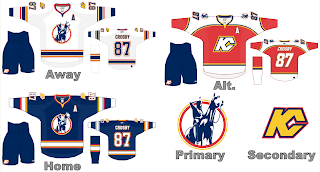
I know we've seen a lot of crazy shit, but wow. A Kansas City Scouts Rbk EDGE jersey with Sidney Crosby's name and number. I'm sure this design was concocted in the days when the Pens' future was largely uncertain. With KC looking like a predator ready to pounce, you never know. Just, wow. I don't really have any other words. Maybe you guys can find some.

Over in Philly, there's a consortium that can't tell the logo forms a "P" unless it's cockeyed.

My neck hurts from looking at that. My eyes hurt after looking at this.

Ha ha. Now your eyes hurt too. I promise I won't do that anymore.

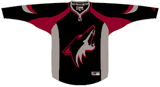
Oops, gotcha! You guys are easy. Anyone want to see a black coyote?

Probably not anymore, huh? Seriously, though. Charlie, from SabresNotSlugs.com really needs to see this. It could be the new logo for his site.

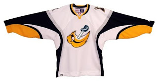
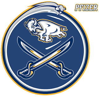
Somebody didn't like the slug. Showed it what a sabre is. Then gutted it. Sad story, really. But you guys haven't seen the half of it yet. Remember the amazing composite logo Pfizer created for the Canucks. He dropped the Sabres logos into the same blender. It produced this.

Maybe that should be your new logo, Charlie. Sometimes we just don't recognize how good we have it.

I hope I've been successful this week in freaking you all out a little bit. My goal is to show you that what you have, despite what some of you think, isn't that bad. We all like to moan and complain about changes but just remember, they could've done so much worse. And then where would we be?

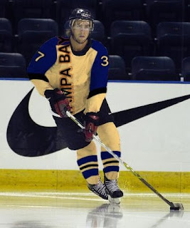
I'm going to leave you one last little nugget, though. On Tuesday I posted a crazy concept for the Tampa Bay Lightning. I also asked if someone might be able to show me what it would look like on a player. As I close out this series, let me leave you with that image. Let me burn it into your soul.

Big time thanks to Russ for that one!