NHL Tournament of Logos

Entries in senators (67)

Thursday
Aug302007

Poll: Senators vs Bruins


vs
Ottawa
SENATORS
Boston
BRUINS


Place your vote and then feel free to leave a comment as to how you came to your decision. Tell all your friends to drop in and vote! The more voices heard, the more accurate the results!

UPDATE (9/5 2:36 AM): You already know what I'm going to say. I've closed the comments on this post. You guys need to get a hold on yourselves. It's just a silly poll that, in the long run, will mean absolutely nothing to anybody. I guess I can't make anyone not take it seriously, but come on. This isn't a message board. This is a personal blog. Not only are you being rude to each other, but you're being horribly rude to me. And it's not right.

I offer the privilege to post comments assuming you can be civil about it. There's no call for vicious attacks on one another or myself. If someone says something you don't like, try to let it go or just don't visit my blog anymore. That's all I can offer. Please don't ruin it for everyone else. Thank you.

Poll opening date
Aug 30 @ 4:18 AM
Poll closing date
Sep 6 @ 11:59 PM

07CHTRN | #E2C | OTTvBOS

Sunday
Aug262007

Result: Senators vs Rangers

Ottawa
SENATORS

55% 6,359 votes

New York
RANGERS

45% 5,099 votes

11,458 total votes

Ottawa Senators
Advancing to Quarterfinals to face Bruins or Capitals

New York Rangers
Eliminated


Poll opening date
Aug 18 @ 4:26 AM
Poll closing date
Aug 25 @ 11:59 PM

07CHTRN | #E1D | OTTvNYR

Thursday
Aug232007

Hey, Canada! Part 1

All right, my friends north of the border, today is going to be your day, by my own official decree. I've got Canadian team content up the you-know-what today. (Pardon.) I'm going to start out in your capital. (Sounds wrong now, doesn't it?)

We all know the Ottawa Senators just unveiled their new logo and uniforms last night to much fanfare. Response — at least here at NHLToL — has been widely mixed. Some love it. Some hate it. Some want it to go sit in the corner and think about what it did. Some are indifferent, too, or whatever.

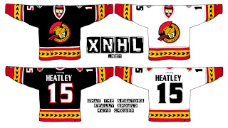
Having said that, I have a rather eager reader interested in gauging your feelings on a concept design he came up with. Behold.

I'd have to say it's pretty nice, if I'm being asked to share an opinion. I always thought the black third jerseys were the best they ever came up with. And I like the side-view logo which we all thought was going to be unveiled last night. It wasn't so I'm led to believe it will be a possibility for an alternate uniform when the league reinstates that program. But that's just me saying that. I have no idea if it's true.

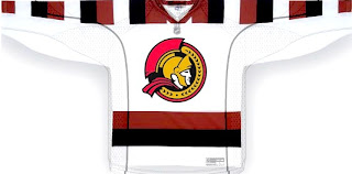
But wait, Sens fans, I have more. A lot's been made of the new shoulder patch that harkens back to the days of the Silver Seven, so what it if they took it a step further? This concept was sent to me and it's quite something.

I don't really have the words for that. Do you have any? Leave me a comment.

Thursday
Aug232007

Too Tight?

This makes me laugh to myself.

Wednesday
Aug222007

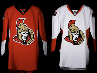
Senators Unveil New Uniforms!

The Ottawa Senators' new Rbk EDGE uniforms are here! Please view!

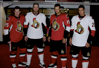
But wait, it gets better. Want to see Chris Neil, Brian McGrattan, Jason Spezza and Chris Kelly posing for a photo in their new threads? Look no further.

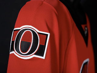
That's really all I got. The Sens unveiled their new sweaters at Scotiabank Place in front of the media and fans. Count them as the tenth team on the list. Before I go, I'll leave you with a close-up of the new shoulder logo.

Enjoy your night and be sure to check out my official Rbk EDGE gallery for all the photos I can find of these new jerseys!

Wednesday
Aug222007

Sens Unveiling Tonight!

Just wanted to remind everyone that in less than three hours the Ottawa Senators will unveil their new uniforms and "updated" logos — the latter of which we've already been treated to, allegedly.

To serve as a primer for the big event, I came across these fan-created designs to share — the last of which that shall be speculative, obviously.

We'll find out tonight what's what. Which reminds me, as a person who generally wakes up for work at 2 AM, don't be surprised if I don't post pictures until then. I'm often up until 7 PM so if I get my hands on photos by then, you can be sure I'll post them. Otherwise, check back after 2 AM — eastern time, that is (11 PM for all of you on the Pacific coast).

Saturday
Aug182007

Poll: Senators vs Rangers


vs
Ottawa
SENATORS
New York
RANGERS


Place your vote and then feel free to leave a comment as to how you came to your decision. Tell all your friends to drop in and vote! The more voices heard, the more accurate the results! By the way, I know the Senators are unveiling their new logo on August 22 (three days before this poll closes), so on that day or the day after, the logo you see here will change. You can choose to vote now based on this logo or later in the week based on the new one. Or you may even be able to vote on both occasions.

Poll opening date
Aug 18 @ 4:26 AM
Poll closing date
Aug 25 @ 11:59 PM

07CHTRN | #E1D | OTTvNYR

Friday
Aug172007

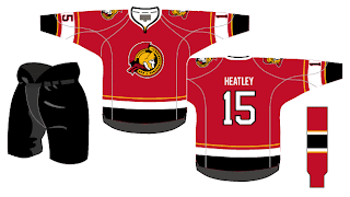
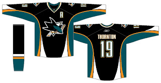
Sens, Sharks Uniform Fan Art

We've seen the new logos (unofficially for one) but we've yet to see the new uniforms that go with them. So why not muse on the Ottawa Senators and San Jose Sharks briefly?

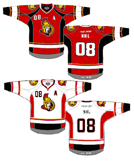
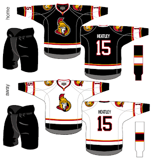
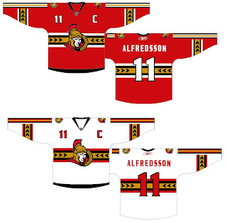
I like the red Senators jerseys a lot, but the black doesn't look half bad. Though in reality, odds are highly in favor of the Sens wearing the red at home this fall. The teaser pic on their web site seems to suggest that. Could be misleading, but I doubt it. I like the larger shoulder patch. More teams should do that. It looks really good.

The only problem I see with these two jerseys is the placement of the numbers on the sleeves. Way too low. Needs to be above the elbows. But wait! There's more!

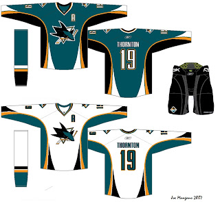
Consider these concepts for the San Jose Sharks.

They're pretty sharp, if you ask me. They could do a lot worse. The new logo looks very good on these. I'd like to see a bigger shoulder logo a la the previous Ottawa concepts. But otherwise I don't have a lot to complain about. Though from everything we've read and heard, I'd lean more towards expecting less curved lines and more straight lines. However, I'm not sure how well that would go with this logo. It's quite curvy.

Anyway, it all remains to be seen. The Sharks have yet to announce a date for unveiling their jersey, but the Sens have said August 22 will be their release date.

Before I leave you to your own devices for the evening, though, I have a couple of alternates from the same artists who came up with these designs. I know the NHL is dropping the third jersey program for this season, but we can dream, can't we?


Enjoy the rest of your night and don't forget to vote on the Senators-Rangers poll tomorrow morning!

Wednesday
Aug152007

Revisiting The Senators

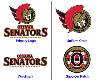
On Monday, we got a preview of the Ottawa Senators' new logo set courtesy of Canada's government trademark web site. They were black and white on the web site, so we had to imagine how the coloring might work (at least for the secondary mark).

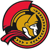
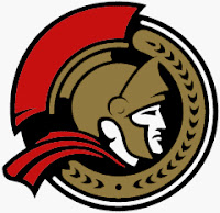
The image I posted had the outer circle in gold. Here's how they might look in red or white.

As for the primary logo, one fan ran with that on a jersey concept. See below.

Not sure how I feel about the striping across the chest. Certainly an interesting choice, though. Thoughts on that?

For the part of you that persistently resists change, one fan designer altered the new logo to mix in some of the old.

Truthfully, I'm not a fan. Until we get to the shoulder patch. I think that is pretty cool. I like the old-time stripes and the contrast in that logo, which you'd think would be hard to achieve, is excellent.

Sens fans, what do you make of all this here? Good? Bad? Ugly?

Monday
Aug132007

Mailbag: New Sens Logo On CIPO Site

Got some interesting emails from a reader regarding the new look of the Ottawa Senators. He emailed me links to pages on the Canadian Intellectual Property Office web site showing what appears to be the new primary and secondary logos of the Sens.

According to the CIPO, this is the primary logo:

It matches the "leaks" we've been seeing all along. You can link to the CIPO's page directly, here.

And apparently, this is the secondary logo:

This is the first time we're ever seeing this logo. Like I said, the guy who emailed me says this will be the secondary mark. Expect it to be unveiled along with the new primary and Rbk EDGE jerseys on August 22 at Scotiabank Place.

You can link to the page directly, here.

Sorry they're only black and white, but this is what I have to offer. What do you guys think?

By the way, huge thanks to Greg on the awesome find!

UPDATE (4:36 PM): In case anyone was wondering, here's how these two logos might look with a little color splashed on.

Page 1 ... 2 3 4 5 6 ... 7 Next 10 Entries »