


Monday
Oct252010
Polls: NHL ASGToL Semifinals
 Share
Share Polls close Sunday, October 31 at 11:59 PM
The current Icethetics logo tournament features NHL All-Star Game logos from the past two decades. Read more about the format here.
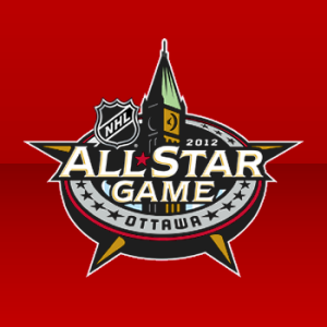 Ottawa 2012 |
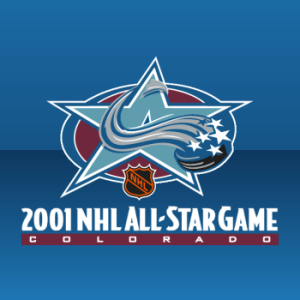 Colorado 2001 |
ASGToL 35
|
 Toronto 2000 |
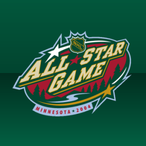 Minnesota 2004 |
ASGToL 36
|
Commenting Feel free to add your comments about the polls below. Keep it short, relevant and friendly. Currently, commenting is unmoderated. Abuse it and commenting will go away. I'd prefer to offer an open discussion but not at the expense of civility. Also, if you choose to announce the logos you've voted for, do it in paragraph form. Comments with long lists will be removed.

Reader Comments (13)
ottawa and toronto final. its going to be close
Is it just me or are all of these NHL All Star logos pretty weak? I'm speaking from a purely design angle... not a fan angle. Not trying to be uncivil... but I have a hard time voting for any of these. I'm a bit shocked that the Toronto logo made it to the final four, all respects to my Toronto friends. Compared to say the Winter classic logos, these just don't measure up. Great site btw.
The Toronto logo is very cool but it could easily be for a bread or milk company
Colorado and Toronto get my vote.
Not sure what people find so appealing about the Ottawa one.
Nathan, it incorporates a landmark in Ottawa, and it forms a star.
The only thing missing is something from the Sens logo.
Lightning23,
Sure and fair enough. But isn't the fact that it's totally missing anything to do with the Sens' logo more than enough reason to suggest that it's not such a good logo?
One quick glance at both the Colorado and the Minnesota logos and it's readily apparent what team they go with.
Whoever said the all-Star logo should have anything to do with the host team's logo? I think the Ottawa and Toronto logos are my favourite just because thay have some originalty to them and AREN'T just an modified version of a previously existing logo.
Toronto will win it cause its differnt than all the others
I have a feeling Toronto might lose in the final to Ottawa purely because a lot of people don't like the Leafs. Honestly, the Toronto logo should be a landslide over Minnesota. All it is is ALL STAR GAME, written over the teams logo.
for some reason I just don't love the Toronto one other than the 2T0r0nt0 script and the five grey steaks for five players... maybe because only 3 of the 5 points on the star go out of the big circle? or maybe because the central white maple leaf is inside a half-red maple leaf which is inside the blue maple leaf/star combo and it looks like leaf mania?
it's not that bad but the Minnesota one is (also) easily identifiable to the home team, the colors look great, and I like the yellow and white stars going around the outside. either one from that pairing should beat the Colorado/Ottawa pairing I think!
It seems our freinds in Ontario have a knack for designing good allstar logos. Is it just me or does the Colorado entry look kind of, naked? As always, until this year, Minnesota comes up with a great logo.
I seem to be in the minority on BOTH votes. I love that the Colorado logo looks like an All-Star logo AND looks like the team's logo. I also love the Wild's version...other than their new shoulder patches, I've never NOT liked/loved a logo from the Wild. The Ottawa logo is very nice, though I personally don't care for the Toronto logo. I think (like Tom pointed out) it's because only three-fifths of the star exists. I do think the 2T0R0NT0 thing is creative, but that doesn't make it a good logo.
Battle of Ontario final... At least Toronto and or Ottawa have a chance to win at leat ONE of these logo tournaments lol. Most of the time, neither of these two come close.