Tuesday
Oct122010
Polls: NHL ASGToL Quarterfinals
 Tuesday · Oct 12 · 2010 | 8:23 AM PDT
  12 Comments
 Polls close Wednesday, October 20 at 11:59 PM
The current Icethetics logo tournament features NHL All-Star Game logos from the past two decades. Read more about the format here.
 Ottawa 2012 |
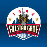 New York City 1994 |
ASGToL 31
|
 Atlanta 2008 |
 Colorado 2001 |
ASGToL 32
|
 Toronto 2000 |
 Montreal 2009 |
ASGToL 33
|
 Minnesota 2004 |
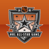 Los Angeles 2002 |
ASGToL 34
|
Commenting Feel free to add your comments about the polls below. Keep it short, relevant and friendly. Currently, commenting is unmoderated. Abuse it and commenting will go away. I'd prefer to offer an open discussion but not at the expense of civility. Also, if you choose to announce the logos you've voted for, do it in paragraph form. Comments with long lists will be removed.


Reader Comments (12)
As much as I like most of the elements on the New York logo, the main banner just throws it off. They should never have tried to cram that text in there in that way; it looks like "ALL STAR GAMF"!
Why did New York get that 4th Place and not Pittsburgh?
Is there really a winner between the All Star Logos of 2001 and 2008? They are both horrible and look as if they came out off the same assembly line of manufactured All Star Game logos. Toronto 2000 was always one of my favorites & still shines brightly a decade later.
I have to ask the same question. Why is Pittsburgh 6th...they got more points than the 4th and 5th logos. The Pittsburgh logo should be in the quarter finals.
The only one of these I find pleasing to the eye is the Toronto one.
All star logos in general are just too busy. I like how the Toronto one has very little text.
Ok, funny story. Here's what happened: I accidentally swapped points between the 1990 and 1994 logos in the standings. Simple error caused me a lot of headaches trying to get to the root of the problem. Bottom line: Pittsburgh was always 6th. New York City was always 4th. The playoff bracket and quarterfinal polls were correct all along. I am just inadequate. Happy voting!
63+50+48=161 - New York '94
41+62+56=159 - Philadelphia '92
58+48+36=142 - Pittsburgh '90
So, tell me how 142 is greater than 161 or 159?
Edit - nevermind, Chris explained it. It was obviously fixed by the time I saw it, but he hadn't commented about the fix yet...
When I look at the LA 2002 logo and all I see and think is Dallas Cowboys...ugh! No way I want that logo to win
The only one i voted with the minority on is MTL '09 vs. TOR '00. i just like the MTL one better
I love Colorado 2001. Definitely should be in the final with Toronto 2000.
I think Ottawa and Toronto are the top 2 All star logos, but I wouldn't be surprised if Colorado snuck into the finals. The other logos are nice but don't deserve to win the tournament.