


Polls: 3rd Jersey Championship
 Share
Share MINI-TOURNAMENT of LOGOS
Polls close Sunday, May 30 at 11:59 PM
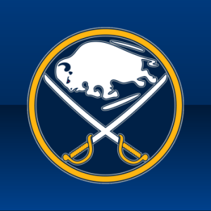 Buffalo Sabres |
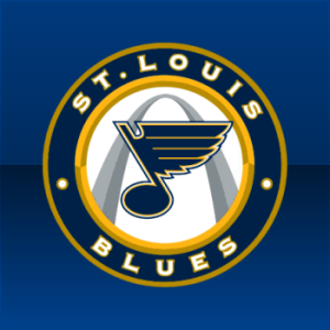 St. Louis Blues |
NHLTOTJC 40
|
Results hidden until poll closes. Winner announced Monday, May 31.
Tie-breaking Since the playoff format is not points-based, the winning logo of the championship final will be determined by the total number of votes received rather than the percentage. In the unlikely event of an exact tie, a 24-hour run-off poll will be held the following day.
Notes Bonus polls will be posted at a later time.
Commenting Feel free to add your comments about the polls below. Keep it short, relevant and friendly. Currently, commenting is unmoderated. Abuse it and commenting will go away. I'd prefer to offer an open discussion but not at the expense of civility. Also, if you choose to announce the logos you've voted for, do it in paragraph form. Comments with long lists will be removed.

Reader Comments (51)
Goin with the Sabres on this one. A timelessly-classic logo with an update that makes it pop. Gotta give the Blues credit though - that's a helluva third jersey logo.
If I wasn't a Buffalo homer, this would be one of the hardest choices for me.
Not at all possible that we could add the Canadian Hockey League Teams as well as perhaps some European leagues to the poll for the next logo tournament?
I persoanlly would like to see us go on to the secondary NHl logos as well, but I think some people mgiht prefer having the choices.
It's gonna be the Sabres because of the obsession with the logo.... but I can't vote for it.
No matter what, I can NEVER vote for a Buffalo logo that HAS a buffalo in it unless they're the bisons or something.
That Blues logo really is cool. The only thing that bugs me about it is that the top-right corner goes over the yellow circle. It should be a little more to the left or a little smaller so there wouldn't be any part of the logo going over the borders.
Go Sabres.
Hey kind of a weird idea for a contest, what about best colors?
The only question becomes, what counts as the thrashers colors?
I kind of like that idea Dave.
I like Dave's Idea! That would be pretty cool
@ Kevin:
I have to disagree with your assesment. While I would agree with your point if it was just the buffalo(late 90s goathead), I think the Buffalo Sabres have one of the best logos in the league and it describes where its from and what the team is called inside the logo without a word. There is one Buffalo and two Sabres. The Buffalo Sabres. Pure genius. I voted for the Sabres logo.
The St Louis Blues logo however is in its own right a beautiful logo, also depicting where its is from and what they are called with the Gateway Arch signifying they are from St Louis and the blue note signifying the Blues.
Both beautiful logos. But the nod for me has to go to Buffalo.
As a Blues fan I would love to vote for them on this one, however I think the Sabres logo is the best in the league so it's going to be a tough choice for me.
I'm for the Blues in the Thirds Final, though, I think Buffalo is going to run away with this. Either way, both teams deserve it.
I'd be all for a team colours tourney, though some teams would be hard to judge considering there is a lot of red, blue, and black teams out there. Maybe we should have a Jersey Tournament to make it easier. Logos would be excluded of course.
My thought for the next tourney is that the AHL should go ahead and the NHL Secondaries should be in the background like the third jersey tourney. This will get us through these tournaments faster since I'd like to see the Canadian Hockey League started by the end of the summer.
Finally a championship that a Buffalo team could win lol
Curtis I agree with you on the jersey contest that way you can judge how the colors are being used.
WOW JAY QC!!!! I hate you now for pointing that out now I can't stand that logo!!!!!
I hate that Blues logo. So I guess that indicates who I voted for.
I love that Blues logo, so i guess that indicates who i voted for
That buffalo looks like it is about to be speared, or projectile pooping.
What is that blue thing under that arch?
StumbleUpon can be so random sometimes . . .
Greetings from Peru
LOL It's a note, now i feel dumb.
The colors poll is an awesome idea, and we can use this website for what the "official" colors are.
http://www.ssur.org/research/TeamColors/Hockey/NationalHockeyLeague/NationalHockeyLeague.htm
actually, with all of the concepts on this page, i'm astounded that website hasn't come up before.
for the record, they list the thrashers as having "Atlanta Midnight Blue, Thrasher Ice Blue, Georgia Bronze, Capitol Copper, Peachtree Gold, White" as their main colors lol
Sabres. But they are both pretty damn good.
If the Sabres would have used the original logo, and not tweeked it with all of the silver trim making it too busy - then it gets my vote. But as it stands, I gotta go with the Blues.
You could always do a tourney of ALL teams combined! Every NHL, AHL, ECHL, CHL, SPHL, IHL, FHL and even the QMJHL, OHL and WHL major juniors and NAHL and USHL juniors too.
This logo is 1 of the reasons that the sabres are my favourite team. Go Sabs!
@glovesave29,
I forget where I saw that but another website has already done that. It's a pretty cool idea.
What's up with all the circle love. Either way go Blues maybe this will put us over the top for a first cup. Win this then the cup makes sense doesn't it, DOESN'T IT.
I voted for the Blues logo, not to take away from the Sabres' logo which is pure classic genius, but I really like the Blues' variation. Although text is involved, I thought it was approached in a simplified way. The use of the Arch, is fantastic, and I agree with an earlier post it could have been centred better.
Lol, if I read the word "classic" one more time on this blog I'm going to...do something bad.
Classic.
Sabres.
I'm skeptical about the colors tourney, but I'd love to see a sweater tourney. We could do one each for home, road, and thirds.
It's not that the Sabres logo is a bad logo. I personally (like Chris) prefer the 2000s red-and-black sabers logo. Devoid of buffalo, and the jersey looked kick-ass (http://www.icejerseys.com/images/temp/sabres_alternate_big.jpg)
Yeah, they stole Los Angeles' name locator on the bottom. HOW DARE THEY!!! But a sabre is a weapon. It came from (according to Wikipedia) the Hungarian verb "to cut down".
It's has a war background. It's a weapon. Red and black are the colors that just indicate death, violence, and ferocity. It's why the Flames and Devils wear red/black, not blue/yellow, green/white, or whatever. To me, that logo and that color scheme just made more sense than the current/throwback one.
I Went With Blues... But Just Barley. Buffalo's Use Of Colors is awesome!
Not gonna lie, the Sabres logo is pretty, but look at the beauty that is the Blue Note under the Arch. Pure symbolic beauty. The Blue Note by itself won the championship for best logo and with the Arch in the background, it can't lose. The Arch is one of the coolest monuments in the world, and the Blue Note is the coolest logo in the world, together, they are an unstopable force of symbolic machismo that you can't stop looking at. Vote for the Note and I will always love you. I MEAN IT. You're a great audience, I thank you, Good Night and Good Luck. GO BLUES!!
My brother JoeBob just came up with the idea for a tournament to find NHL best mascot. If you do, lets go LOUIE for the Blues.
Best Mascot sounds good! So does Glovesave29s idea of all leagues, don't forget KHL though.
BTW I voted Sabres
How about best SEL logo?
Skellefteå AIK!
Well, at least the Blues are in the finals for something!!!!
Now, I guess we will have to wait and see how the NHL can screw 'us' once again.
in terms of logos that pissed me off when i realized a minuscule detail, SJ Shark's old logo infuriated me when i realized THE TAPE ON THE STICK DOESN'T GO ALL THE WAY AROUND ARGHGDblalala
How about Best Jersey Contest. Home, then Away, then third.
Is the vote still going???
@ Headsigh
You're right. I never noticed that.
It is annoying.
what happened with the old teams logo contest ie whalers, north stars etc...
Alright Chris, I can understand, but it's time to take a break from Super Mario Galaxy 2 and give us the results of this nail biter.
Results???
Hey!!!Who Won The Tourney?
!!!!!!!!!!!!!!!!!!!!!!!!
And the winner is.........?
Come on Chris! Where are you at!?!
Super Mario Galaxy 2 must be pretty good.
wheres the results and what happened to that relocated teams tourney?????
C'mon, Chris, the drummer is getting tired. He's been drum-rolling for the last almost 48 hours!